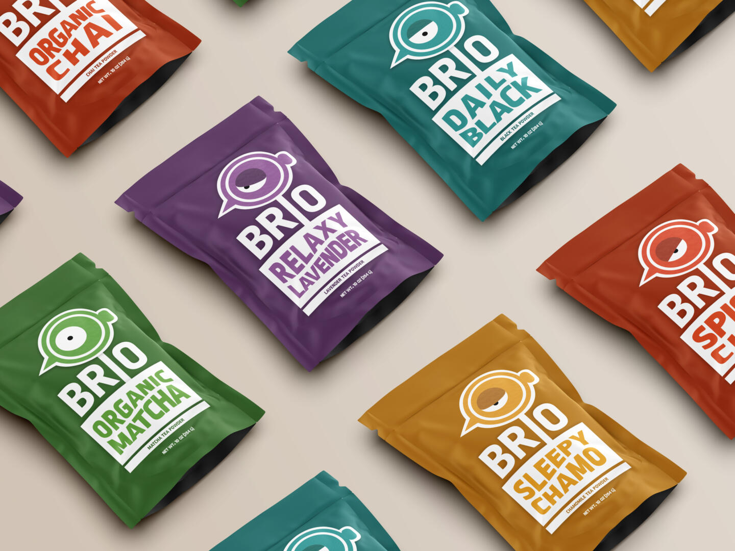
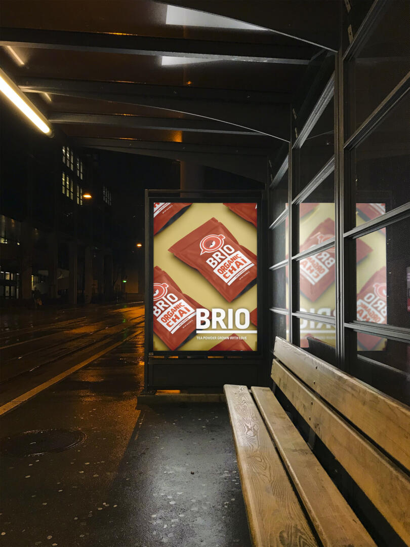
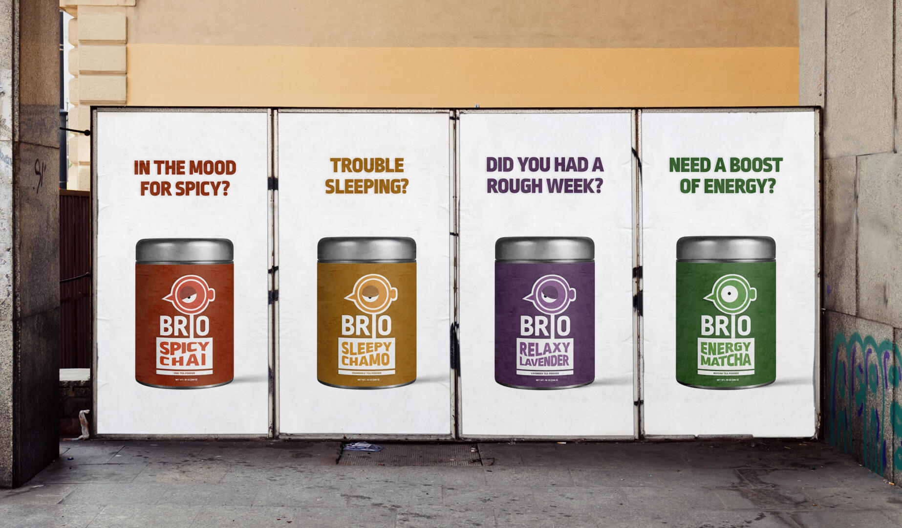
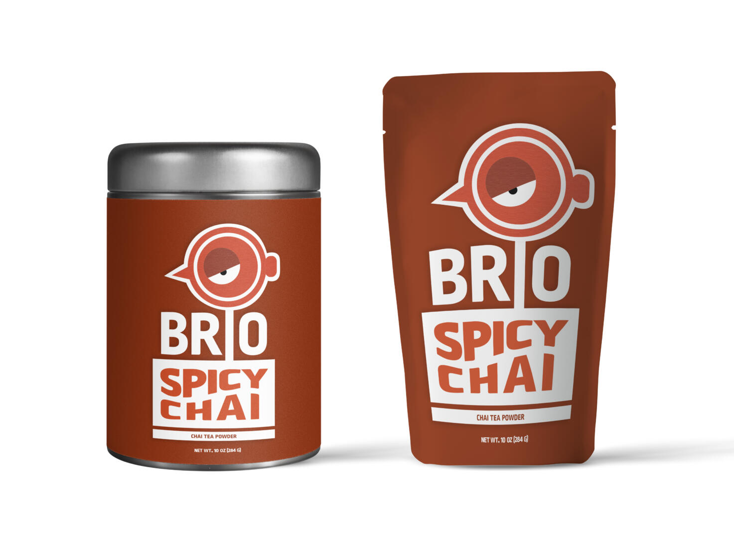
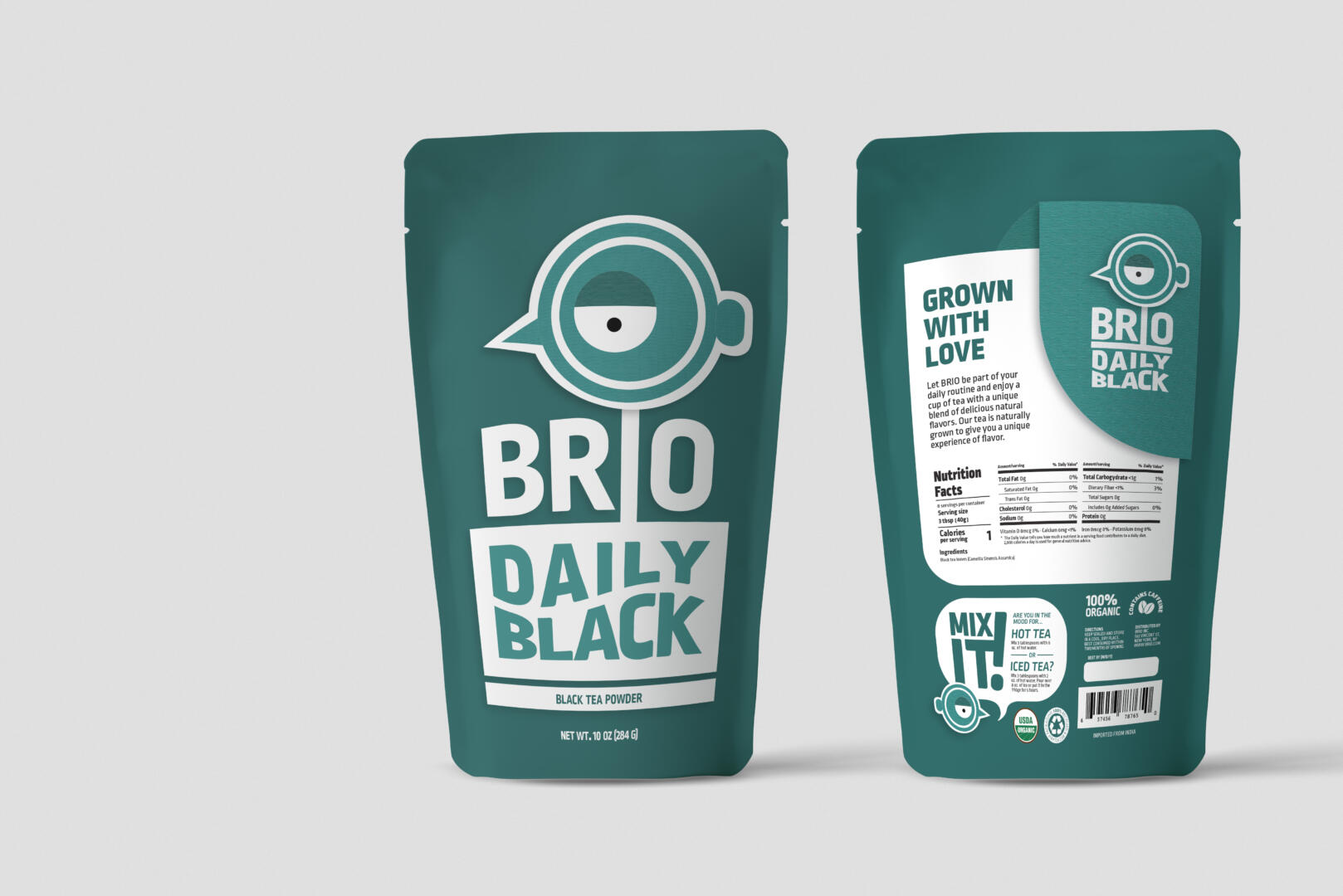
Brio is a tea powder brand that focuses on creating a unique experience for the audience. The main focus of this brand is the relationship between the consumer and the product. The objective is to introduce the wide range of benefits of tea powder to a young audience. Brio’s visual identity is based on an energized and modern lifestyle.
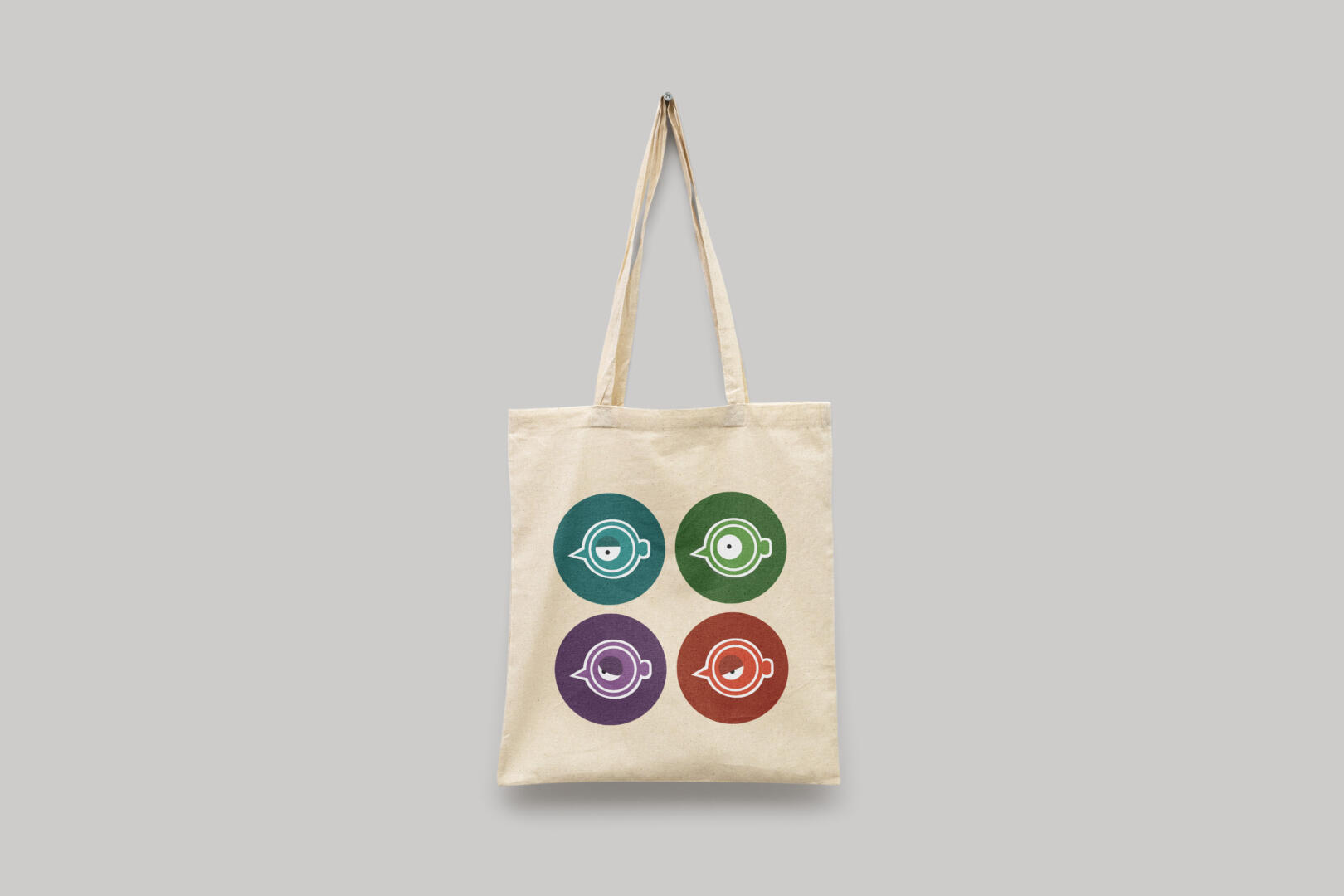
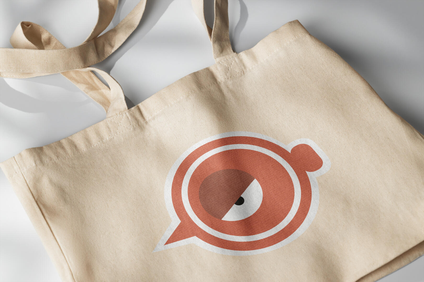
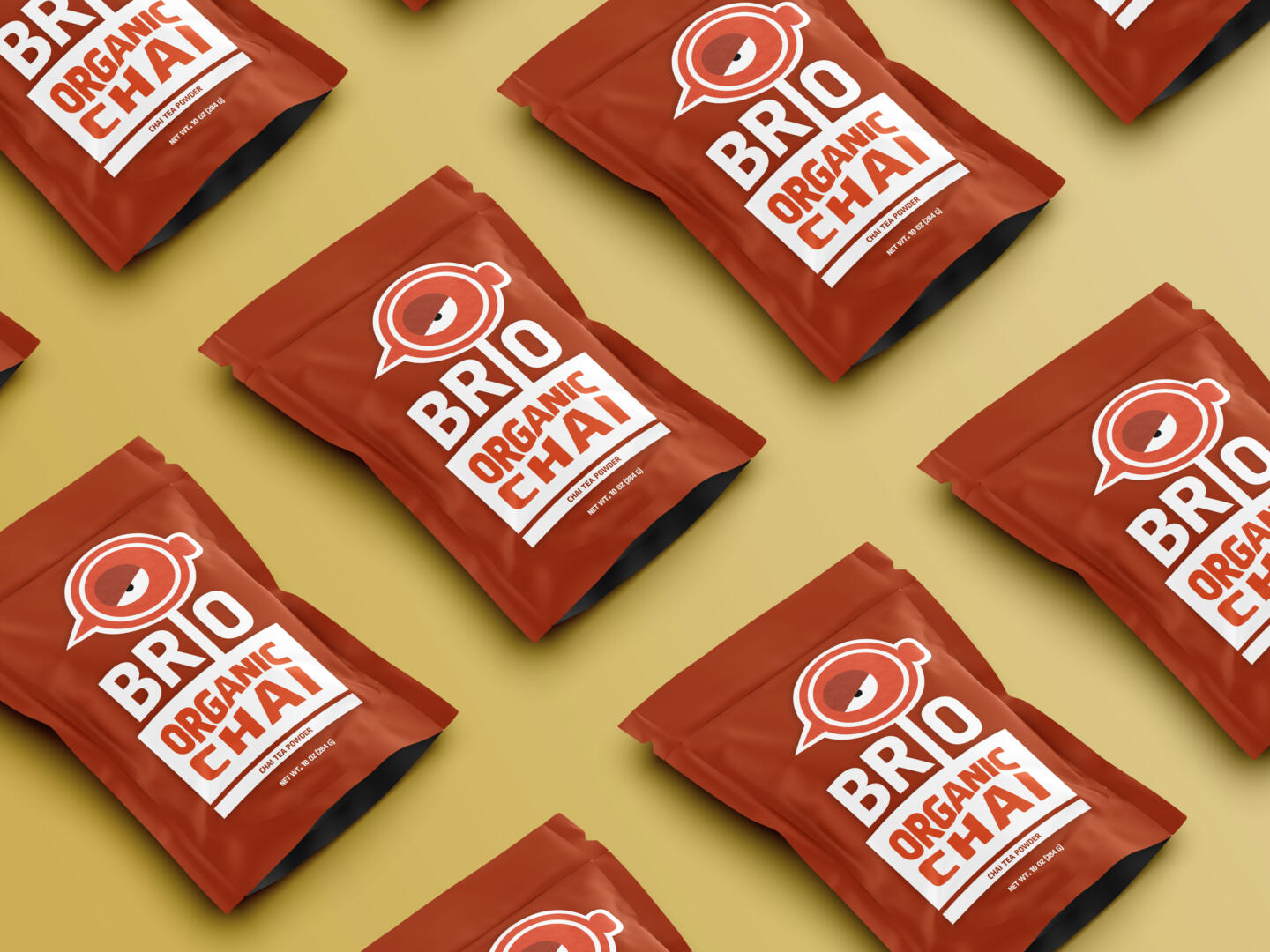
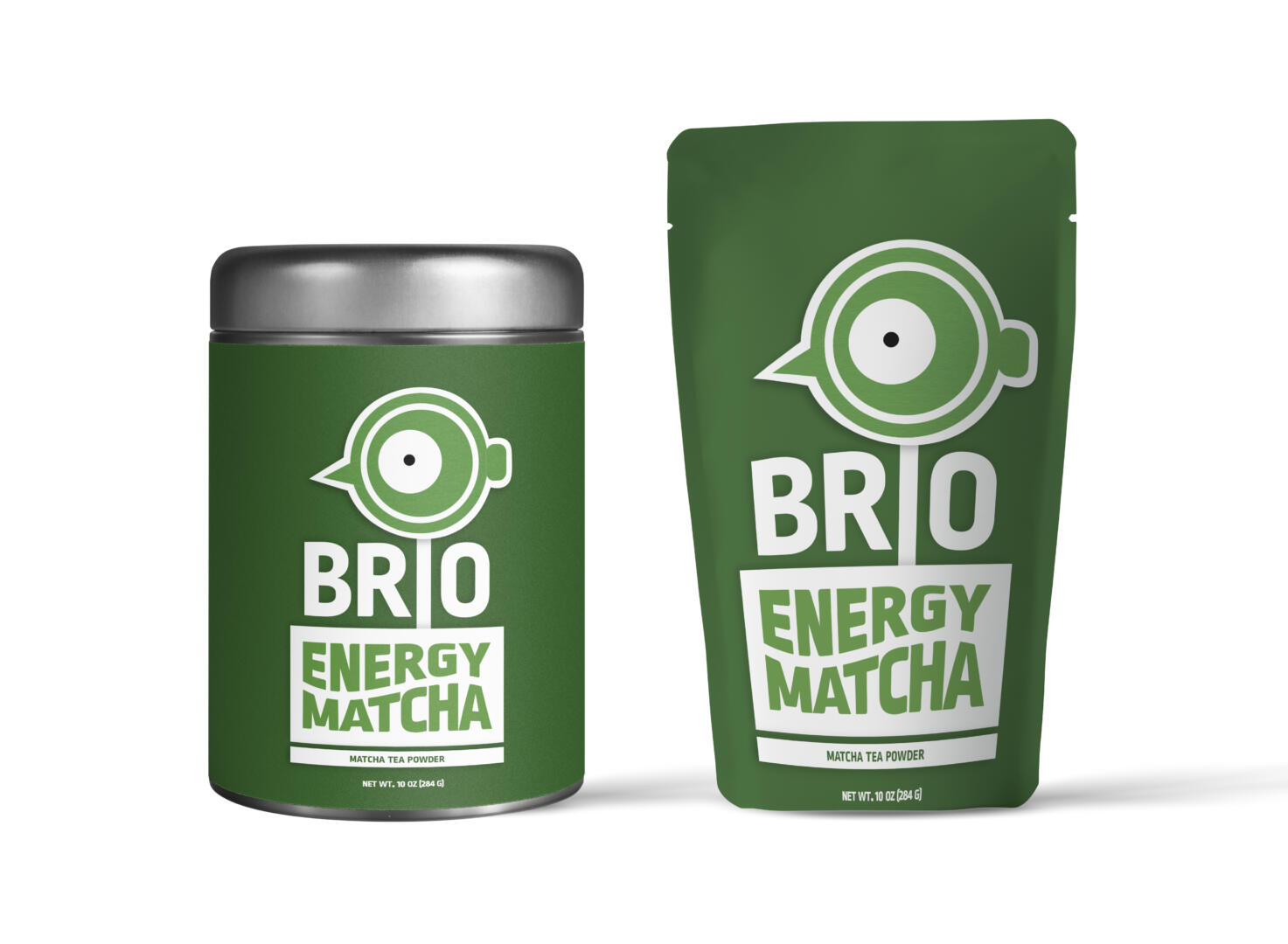
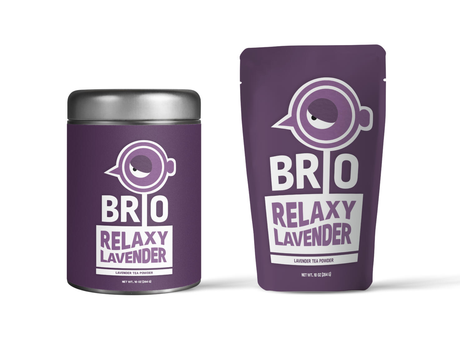
To reach this goal, the branding and packaging portray the core significance of the brand and emphasize the flavor and benefits of tea. To evoke the interest of a younger audience, bold and colorful shades combine together to create a meaningful and modern color palette. Furthermore, a series of illustrations have been created to represent the central character of the brand, with each tea variety having a unique illustration to depict its flavor. This gives the brand a dynamic, lively, and recognizable personality.
In order to provide an ecological approach to the brand, eco-friendly pouches, and tin cans were designed to diminish the use of one-use plastic. Each packaging contains detailed information about the tea variety, its origin, ingredients, nutrition facts, organic and eco-friendly seals, and instructions for use and conservation. Brio’s branding and packaging convey a unique and modern approach to tea. The main goal was to create a memorable visual identity that represents tea’s energizing properties and delicious flavor.