
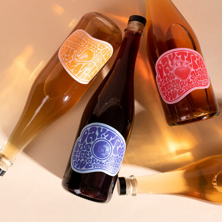
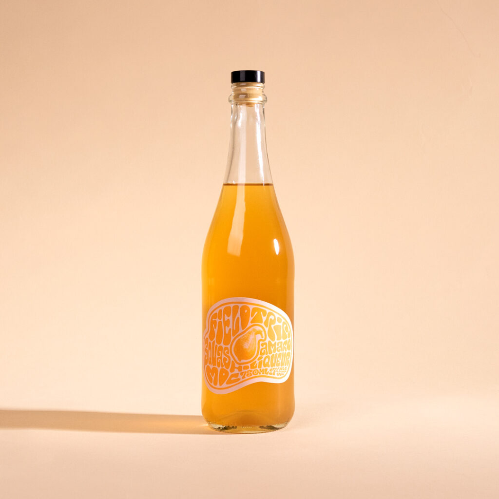
Matchbook Distilling Co. wanted to lean into the light-hearted, funky vibes of their growing Amaro line. The designs are meant to evoke a carefree moment in time, a season, a feeling, true to the origins of Daytrip. It also reflects a feeling of movement and morphing into something new, following the story of how these spirits came to be.
The design was inspired by the fluid typography of Wes Wilson, and these hand-lettered labels center around the locally sourced ingredients of each release that produce these bright flavors. The center imagery is textured in a screenprint style reminiscent of traditional printmaking, further reflected in the simple two-tone design of the label design.
The outer die follows the morphing typography, natural and true to the organic roots of the product.
 Anna Kachaeva
 vrai studio
 Studio Pistache
 Slice Design
 David Byerlee
 宏洛图品牌设计HONGLT
 The Creative Method
 Fond
 DS1 branding agency
 Ashwini D
 Dozen Agency
 We Craft Studio
 Likit
 Asprey Creative
 Firstrein
 Nouna design
 JavierGarduno
 Daria Kolesnikova
 HerCreativeSide
 lbeck