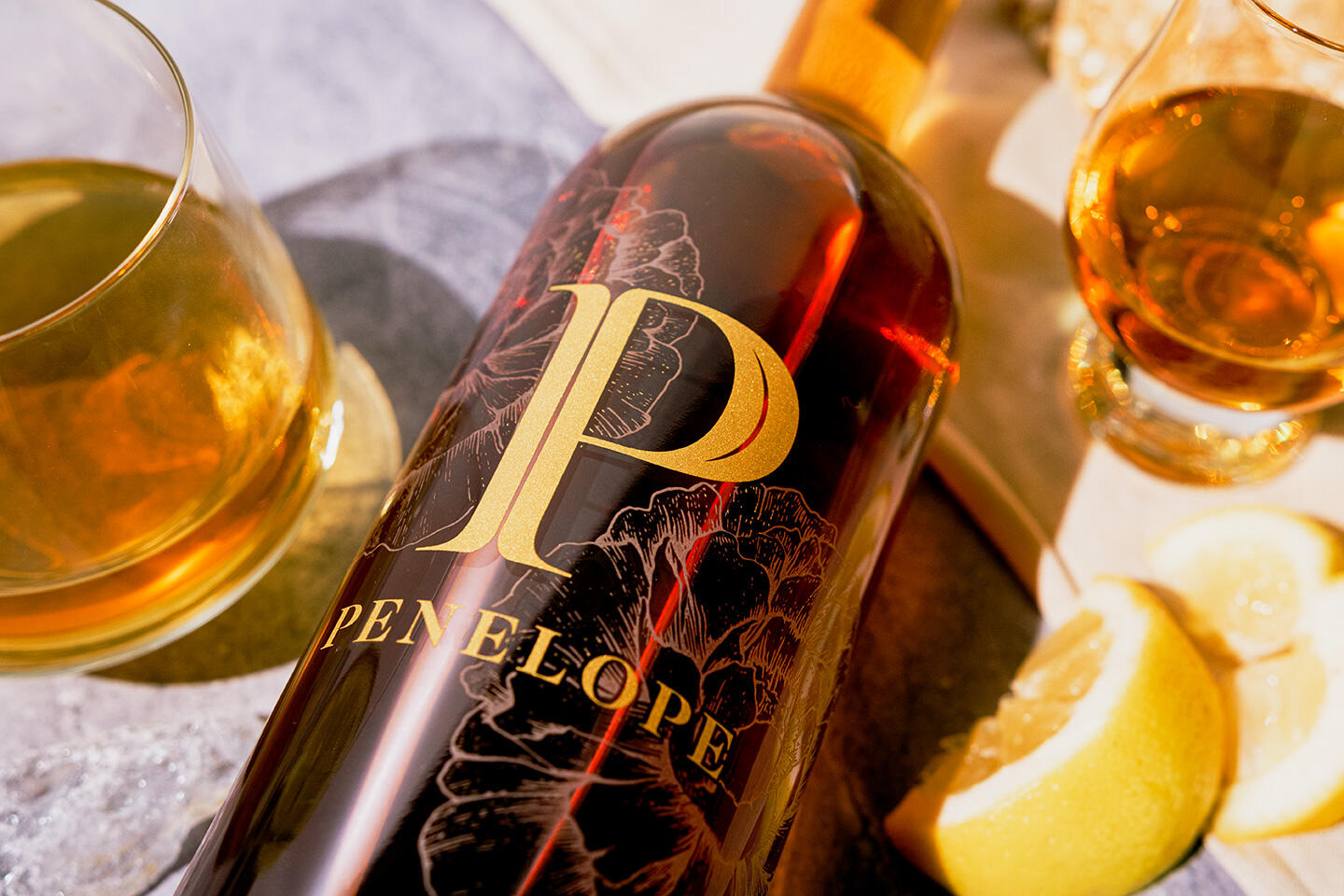
Watermark specializes in refreshing brands that already have a strong reputation and following, like Penelope Bourbon. Beginning with the logo, we retained brand equity by keeping the ‘P’ in the logo, but customized and elevated it with additional detailing and refined typography beneath. Next, we refreshed their peony imagery, evolving from a photographic background to a custom, hand-drawn illustration that can perform with more versatility, while also elevating the overall brand with delicate linework.
The package design process evolved from an update of the four grain label into their premier Barrel Strength bottle, allowing full visibility of this beautiful liquid with a barely-there etching of the peonies and a bikini label around the bottom. Consistency is maintained across the product line-up through logo placement and other design choices.
Curator’s Insight: Watermark has done a remarkable job of rebranding Penelope Bourbon without losing its essence and identity. The new logo is elegant and sophisticated, while still retaining the recognizable ‘P’ shape. The custom peony illustration adds a touch of femininity and grace to the brand, while also creating a distinctive visual element that can be applied across different media and formats. The package design is minimalist and refined, highlighting the quality and clarity of the product. The use of etching and bikini labels creates a contrast between transparency and opacity, adding interest and intrigue to the bottle. The design choices are consistent and coherent, creating a strong and unified brand identity that appeals to both loyal and new customers.