More than a decade after the first release, Watermark refreshed the Ankida Ridge Vineyards brand and packaging to reflect the growth they had experienced since we had first started working together in 2011. Ankida wanted to stay true to their brand and winemaking philosophy, but also update to have a more modern look & feel. These labels double down on story, digging deep into the roots of who Ankida Ridge is.
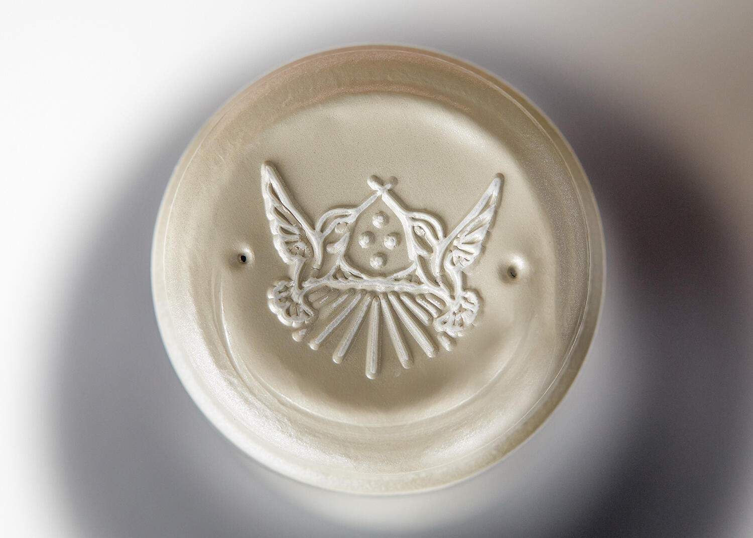
Ankida, meaning where heaven and earth join, is personified by the vineyard rows reaching out toward the heavens above the mountain’s ridge in the logo design. Four stars sit in the heavens, one to represent each of the owner’s children. Two hummingbirds, frequent tasting room visitors, join wings to form the mountain ridge as well as a hidden A for Ankida.
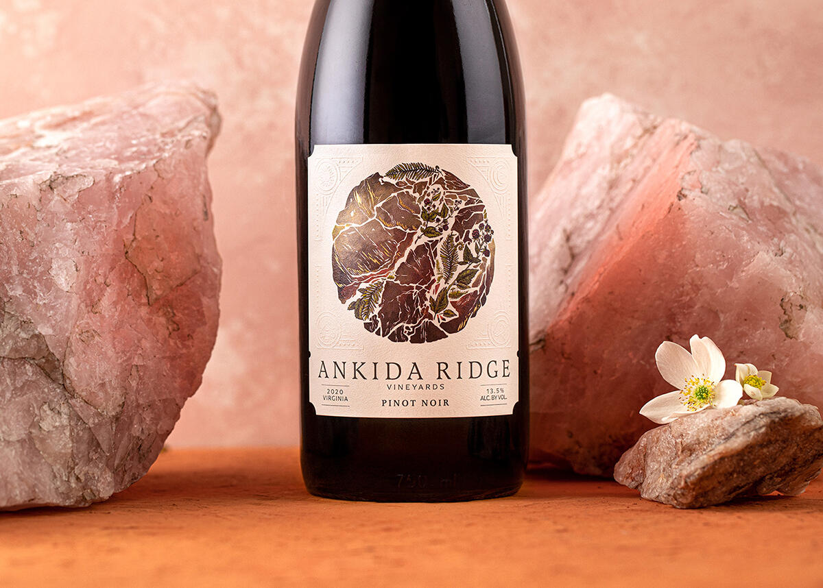
The vineyard is built with a respect for the cyclical nature of the environment, and the knowledge of how everything will one day return to the earth and soil the vineyard is built upon. Finding this to be truer than the day they first planted, Ankida wanted to pay tribute to the soil as the hero of their wine labels.
Each varietal depicts a different element of the vineyard. The Rosé uses the redbuds that speckle the ridge in spring, the Chardonnay focuses on the pollinators and blooms of fruit trees, and the Pinot Noir uses foliage and fruit found on the forest floor. Flecks of hot-stamped foil hide in the illustration, which adds depth to the design and further reflects the metallic nature of the soil sample that inspired it all.
The illustrations are designed to be held by a blind-embossed frame which gives the label a storybook and whimsical feel. This particular corner holds a portrait of Roscoe, one of Ankida’s beloved sheep that roam that can be often found roaming the grounds of the vineyard.