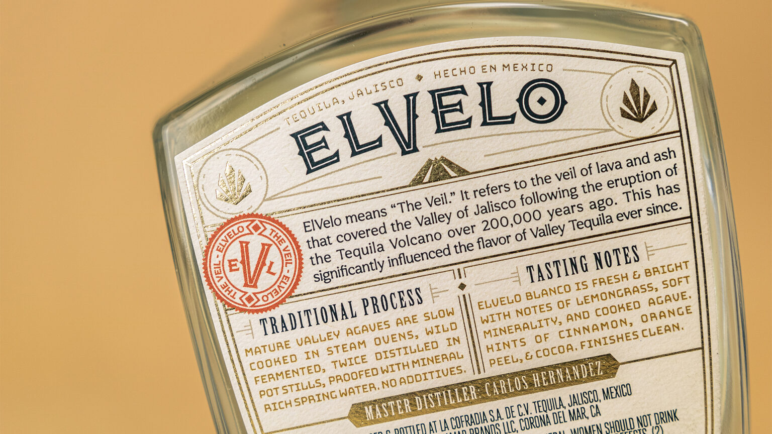
Made from 100% puro de agave, ElVelo celebrates the distinctive character of the Tequila Valley. The bold, agave-forward tasting notes, perfect for cocktail mixing, and the new visuals for ElVelo tell the tale of the region’s volcanic-rich soil, letting the full experience commemorate the valley’s origins. Over 200,00 years ago, the Volcan de Tequila erupted, creating a veil of ash over the valley. ElVelo, meaning “The Veil”, celebrates and highlights this unique agave, produced by the volcanic soil in the lowlands.
Formerly feeling delicate and more like a wine, the new brand and packaging needed to feel bold, rugged, and crafted. We took notes from the rough terrain to develop a logotype that stands out proudly, paired it with fonts that felt authentic and celebratory, and illustrated the volcano to take the viewer to the historic location.
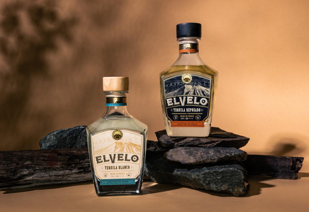
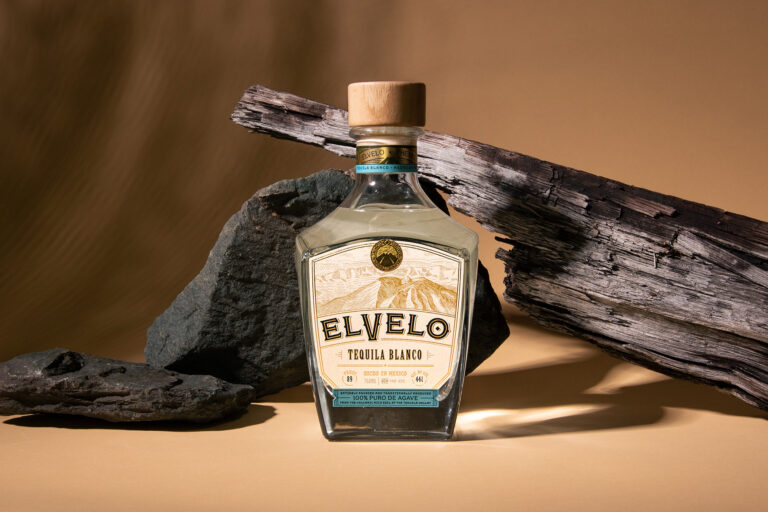
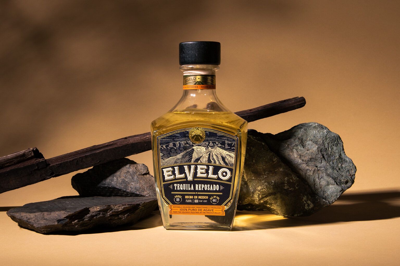
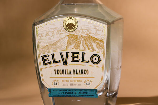
The details are what make stories come alive. These packages show a hand-drawn illustration of the Volcan de Tequila, a foiled emblem at the top of each label, and an engraved stamp on the bar top reinforces the brand with a central monogram, surrounded by descriptive text reminding the viewer of the meaning behind the name. Contrasting light and dark color schemes were used on the labels and closure to showcase the differences in the two expressions, from the lighter Blanco to the barrel-aged, darker Reposado. In every detail, from the package to a cocktail tasting, the incredible history of the Tequila Valley is told, experienced, and commemorated with ElVelo.