Guay is a brand of Spanish sauces. The name means “Cool”.
Already with naming the brand’s mood begins to be broadcast. “Guay” is saturated with sunshine, emotions and of course vivid tastes! It is the main advantage of the brand.
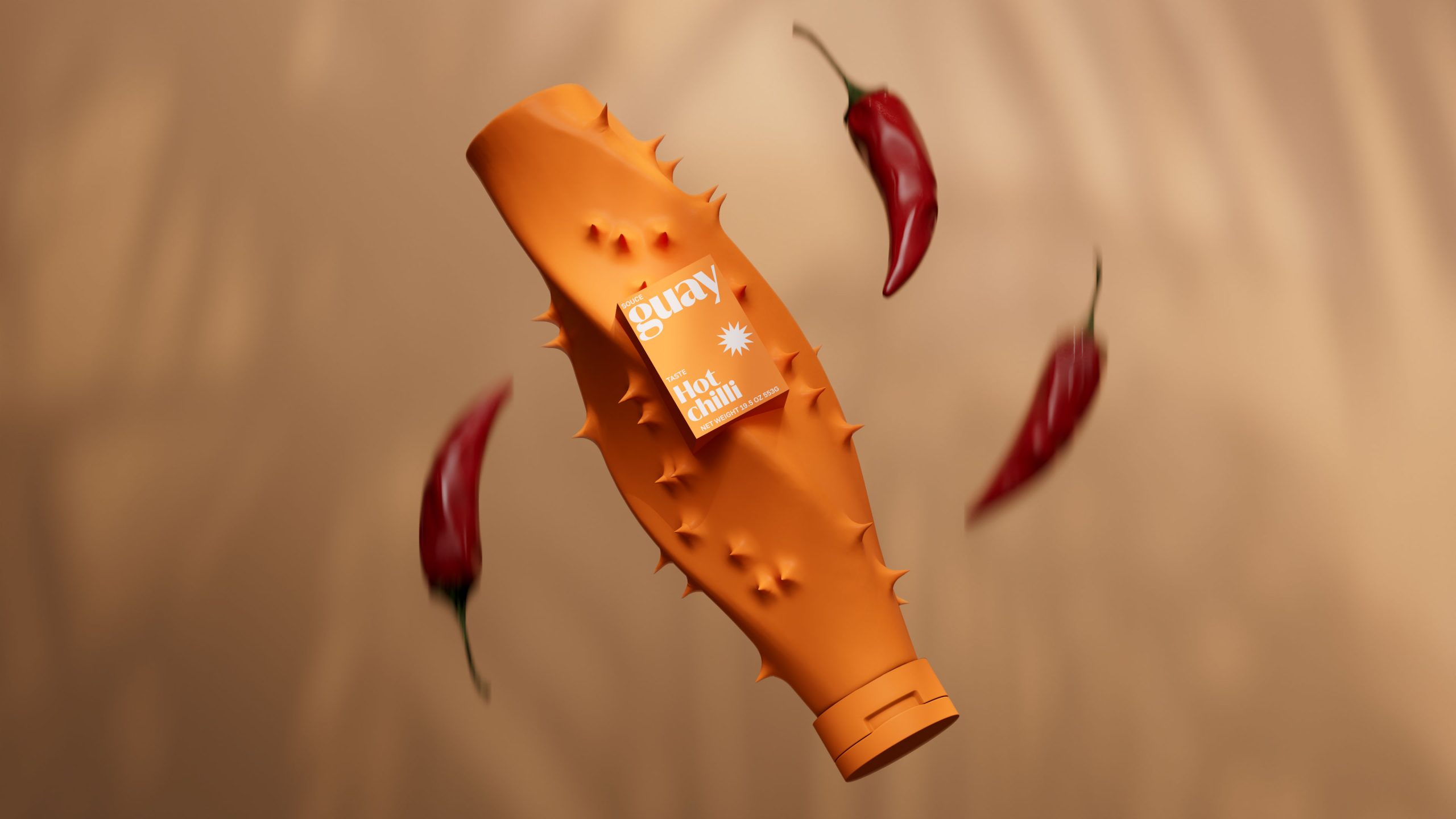
The packaging idea was inspired by visual symbols of taste sensations. Prickly means spicy, sweet means something soft and pleasant. Almost every taste in nature has its own visual embodiment, which is conveyed in packages, preserving the bright spirit of the brand.
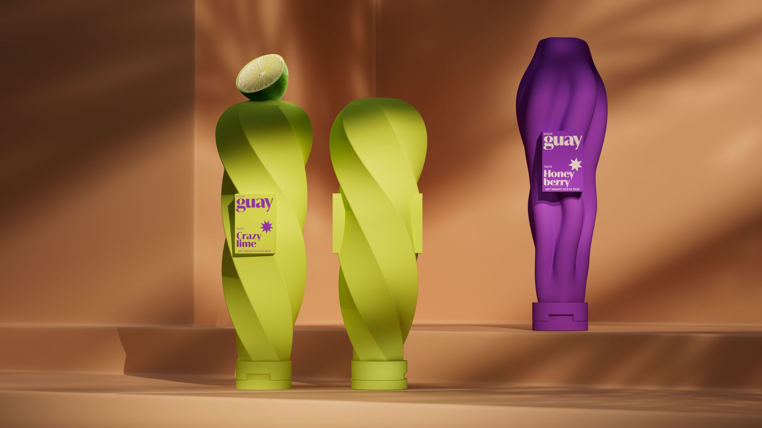
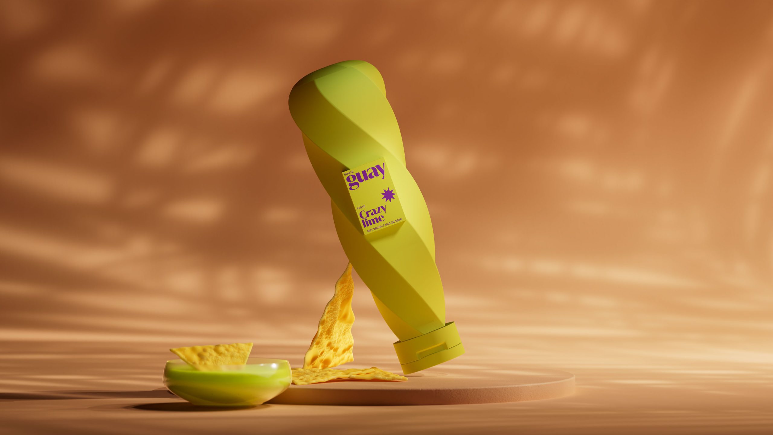
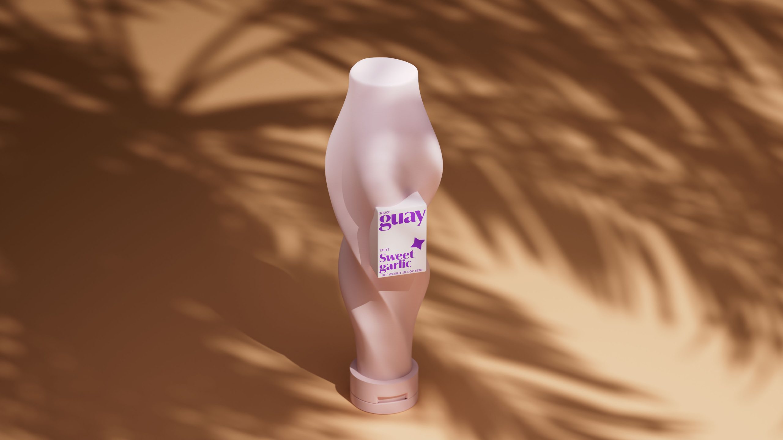
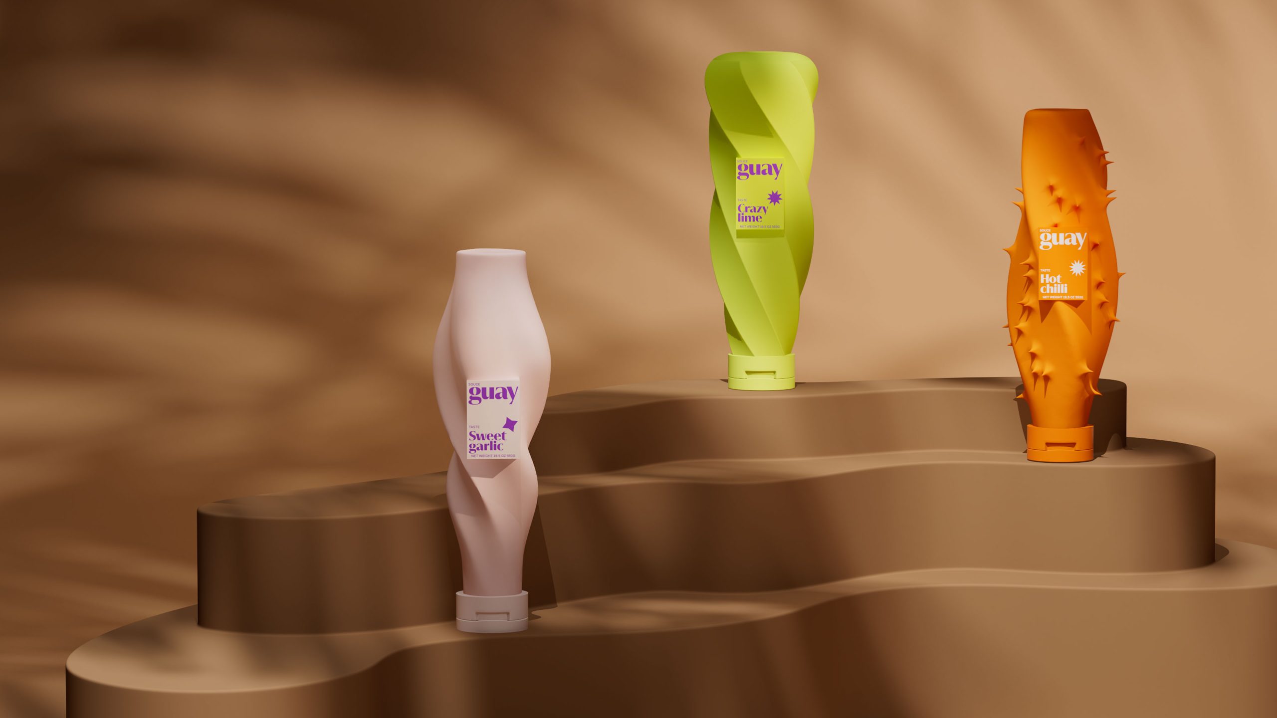
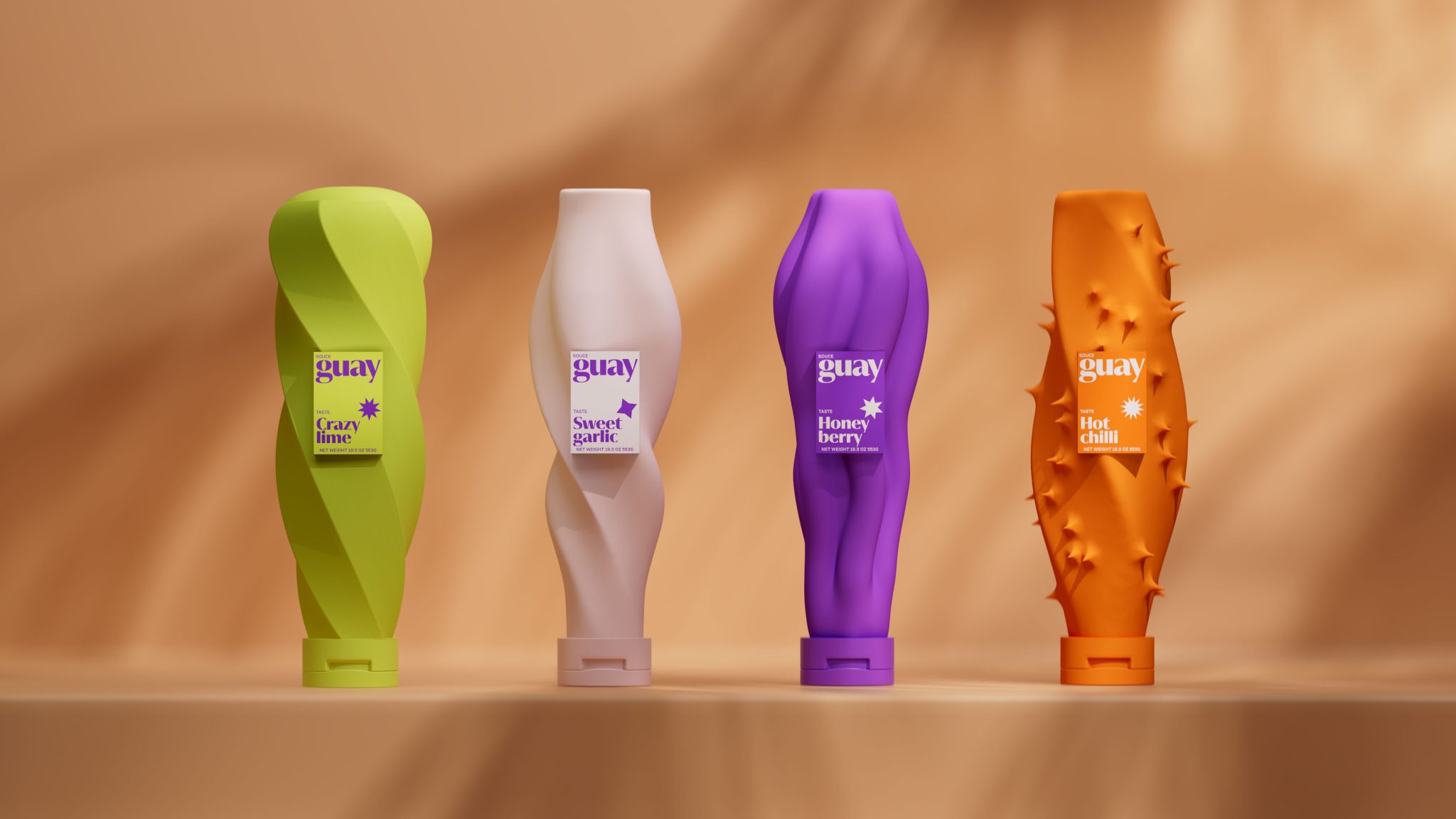
The line includes 4 different flavors: crazy lime — sour sauce, sweet garlic — delicate, honey berry — sweet, hot chilli — spicy.
A unique shape has been developed for each taste. Spice sauce is notable for its sharpness. Picking up the packaging the consumer will immediately realize that the taste of the sauce is spicy and quite bright. The spikes are made intentionally with well-coordinated ends, just to hint at the feeling and evoke positive emotions. The sweet garlic, on the other hand, is characterized by smooth and delicate shapes. The packaging lines flow into each other, forming elegant curves. Honey berry packaging makes an allusion to something stringy and sweet, like honey or caramel flowing. The streams form curls and sweet streams. Lime sauce is characterized by its twisted shape. It transmits the sensations of that emotion when you want to twist and cringe from such a bright sourness.
In each of the packages, the spirit of naturalness is reflected due to no symmetrical forms. There is no perfect order, the shapes seem to be alive. It is twist in their own way, show thorns that are strewn in the same way not regular. It was as if we had stopped at a unique moment of feeling the taste of the sauce. The brand name elegantly fits into the package.
Non-standard forms make the brand stand out from its competitors, mainly standard forms with different labels are available on the market. In our case, the brand immediately stands out due to the color and due to the non-standard approach to packaging forms.
Also, due to the expressive shapes, the consumer does not need to read the packaging to find the right taste, the selection process becomes easier, because the shapes speak for themselves.
The brand is represented in one size range.