Project Description:
Bold flavour with a sense of humour
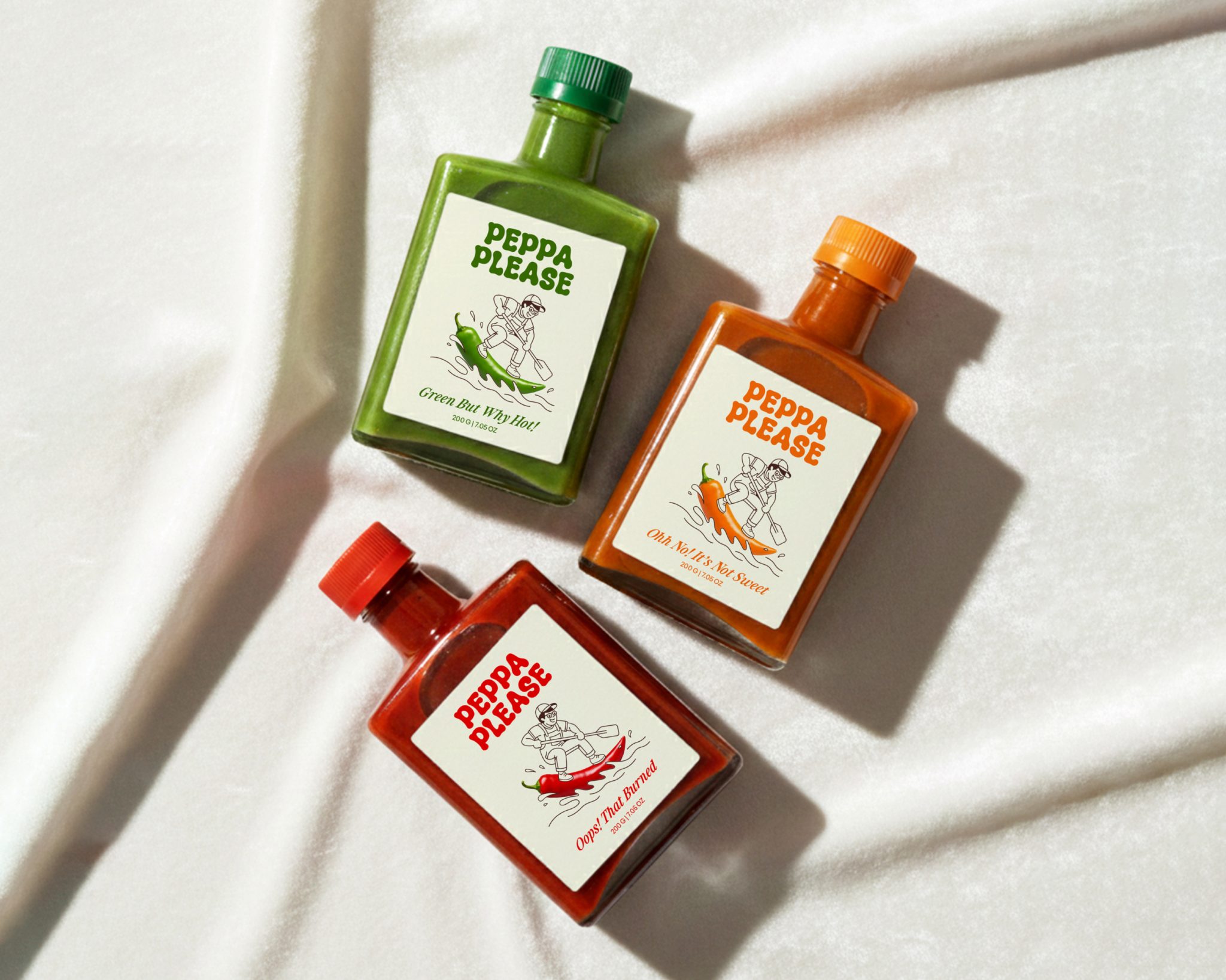
Peppa Please is a hot sauce brand for people who enjoy strong flavours without taking food too seriously. The packaging balances heat and playfulness, positioning the brand as confident, cheeky, and approachable rather than aggressive or intimidating.
Simple visuals with high impact
The visual language focuses on simplicity and strong contrast, allowing the product to stand out on the table. A clean label structure ensures clarity and instant recognition, while the vibrant colour palette reflects the intensity of flavour and the energetic spirit of the brand.
Expressive typography, modern appeal
Bold and expressive typography reinforces Peppa Please’s fun personality without overpowering the design. The minimal layout keeps the packaging contemporary and shelf-friendly, while subtle details add character and memorability.
Modern, honest, and spicy
Overall, the packaging feels modern, spicy, and light-hearted — a product that doesn’t take itself too seriously but still delivers real heat, made with honest, recognisable ingredients.


