noa_ is a conceptual bath & body oil brand designed around the idea of quiet rituals. Moments of stillness embedded in everyday life.
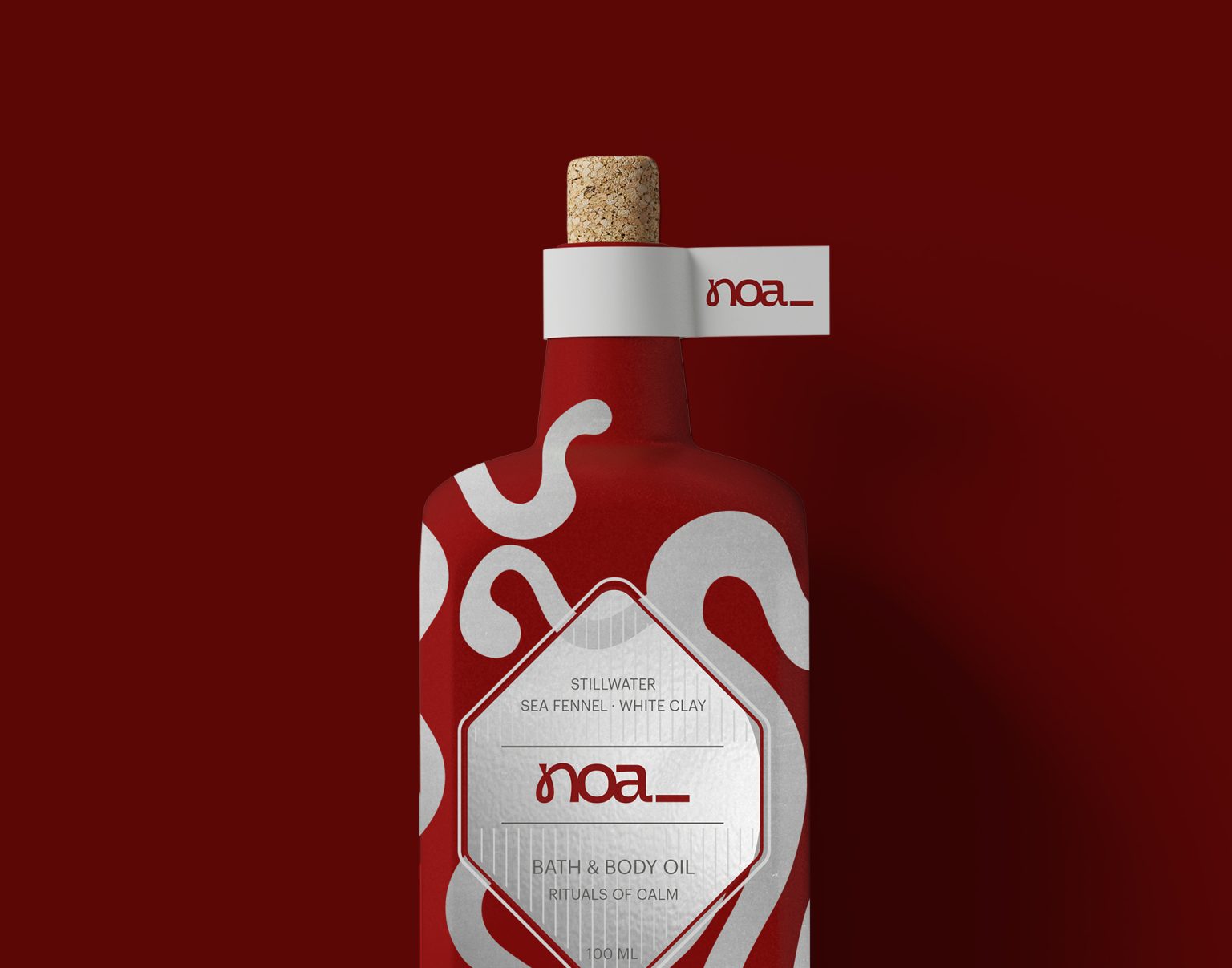
The project began in an unconventional way: not with a name or product brief, but with a bottle. Its tactile form, matte surface, and natural cork closure became the emotional and physical anchor of the brand. From this object-first approach, the identity, tone, and product philosophy were developed in reverse. Allowing form, texture, and restraint to guide every decision.
noa_ is designed for a modern, design-conscious audience seeking calm without excess: thoughtful consumers, creatives, and slow-livers who value sensory experiences, reduced aesthetics, and intentional self-care. The brand avoids clinical wellness language in favour of warmth, presence, and subtle confidence.
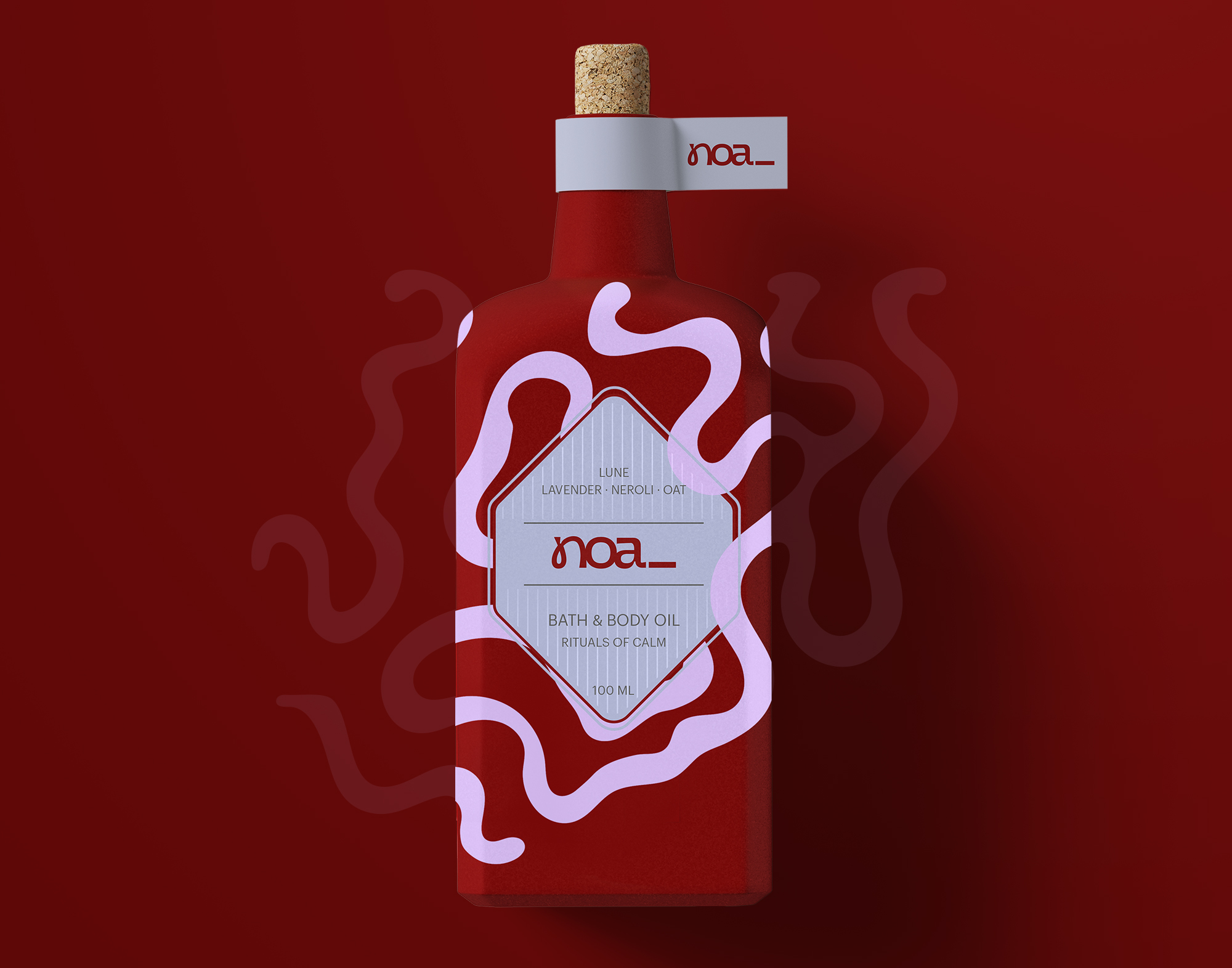
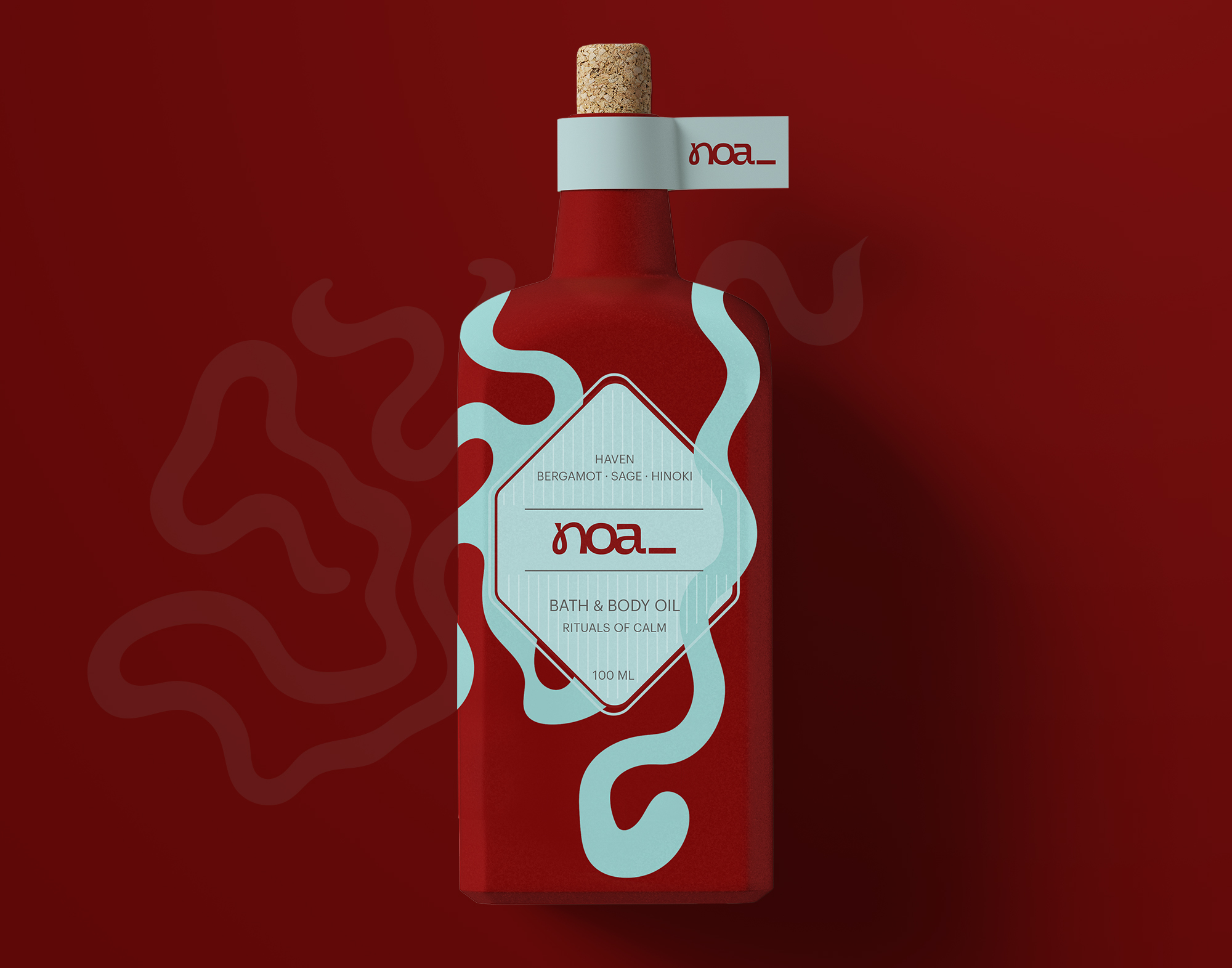
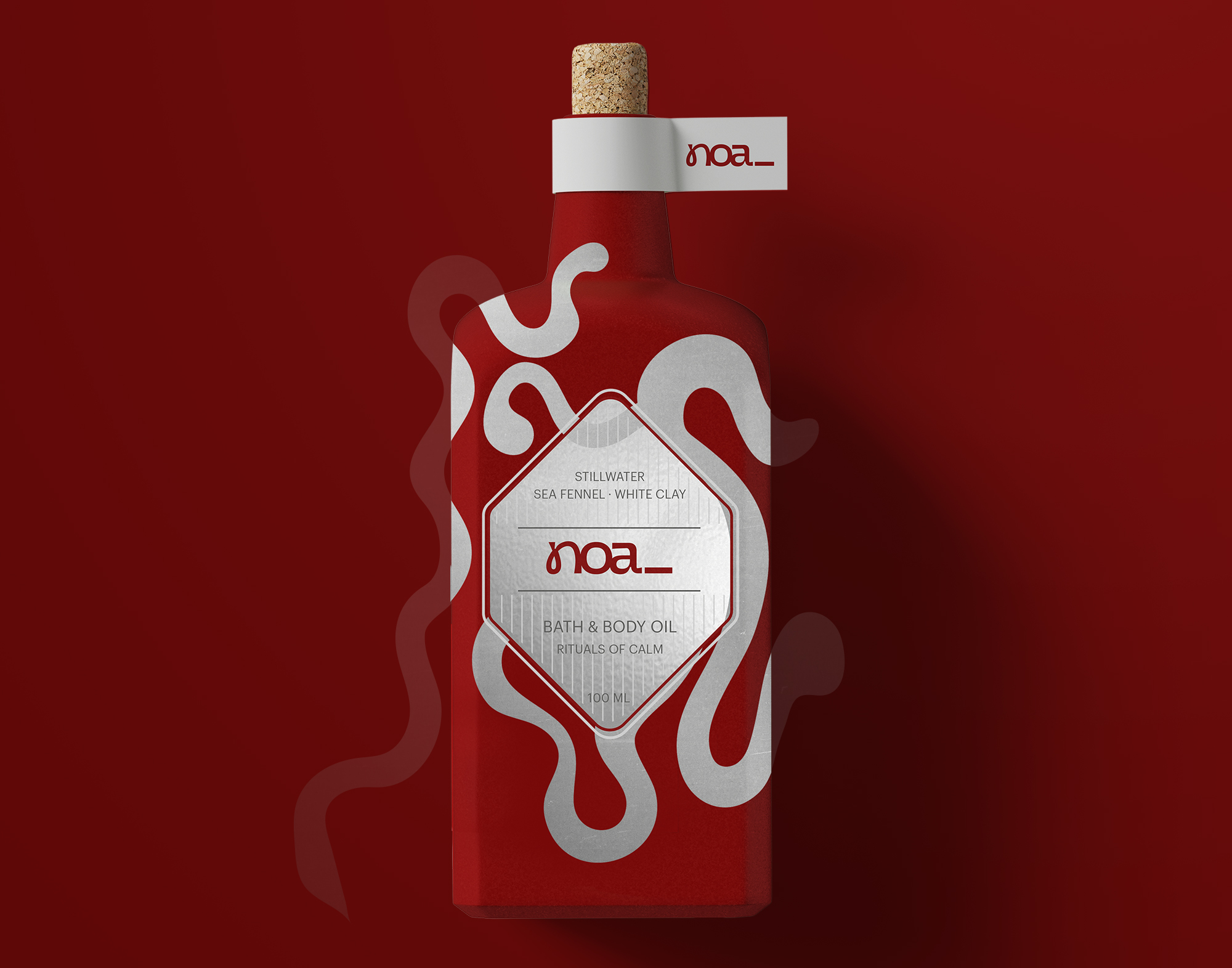
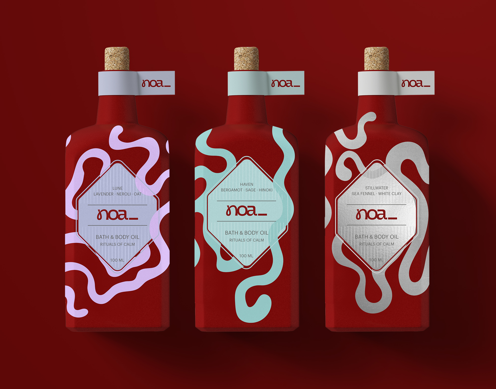
The packaging system centres around a deep cherry red, chosen to balance intimacy and strength, paired with understated typography and organic, flowing graphic elements. These abstract forms reference movement, breath, and ritual without becoming illustrative or literal. The logo placement remains calm and deliberate, integrated into the label as a quiet signature rather than a dominant mark.
The initial product line consists of three bath & body oils, each conceived as a distinct ritual:
Lune: lavender, neroli, oat
Evening unwind. Reflection.
Haven: bergamot, sage, hinoki
Grounding calm. Everyday ritual.
Stillwater: sea fennel, white clay
Morning clarity. Reset.
Rather than relying on loud claims or decorative storytelling, the design language of noa_ focuses on balance, materiality, and emotional pacing. The result is a packaging system that feels tactile, quiet, and contemporary. Inviting users to slow down and reconnect through daily rituals.