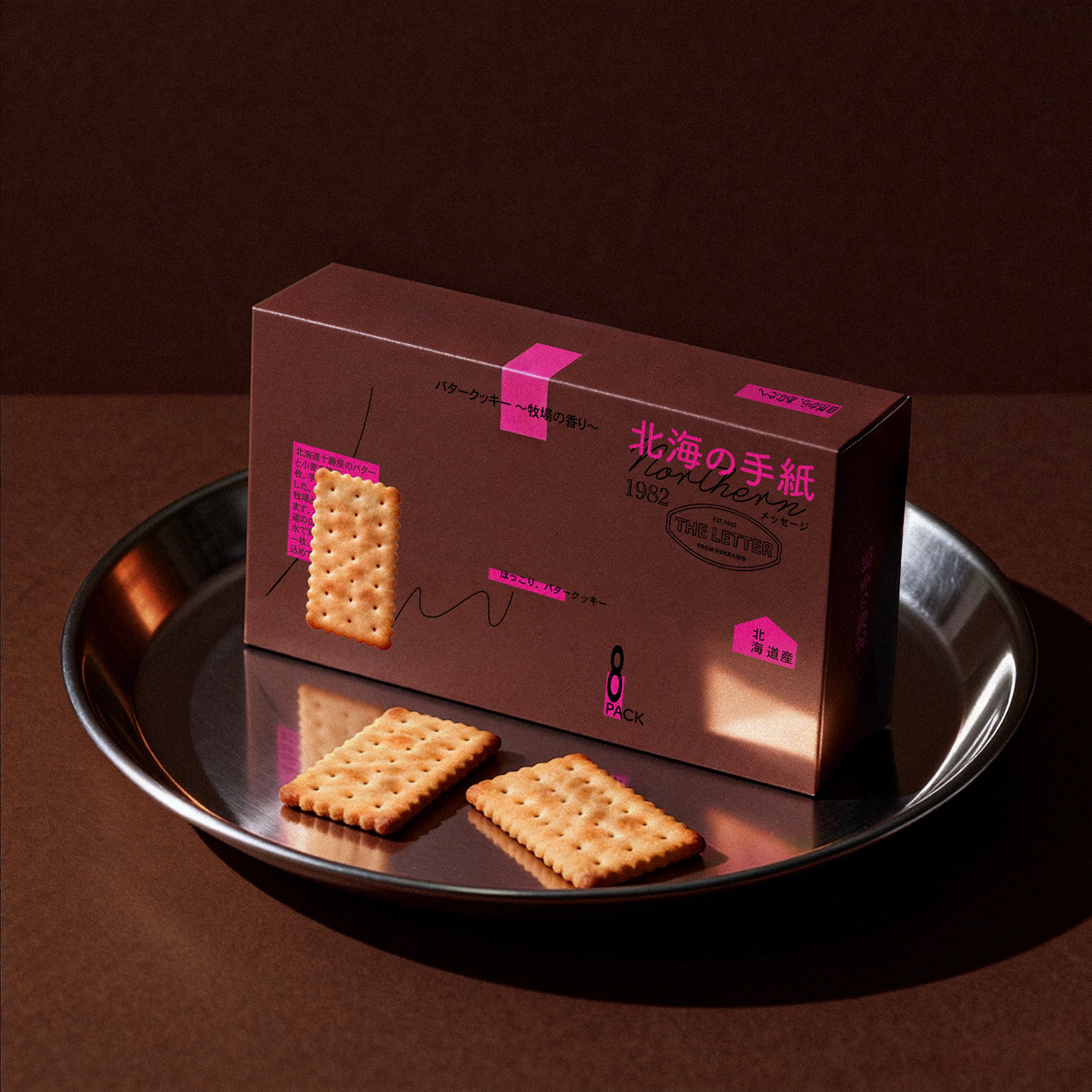

北海の手紙
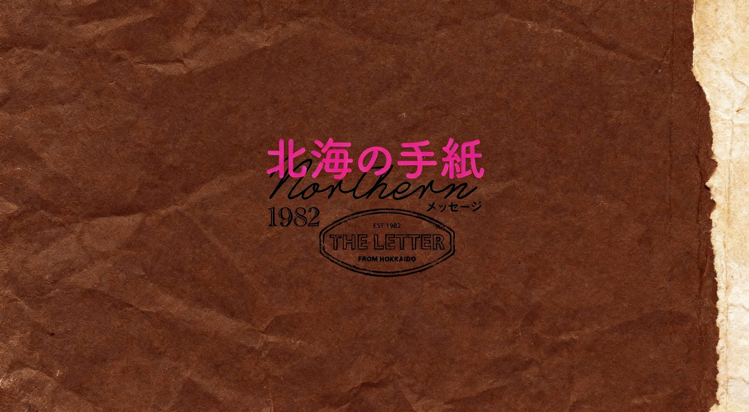
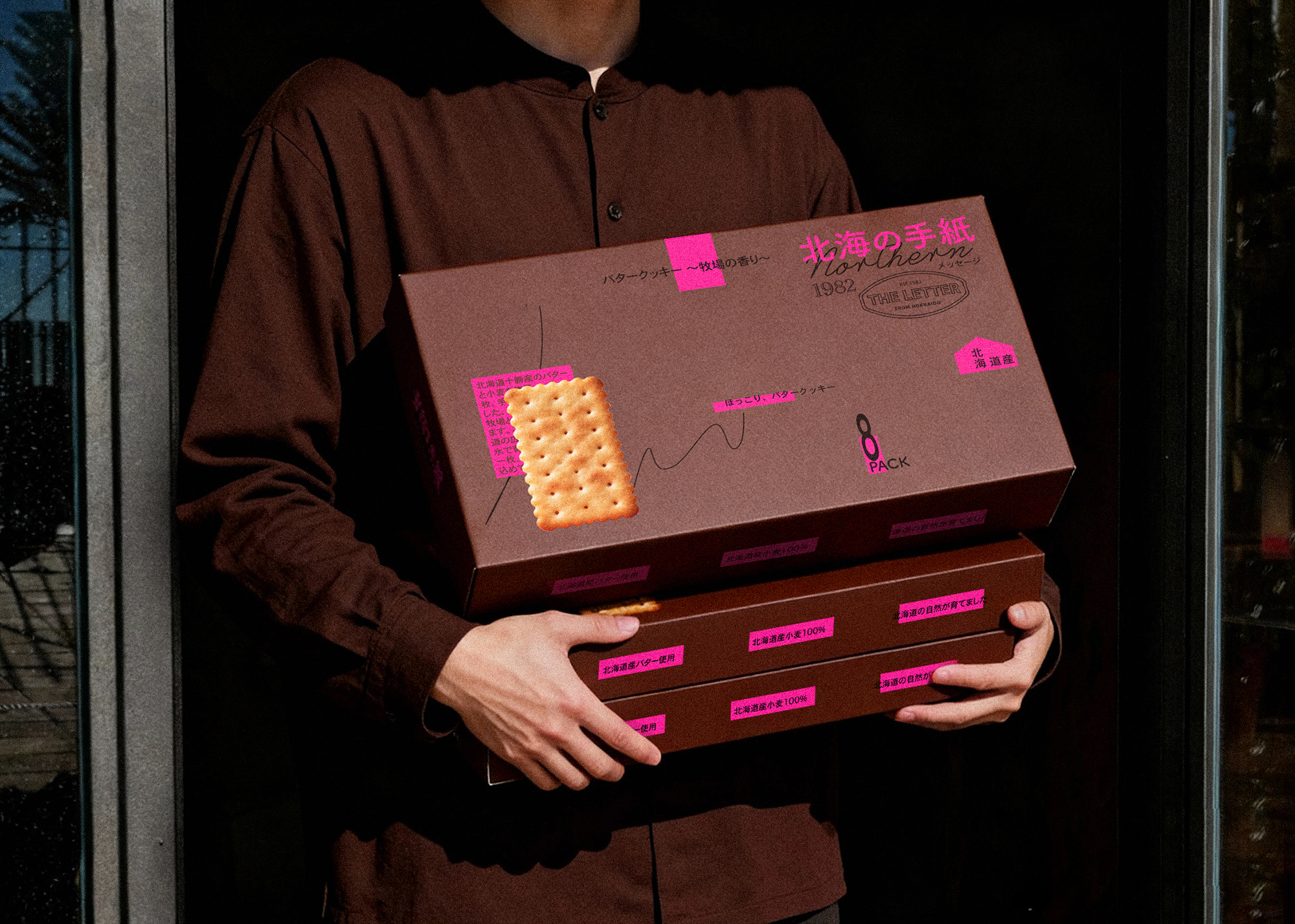
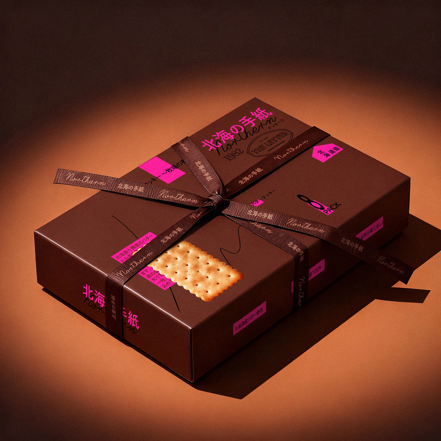
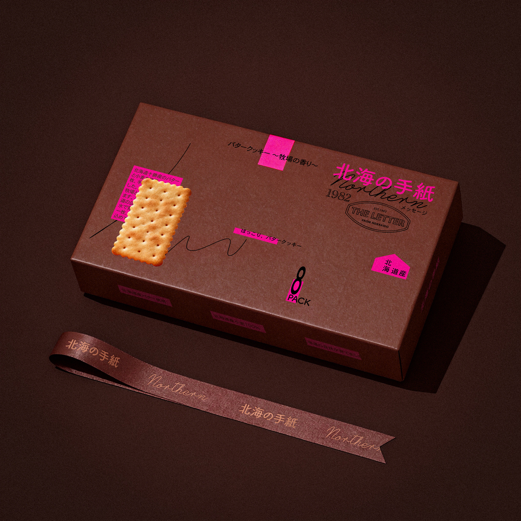
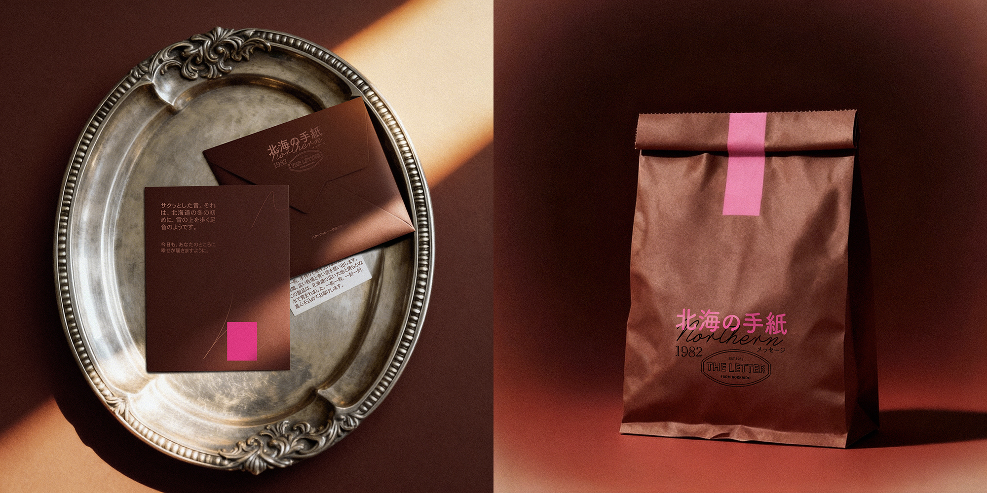
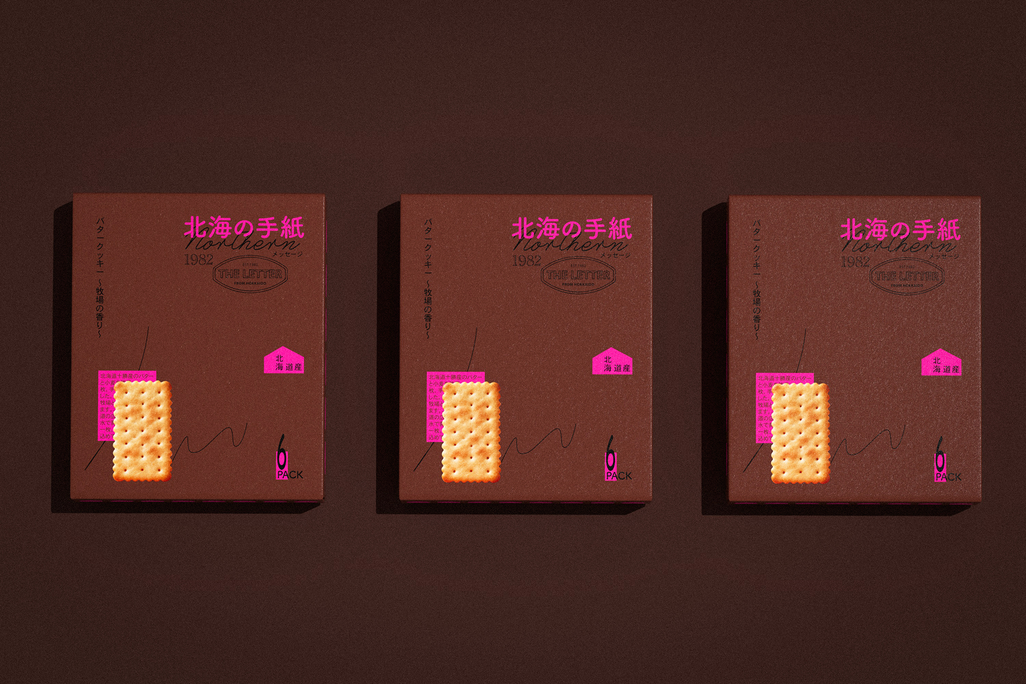
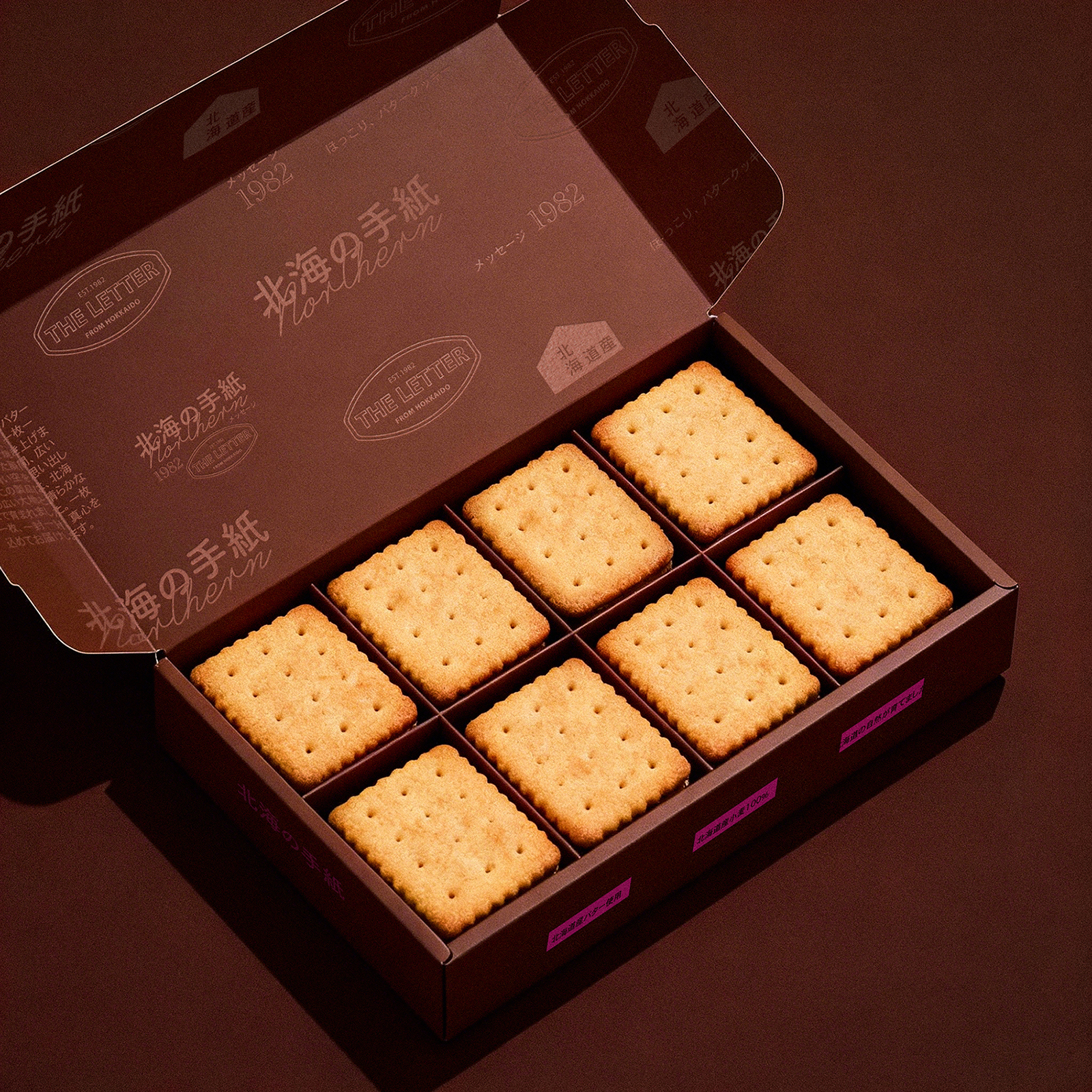
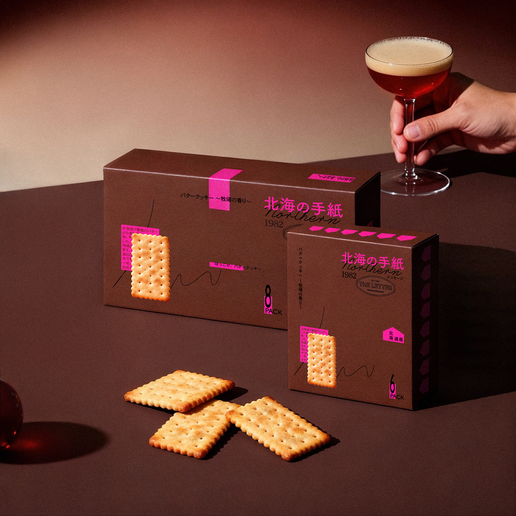
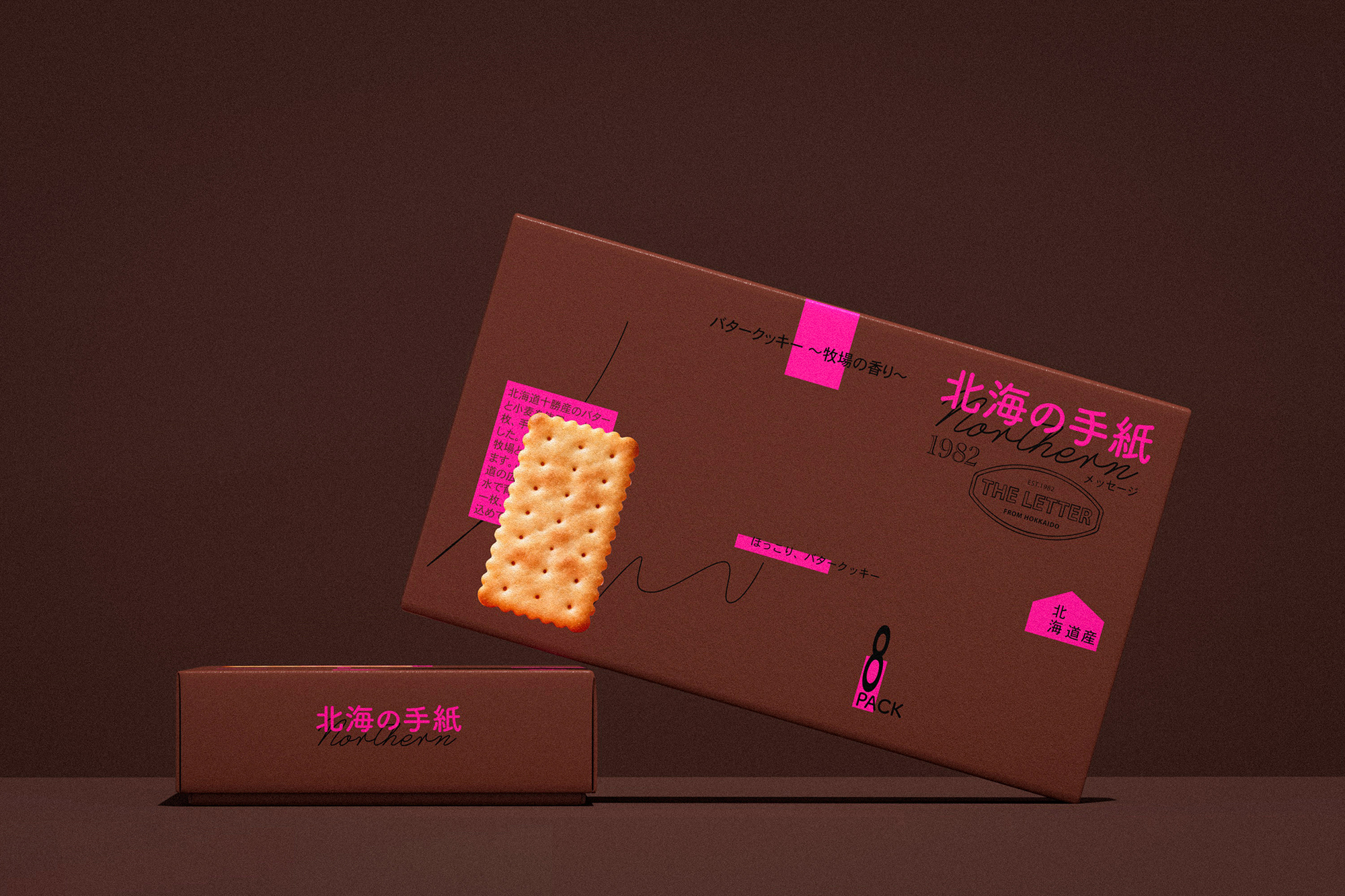
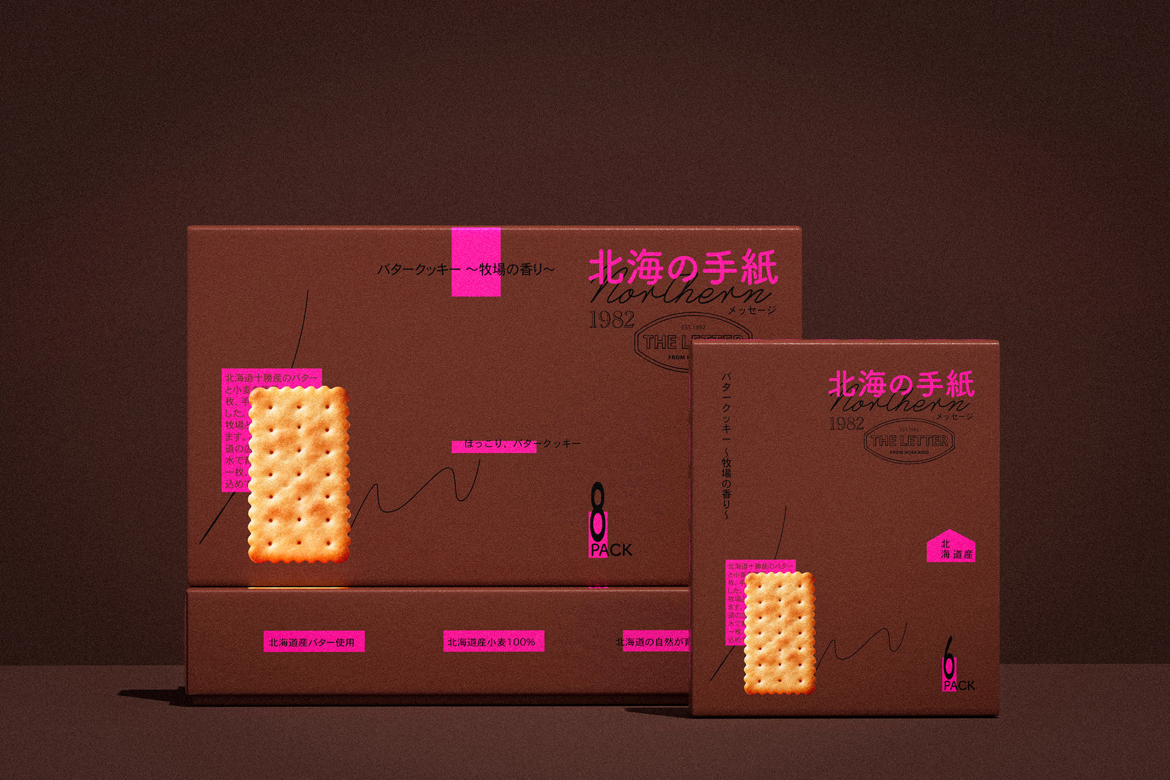
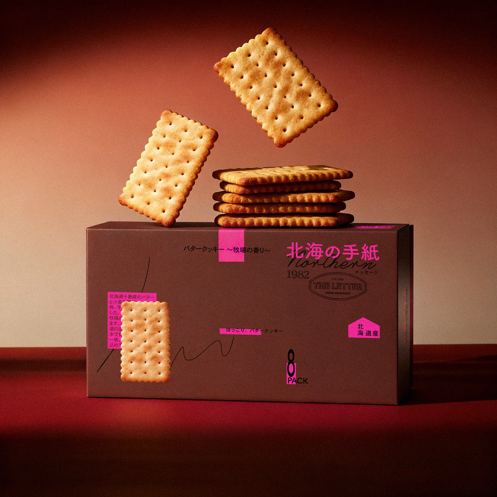
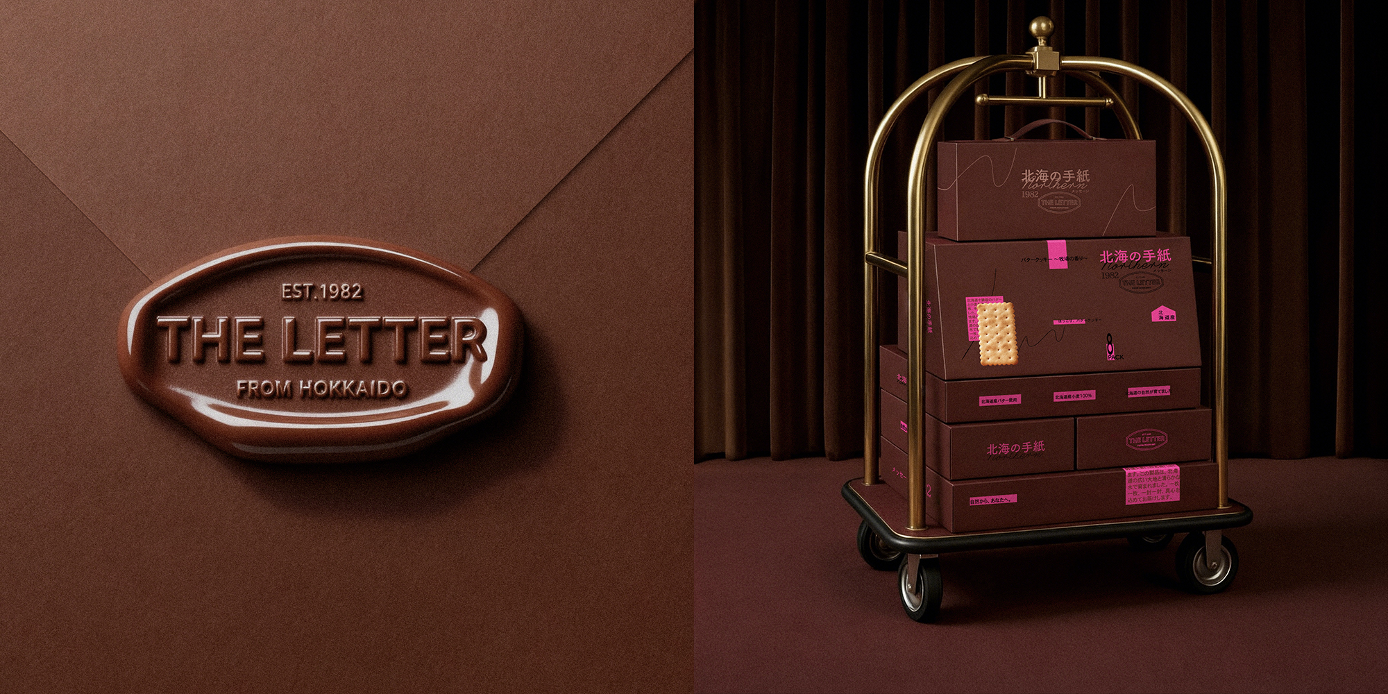
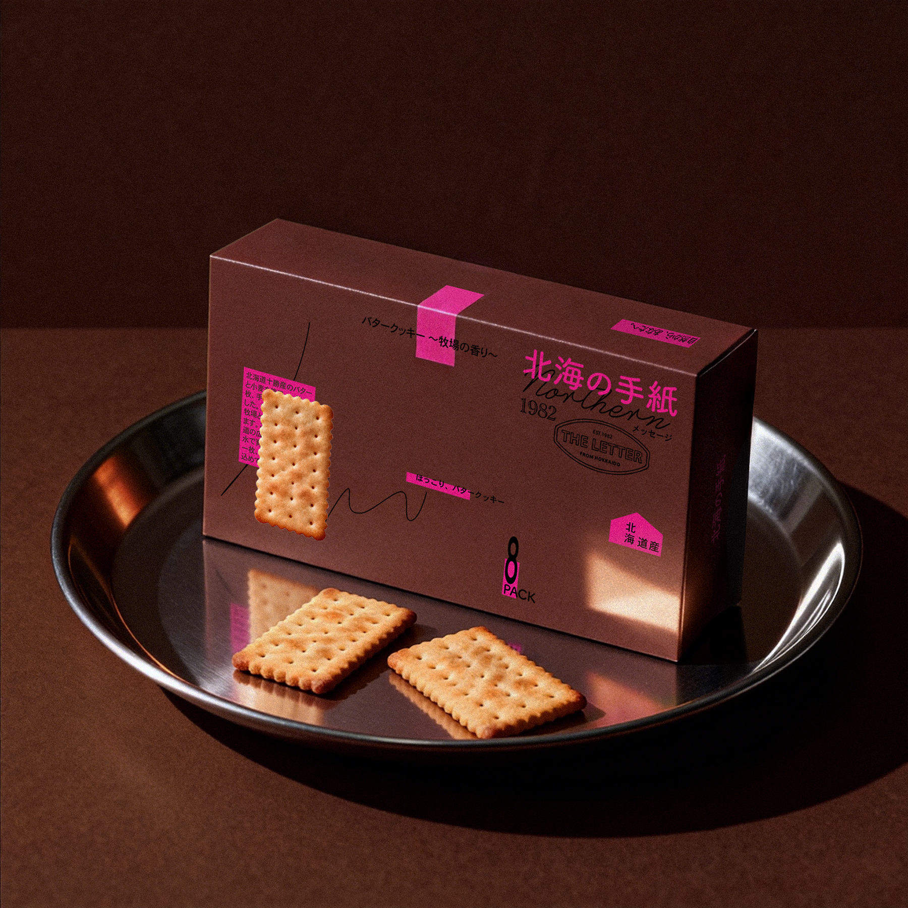
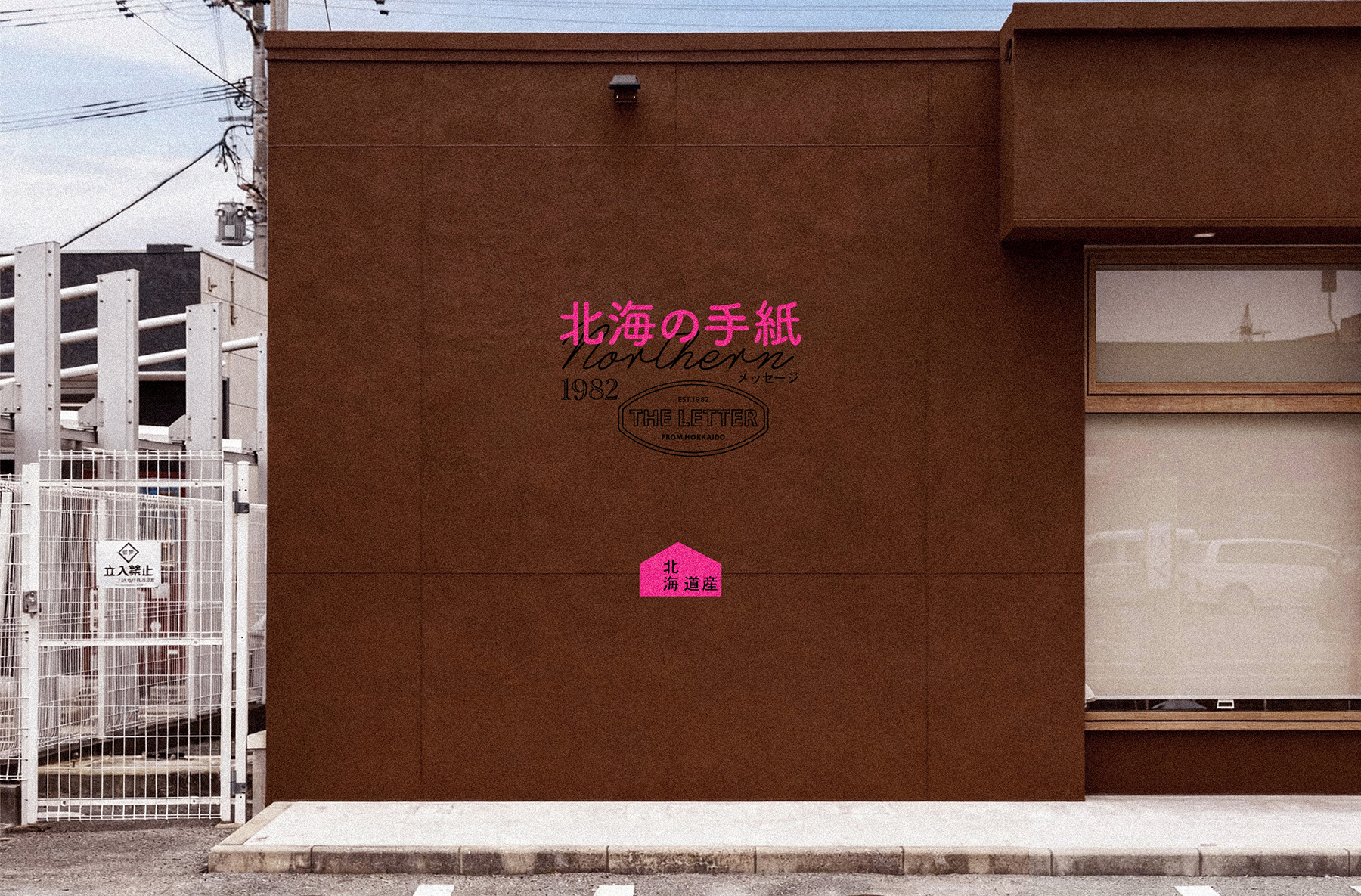
「手紙の小包」を中核コンセプトとし、ブランド「北海の手紙」が宿す温もりと情感を、感じ取れる視覚体験へと昇華させます。パッケージの細部ひとつひとつ——消印風の製造年月日、手書き風の文案、封筒を開けるような構造——すべてが「北海道からの手紙」の具体的な延長として機能します。視覚言語においては、モジュラー化されグリッドに基づいたグラフィックシステムを採用。厳格な秩序感と理性的な構造を通じて、北海道の風物が持つ自然の詩情と人の温もりを引き立て、支えます。この「理性の枠組み」と「感性の内実」の対比は、まさに手紙そのもののよう——形式は整然としているが、内包される情感は豊かで誠実です。秩序ある基盤の上で、情感はより明確に、より抑制され、それゆえに一層深く滲み出てきます。最終的に、このパッケージは単なる容器ではなく、一貫したブランドの物語であり、感官の旅そのものです。開封していく過程で、ユーザーは徐々に北海道の風、牧場の香り、そして手作り贈り物に込められた真心に触れていくことでしょう。
With the “letter parcel” as its core concept, this design transforms the warmth and emotional resonance embodied by the brand “A Letter from Hokkaido” into a tangible visual experience. Every detail of the packaging—from the postmark-style production date to the handwritten copy and the envelope-inspired opening mechanism—serves as a concrete extension of a “letter from Hokkaido.”
Visually, we employ a modular, grid-based graphic system. Through its structured order and rational framework, it accentuates and carries the natural poetry and human warmth of Hokkaido’s landscape and culture. This contrast between a “rational structure” and “emotional content” mirrors the essence of a letter itself: the form is orderly, yet the emotion within is rich and sincere. Within this order, emotion emerges more clearly, more restrained, and thus more profoundly felt.
In the end, the packaging is not merely a container, but a complete brand narrative and sensory journey. It allows the user, while unfolding it step by step, to gradually connect with the breeze of Hokkaido, the scent of its pastures, and the sincere heart behind a handcrafted gift.


 butterflyhunters
 monther al omari
 Asprey Creative
 About House of Ta
 Up-Brands
 KJS CRAFT
 hello ocean
 PG Branding
 CF Napa Brand Design
 booouuuche
 Hyejung Choi
 Abbydraw Designs Unique Conceptual Branding & Packaging Designing Ideas
 Hollóka Grafikai Műhely / Graphic Design Studio
 Minim Brand Design
 saerom81
 YNL
 bilel tkouri
 vitoramockup
 Lampra
 Sanavala
 www.branding.uz
 alchimistestudioParis
 Estudio Argo
 Modern Theory