
HIGHGINLAND. Full Steam Character.
Premium Whisky Label Packaging & Brand Identity Design
RANGE & DIFFERENTIATION
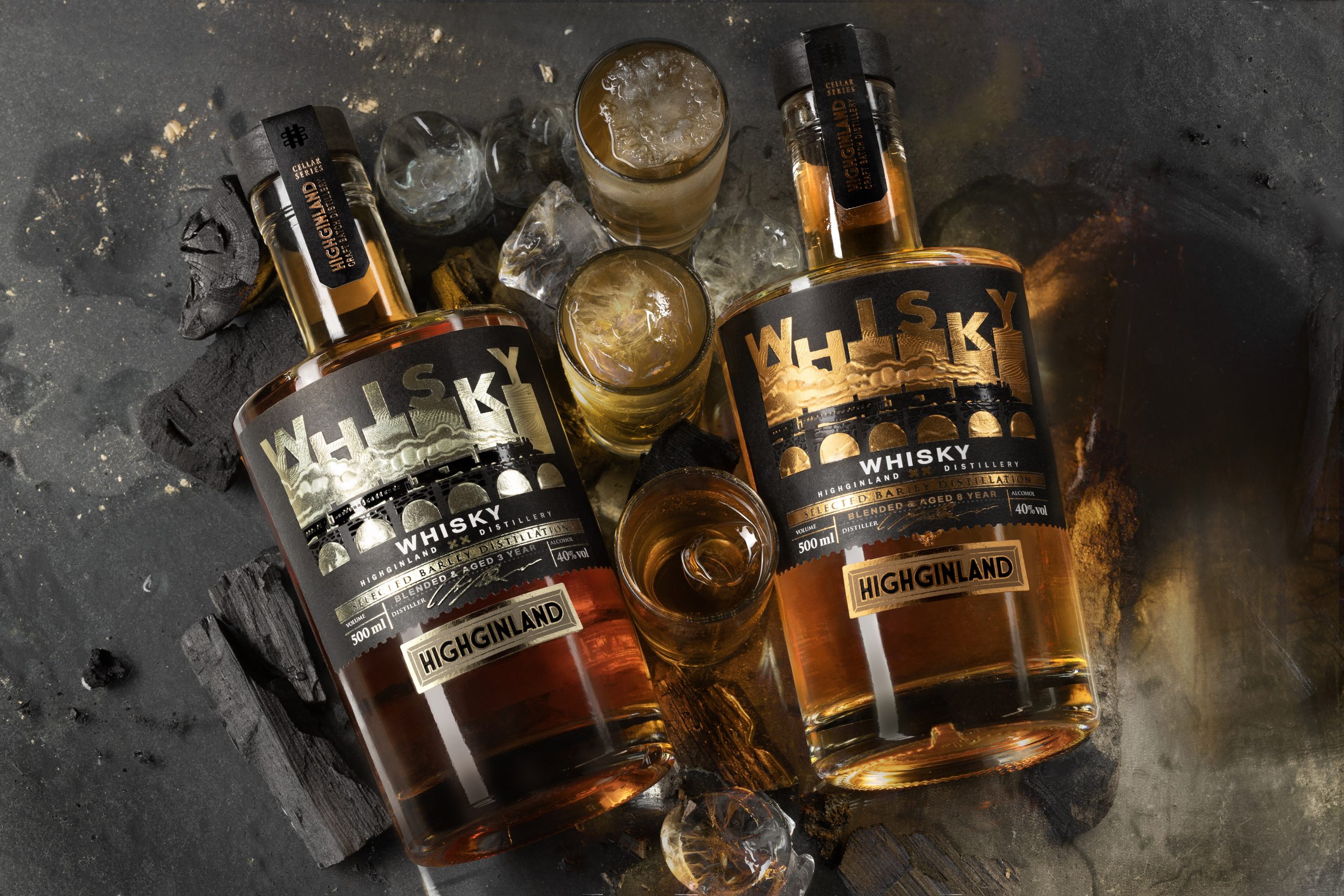
The whisky range includes three expressions defined by aging and metallic identity:
- 3 уears — Platinum
- 5 уears — Rose Gold
- 8 уears — Copper
The foil color palette is not accidental — it draws inspiration from the tones of the distillation apparatus itself. These metallic hues visually echo the craft of distillation, reinforcing the product’s authenticity and its connection to the art of whisky-making.
BRAND PHILOSOPHY
HIGHGINLAND is built on the idea that movement is not an action, but a state of being. Inspired by the industrial era of the 19th century, the brand reflects a timewhen progress was driven by pressure, heat, and relentless forward motion.
Here, character is not given — it is forged. Like steel under tension. Like steam building force. Like the spirit of an era defined by transformation. It is a whisky for those who don’t stand still — but shape their own direction.
THE BRAND CONCEPT
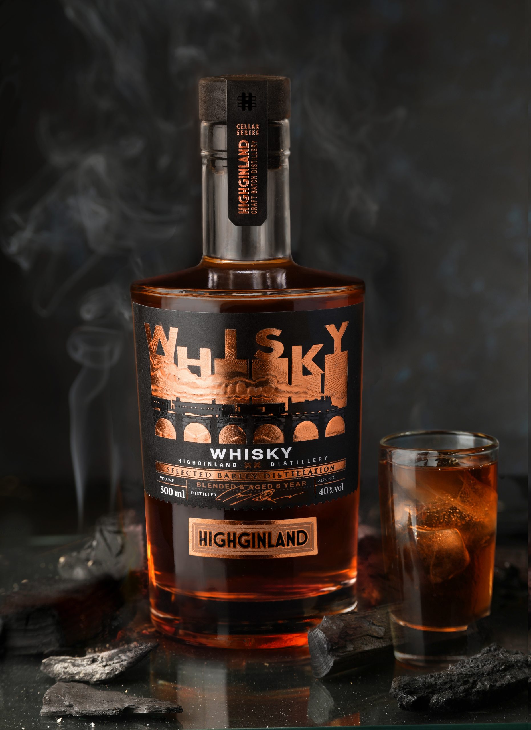
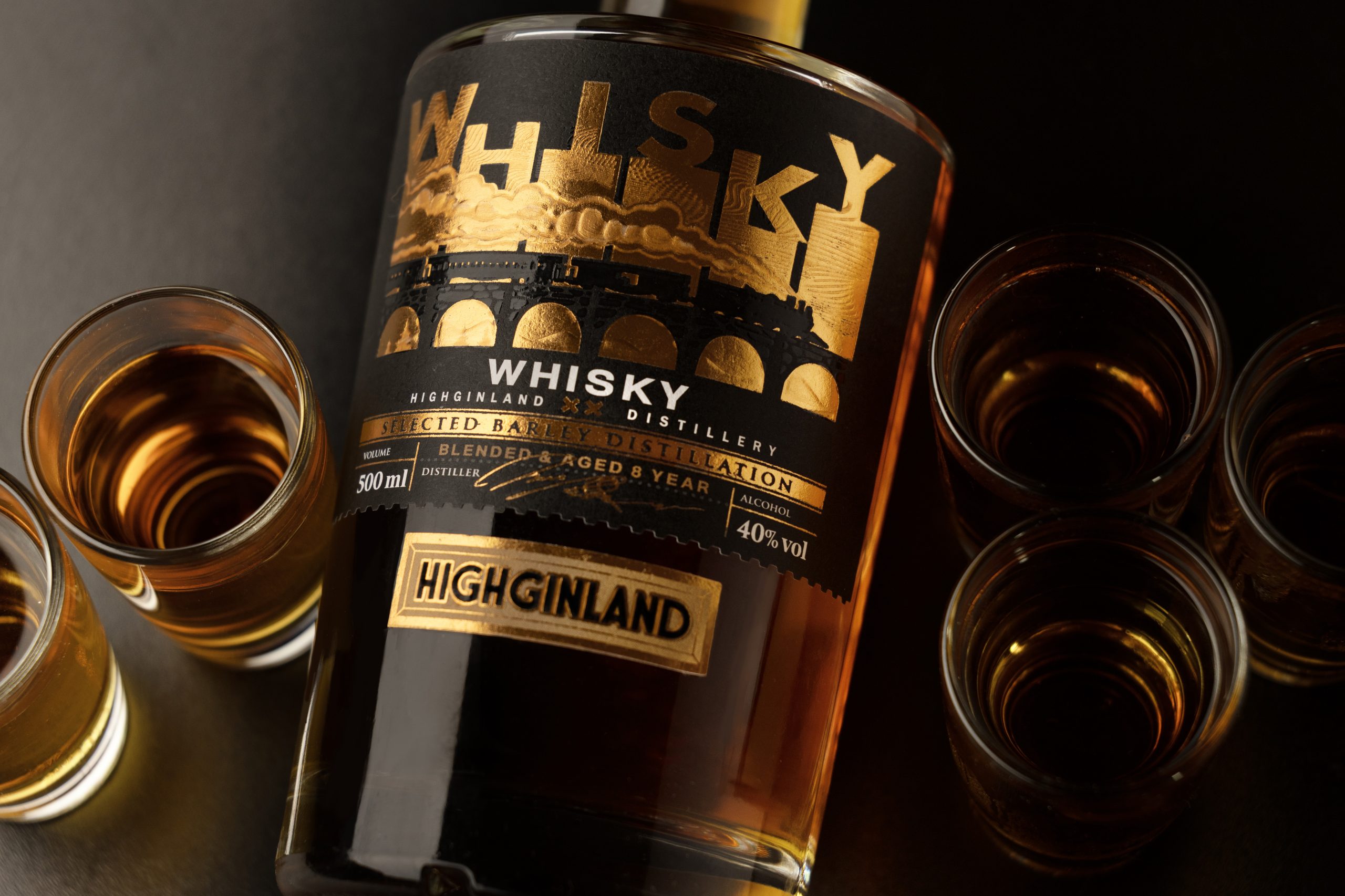
Rejecting predictable visual clichés of distillation, I take a more conceptual direction. The steam locomotive becomes the central metaphor — both it and the copper still embody pressure, heat, transformation, and controlled power. Rather than illustrating the process, the locomotive embodies it, creating a memorable visual language that communicates the spirit of whisky through association.
REBRANDING & RENAMING
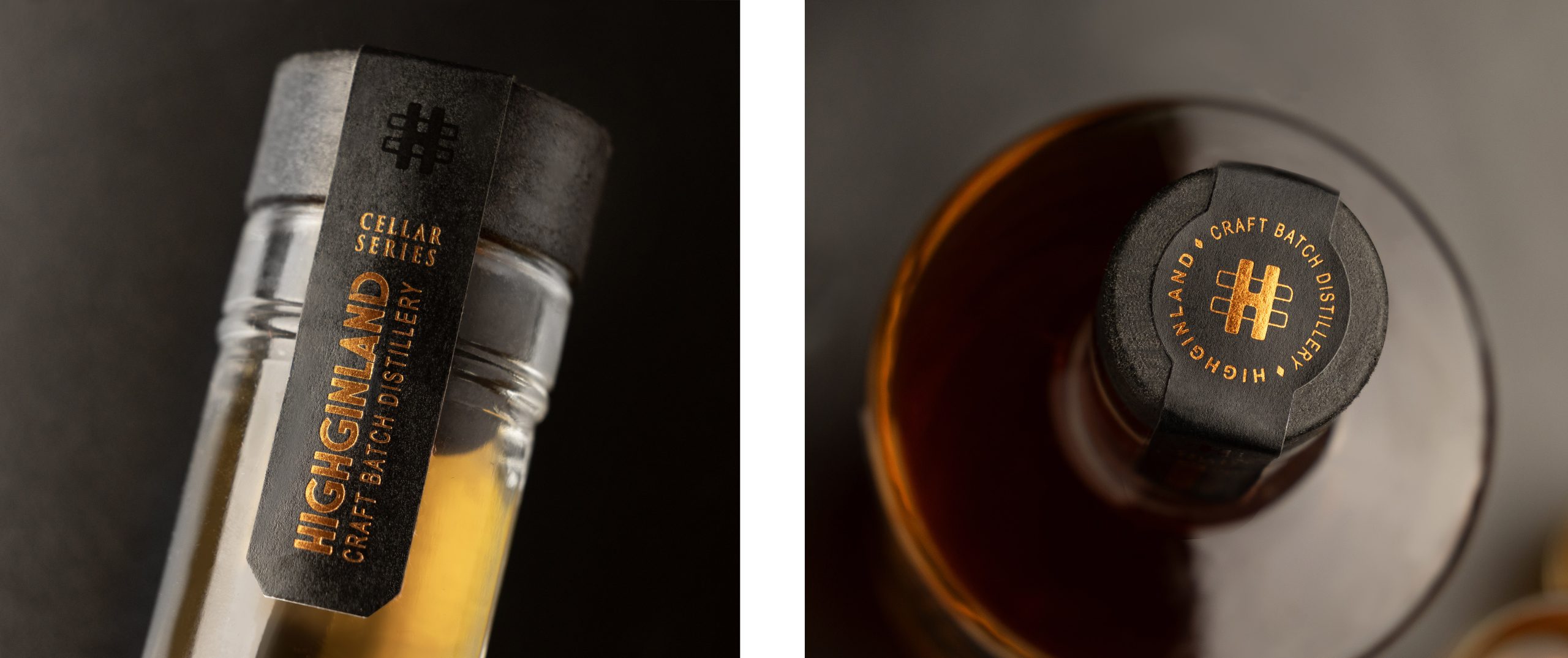
The name HIGHGINLAND is intentionally unconventional: the “ber” syllable is replaced with “gin” to emphasize the brand’s focus on strong spirits and deliberately avoid associations with the word “beer.” The minimalist, architectural logo structures the visual composition without competing with the illustration, keeping the brand clear and confident.
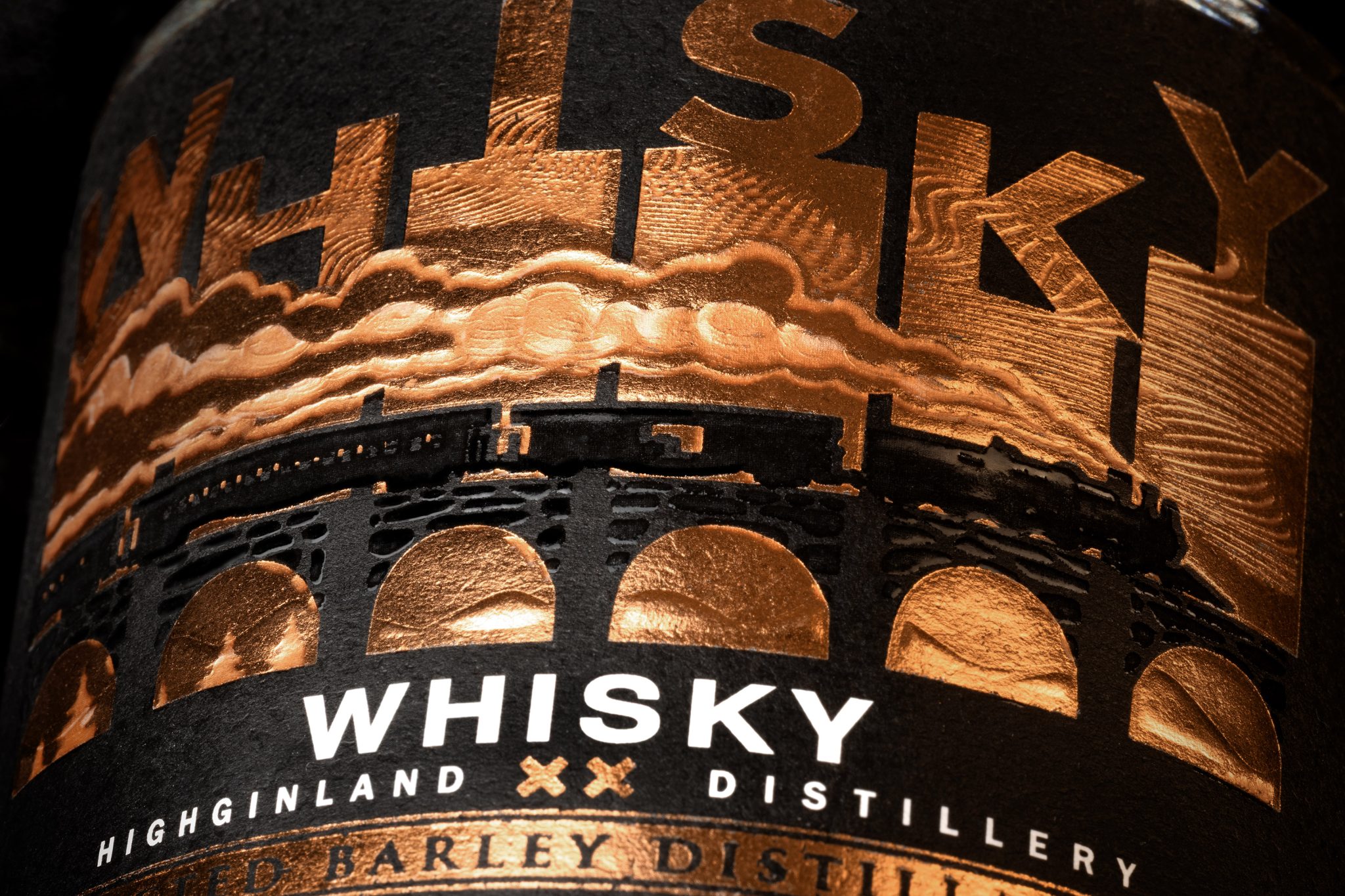
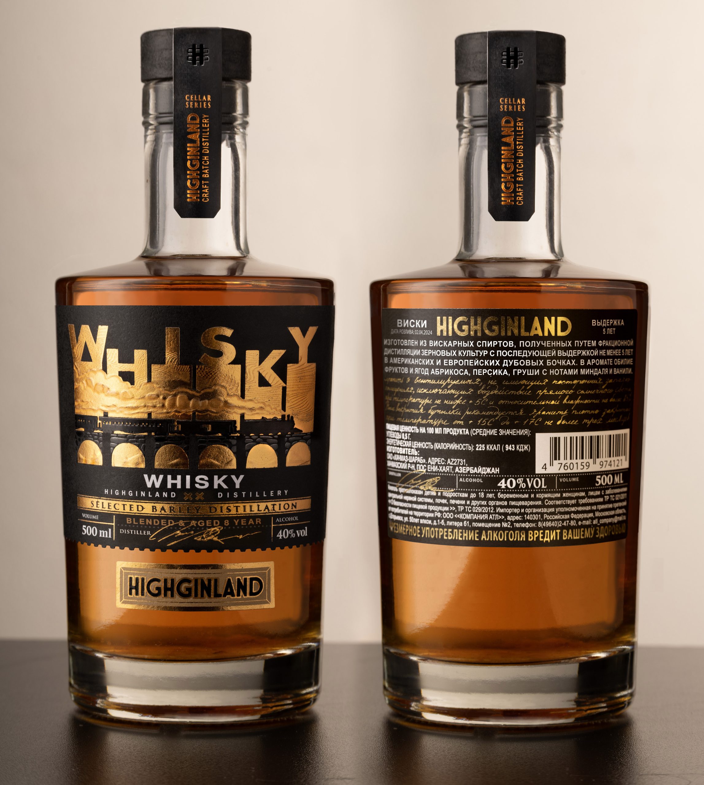
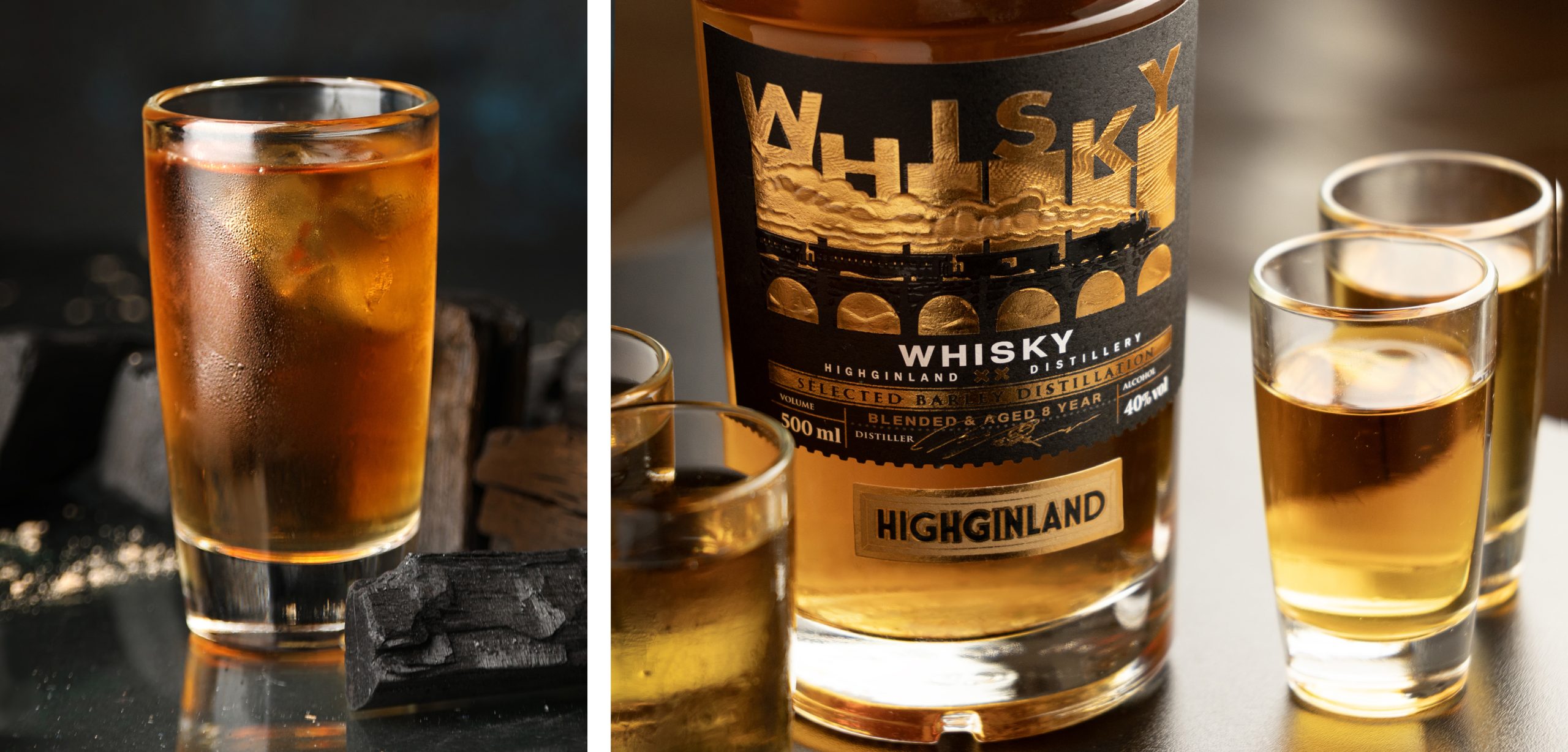
CREATIVE DESIGN The design creates a cinematic effect. The locomotive, integrated into the typography, doesn’t just illustrate — it becomes part of the structure, literally “moving” through the word. Smoke, light, and golden accents add depth, warmth, and a premium feel, while the dark base provides weight and confidence. The contrast of fire and smoke emphasizes the idea: hidden warmth inside, cool confidence outside.
MARKET ADAPTATION: EUROPE & AZERBAIJAN
For the European market, the design operates through an aesthetic of contrast and storytelling, offering a contemporary interpretation of classic whisky.
It speaks to an audience that values character, visual depth, and cultural nuance.
For the Azerbaijani market, the decorative and tactile qualities are amplified: gold, warmth, and richness become key elements of perception, reflecting a preference for expressive and status-driven objects.
At the same time, the design avoids direct cultural clichés, maintaining a universal language of luxury and energy.
MATERIALS & TECHNOLOGIES
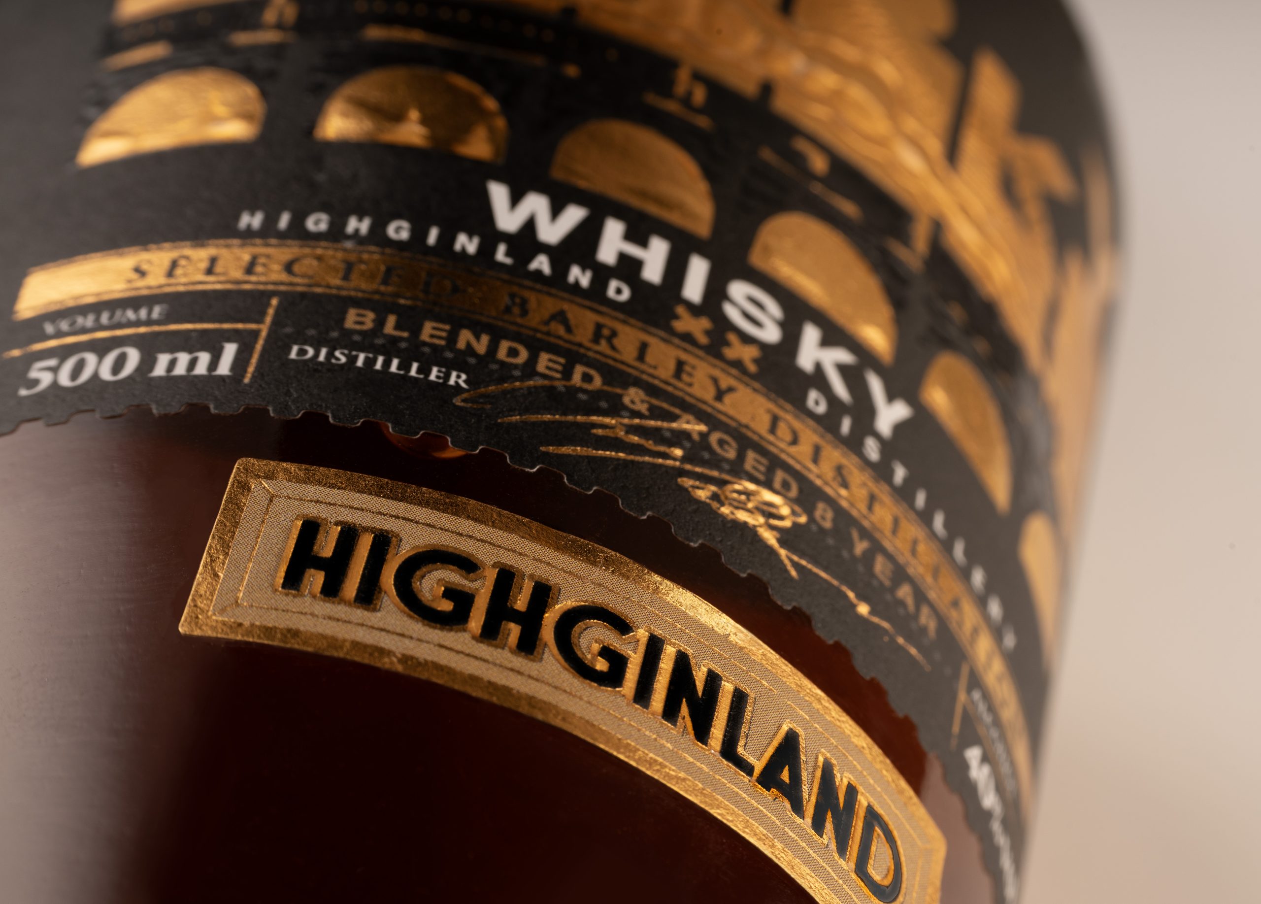
3D acid-etched relief on gold foil creates a deep relief and a refined play of light.
The illustration reveals itself in motion, producing a living engraving effect.
Matte paper creates a contrast of textures with the foil.
Spot UV builds tactile accents and enhances the play of light.
Embossing enhances the volume of the steam, making it feel more alive and airy.
CREDITS Client: HIGHGINLAND Concept / Label Design / Photography: COSOVAN SVETLANA Printing: FLEXLABEL Contact: cosovandesign.com







 monther al omari
 43oz
43oz Thirst
 Carreto Concepts Design Studio
 M&A CREATIVE AGENCY
 pastellofactory
 Omar Altayeb
 Cocoon Prague
 古戈品牌
古戈品牌 Pascal Riviere Design
 ZIMO Studio
 alchimistestudioParis
 Valérie Colace
 Platon Ivantsov
 Leyma Design
 Dina Gamal eldin
 clermentza
 Redlana
 anushrishah
 Natania Doshi
 NewFolderStudio
 francapovilla
 Mother Tongue Design
 CJMartins