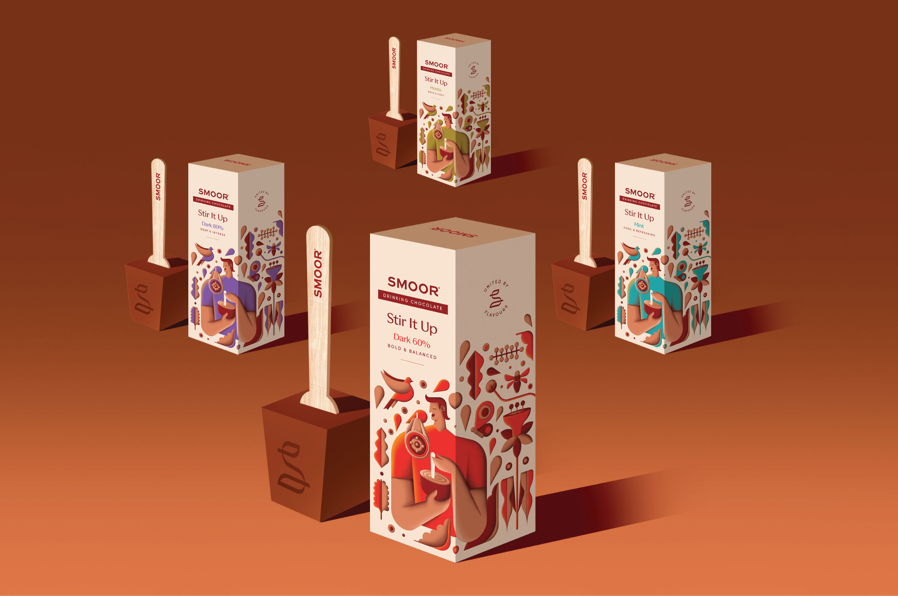

“Stir It Up” reimagines drinking chocolate as an everyday ritual — warm, approachable, and easy to engage with.
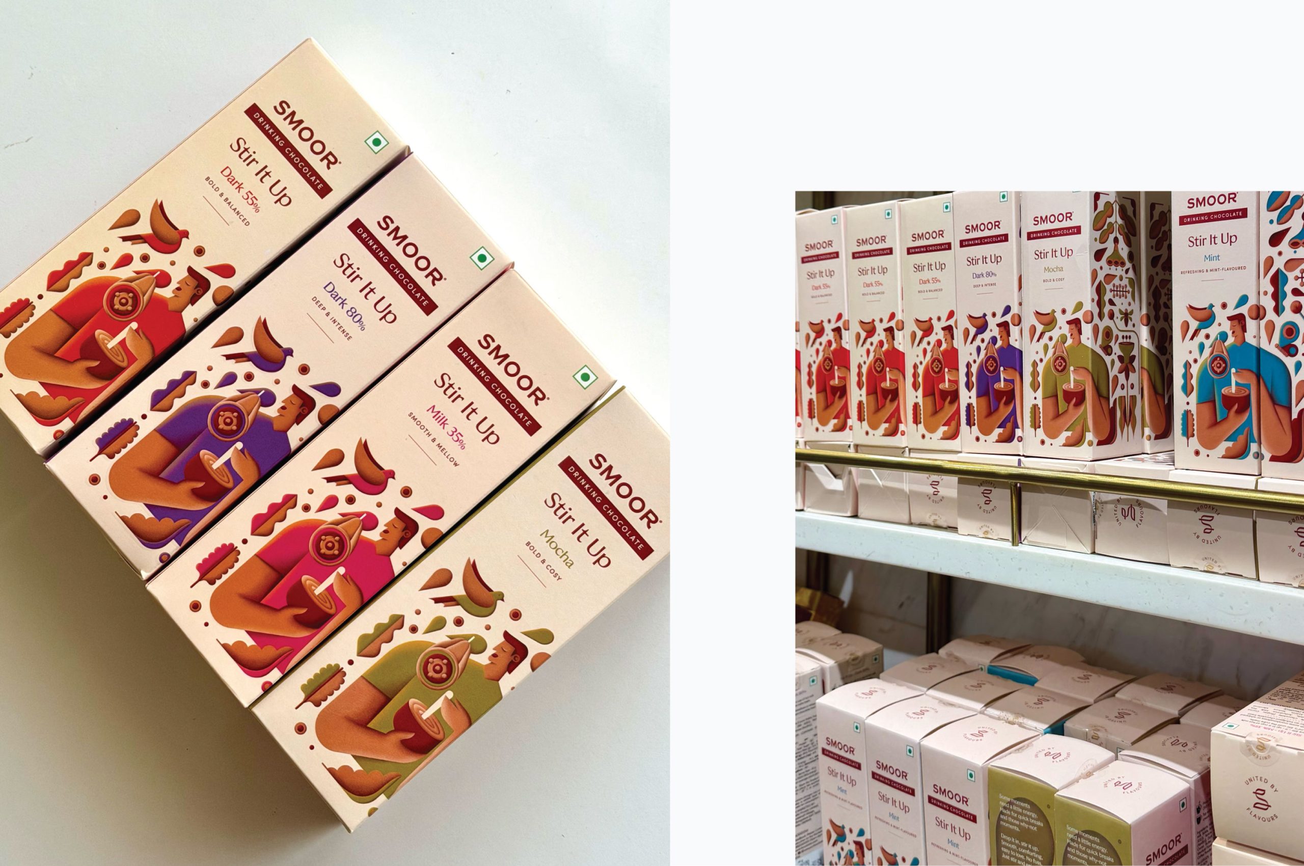
Developed for SMOOR, the packaging system was created to address a key retail challenge: the earlier packs lacked clarity and weren’t standing out effectively in fast-moving environments like cafés and airports. The redesign focused on making the product instantly recognisable while retaining a premium yet welcoming feel.
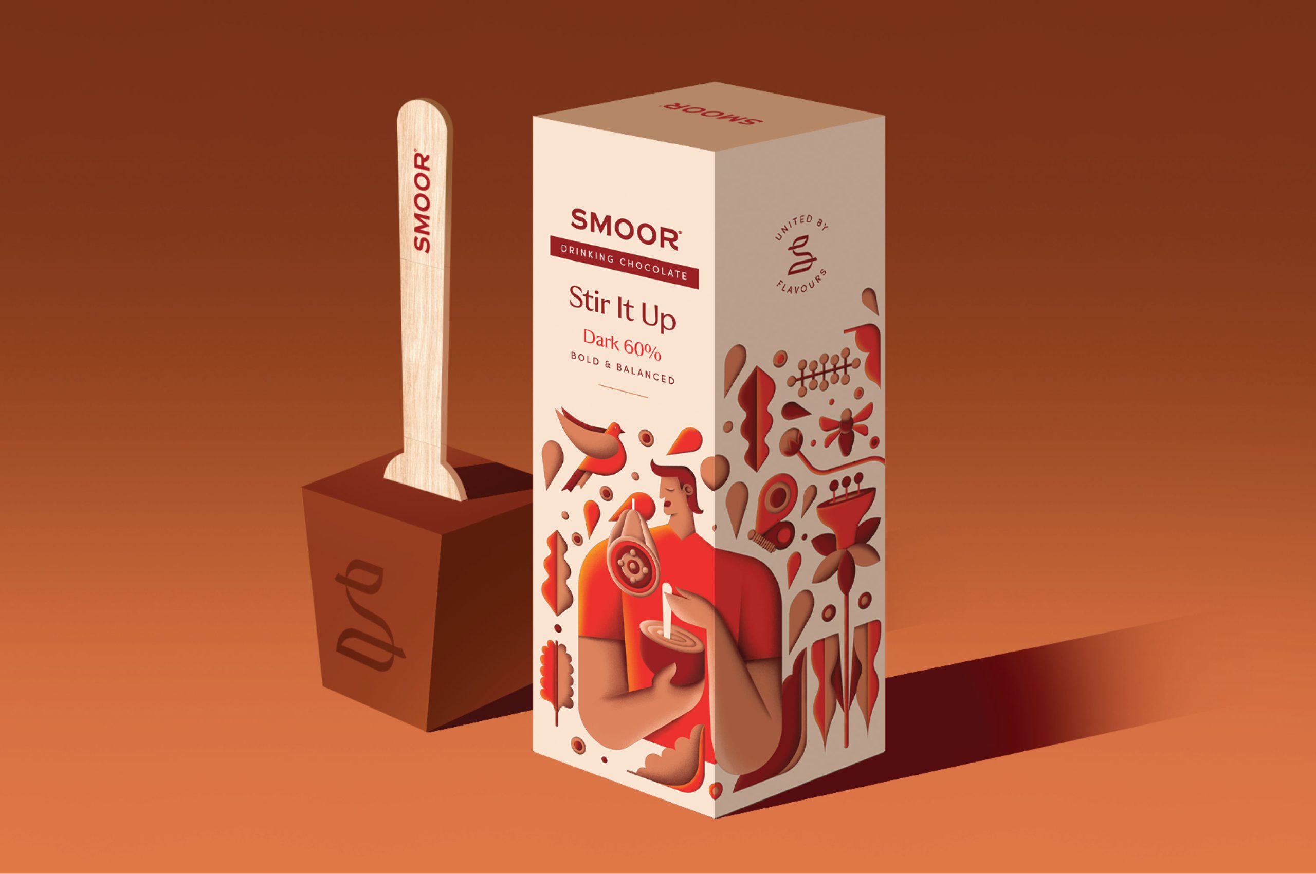
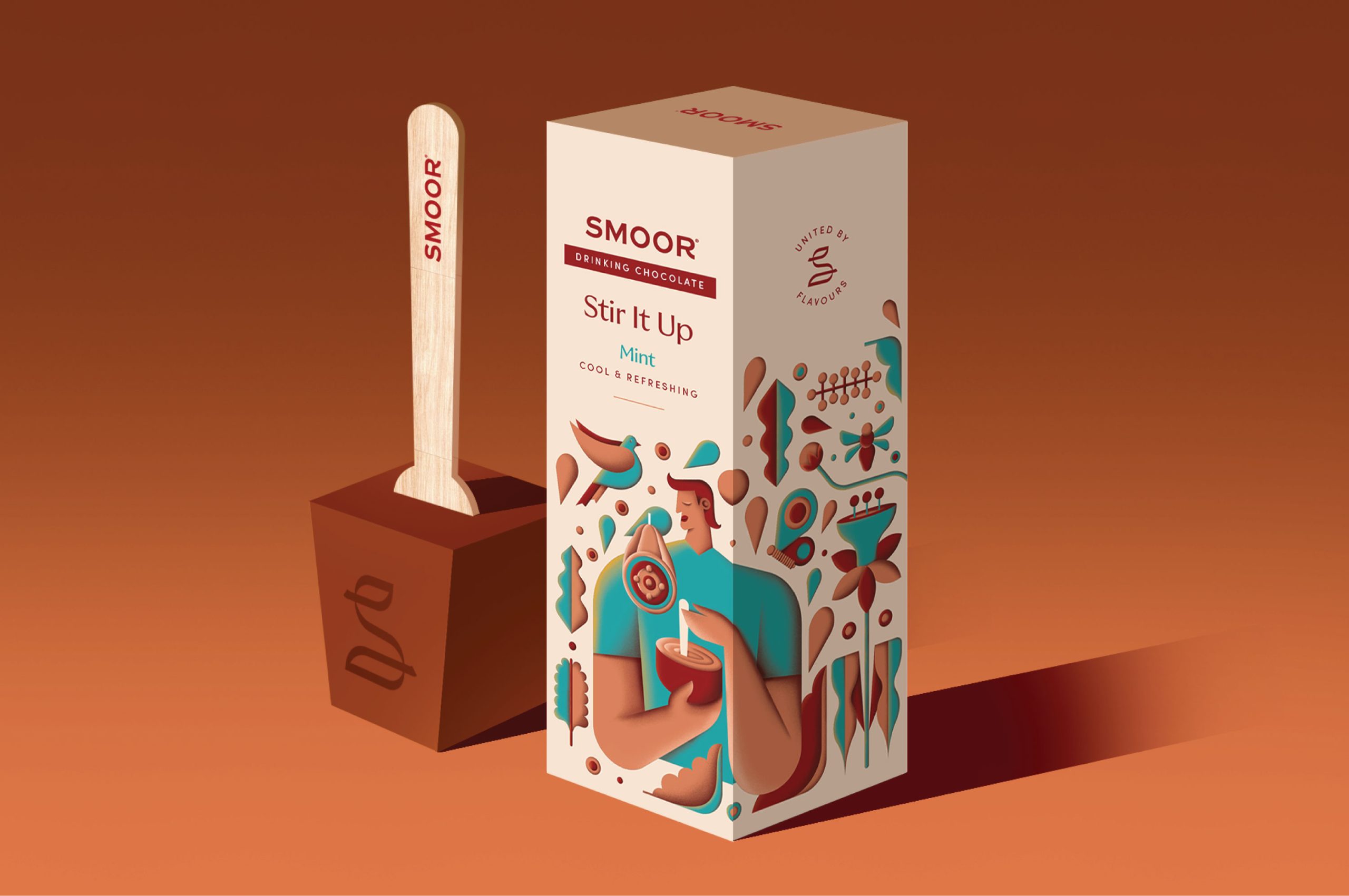
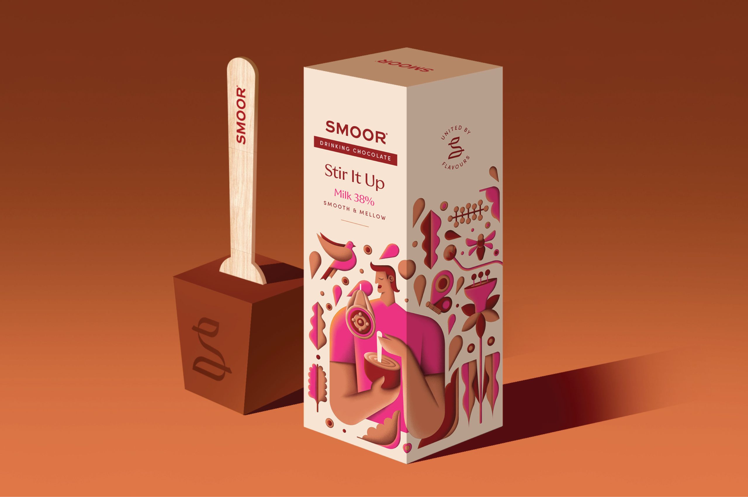
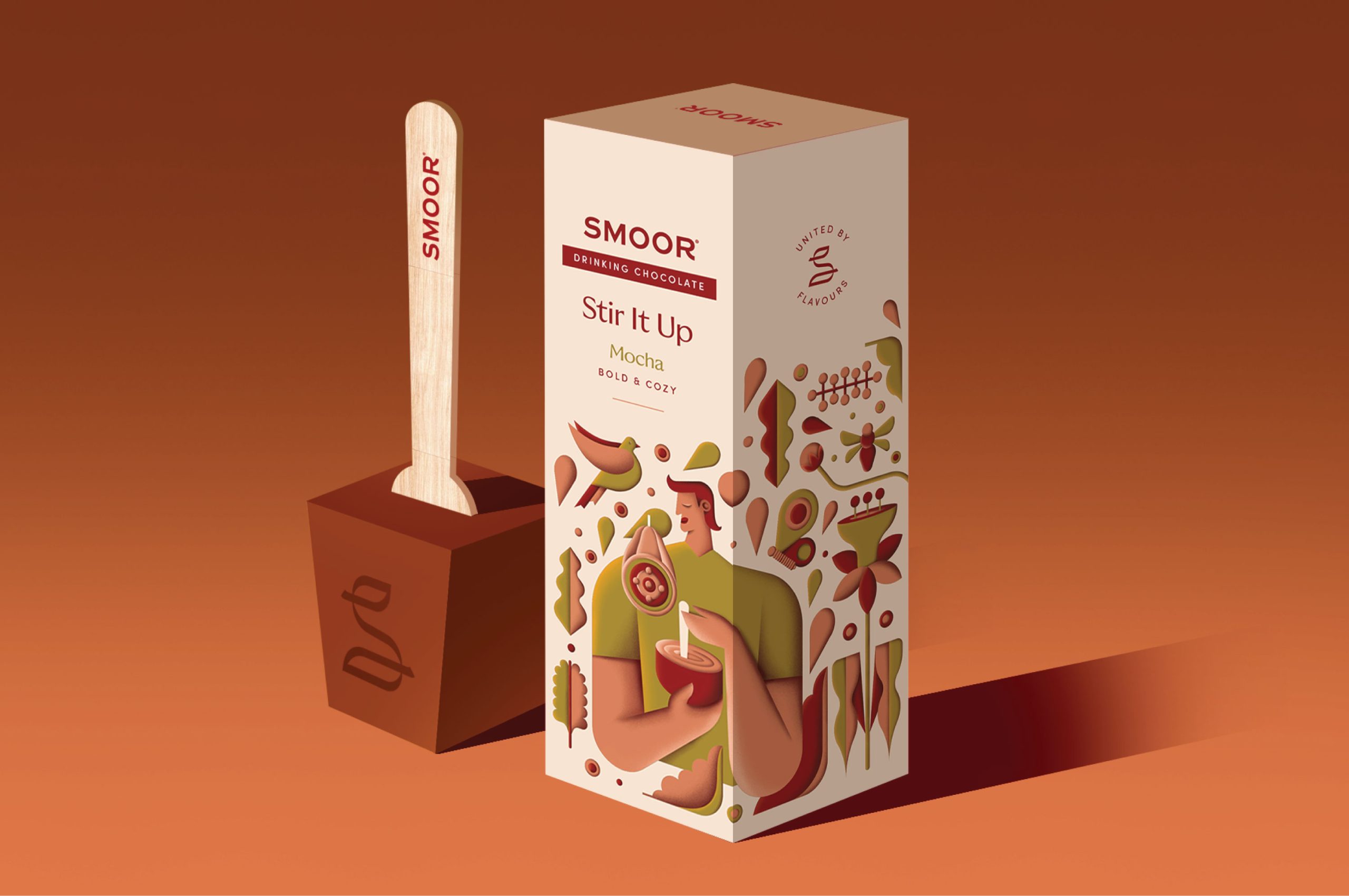
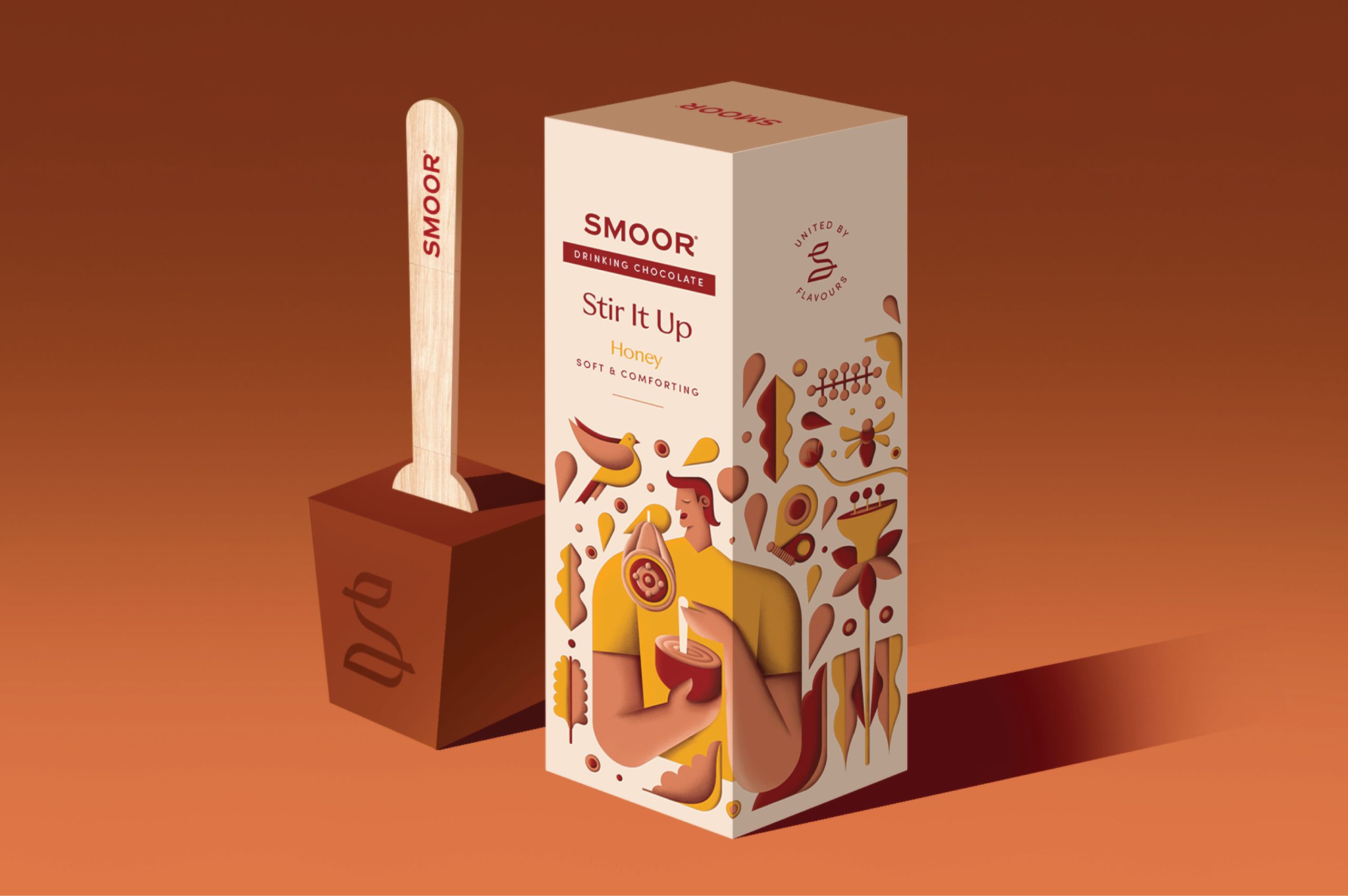
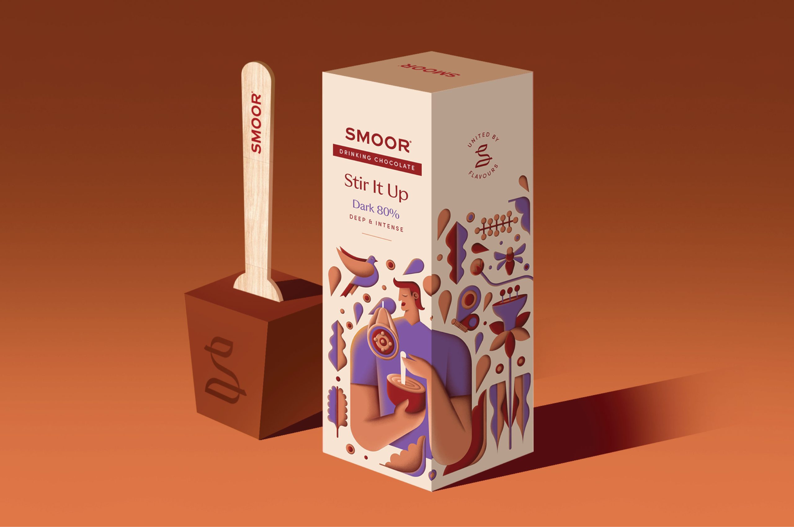
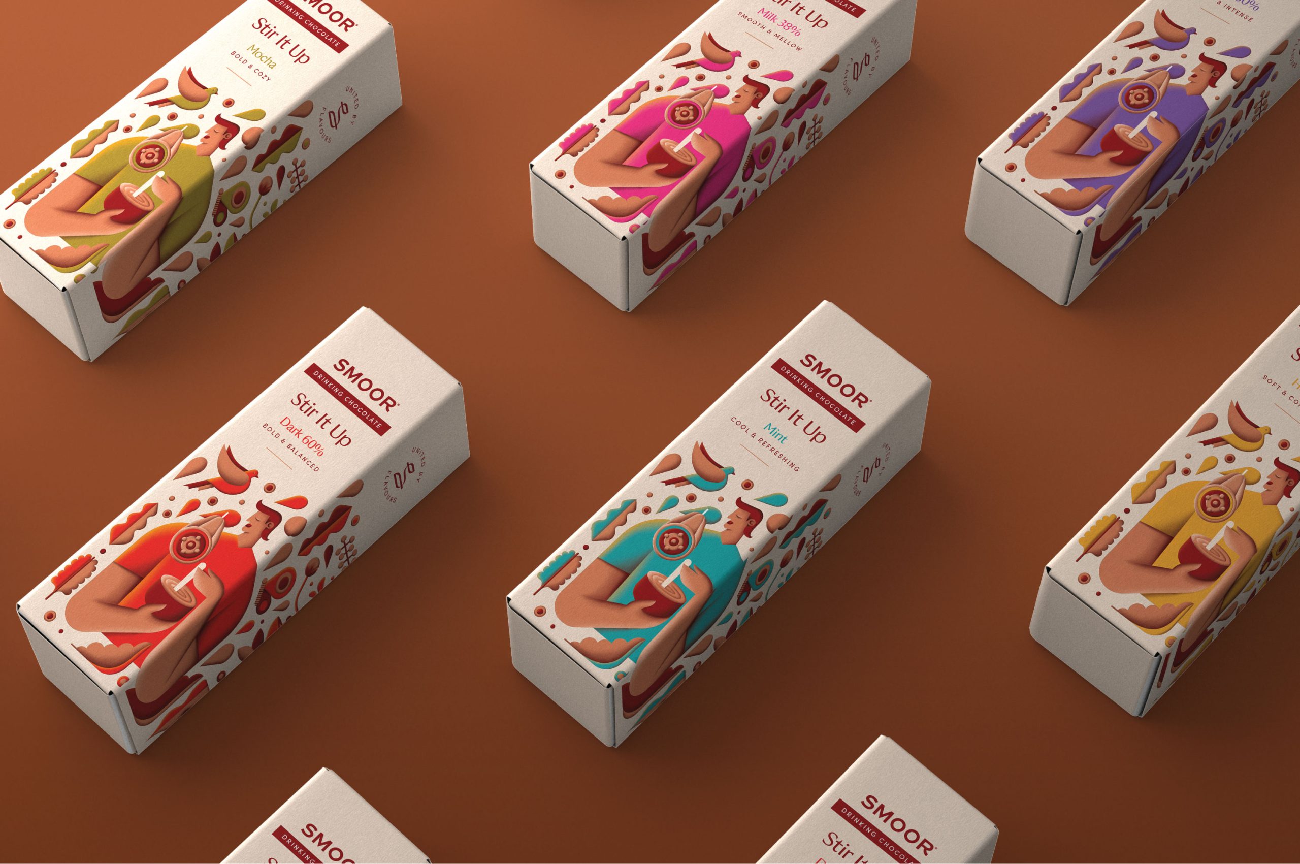
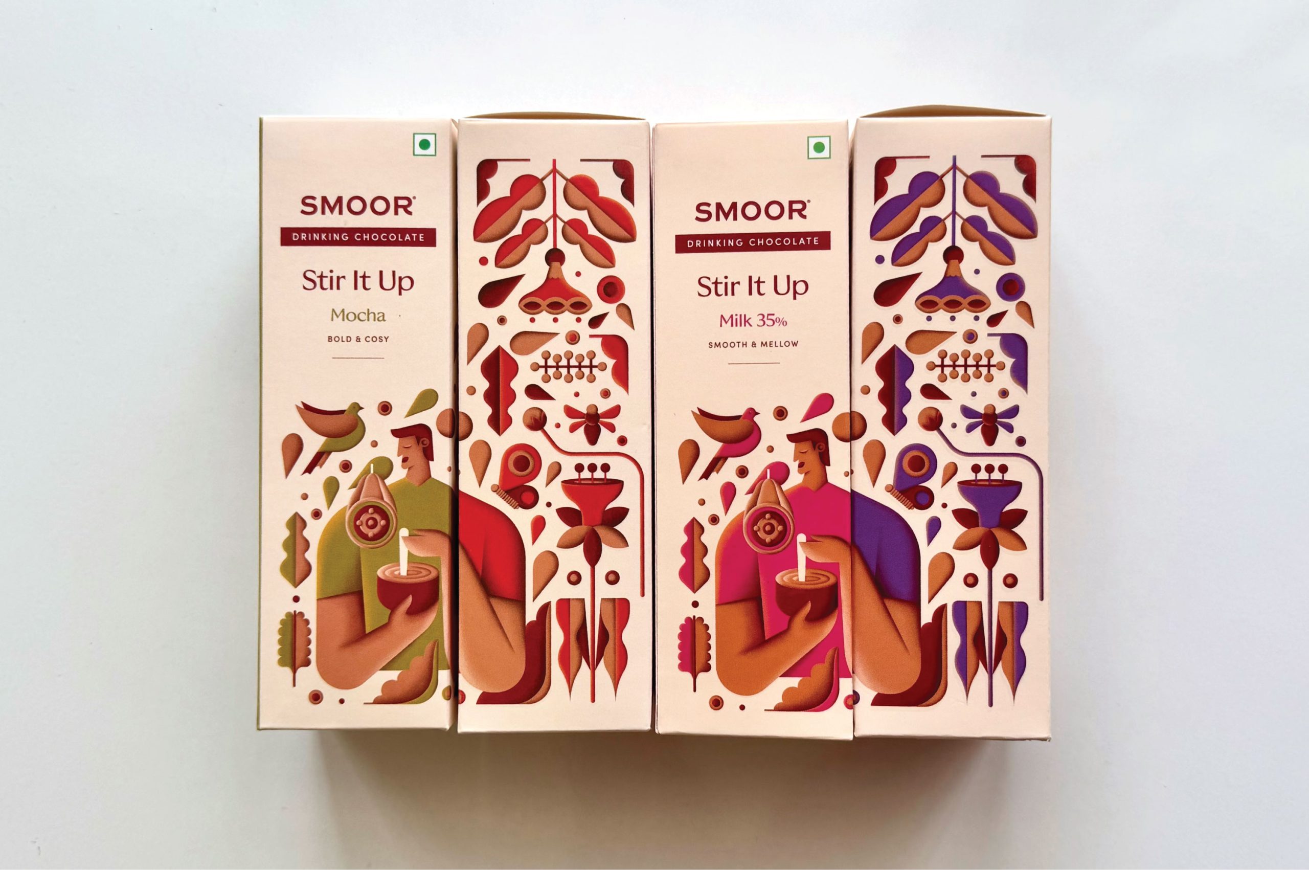
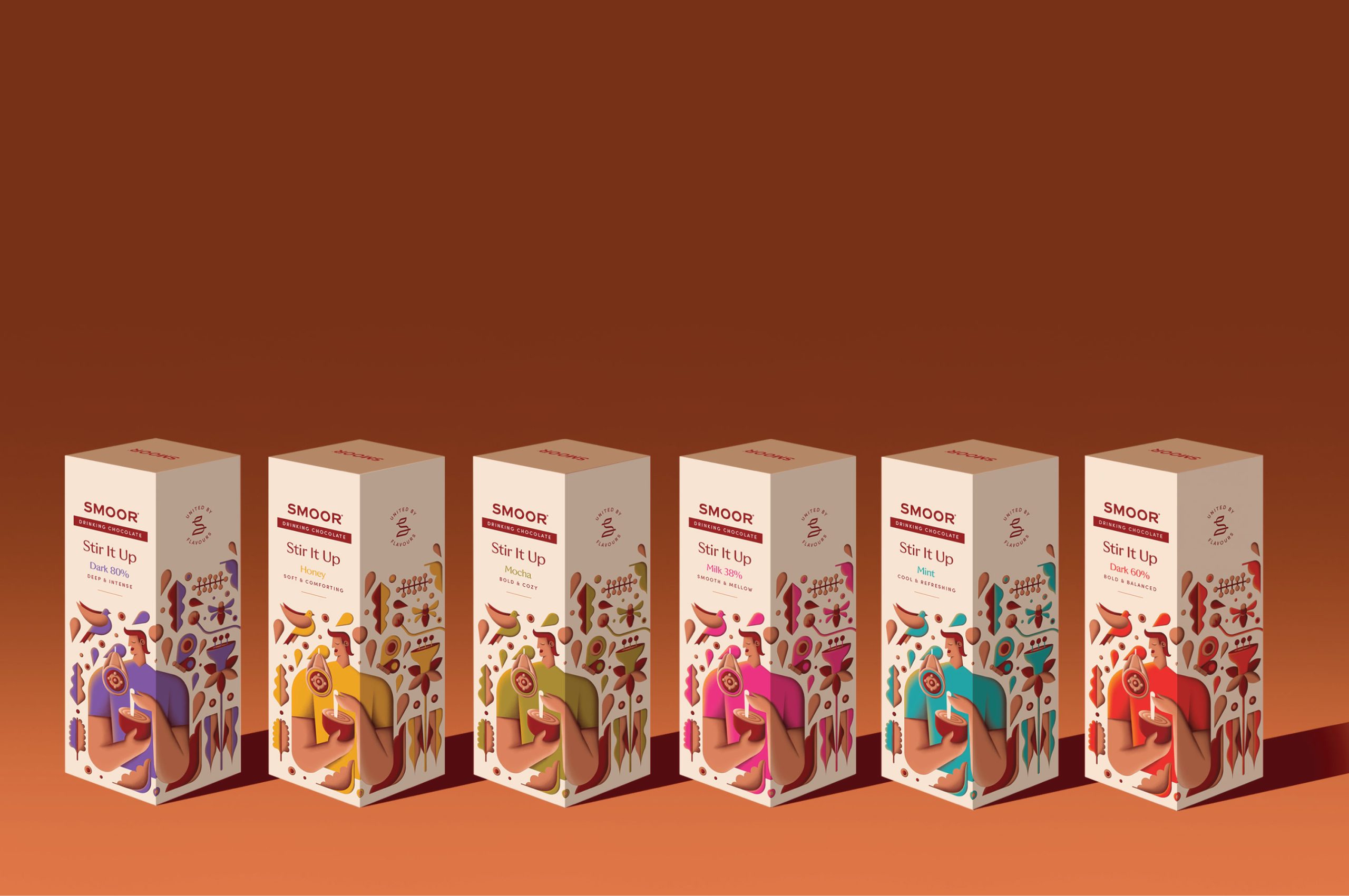
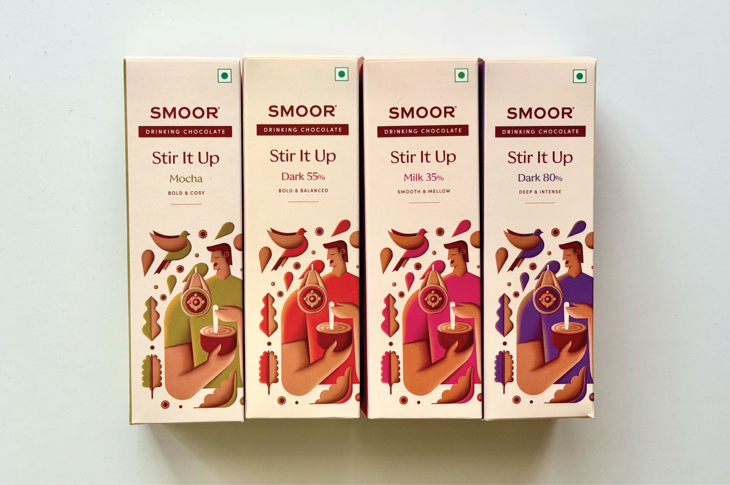
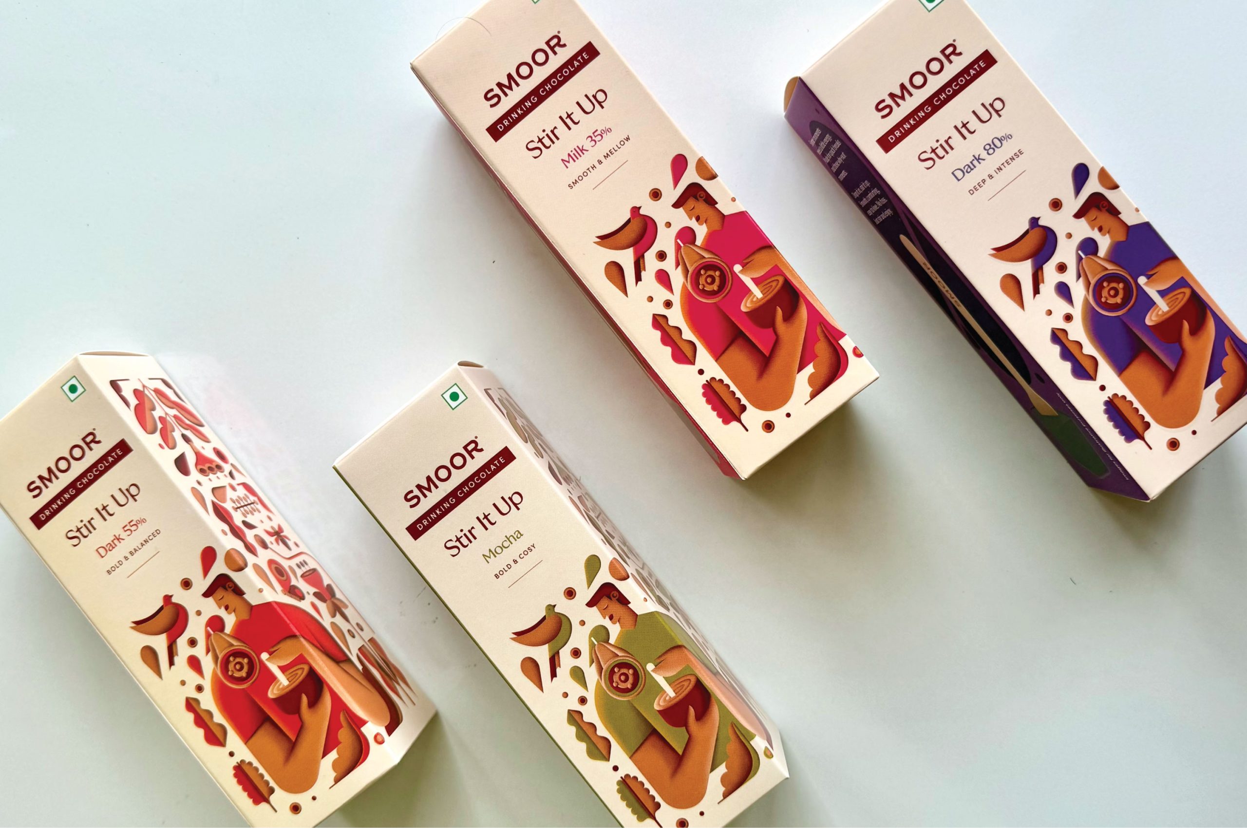
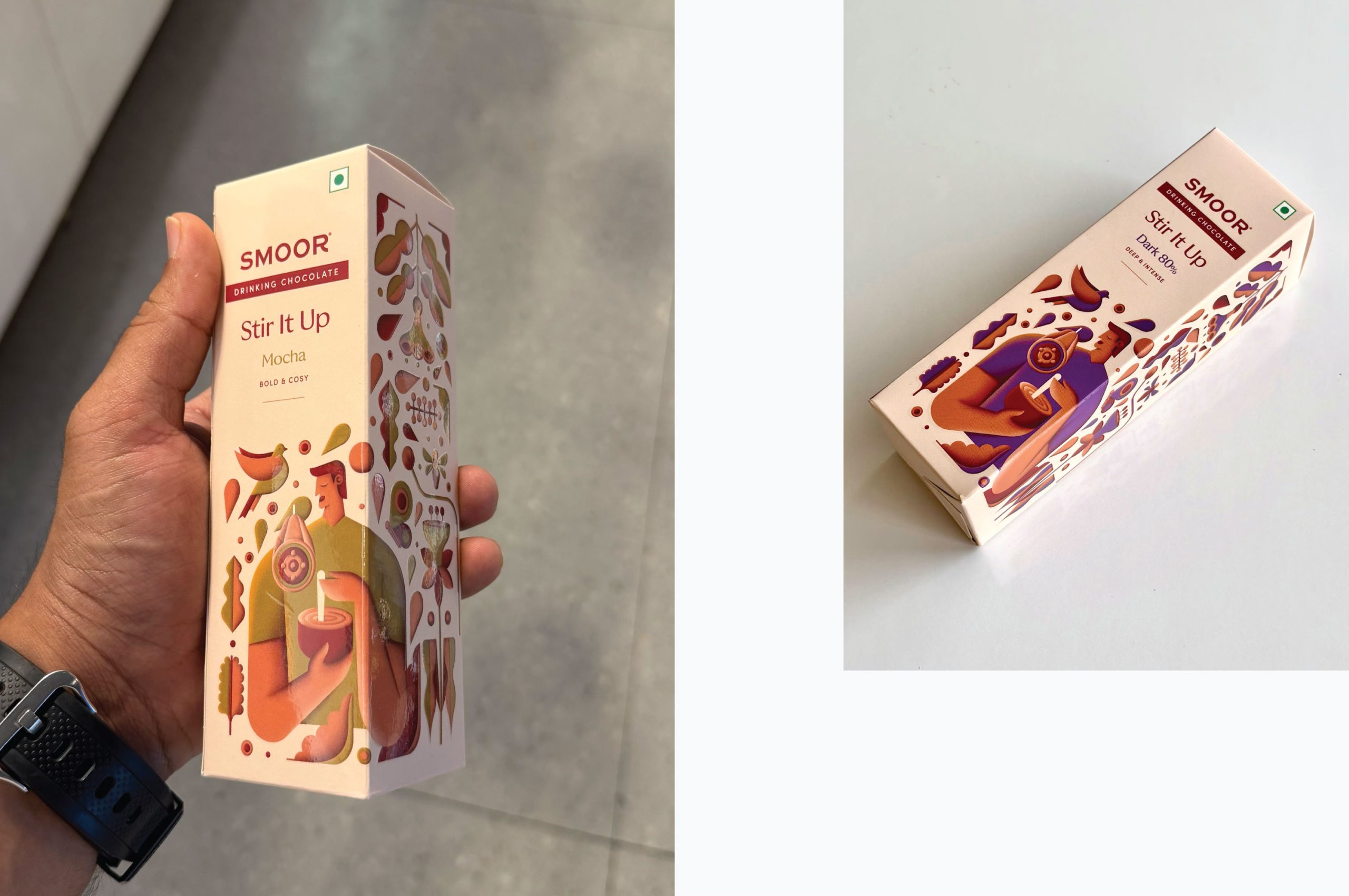
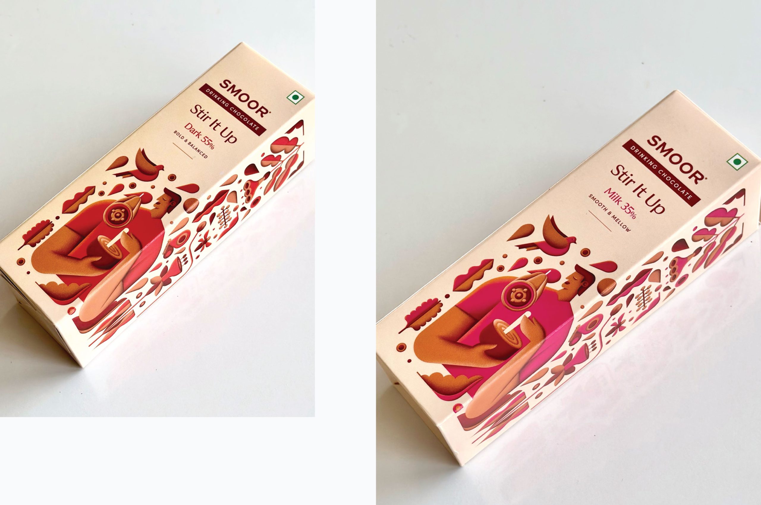
The visual system is built around consistency. A single illustration style runs across the range, while flavour differentiation happens purely through colour. This creates a strong shelf presence where packs work both individually and collectively — forming a unified visual pattern while still making each flavour easy to identify.
At the centre of the illustration is a quiet, relatable moment: a person stirring chocolate into hot milk. Surrounding elements draw from ingredients, warmth, and everyday indulgence, expressed through a contemporary Indian-inspired visual language.
Instead of relying on a small transparent window, the design introduces a real-size product visual on the side panel, helping customers quickly understand the product format and building trust at the point of purchase.
The result is a packaging system designed not only for aesthetics, but for usability — helping the range become easier to notice, understand, and choose across retail shelves and airport outlets.
 Up-Brands
 Almighty
 Desember Design Studio
 Daria Levina
 Yuliya Likhacheva
 carola matalinares
 daniitenaa
 StudioMordius
 Simon Pendry Creative
 Sti&Co Design
 Yasmin Sherif
 Roberto De Simone
 aseelstudio
 Rabia zouina
 UPRISE
 HazelBishop
 Qianyu Liu
 siyajacob
 Rohan Barwal | D2C Brand Identity, Logo & Packaging Designer
 Karen Salem
 omarchafik
 nastyaabeketova
 Roberto Núñez Studio