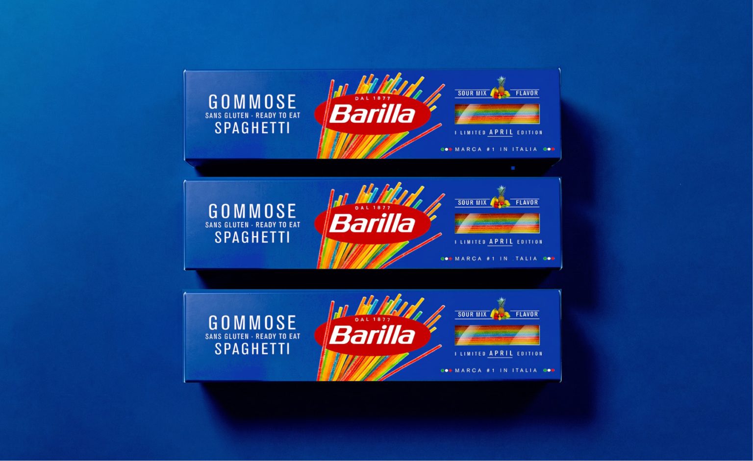

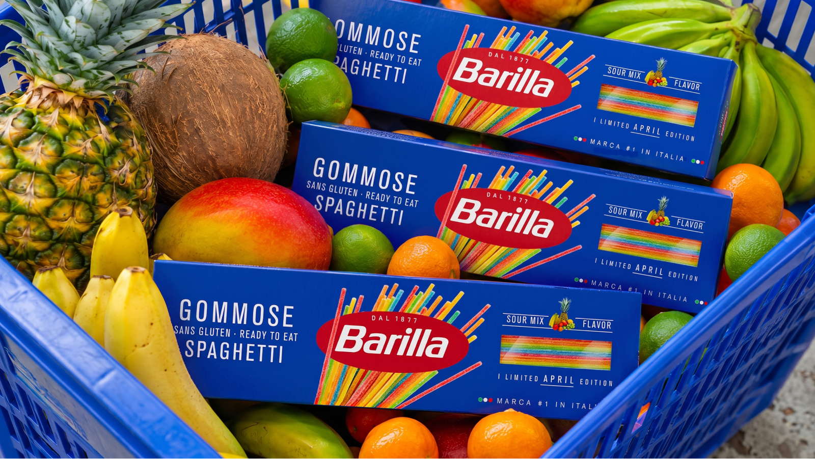
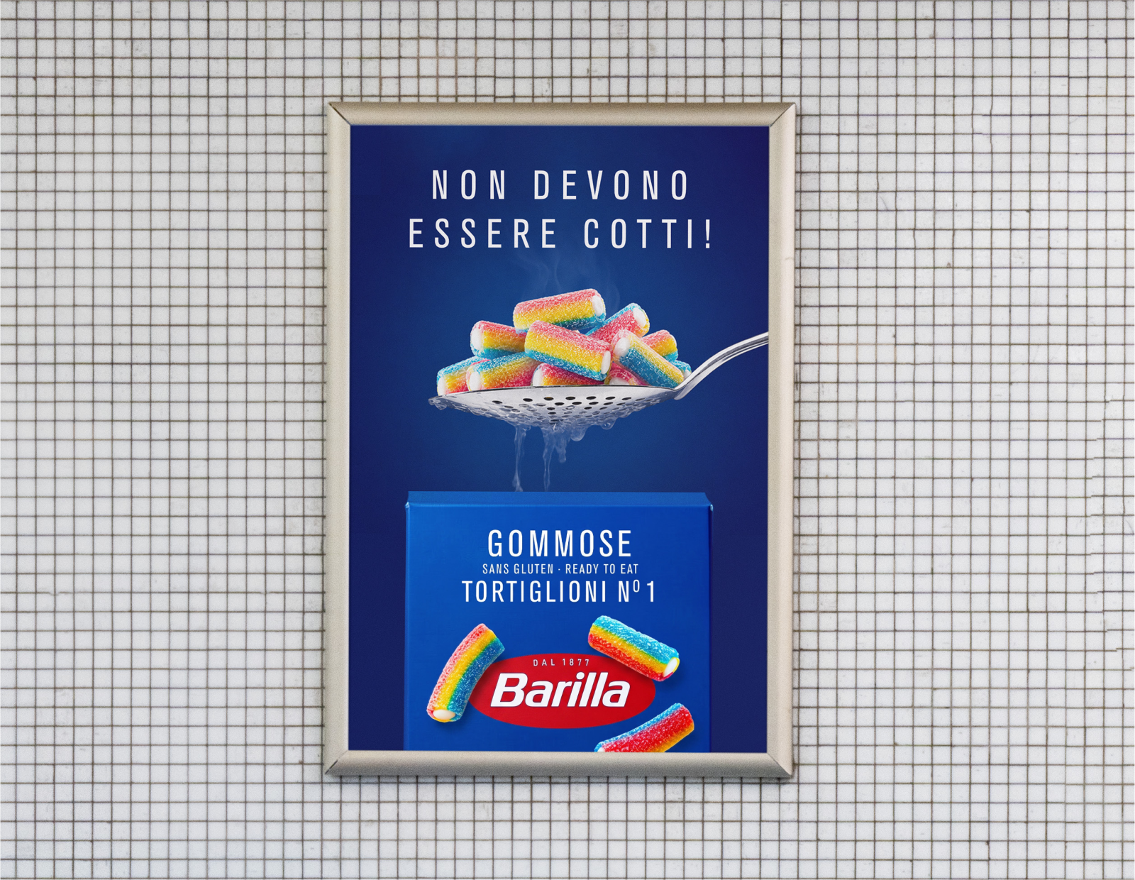
Barilla Gommose is a fictional April Fool’s brand drop that imagines Barilla entering an entirely unexpected category: gummy candy shaped like pasta.
Every April, brands blur the line between reality and fiction with playful product launches. This concept explores how far a recognizable visual identity can go in making an impossible idea feel surprisingly believable.
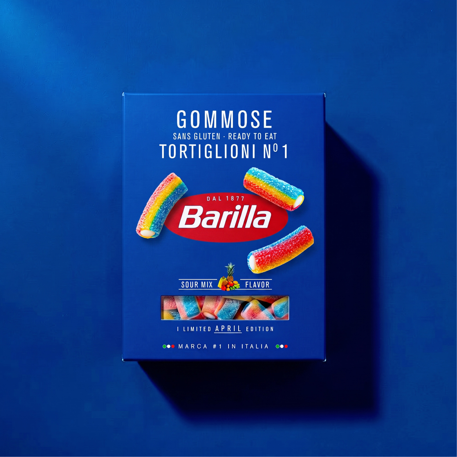
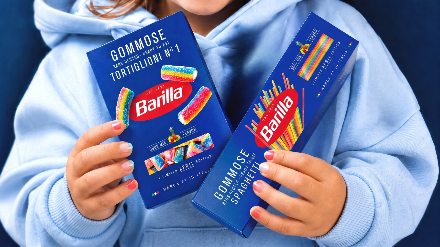
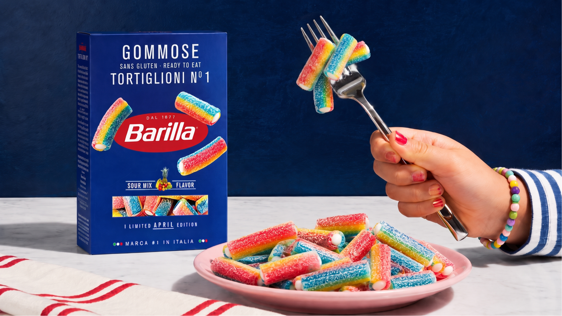
Instead of reinventing the brand, the project carefully preserves Barilla’s iconic packaging system. The familiar blue boxes, typography, composition and product windows remain instantly recognizable, while traditional pasta is replaced with colorful gummy shapes inspired by Tortiglioni and Spaghetti. The contrast between expectation and reality creates the joke without breaking the visual language of the brand.
Barilla Gommose demonstrates how consistent packaging design can become a powerful storytelling tool, making even the most unexpected product feel as though it has always belonged on the shelf.
 JavierGarduno
 Daria Kolesnikova
 HerCreativeSide
 宏洛图品牌设计HONGLT
 Likit
 lbeck
 Aidearte
 Antonia Skaraki
 rufydesign
 Calacreative
 Konê Design
 Abbydraw Designs Unique Conceptual Branding & Packaging Designing Ideas
 Armoder Arte y Diseño
 Daria Fox
 Nouna design
 sashapanchenko
 buddybuddyco
 B&WGraphicLab
 YNOT TONY Design Studio
 Agustina Bo
 Widakk Design
 Amjad Battal
 Denis Irisov
 Rohan Barwal | D2C Brand Identity, Logo & Packaging Designer
 SOT B&D