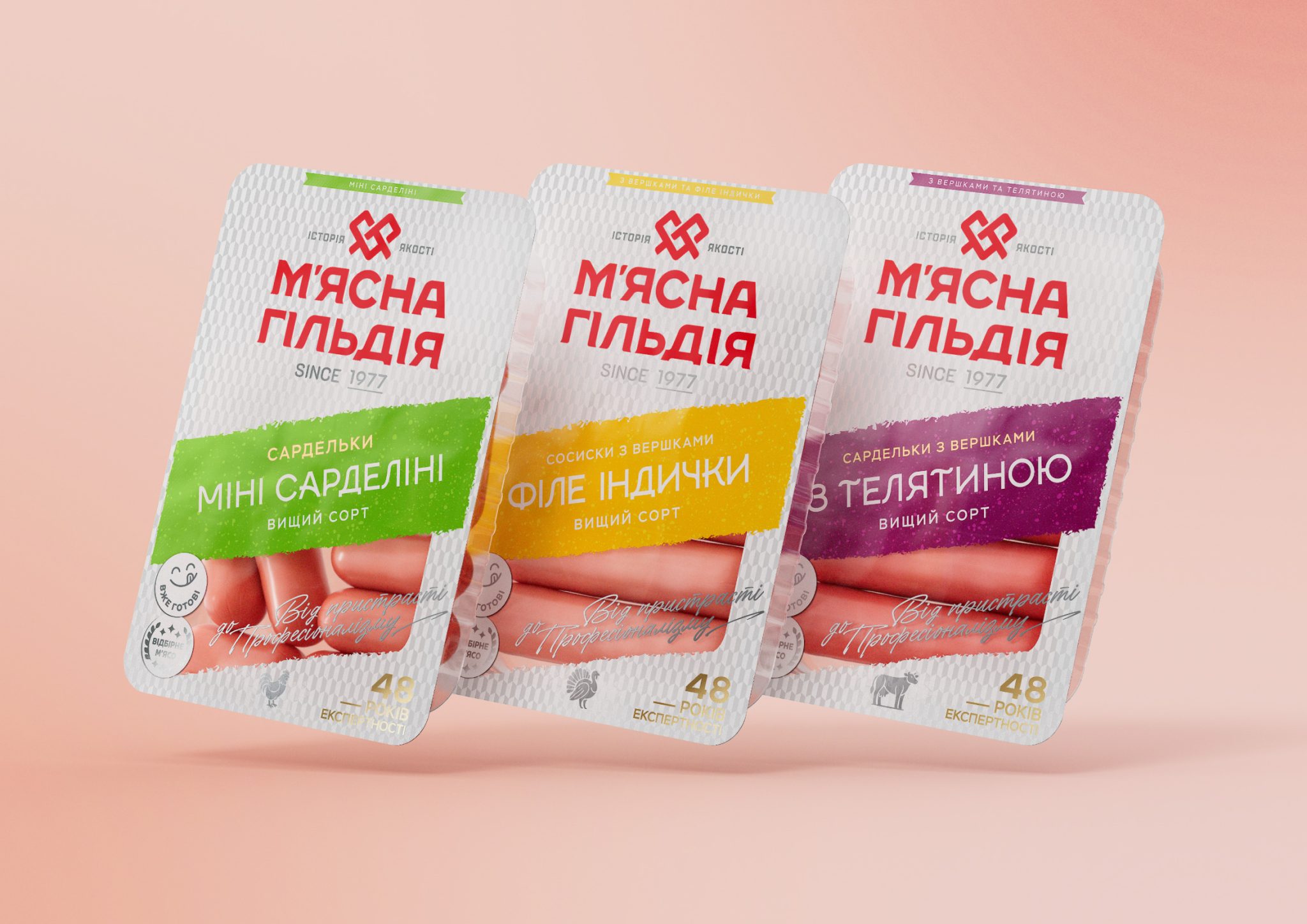

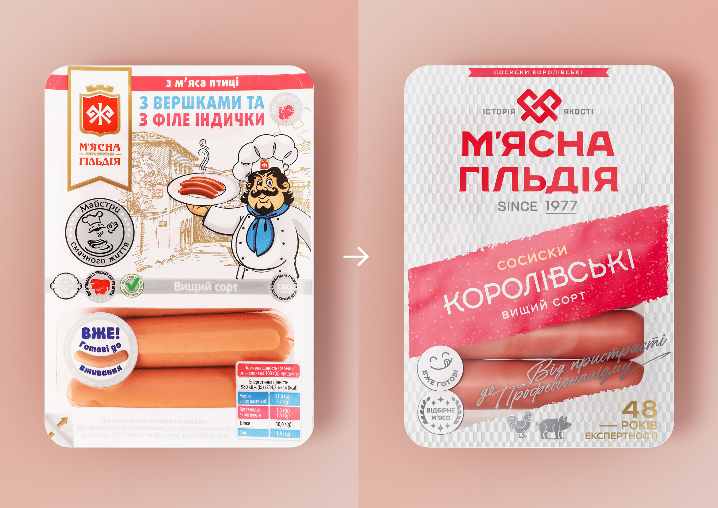
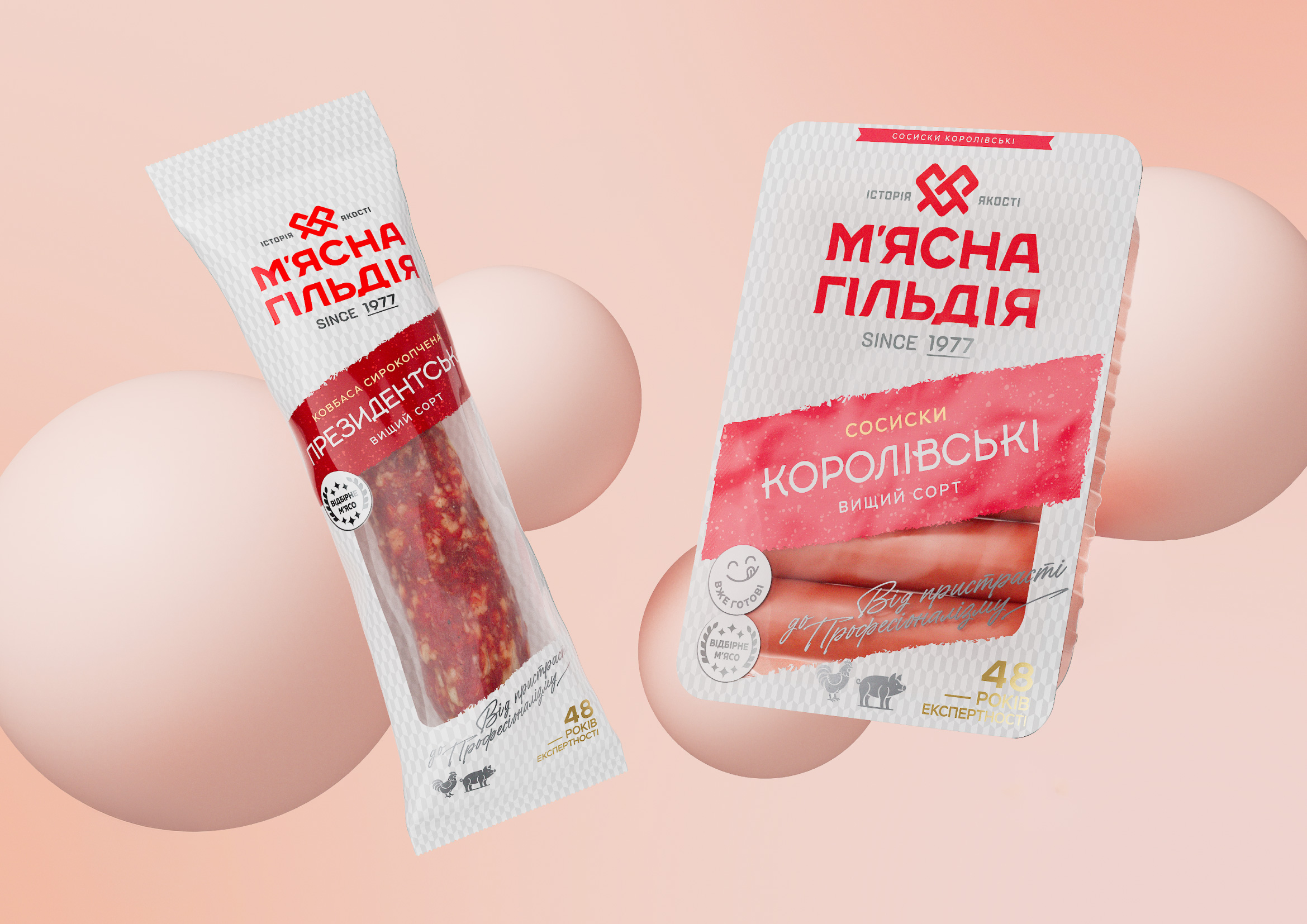
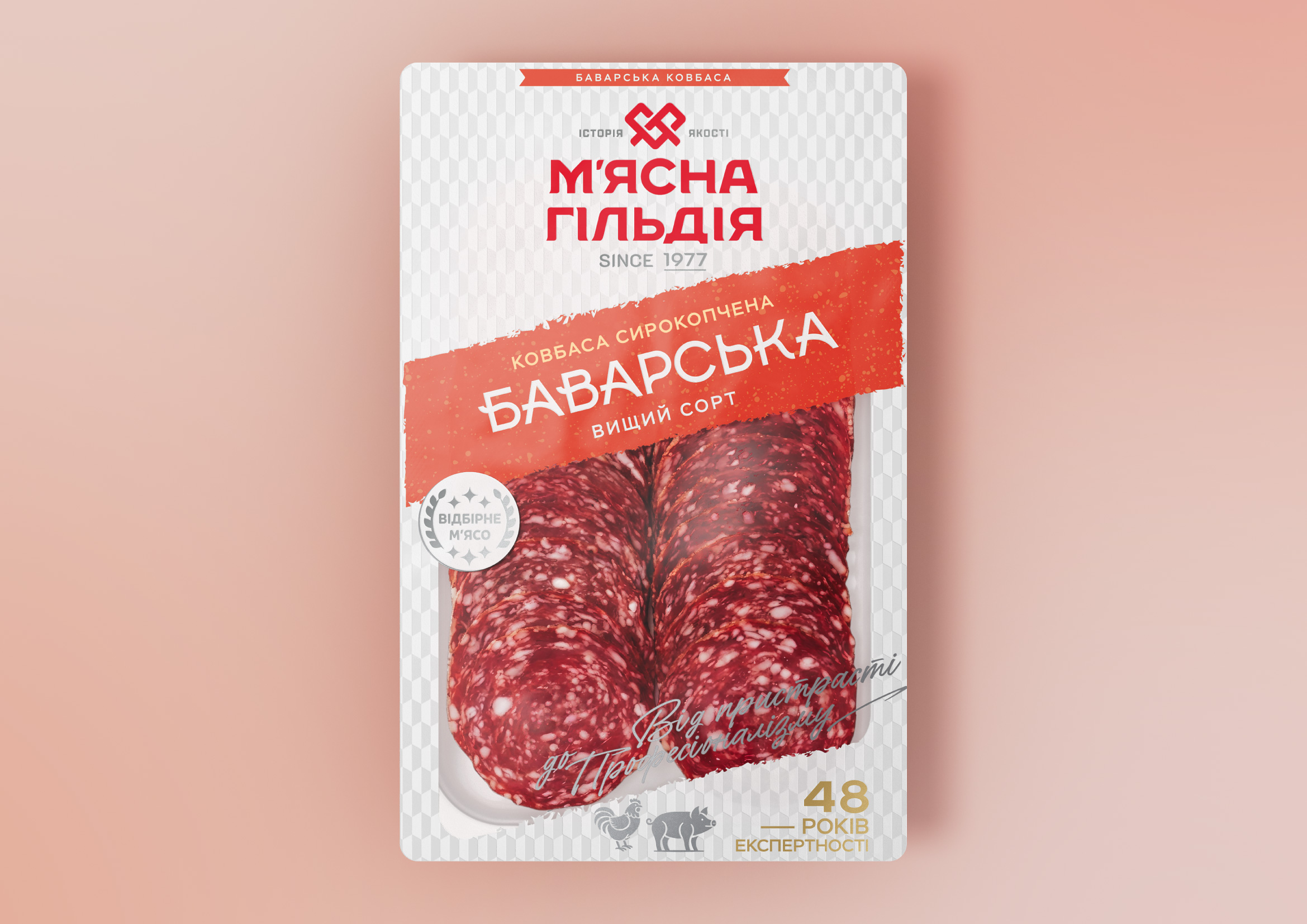
The redesign of the “Myasna Gildiya” brand is aimed at creating a more modern, expressive, and memorable brand image. The new packaging moves away from a complex illustrative composition and an abundance of elements in favor of a clear visual hierarchy, where the brand and the product become the key focal points.
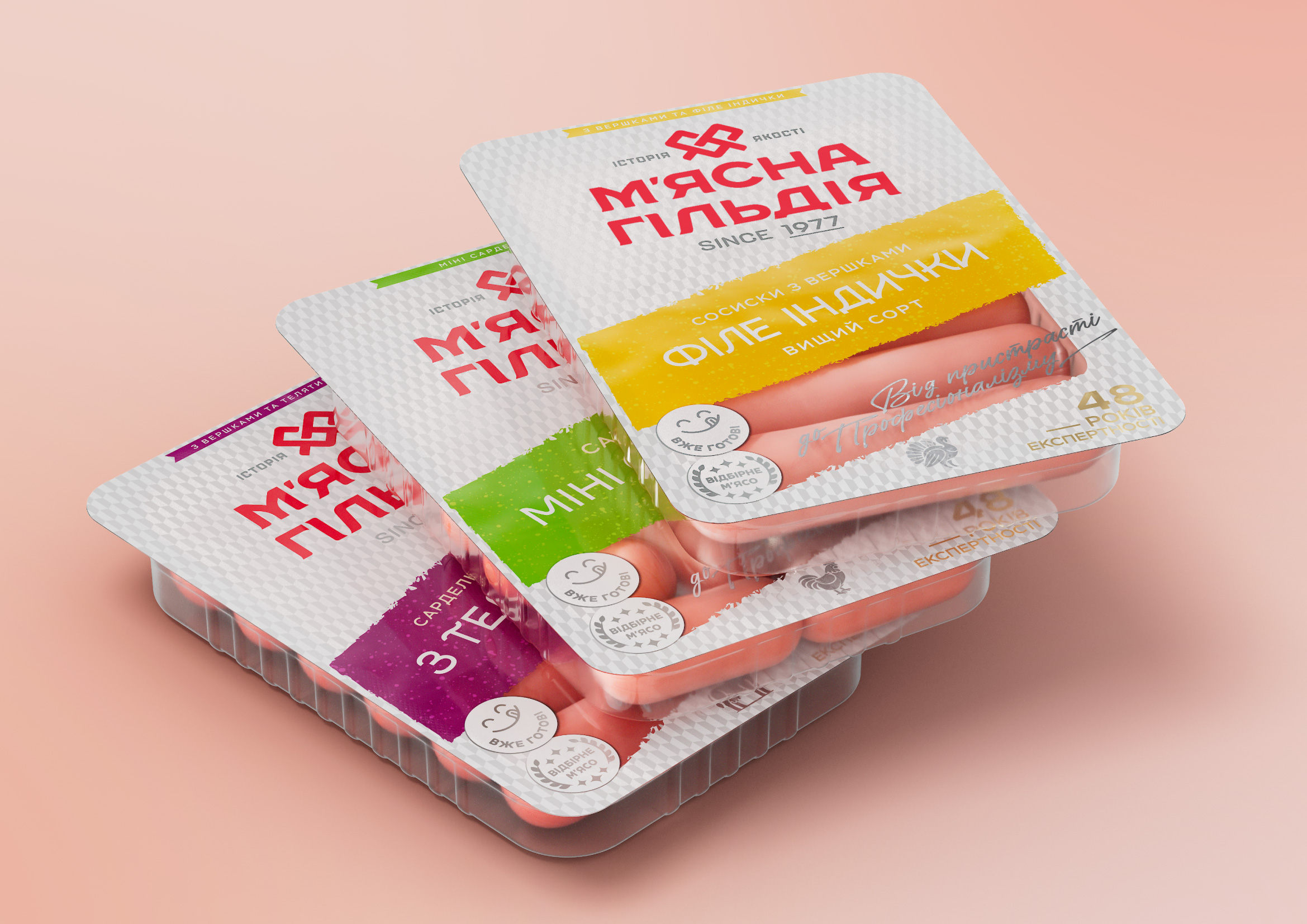
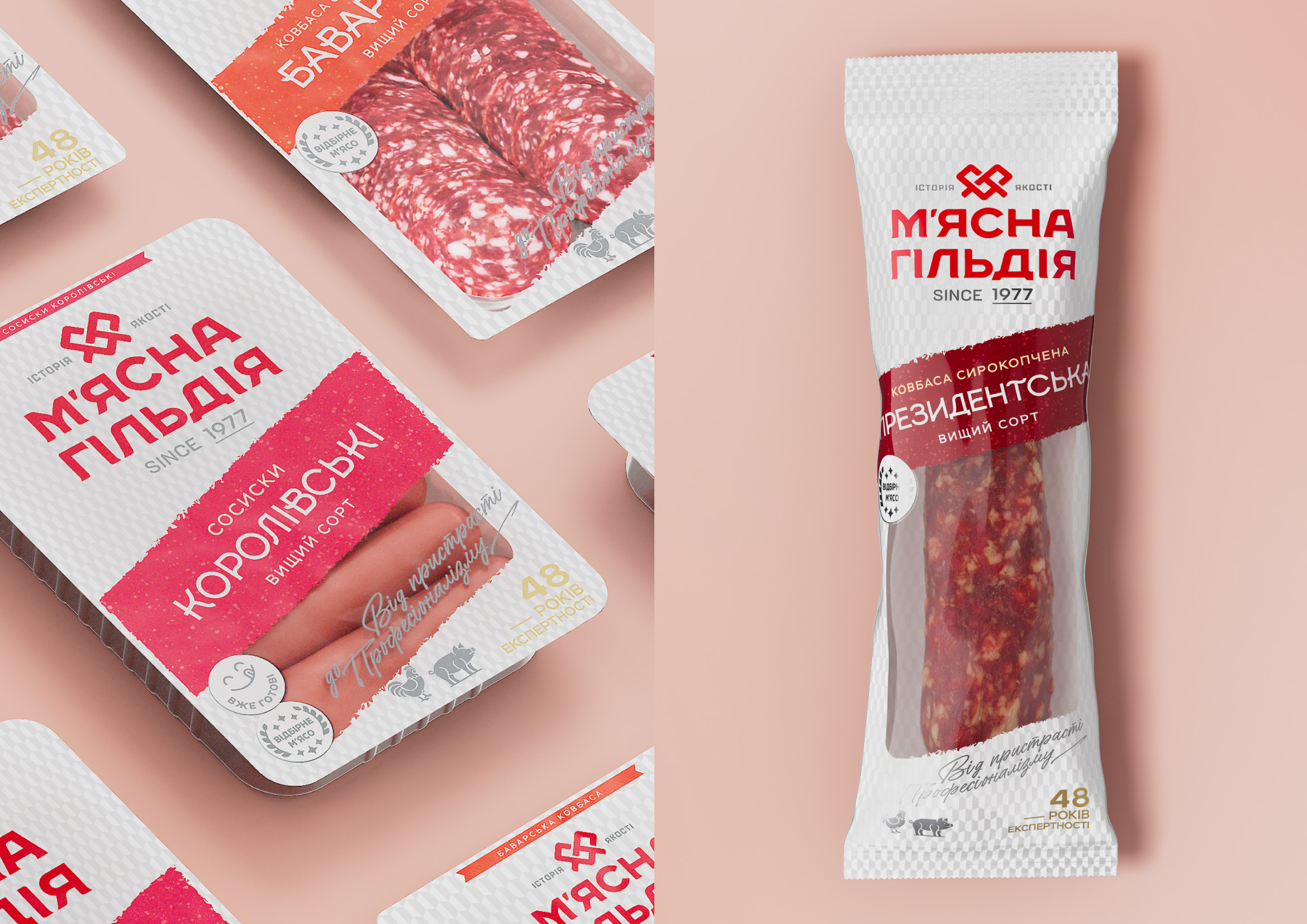
The design is built around a white-and-silver geometric pattern that creates a distinctive branded background, while a contrasting colored diagonal block draws attention to the product name and identification. A transparent product window featured on some of the packs is an important part of the composition — it showcases the quality of the product, enhances its appetizing appeal, and makes the packaging more honest and transparent for the consumer.
The new design features an evolutionarily refined logo, which has become 3–4 times larger and more prominent. Key brand assets have been retained, including the signature color palette and the “Already Ready” badge. As a result, the design feels more modern and premium, while the new design system creates a unified, scalable framework across the entire product range.




 Derrick Lin
 Axiniya Knyazeva
 Hadi Samir
 Atiq Alam
 Furt Goods
 宏洛图品牌设计HONGLT
 Ampersand Creative
 Modern Theory
 Palashcc
 neo creative studio
 Valérie Colace
 Anshuman
 Archi Jain
 DESIGN CONCEPTS
 Shapers Studio
 jamajkajakub
 tamara barakat