
NK New York Eye Cream — Targeted Care, Clearly Designed
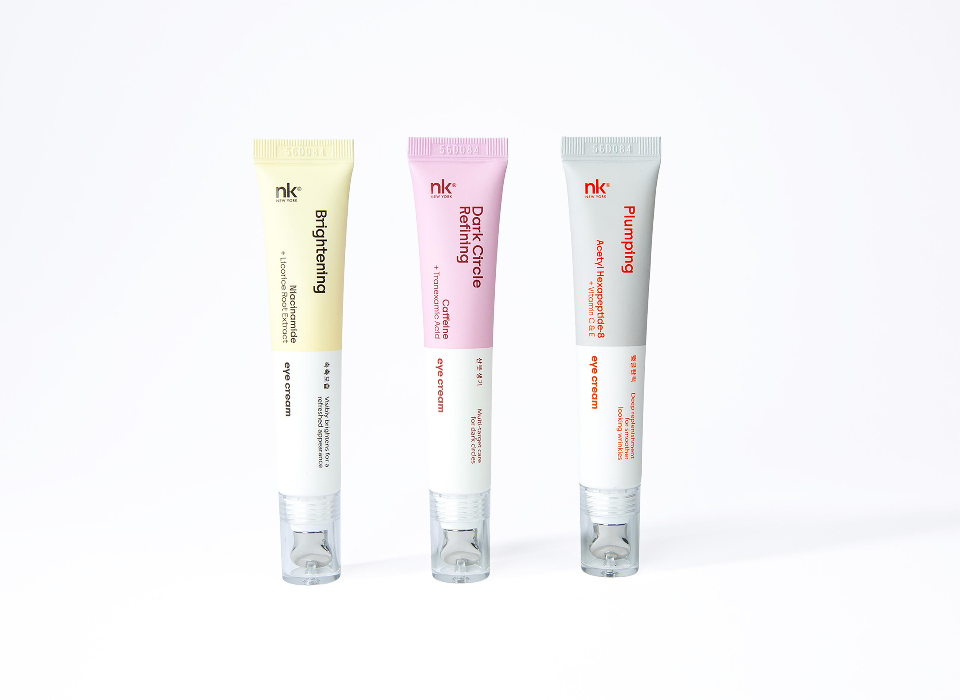
NK New York’s eye cream collection was designed around a simple idea: make targeted skincare easier to understand at a glance.
Each formula begins with a clearly defined skin concern and active ingredient story. Brightening, Dark Circle Refining, and Plumping are expressed through a restrained color system, while key ingredients including Niacinamide, Caffeine, Tranexamic Acid, and Acetyl Hexapeptide-8 are given strong visual priority. This creates a clear ingredient-to-benefit hierarchy that feels clinical and informative without becoming cold or overly pharmaceutical.
The elongated tube format is paired with a clear applicator housing and cooling metal applicator, adding a functional and elevated skincare experience. Vertical typography follows the slim proportions of the tube, creating a distinctive shelf presence while organizing multiple layers of information within a compact format.
Korean typography is integrated alongside English copy as part of the visual system, reinforcing the collection’s K-beauty identity while creating a bilingual rhythm across the packaging. Distinct color accents give each formula its own personality while keeping the collection cohesive.
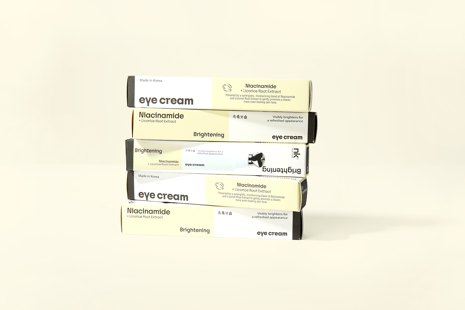
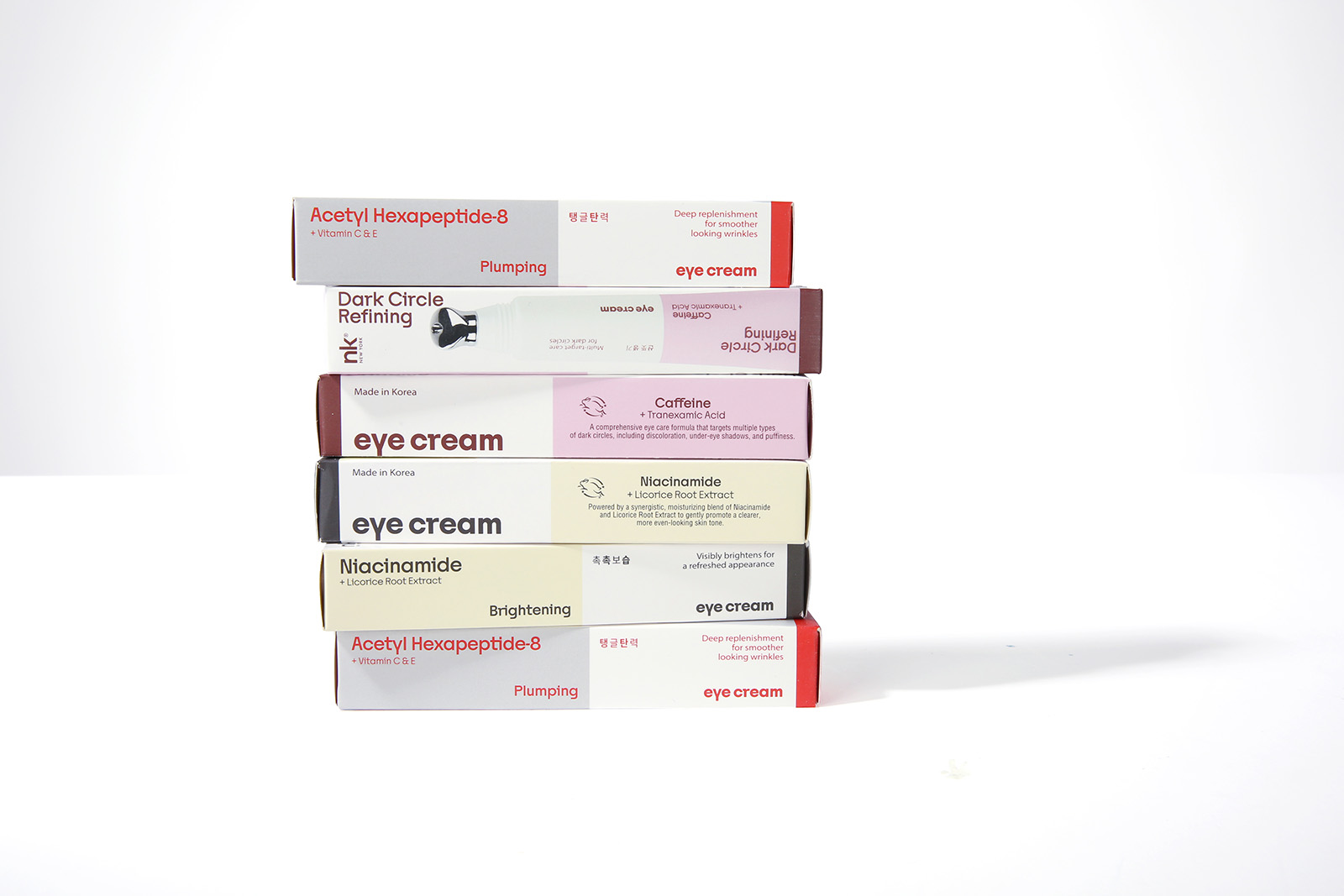
The secondary packaging extends the same ingredient-led system across every panel through prominent benefit statements, active-ingredient messaging, bilingual copy, and color coding. Together, the tube and carton form a unified packaging system that balances clarity, functionality, and the energetic character of NK New York.
 Up-Brands
 Almighty
 Desember Design Studio
 Daria Levina
 Yuliya Likhacheva
 carola matalinares
 daniitenaa
 StudioMordius
 Simon Pendry Creative
 Sti&Co Design
 Yasmin Sherif
 Roberto De Simone
 aseelstudio
 Rabia zouina
 UPRISE
 HazelBishop
 Qianyu Liu
 siyajacob
 Rohan Barwal | D2C Brand Identity, Logo & Packaging Designer
 Karen Salem
 omarchafik
 nastyaabeketova
 Roberto Núñez Studio