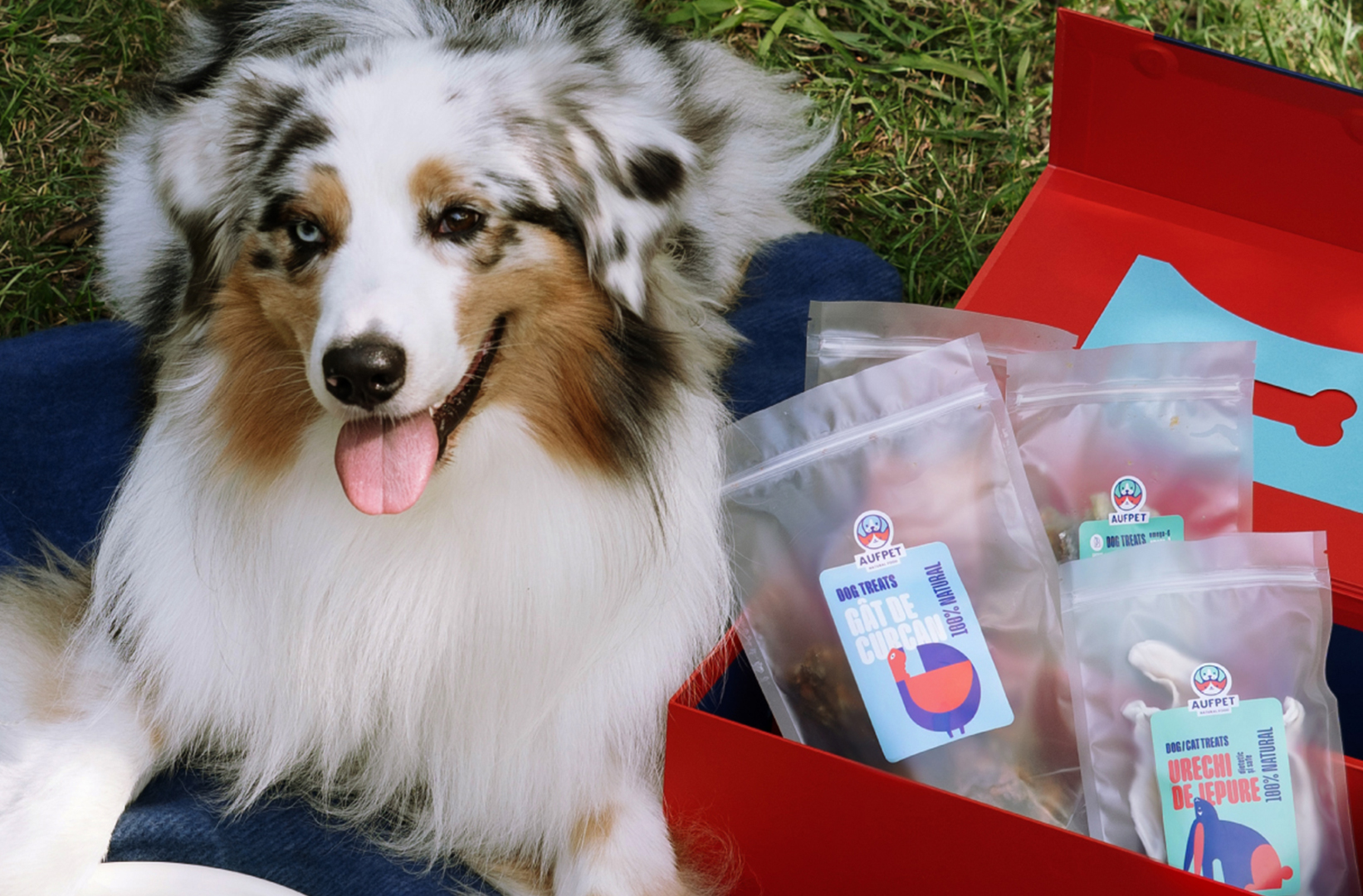

Aufpet is a pet treats brand built on single-ingredient simplicity. We removed everything unnecessary: no fillers, only natural ingredients, and straightforward branding that speaks to conscious pet owners.
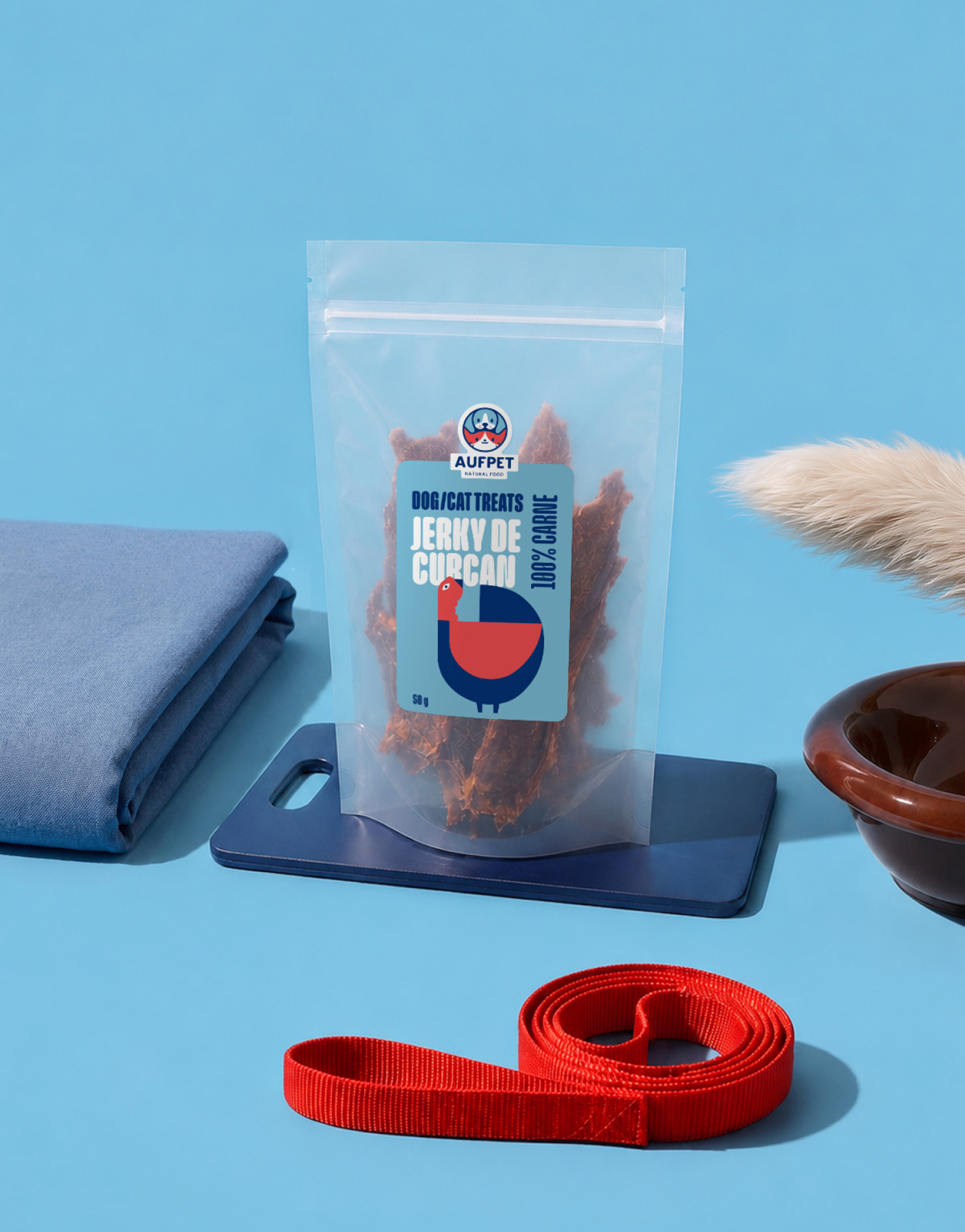
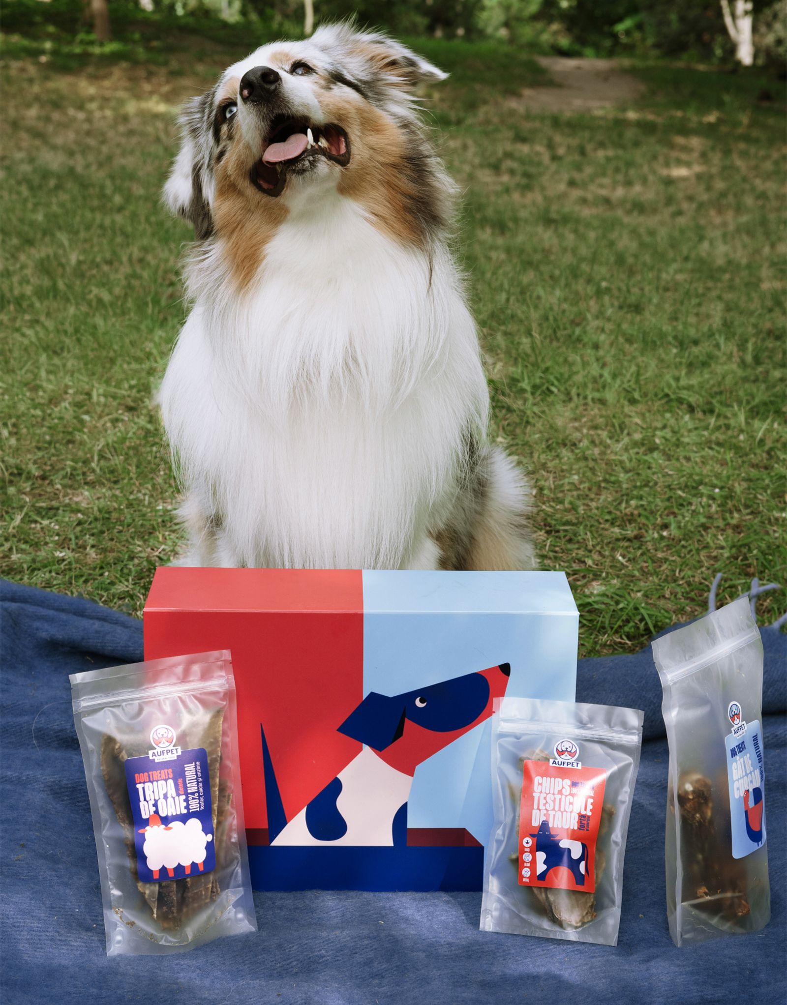
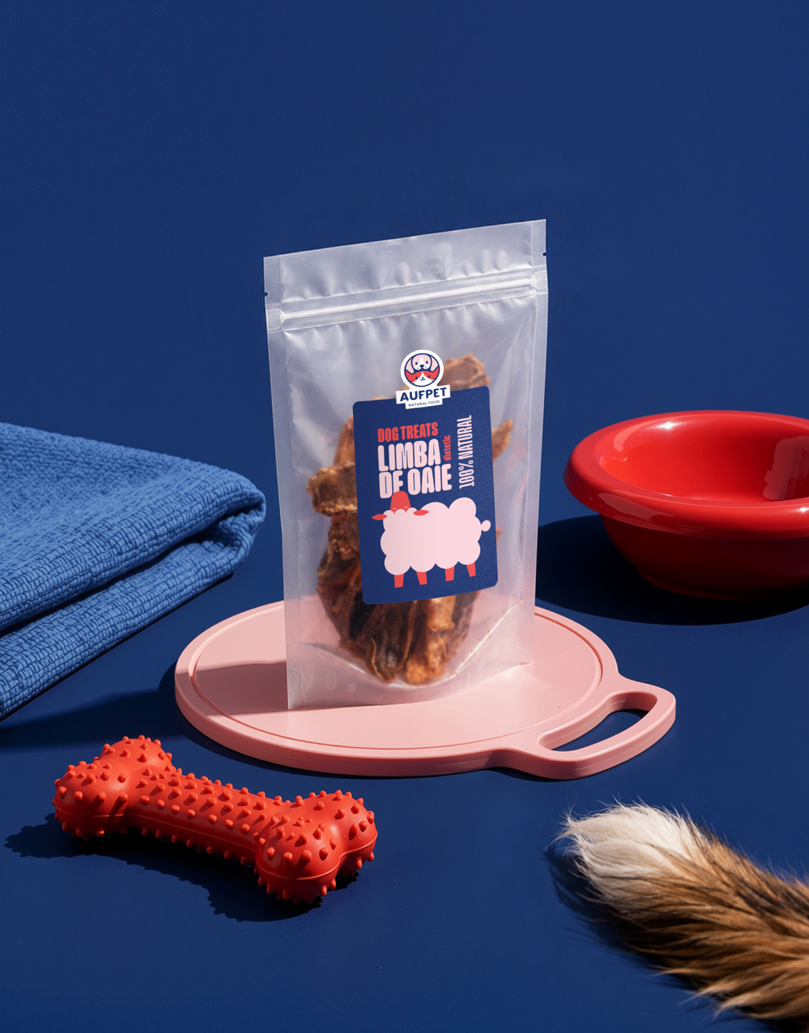
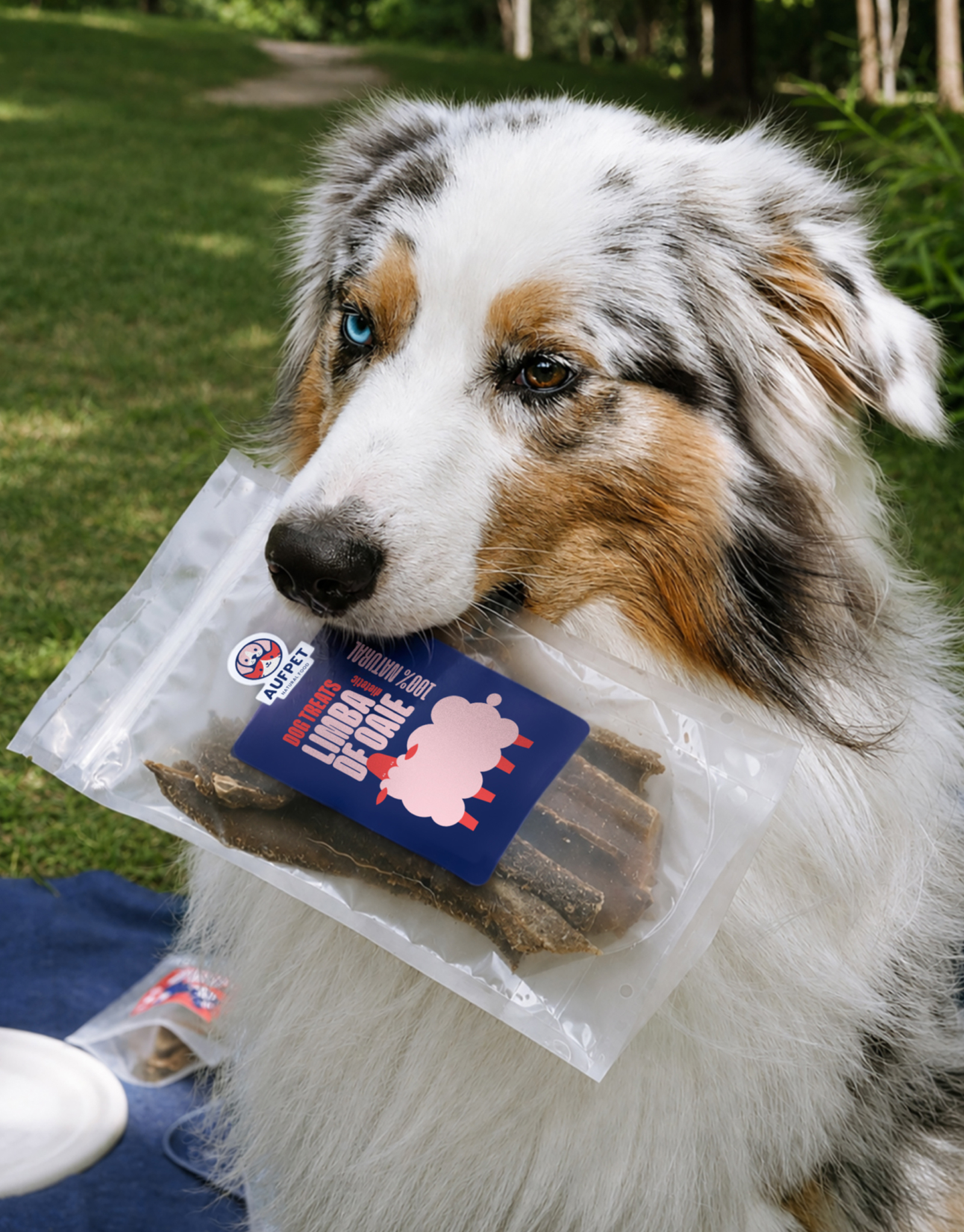
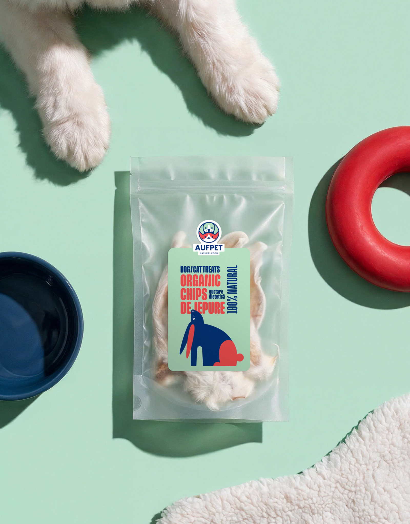
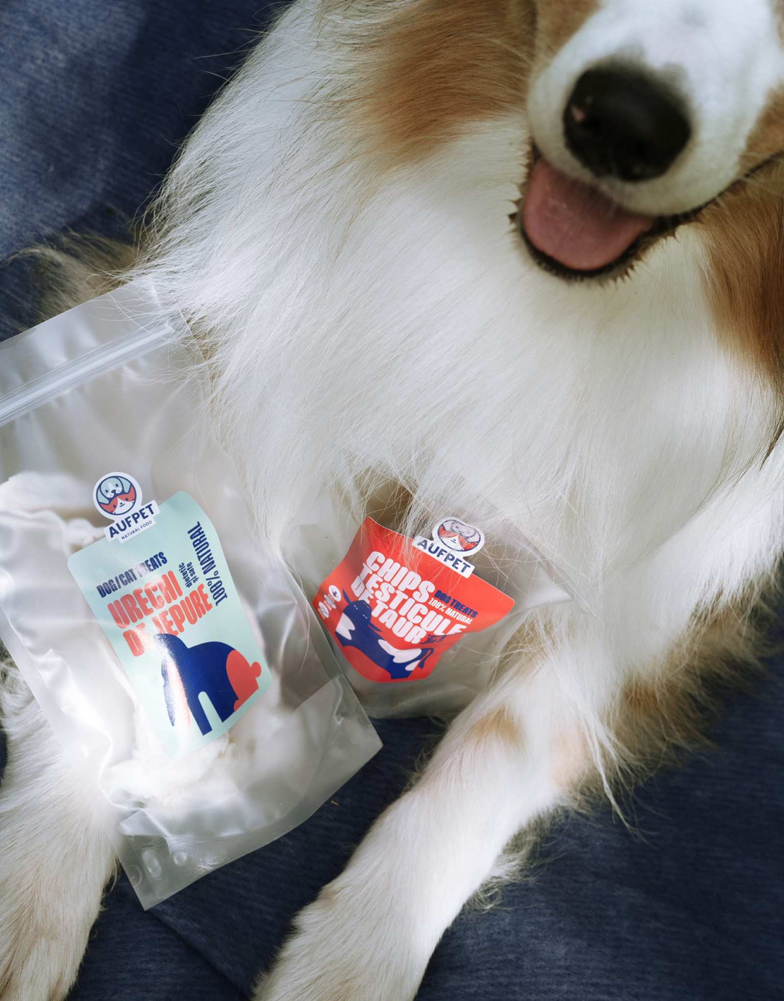
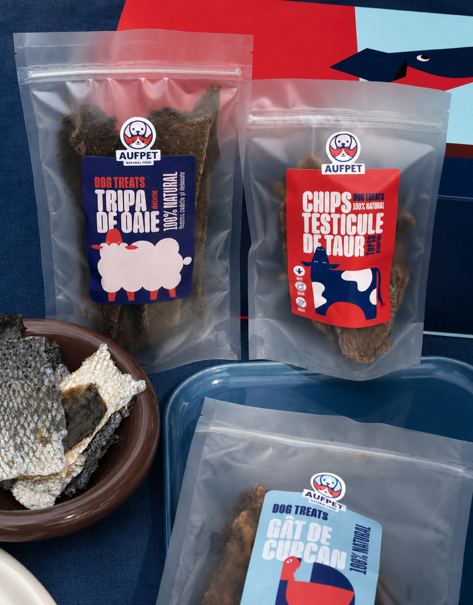
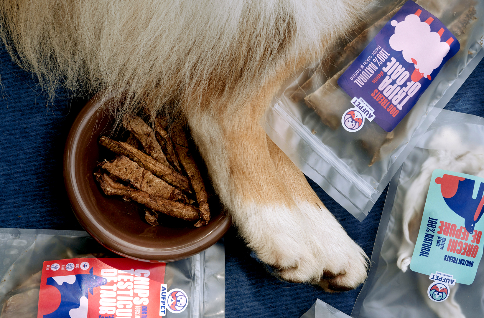
Geometric minimalism. Each product variant has its own shape—circle for chicken, triangle for fish, square for beef. Extensive whitespace, clean typography, and a carefully curated color palette create a distinctive visual identity that stands apart from conventional pet food packaging.
The design stands out on shelf through minimalism (competitors use photorealism and mascots). A geometric system that scales across packaging, social media, and marketing materials. Positions the brand in the premium segment for health-conscious pet owners who value transparency and quality.
Grid-based system, geometric composition, strategic color application, and typographic hierarchy. Every element aligns to a mathematical grid ensuring precision and harmony throughout the visual system.
Geometric language that communicates without words—users recognize products by shape alone. Whitespace as an active design element, not filler. A complete modular system where packaging, social media, and merchandise flow from the same geometric language.
Visually distinctive shelf presence. Minimalist aesthetic positions brand in premium segment. One unified system works across physical and digital touchpoints. Modular design scales effortlessly as product line expands—built for growth.
Aufpet | Design by True Agency, Chișinău
 Lisa Pokrovskaya
 Simple Studio
 Studio Unbound
 David Byerlee
 M&A CREATIVE AGENCY
 alchimistestudioParis
 monther al omari
 Studio Be Design
 LogoSayLove
 agenciabud
 Shustova p
 mutta
 @Allenarts13
 Sirka Agency
 Atiq Alam
 Dozen Agency
 j.substance
 SCD
 Cristian Lepore | crilep Copia
 Chris Creative Works