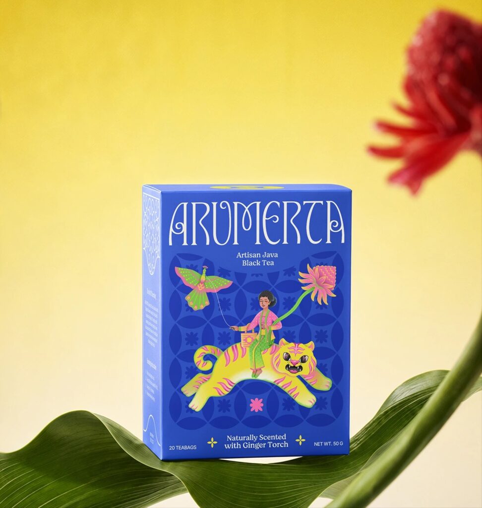

In this Curator’s Insight, we take a look at Arumerta designed by Studio Moara
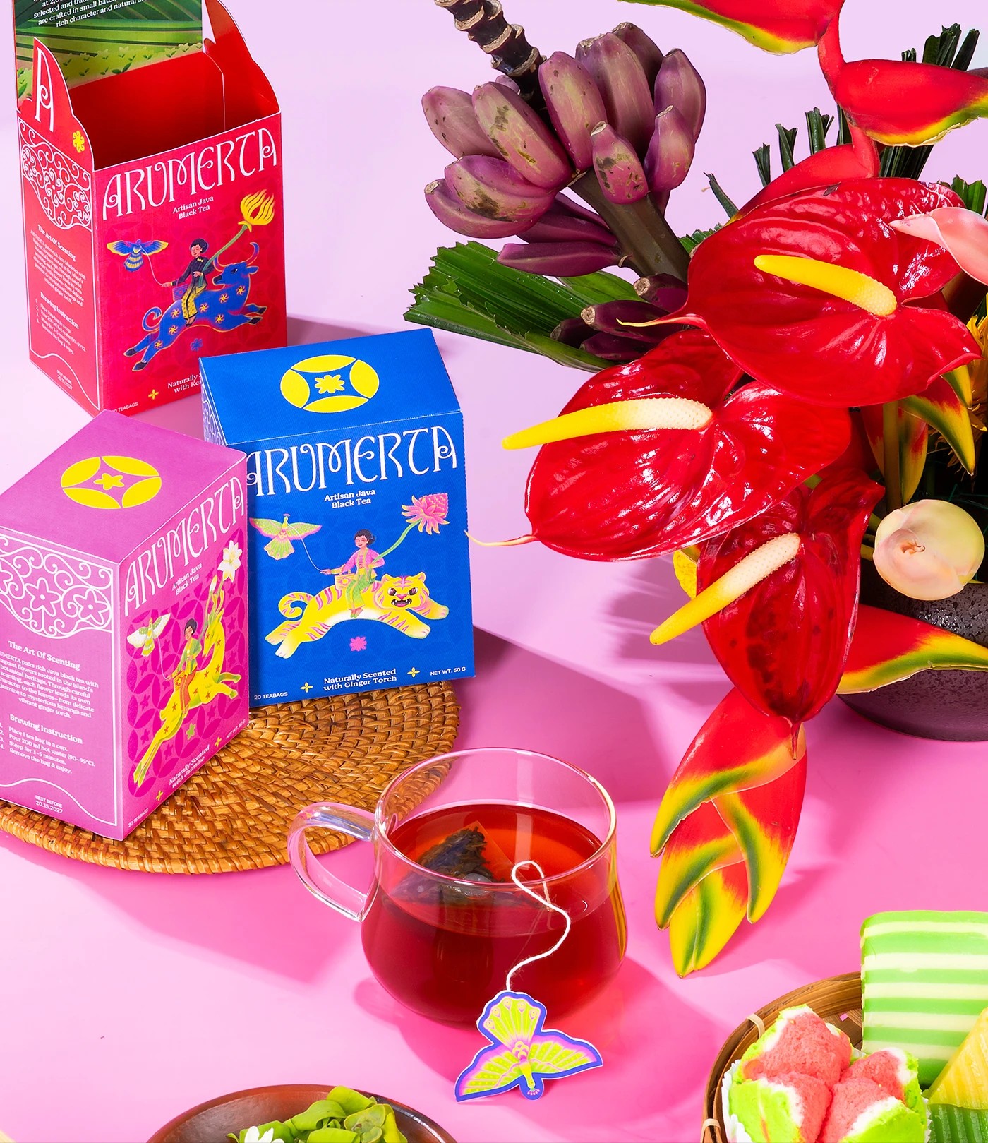
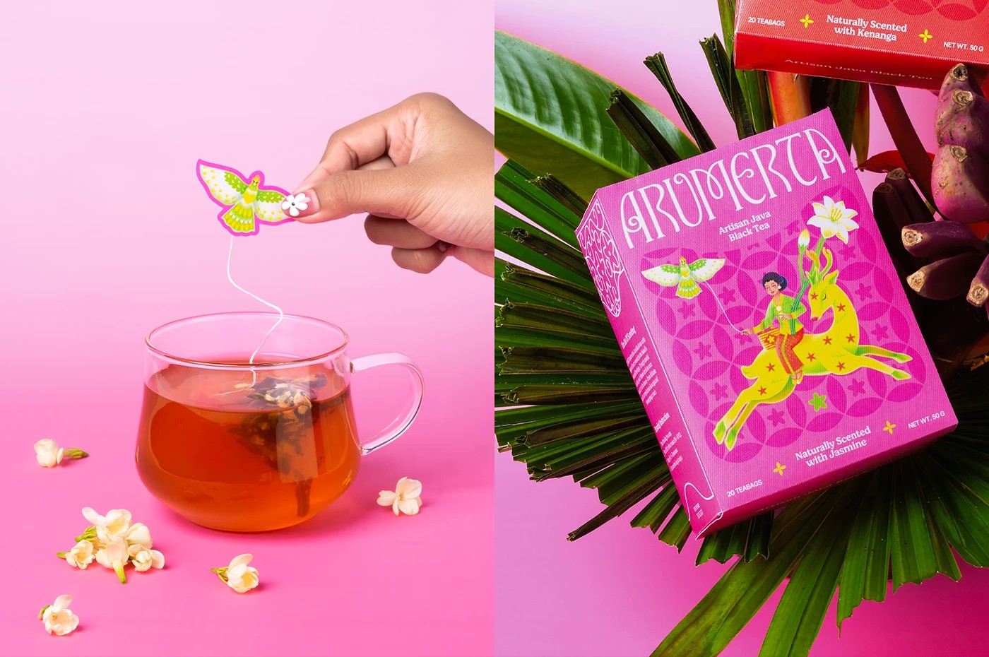
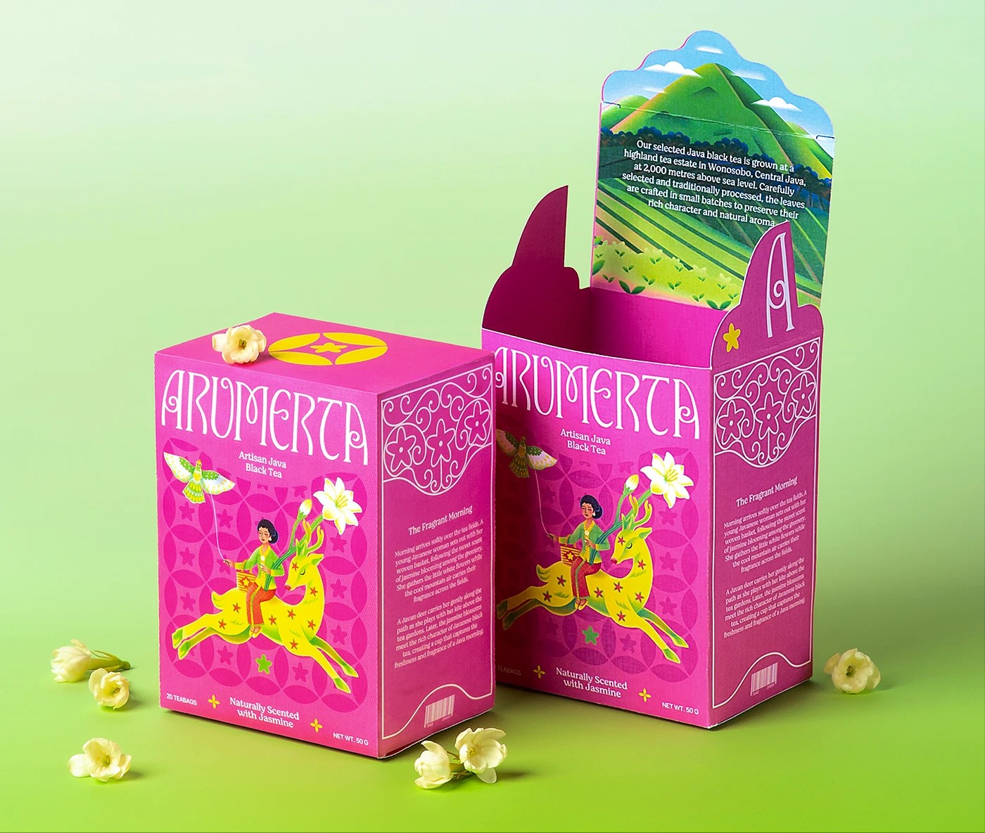
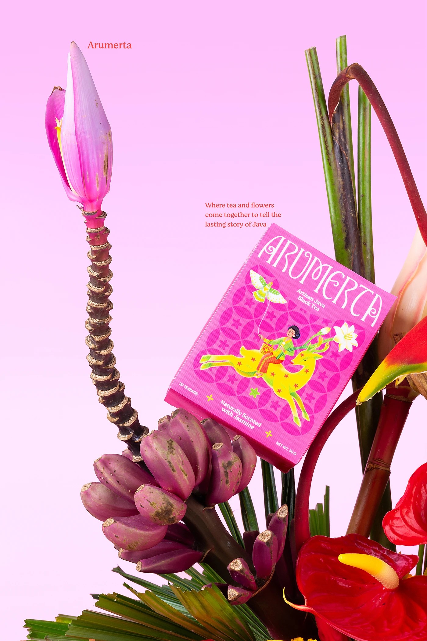
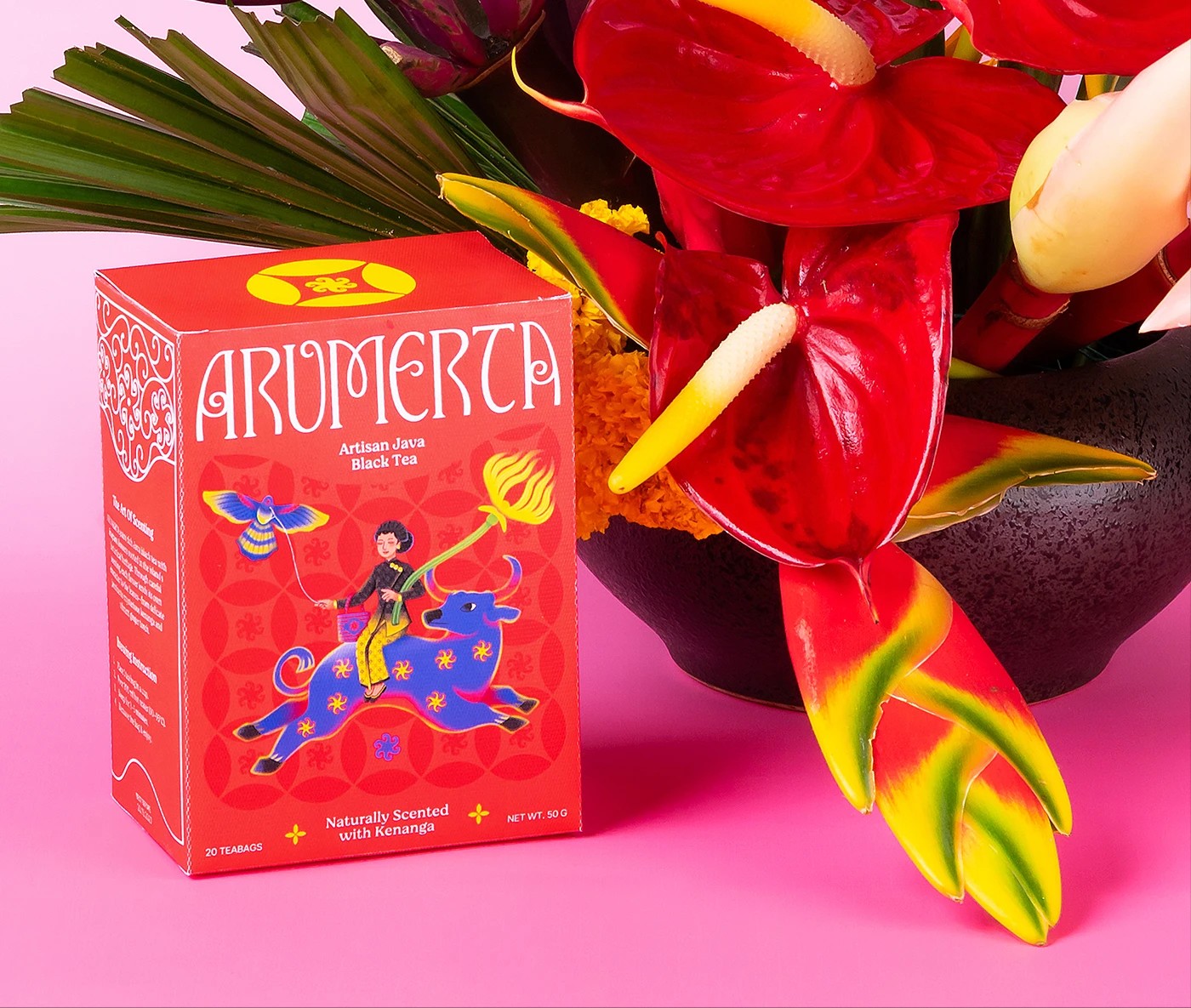
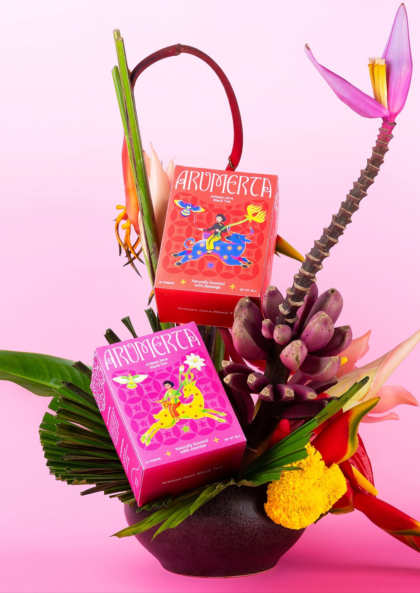
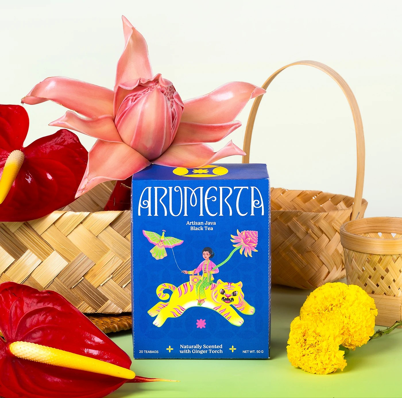
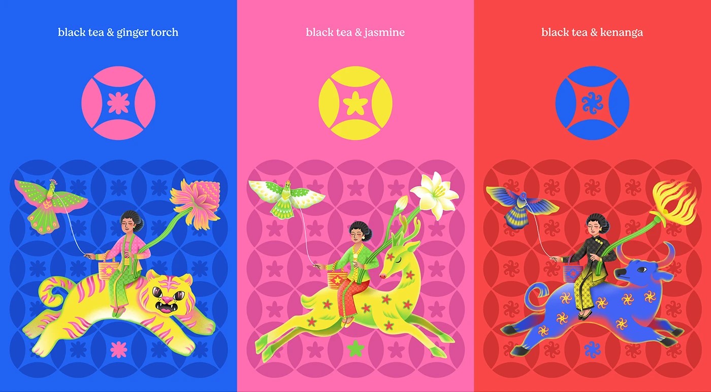
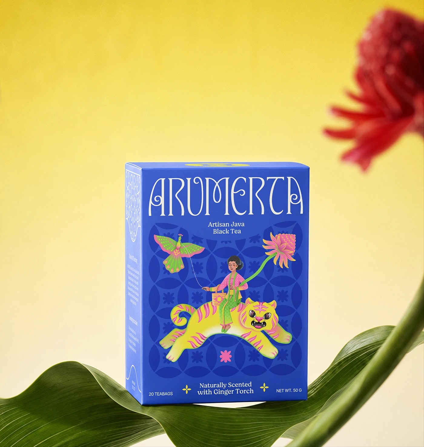
Arumerta is an artisan Javanese black tea brand that turns everyday tea drinking into a small piece of folklore. Its name blends “arum” (fragrance) and “amerta” (elixir of life), setting the tone for an identity rooted in Java’s botanical and cultural heritage. Each variant, jasmine, ginger torch, and kenanga, is brought to life through custom typography, hand illustration, and pattern work drawing on motifs like lung-lungan and Kawung. A kebaya-clad woman rides a mythical creature on every box, a surreal touch that turns packaging into storytelling rather than simple product display. The colour palette, hot pink, cobalt blue, and red, feels bold and joyful without losing its cultural grounding. What stands out most is the cohesion: naming, illustration, and structural packaging all read as one imagined world, proving that heritage-inspired branding doesn’t need to feel nostalgic to feel authentic. It can be playful, contemporary, and still deeply rooted in place.
What makes this identity work is restraint hiding inside abundance. The palette and illustration style could easily tip into chaos, but a tight structural system, repeating circular emblem, consistent rider-and-creature composition, fixed pattern grid, holds every variant together. It reads less like three separate flavour boxes and more like chapters of the same tale, which is a harder thing to pull off than it looks.
Project Team
Art Director: Dhika Supangestu
Graphic Designer: Dhika Supangestu / Raihan Rafly Romadhon
Illustrator : Ajeng Saski Novalita / Dea Andineta / Zainul Rozikin
Font Designer: Panca Hasan

 monther al omari
 43oz
43oz lilyz design23
 Modern Theory
 Eighteen Brand Studio
 Bhumika Singh
 MohamedMashaly
 Pixels Studio
 Gulya
Gulya UPRISE
 Lizaveta Kharitonyuk
 Bonsanco Creative Studio
 DesignRepublic
 GIRAFA STUDIO
 PiotrWisniewski
 Sophiagdotcom
 CreativeWise
 SoreThumbStudio®
 Modern World Studio
 Palashcc
 Valérie Colace