

GIONA is a family of low‑ABV gin liqueurs that channels classic cocktails, Italian aperitivo and neon bar nightlife, using punchy colour blocks and oversized type to express a bright, “Super Delish” personality.
Creative brief / design challenge
Sedina Distillery set out to introduce a lighter‑strength gin liqueur range that feels contemporary and upbeat, yet remains premium and credible for cocktail lovers. The brand needed to stand apart from the cluttered world of flavoured spirits and RTDs, clearly signalling its gin backbone and low‑ABV profile while resonating with design‑savvy drinkers in both retail and bar contexts.
Design solution
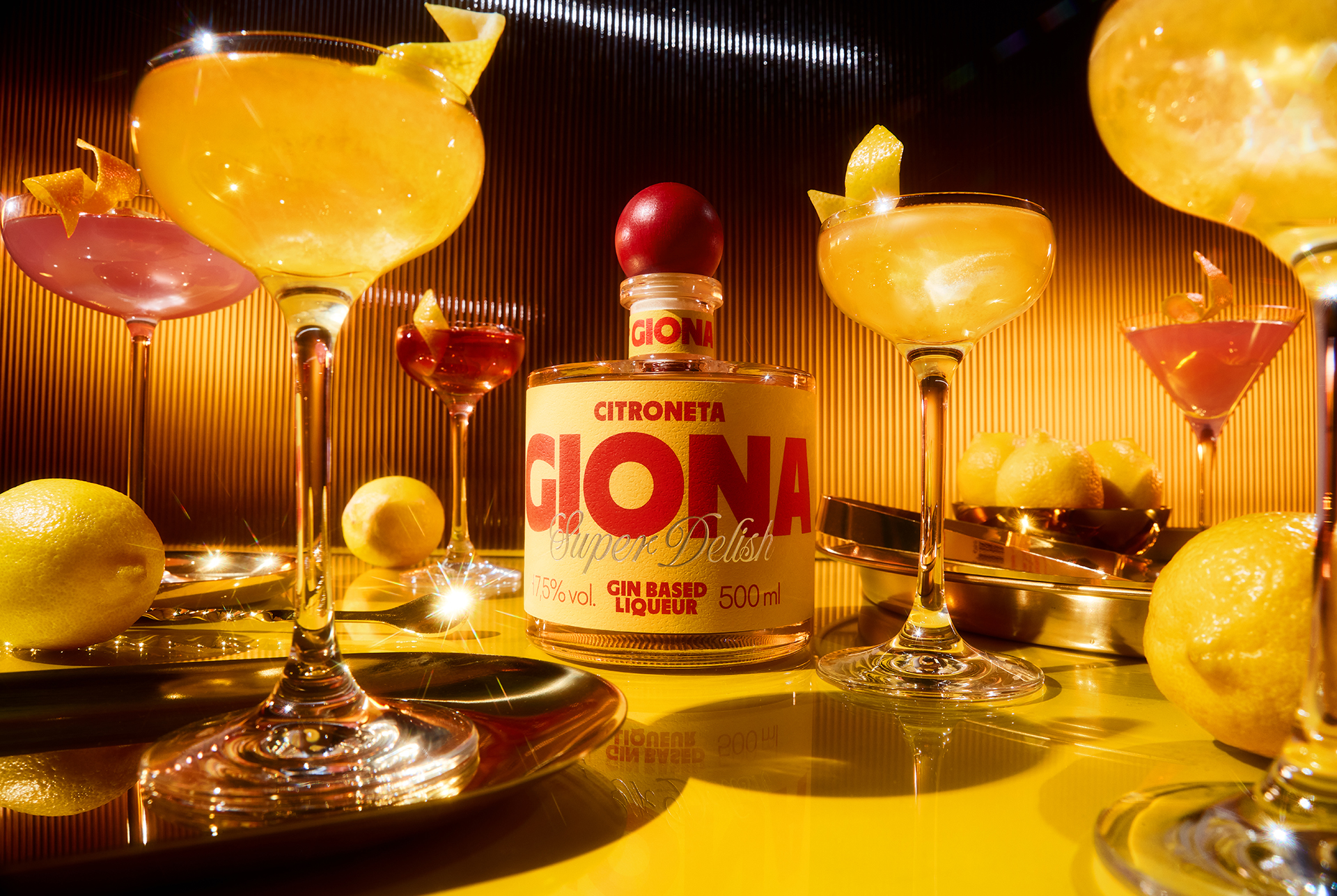
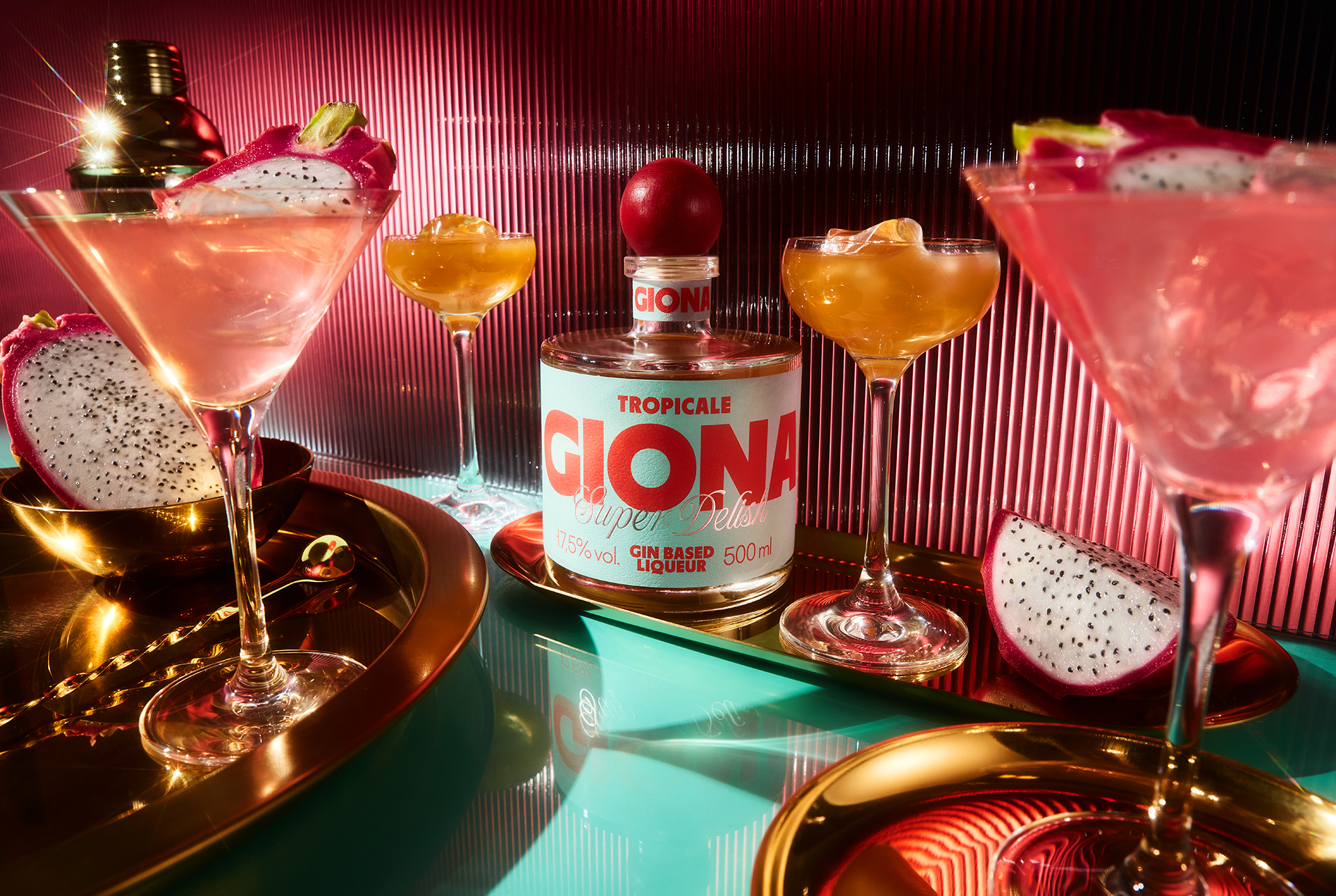
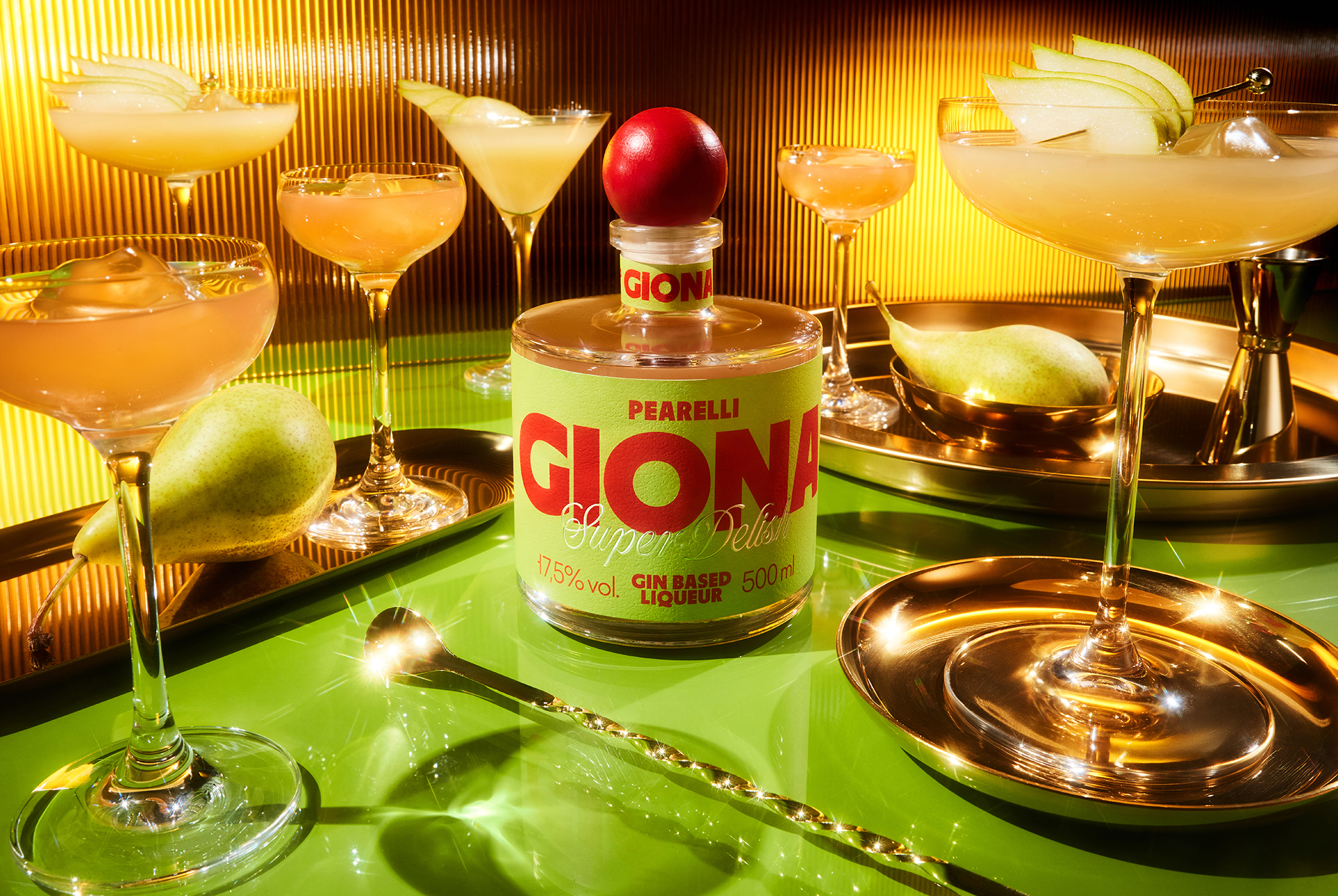
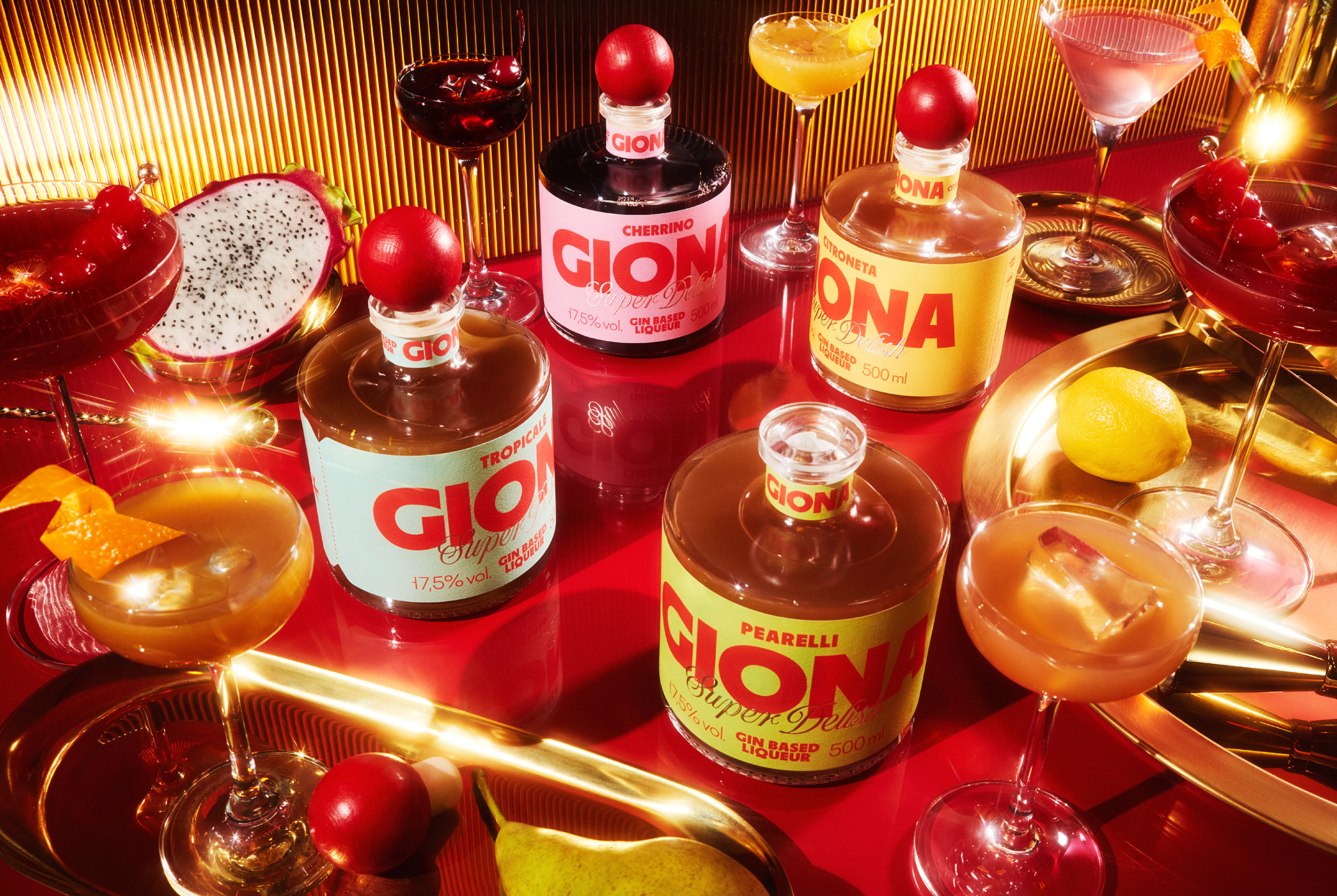
The identity centres on a confident wordmark and a label layout that treats the front of pack as a compact poster. Amplified typography, sharp geometric layouts and a saturated, Italy‑influenced palette reference neon bar signage and aperitivo culture, while transparent glass and reflective accents spotlight the liquid itself. Each variant has its own chromatic universe, tied together by a recurring “Super Delish” device, creating a recognisable family look that translates seamlessly from shelf and back bar to digital channels.
Materials / production
For the main label, we selected Avery Dennison Fasson® rGranite, a stock with a subtle fruity‑peel pattern and stone‑like tactility that enriches the otherwise graphic design. Dense inks and targeted varnishes reinforce the colour blocking and highlight reflections in the glass, helping the pack maintain impact under different lighting conditions, from store aisles to dim bar environments.
Results / recognition
The launch of GIONA has reinforced Sedina’s position in the growing low‑ABV space and earned international acclaim, including a Silver award in the Low Alcohol Beverages category at the NAPA Baltic Packaging Design Awards 2026.

 Anna Kachaeva
 vrai studio
 Studio Pistache
 Slice Design
 David Byerlee
 宏洛图品牌设计HONGLT
 The Creative Method
 Fond
 DS1 branding agency
 Ashwini Dang
 Dozen Agency
 We Craft Studio
 Likit
 Asprey Creative
 Firstrein
 Nouna design
 JavierGarduno
 Daria Kolesnikova
 HerCreativeSide
 lbeck