Lifeup are dietary supplements developed based on the results of scientific research. A carefully selected recipe and high-quality ingredients guarantee safety and optimal enrichment of the diet with important nutrients.
When creating the visual identity of the Lifeup brand, we tried to emphasize the natural origin and professional quality of the ingredients of the products.
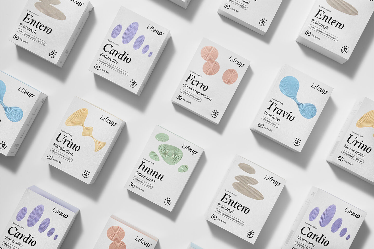
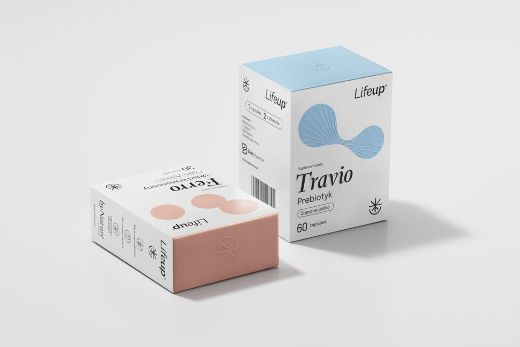
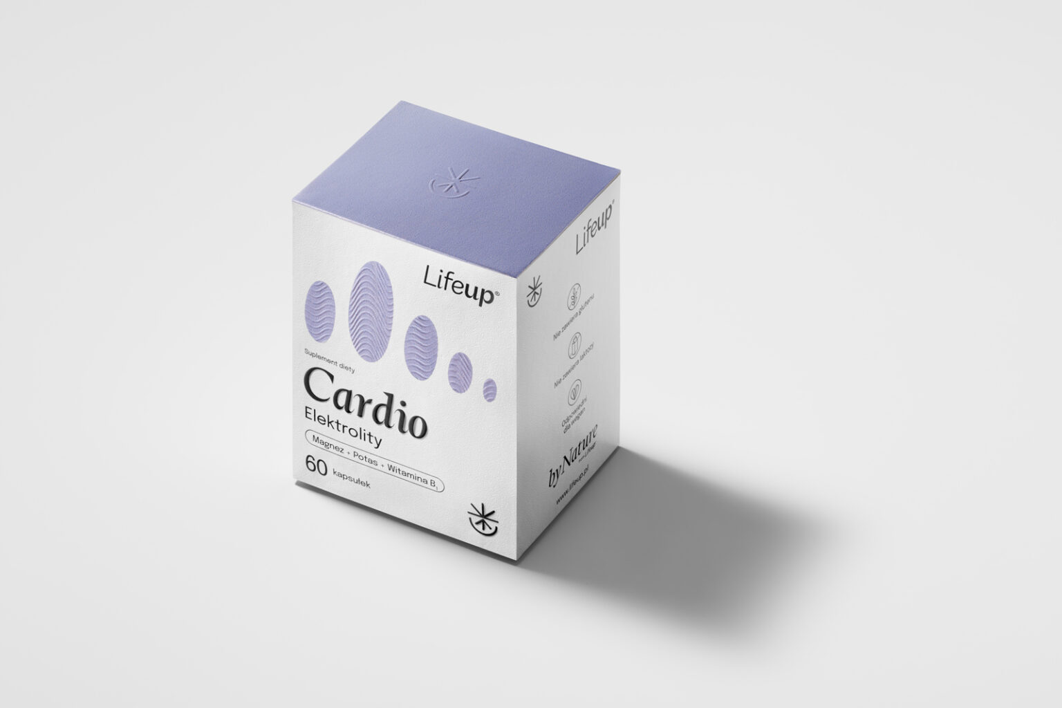
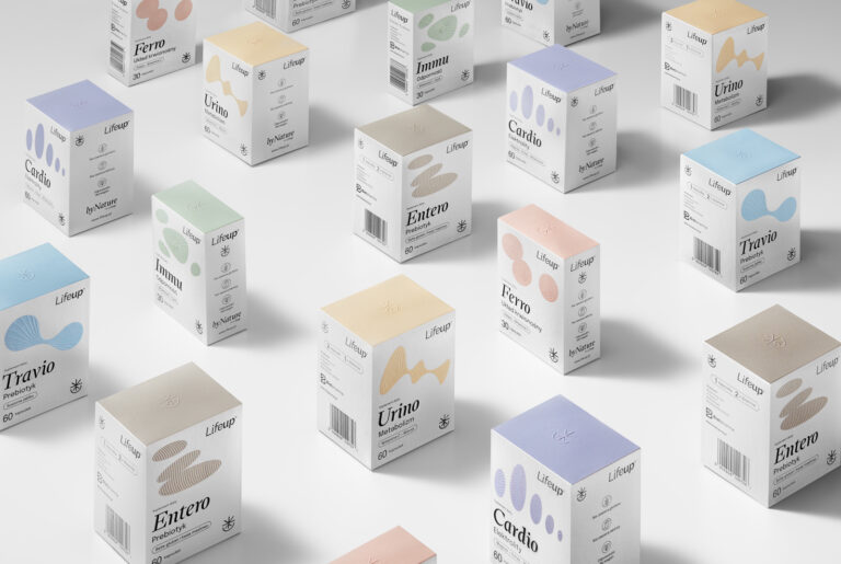
We decided on minimalist packaging with abstract, organic forms, which additionally have embossing elements defining the use and operation of individual products. The use of a pastel color palette brings Lifeup brand packaging closer to cosmetic products, which at the same time encourages customers to take the products with them during the day.
Print: Mellow (Cracow)
Typography: Typografische (Faith Hardal)
Photos: Łukasz Mazurkiewicz
Curator’s Insight: The way FLOV Bradnging Studio designed the packaging is smart. They used raised shapes to show what each product does and why you need it. Like, the energy one has a zap and the immunity one has a shield. And the colors are so pretty! They are soft and pastel, like something you would see in a makeup store. It makes you feel like these products are not just pills, but also part of your beauty routine. The packaging is simple, but classy, and it catches your eye among all the other supplements.