

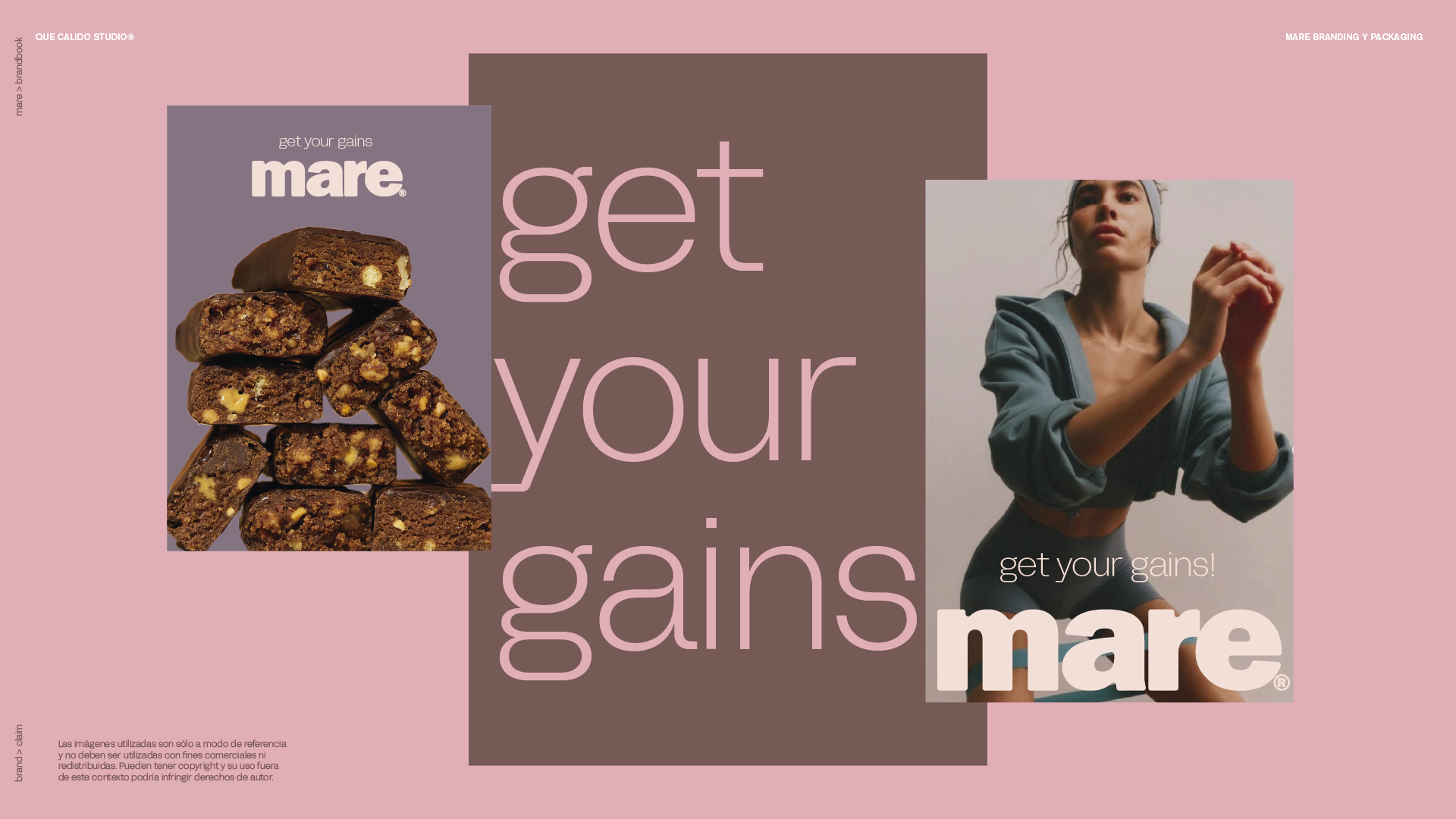
Mare is a protein snack brand created to challenge the visual codes of the sports nutrition category. While most protein products rely on aggressive aesthetics, technical language, and masculine cues, Mare embraces a softer and more contemporary approach.
Que Cálido Studio developed the brand identity and packaging system around the idea that performance and pleasure can coexist.A bold wordmark, simplified information hierarchy, and a carefully curated color palette create a brand that feels approachable, desirable, and easy to understand. The packaging moves away from the visual noise typically found in protein bars, prioritizing clarity and shelf impact through strong typography and distinctive color combinations. Each flavor is identified through its own color expression while maintaining a cohesive brand system.
The result is a protein brand that feels more like a lifestyle product than a supplement, inviting new audiences into the category through design that is confident, simple, and contemporary.


 monther al omari
 43oz
43oz Thirst
 Carreto Concepts Design Studio
 M&A CREATIVE AGENCY
 pastellofactory
 Omar Altayeb
 Cocoon Prague
 古戈品牌
古戈品牌 Pascal Riviere Design
 ZIMO Studio
 alchimistestudioParis
 Valérie Colace
 Platon Ivantsov
 Leyma Design
 Dina Gamal eldin
 clermentza
 Redlana
 anushrishah
 Natania Doshi
 NewFolderStudio
 francapovilla
 Mother Tongue Design
 CJMartins