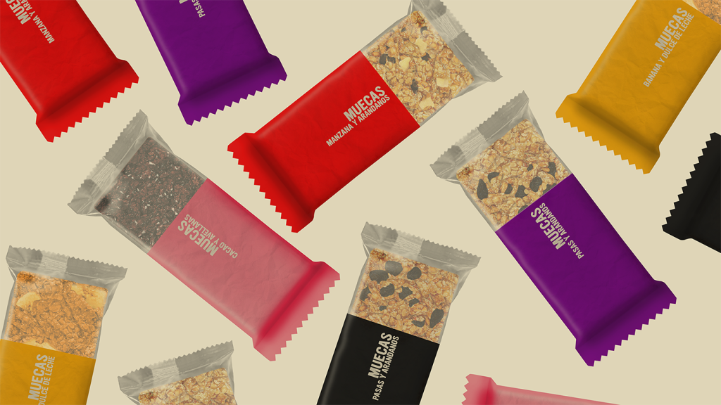

MÜECAS is a cereal bar brand created to redefine the visual language of healthy snacking.
Before MÜECAS, the category was largely dominated by handmade labels, muted colours, and artisanal aesthetics. Que Cálido Studio saw an opportunity to create a brand and packaging system that felt vibrant, contemporary, and accessible, helping healthy snacks move beyond a niche audience and become an everyday choice.
The project included brand strategy, visual identity, product design, packaging design, graphic design, editorial design, art direction, and content development.
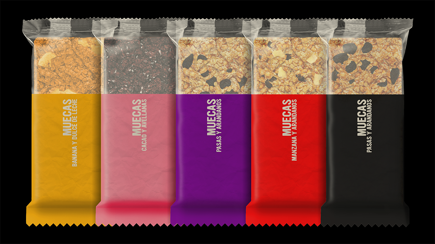
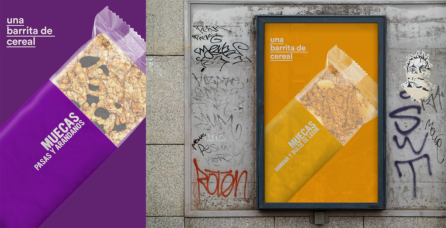
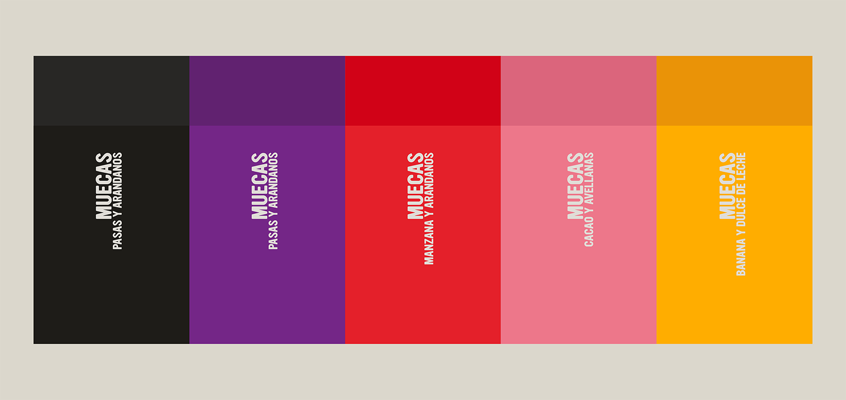
The concept was built around simplicity, transparency, and joy. Five bold colours help differentiate flavours, while ingredient-led graphics and a transparent window allow consumers to immediately understand what they’re buying and see the product inside. The system prioritises clarity, honesty, and shelf impact without relying on the visual codes traditionally associated with the health food category.
By combining a playful identity with a clear packaging architecture, MÜECAS transforms healthy eating into something approachable, optimistic, and easy to understand.
The result is a distinctive brand and packaging system that stands out on shelf, democratizes the healthy snack category, and offers consumers a more modern way to connect with nutritious food.
Que Cálido Studio is a branding and packaging design studio based in Buenos Aires, working with founders, startups, restaurants, food brands, and companies creating something new through brand strategy, visual identity, packaging design, storytelling, and art direction.

 monther al omari
 43oz
43oz Thirst
 Carreto Concepts Design Studio
 M&A CREATIVE AGENCY
 pastellofactory
 Omar Altayeb
 Cocoon Prague
 古戈品牌
古戈品牌 Pascal Riviere Design
 ZIMO Studio
 alchimistestudioParis
 Valérie Colace
 Platon Ivantsov
 Leyma Design
 Dina Gamal eldin
 clermentza
 Redlana
 anushrishah
 Natania Doshi
 NewFolderStudio
 francapovilla
 Mother Tongue Design
 CJMartins