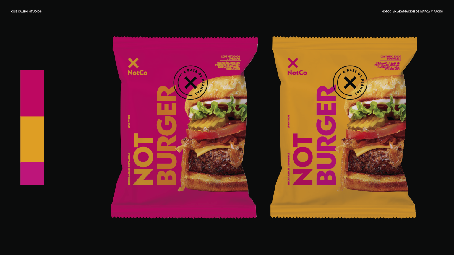

For its arrival in Mexico, NOTCO partnered with Que Cálido Studio to reinterpret its brand and packaging system for a new cultural context.
The challenge was to evolve a brand known for its minimal and functional aesthetic into something that could connect with the colour, energy, and expressive spirit of Mexican culture.
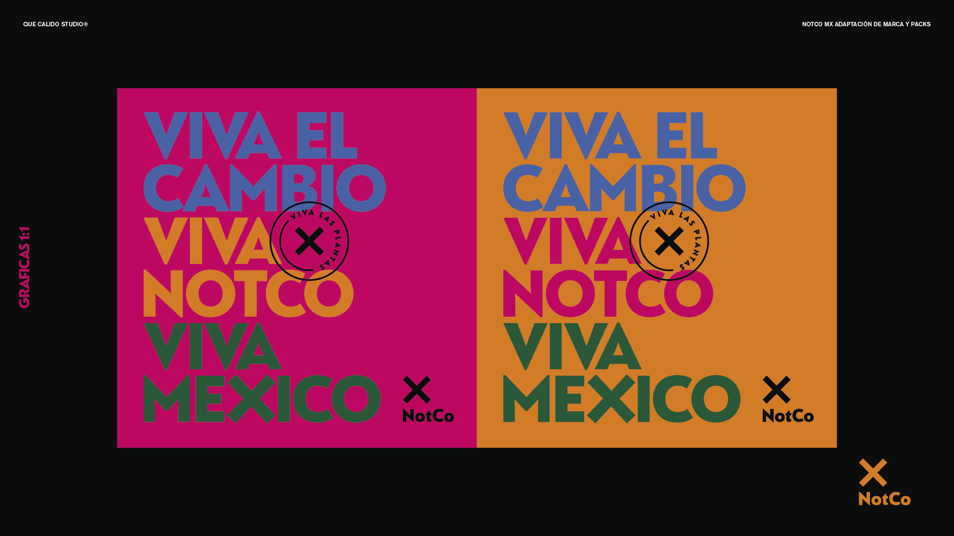
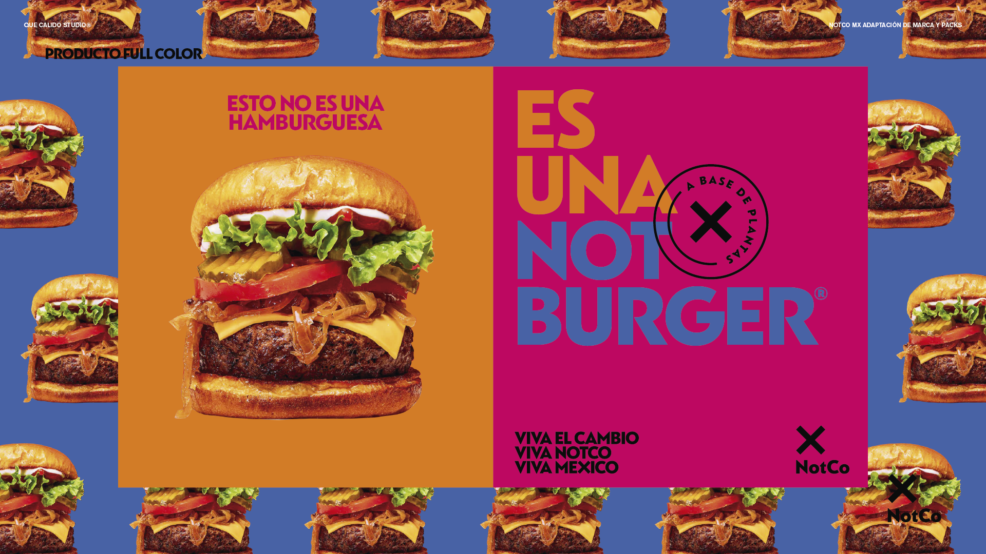
Built around the idea Viva el Cambio, the project celebrates transformation through bold colours, vibrant graphics, expressive typography, and packaging designed to feel joyful, approachable, and full of life.
Rather than simply adapting the brand, we sought to create a conversation between NOTCO and Mexico’s rich cultural identity, bringing more warmth, personality, and emotion to every product. The result is a packaging system that celebrates change while helping NOTCO connect with a new audience in a way that feels both authentic and unmistakably Mexican.
Que Cálido Studio is a branding and packaging design studio based in Buenos Aires, creating brands, packaging, and visual systems for food brands, restaurants, startups, and companies bringing new ideas into the world.

 monther al omari
 43oz
43oz Thirst
 Carreto Concepts Design Studio
 M&A CREATIVE AGENCY
 pastellofactory
 Omar Altayeb
 Cocoon Prague
 古戈品牌
古戈品牌 Pascal Riviere Design
 ZIMO Studio
 alchimistestudioParis
 Valérie Colace
 Platon Ivantsov
 Leyma Design
 Dina Gamal eldin
 clermentza
 Redlana
 anushrishah
 Natania Doshi
 NewFolderStudio
 francapovilla
 Mother Tongue Design
 CJMartins