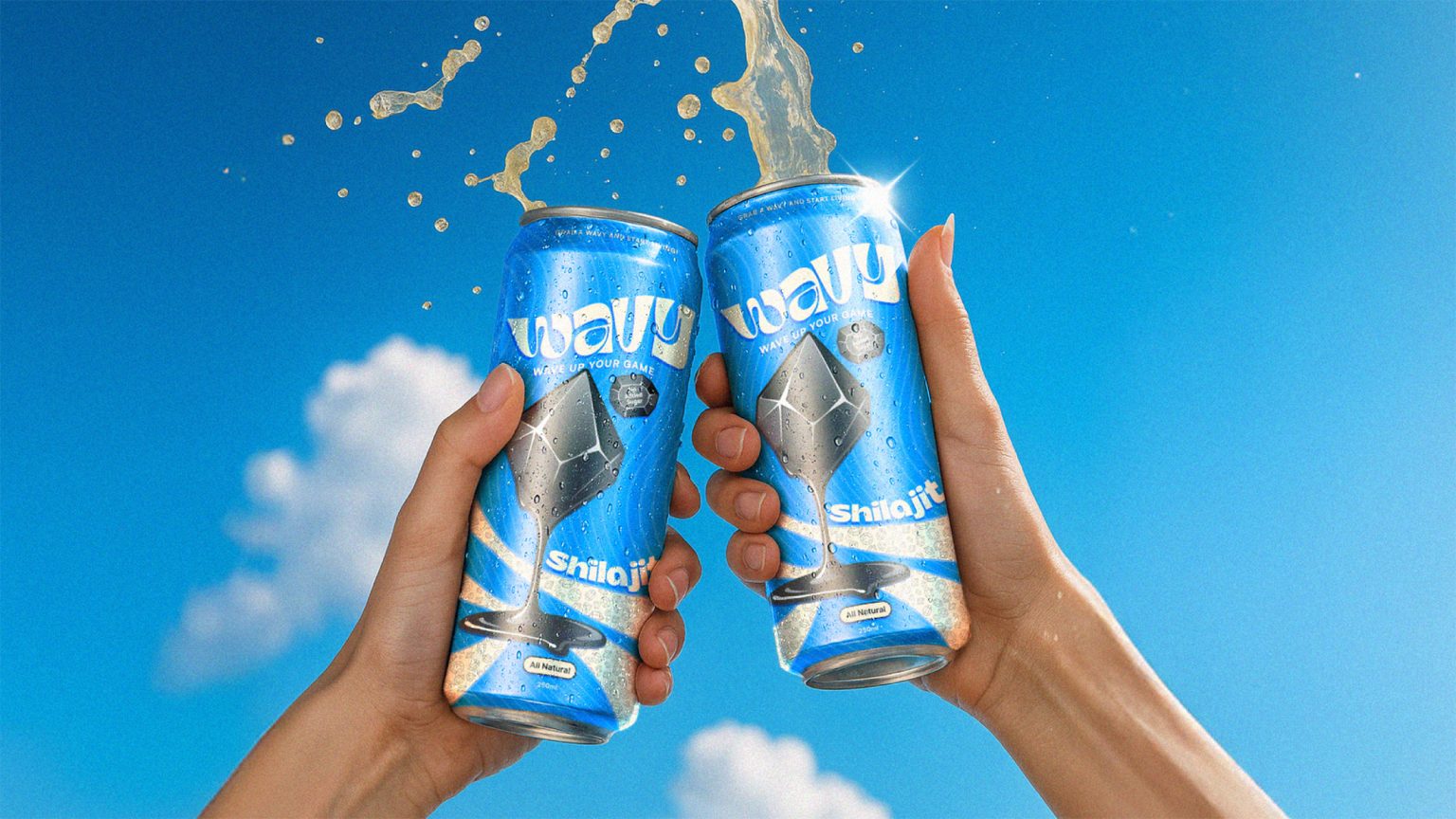
Client: WAVY is one of our most defining branding projects — where a beverage brand became a symbol of movement, balance, and raw vitality. Unlike traditional energy drinks that rely on aggressive, high-voltage aesthetics, we set out to create a brand that feels alive yet composed — luxurious yet kinetic.
We weren’t just designing a drink. We were designing a state of flow — a product that bridges natural energy and modern lifestyle through an identity that feels effortless, fluid, and premium.
Solution: The foundation of WAVY’s design lies in contrast — where calm meets charge. Inspired by the rhythmic flow of waves and the grounding power of Shilajit, we crafted a visual identity that celebrates motion without chaos.
The logo reflects this balance: the letterforms ripple with gentle energy, embodying movement while maintaining structural sophistication. Each curve and contour was meticulously crafted to symbolize fluid performance — much like the surge of focus and vitality the drink provides.
For the packaging, we imagined the can as a vessel of momentum. The base blue tone anchors the brand in calm energy, while the vibrant and dynamic logo brings vibrancy and attitude — creating visual motion even at rest. Every element, from the typography to the Afrobeat-inspired waves branding, is designed to make WAVY feel like a lifestyle, not just a beverage.
Result: The outcome is a brand that doesn’t shout energy — it flows with it. WAVY challenges the stereotypes of what an energy drink looks and feels like by introducing a new aesthetic of quiet power and sensory sophistication. It’s not just another can on the shelf — it’s a rhythm in your hand, a moment of motion in pause. With WAVY, we transformed a functional drink into a statement of identity — one that resonates with those who want to feel good, stay focused, and keep moving.


