Sova (“owl” in Russian) is a specialty coffee roaster. The company has been existing for seven years now — the time has come to update its customary image, find a new visual language and new narratives. We have shaped the semantic field of the Sova brand, updated its identity, packaging, and prepared the brand communication rules.
The Owl is a friendly expert. It tells about team skills and knowledge, the extensive experience of handling green beans and the roasting process, and a deep understanding of what each client needs. Nevertheless, being friendly means presenting oneself in a way different from the one most companies on the market choose, as they talk about their expertise with great snobbery. The Owl needs to be open, sincere, and simple not only in texts but in every visual image detail.
Name
The official brand name is OWL COFFEE. However, in real life, clients and colleagues called it just “Owl”, “Owls”, and “Coffee Owl”. Following the rebranding, the official and real names turned into one: SOVA, “owl” in Russian.
Studies have shown that the audience is not afraid of the Cyrillic name at all. Many people noted that, on the contrary, this is a bold move that would definitely distinguish the company from the environment filled with Latin letters, make the brand friendlier and closer to the consumer — exactly what is needed with a view to positioning.
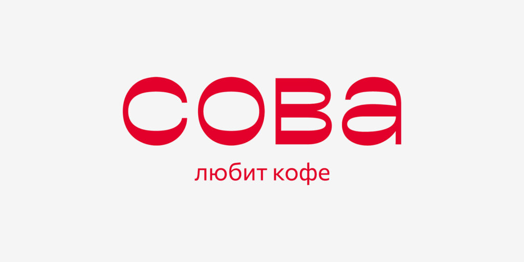
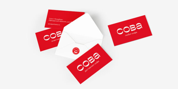
Logo
The logo is a Cyrillic inscription with an expressive “birdy” nature. The rounded shape of letters and the reverse contrast add a slight touch of Russianness and even fabulousness.
Slogan
To make the spelling unambiguously perceived as Cyrillic, it is complemented by a slogan written in Russian.
The main brand slogan is “The Owl loves coffee.” Both the action and the object in the middle of the slogan may change:
The Owl loves coffee.
The Owl loves tea. The Owl loves cocoa. The Owl loves chocolate.
The Owl knows coffee. The Owl understands coffee. The Owl delivers coffee.
The Owl makes coffee. The Owl makes good coffee.
Thus, the word “owl” becomes a part of a holistic statement: “owl + action + object or quality.” Right here, the slogan begins to develop and work in full force. It helps to introduce additional products and meanings, and clarify what can be found inside the package.
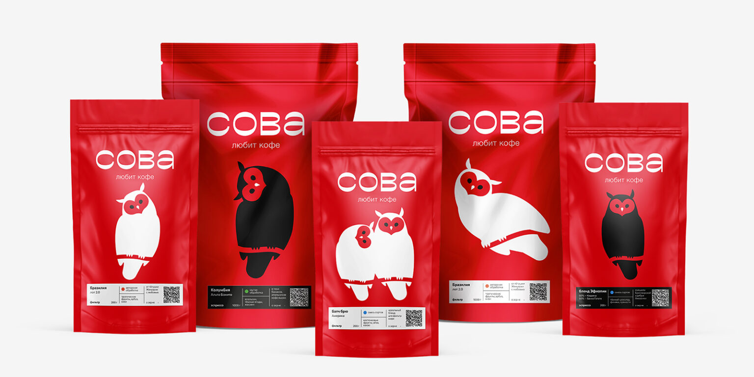
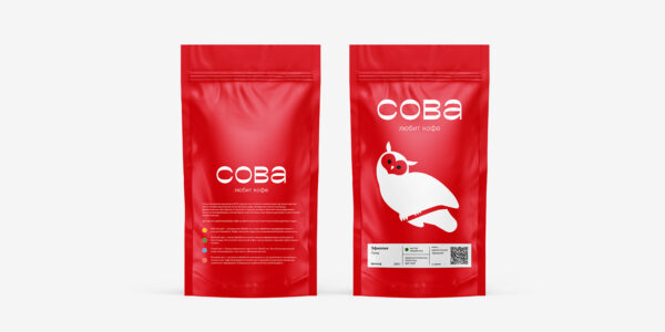
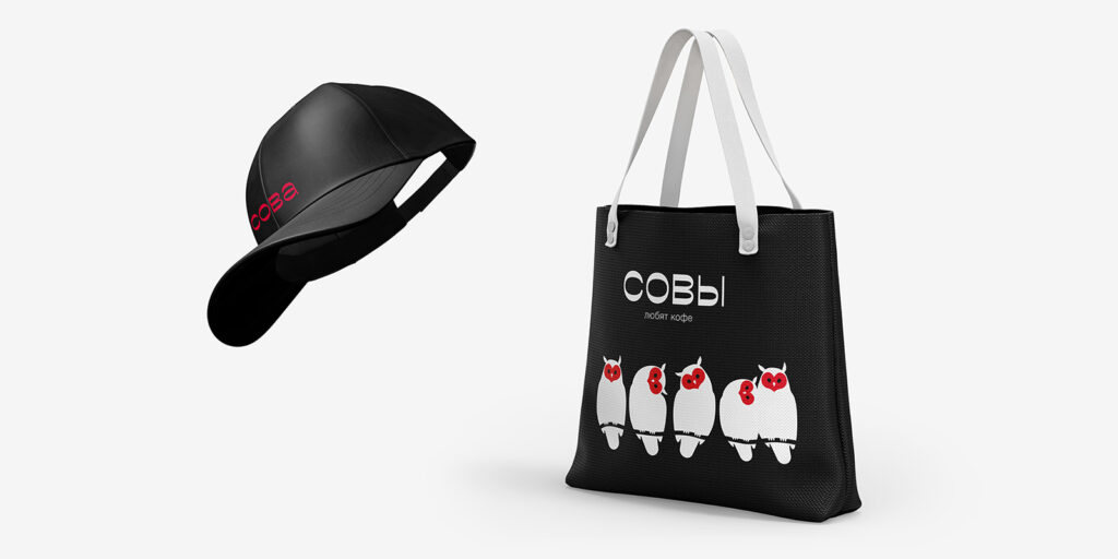
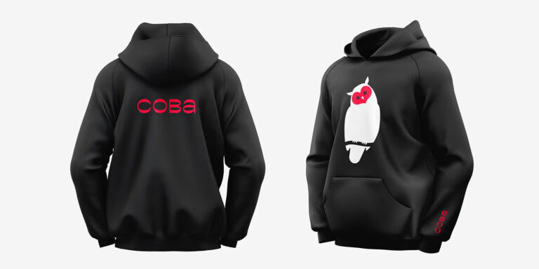
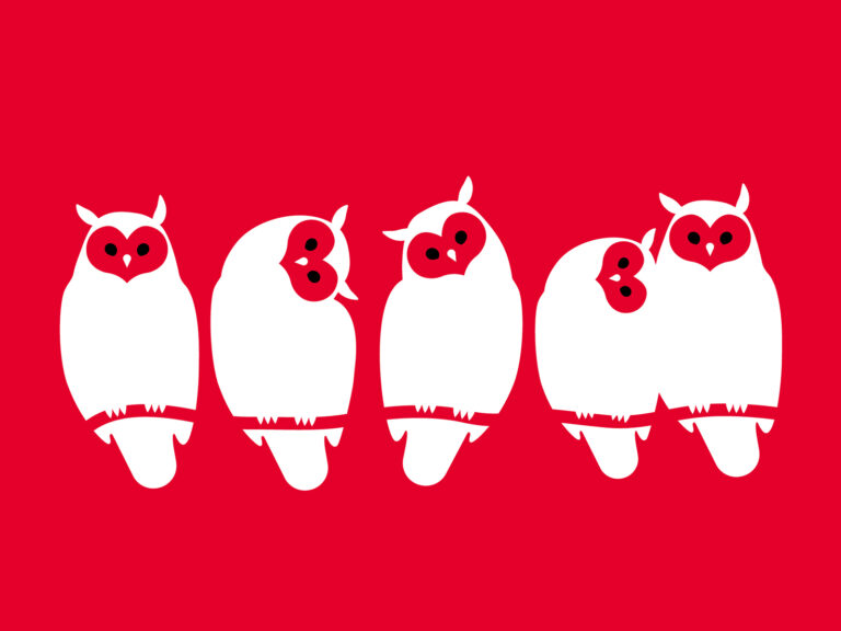
Character
The owl as a character is an important part of the already existing image. It is associated not just with the name and the pack but also with the team itself.
The style focuses on a dynamically changing character. It is easily integrated into different formats and different packages. It speaks to the audience, expresses emotions, and illustrates different sides of the brand’s nature.
Feathering on the owl’s head resembles a heart — this allows to emphasize the brand’s key message that is “The Owl loves coffee.”
A dynamic character is a convenient tool to implement continuous changes to the pack design and add something new while remaining within the framework of the single image.
Color
The vast majority of players on the coffee market use variations of black and white or variegated patterns in style. Few coffee companies can confidently say that they are strongly associated with a specific pure and bright shade: yellow, red, blue, or green. However, Sova does. This is an important advantage, so even after rebranding, the main corporate color of the completely updated brand remains scarlet.
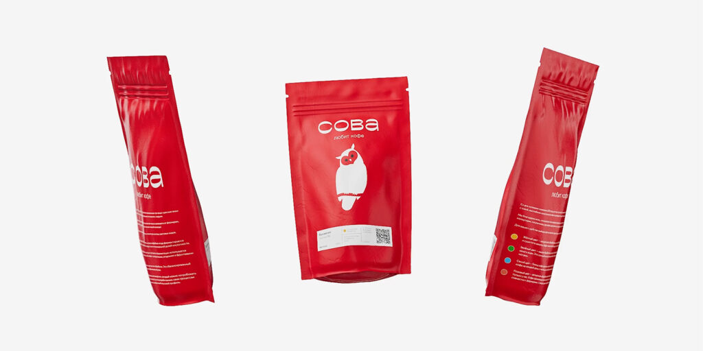
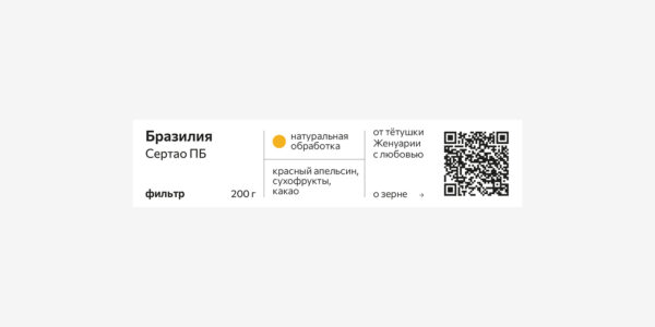
Stickers
Stickers are one of the key package elements. This is the point where the brand’s expertise should be as friendly as possible — simple and understandable wording, navigation, and a clear layout structure.
With black stickers for espresso and white for filter coffee, the color indicates the processing type. An ironic comment near the QR code compensates for the restrained design.
The coffee category (filter coffee or espresso) is determined not only by the sticker color but also by the color of the owl.
The brand’s new image is already working: bright owl packs are seen on the shelves in coffee shops and coffee lovers’ kitchens, and the corporate identity is present everywhere, just like the Owl itself: Instagram, Facebook, website.