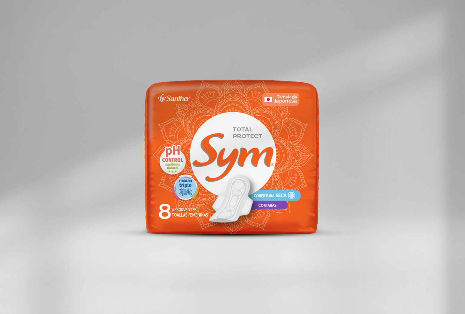
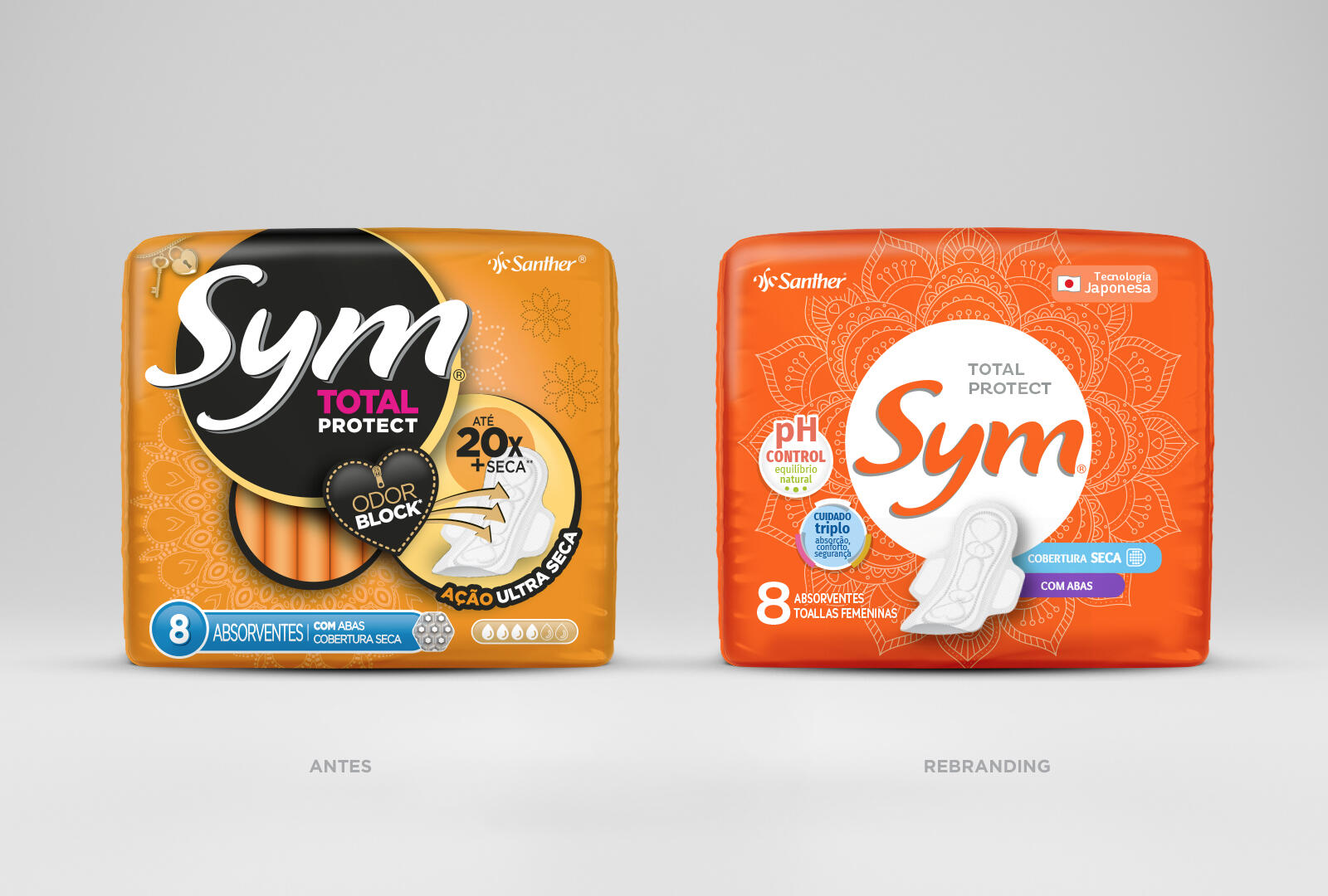
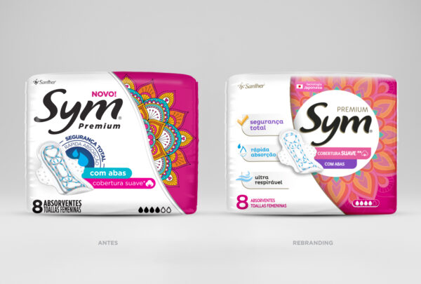
Santher has a solid leadership in the market for home products and personal care and has decided to modernize its Sym brand through a redesign of its packaging, thus adapting it to a new positioning.
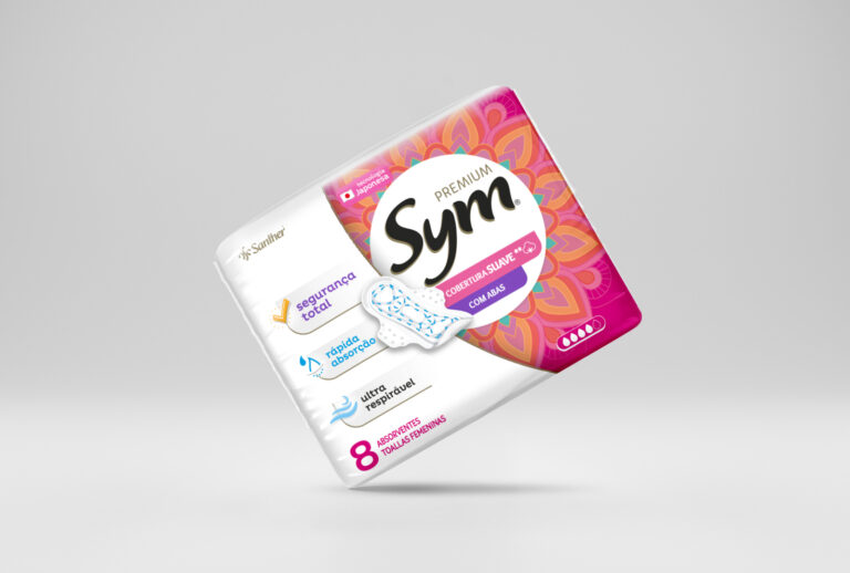
The goal was to bring more lightness and modernity to the graphic language of the mainline line and the premium line.
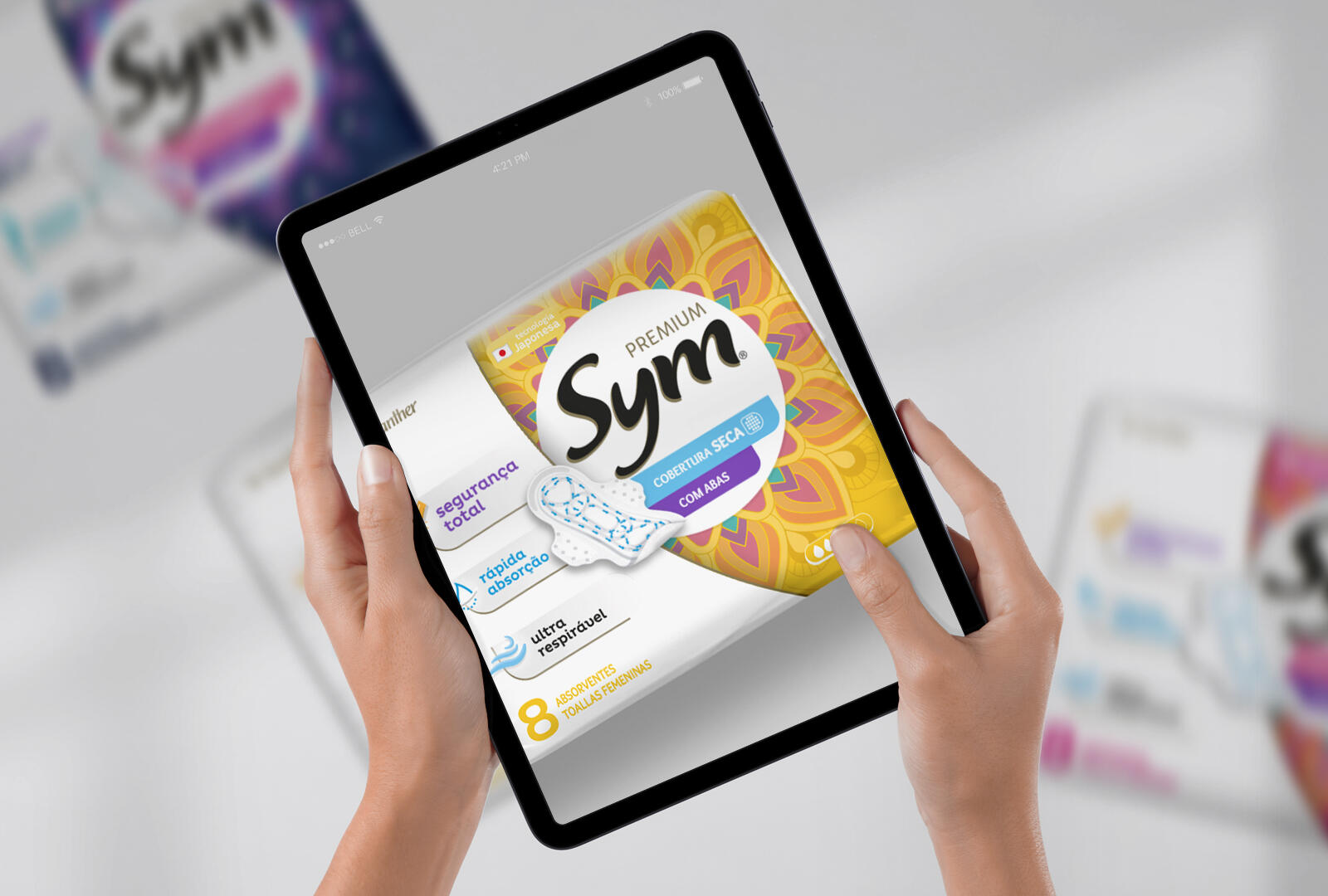
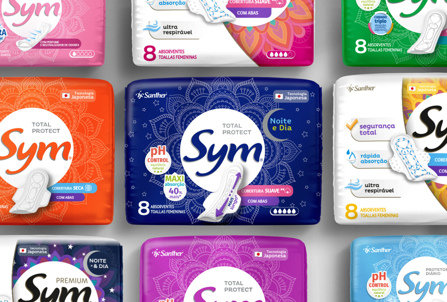
The Taba team worked to create a new visual identity that represented the brand in a current and attractive way for the target audience of young users. This included a review of graphic elements such as typography, colors and use of images. Claims, fundamental elements in this product category, received special care as they have to be very educational and direct to help the consumer choose the right product.
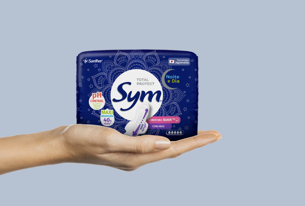
The result was a contemporary and elegant redesign that reflects the quality of the products offered by the brand. The new visual identity conveys the idea of modernity and innovation and helped to highlight Sym as a brand with a strong presence in the sanitary pad market.
The premium line received a more refined and sophisticated design, while the mainline line was updated with a more friendly and attractive visual.
The new visual identity conveyed the message of modernity and quality and helped to attract the attention of new consumers to Sym products, as well as preserving the current audience.