Design: Diferente
Photography: Roc Canals
Location: Spain
Project Type: Produced
Client: Terral
Product Launch Location: Spain
Packaging Contents: Wine
Packaging Substrate / Materials: Amber Glass Bottle
Printing Process: Offset and Debossing Printing
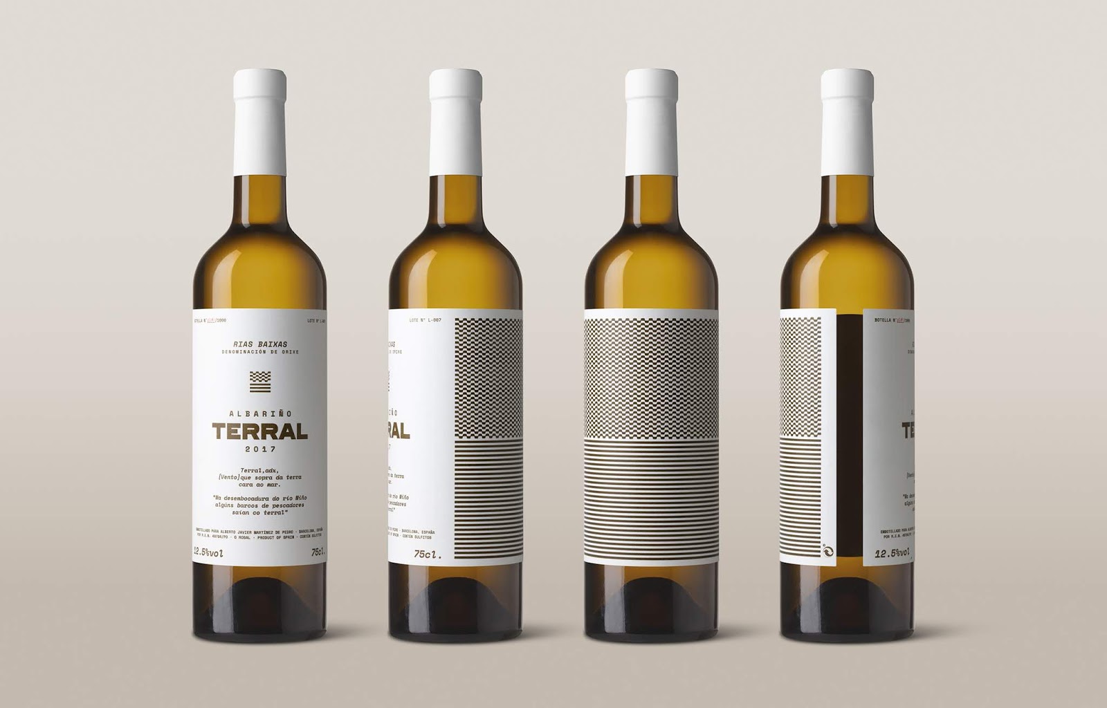
Terral is the first wine produced by a small family winery located in O Rosal, a town in Galicia characterized by its vineyards in the mountains around the Minho River and the Atlantic Ocean.
With the challenge of giving life to this high-quality white wine, this winery commissioned Diferente to create the visual and verbal identity of its product, of which there will only be one thousand bottles available in each harvest.
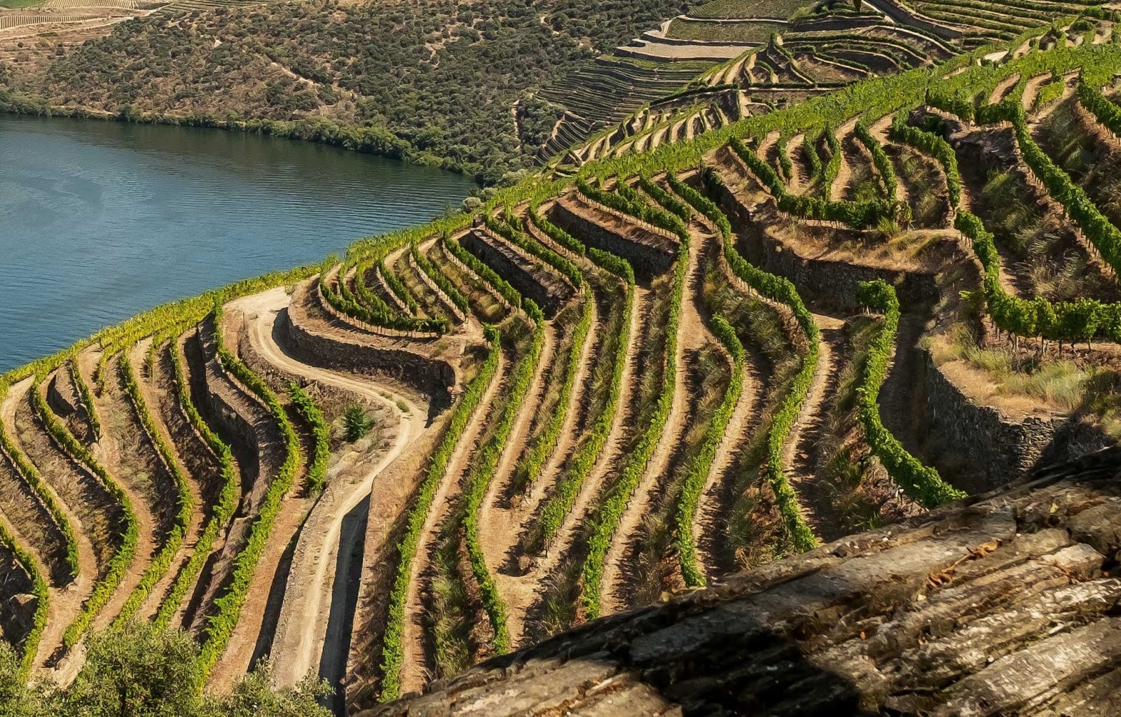
To conceptualize the fresh and earthy essence of the wine, the Galician word “Terral” is adopted as the name for the brand, an adjective that has the meaning “[wind] that blows the soil facing the sea”. This term and its description are taken as a starting point to represent the narrative and the identity system of the wine, visualizing a symbiosis between the soil, the wind and the sea.
In addition, in the region it’s said that “at the mouth of the Minho River some fishermen’s boats set sail with the Terral”, this native saying is present in the bottle to invite you to taste the wine, start a new trip, live an experience.

What’s Unique?
The label designed for Terral stands out for its minimalism, amber color of the bottle and a debossed pattern that remembers the winery landscape, adding a sensory detail that surprises the touch when serving the first glass.