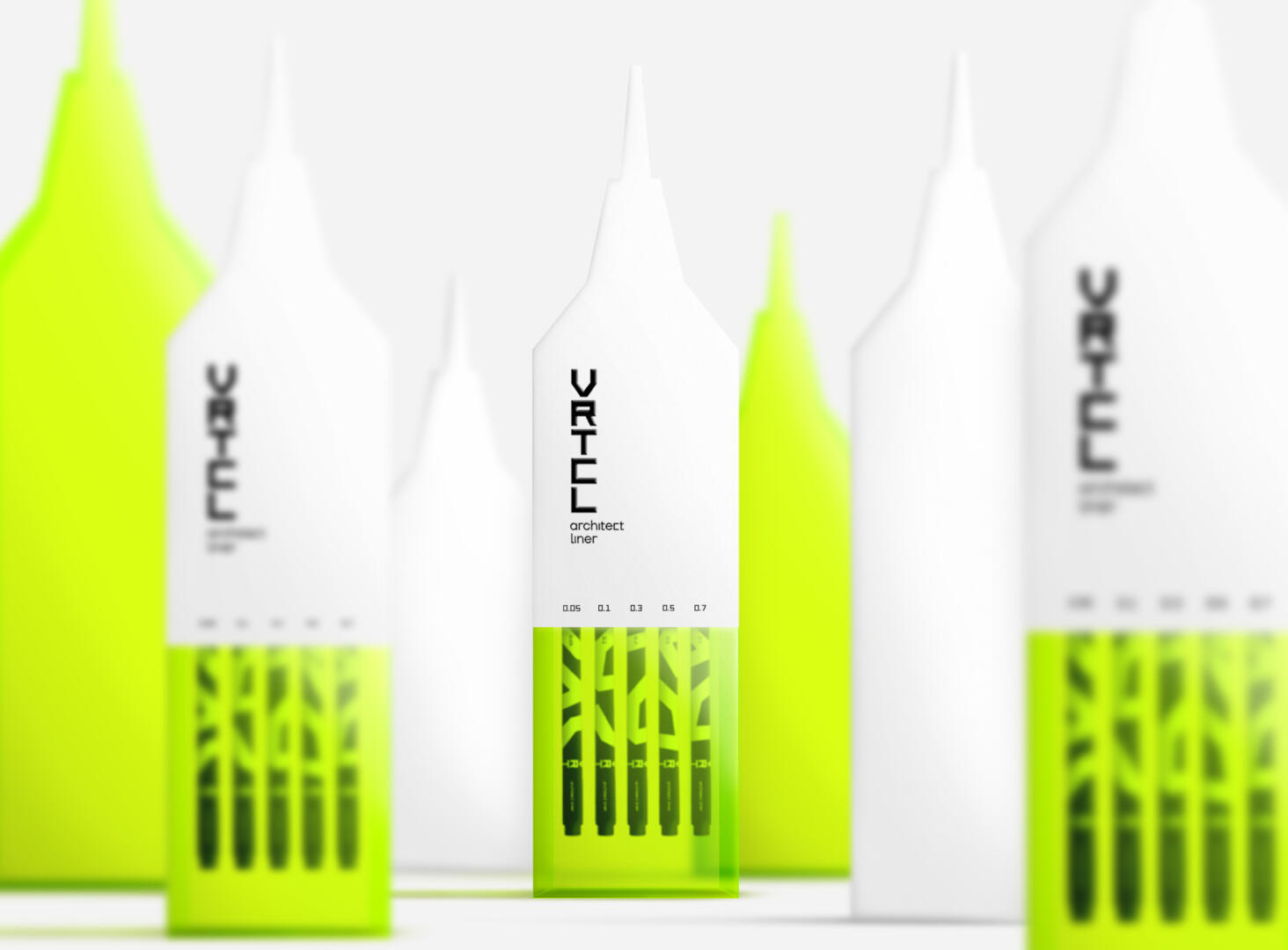
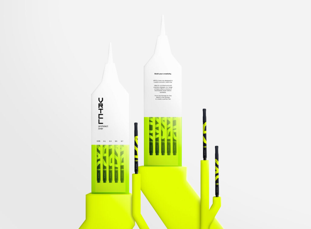
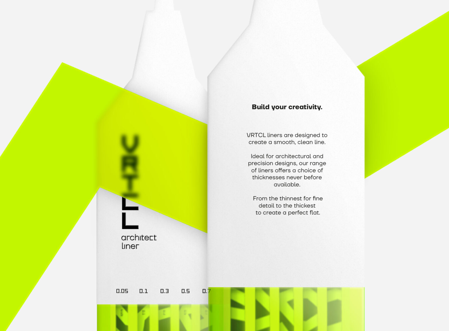
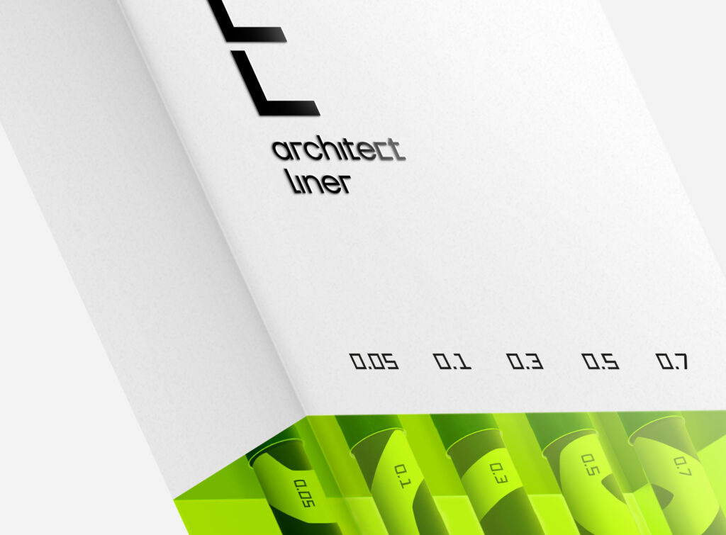
The verticality of skyscrapers sometimes makes us dizzy and the straight, very geometric lines typical of American buildings fascinate us. These characteristics inspired me to create the typography of VRTCL. The evocative name and the layout of the text evoke the verticality of our cities. This brand of liners for architects uses these aspects to communicate in a simple way. The vertical letters VRTCL are obvious and the baseline “architect liner” gives rhythm to the logotype. The fluorescent green color brings light. Essential in architecture, light is omnipresent in skyscrapers, hence the choice of this color. VRTCL liners allow architects to imagine ever higher buildings.
In this packaging, opacity and transparency complement each other to create a contrasting and homogeneous whole. The box takes the archetypal shape of skyscrapers while mixing the lead of the VRTCL liners. The plexiglass allows the liners to show through to accentuate the verticality of the packaging. They also evoke the facades of American buildings, very geometric and ordered. As the opening is from the top, the verticality is once again suggested. The liners are printed with a motif taken from the typography of the logotype. The light is very present with the bright white and the tinted plexiglass. The bright fluorescent green contrasts perfectly with the deep black. VRTCL’s packaging conveys a rather minimalist and very bright conception of architecture.