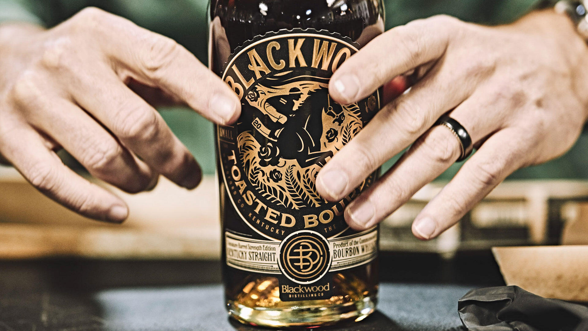
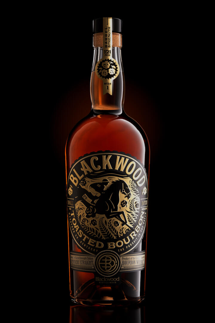
Inspired by their brand foundation, identity and local history, the packaging was meticulously crafted to introduce Blackwood Distilling’s Toasted Bourbon. (Guinness’ Blackwood Stables’ Thoroughbred, Country House (#20) won the Kentucky Derby and his farm is located in Thoroughbred Alley in Woodford County, Kentucky – the catalyst for the new distillery.)
“Much of this brand’s creation has been very personal and directly linked to the lifestyle and love of some of Kentucky’s oldest traditions, horse racing and bourbon. There is a tenacity and grit inherent to both industries. We believe we captured that essence in Blackwood’s tagline ‘The Pursuit is the Dream”. We wanted to elevate and celebrate world class design with Blackwood’s first barrel strength release, as a true trophy of spirits and brand.” Neltner shares.
The packaging reflects a refined elegance that is rich in texture. The use of gold tones seemed only fitting as representation of the brand, complimented in strength with black. The label is a balance of striking visual storytelling with layers of delicate intricacies. The original illustration is one of precision that captures the Thoroughbred’s inherent beauty and forward motion. All emphasized through an exquisite use of varnishes and embossing.
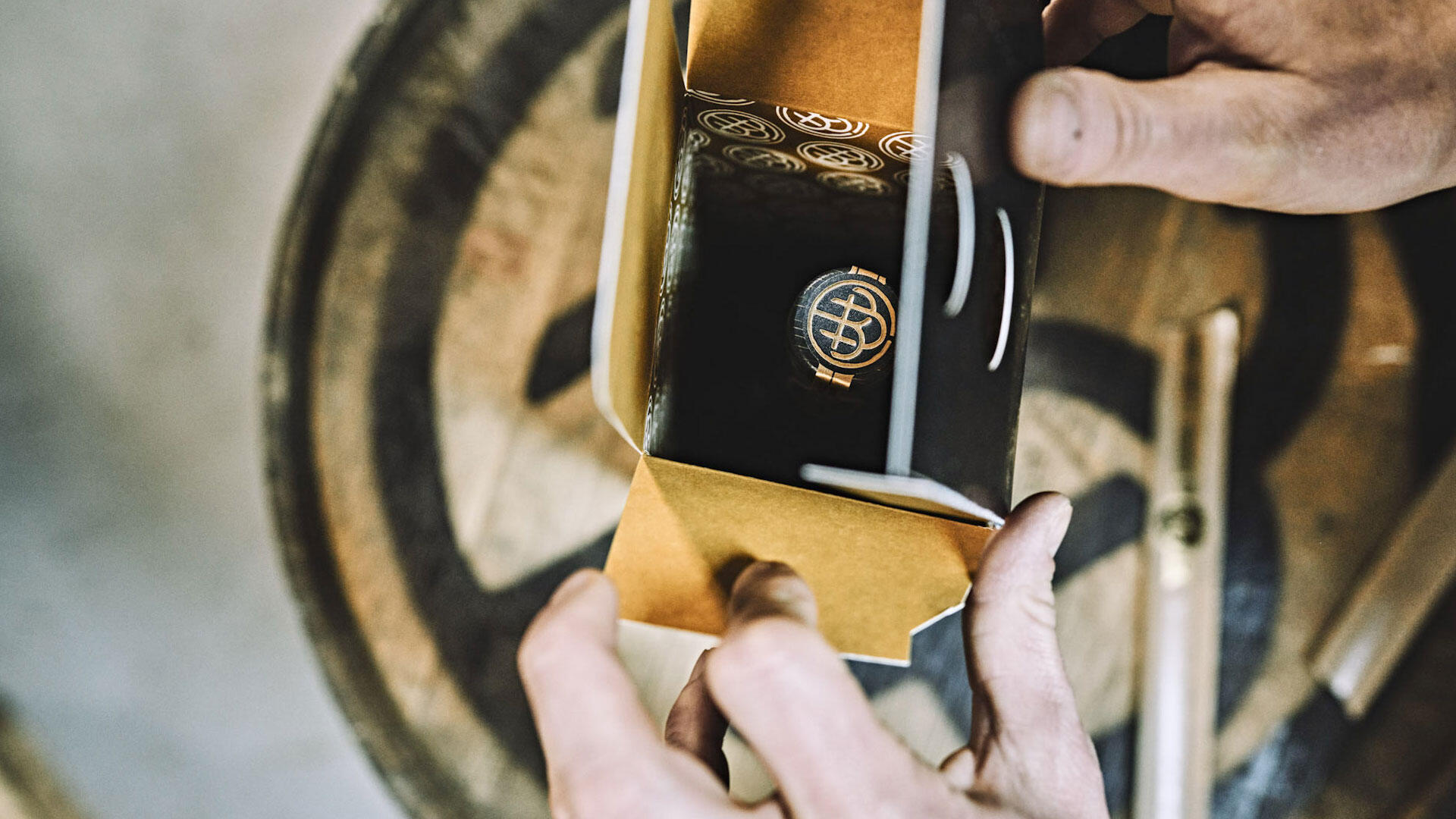
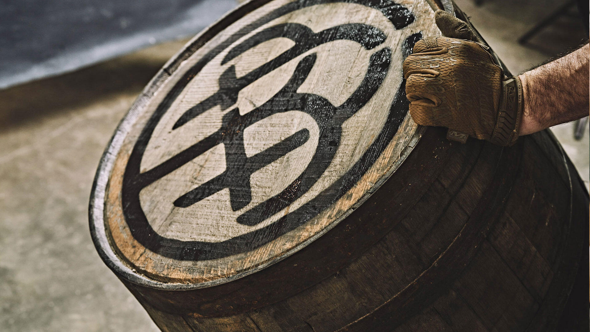
The product experience is further heightened with a custom box, showcasing varnishes that delight the visual and textural senses. Stunning details allow for the unveiling of the bottle. Neltner’s layered and detailed branding also includes a Blackwood merchant’s mark (a modern take on an ancient artisan marking to authenticate their brand in early blacksmithing) that crowns the bottle top.