Orgari is a Vietnamese company providing organic rice for domestic and international markets. They concentrate on developing and distributing organic rice that benefits customers’ health, boosts metabolism, and enhances their physical and mental well-being.
The name ‘Orgari’ comes from the full phrase ‘organic rice’ which is their main product for smart customers at an affordable price. Their mission is to provide rice produced from traditional rice farming under a closed process without using pesticides and chemical fertilizers. Furthermore, they are making efforts with determination to open new potential for the domestic and global food industry.
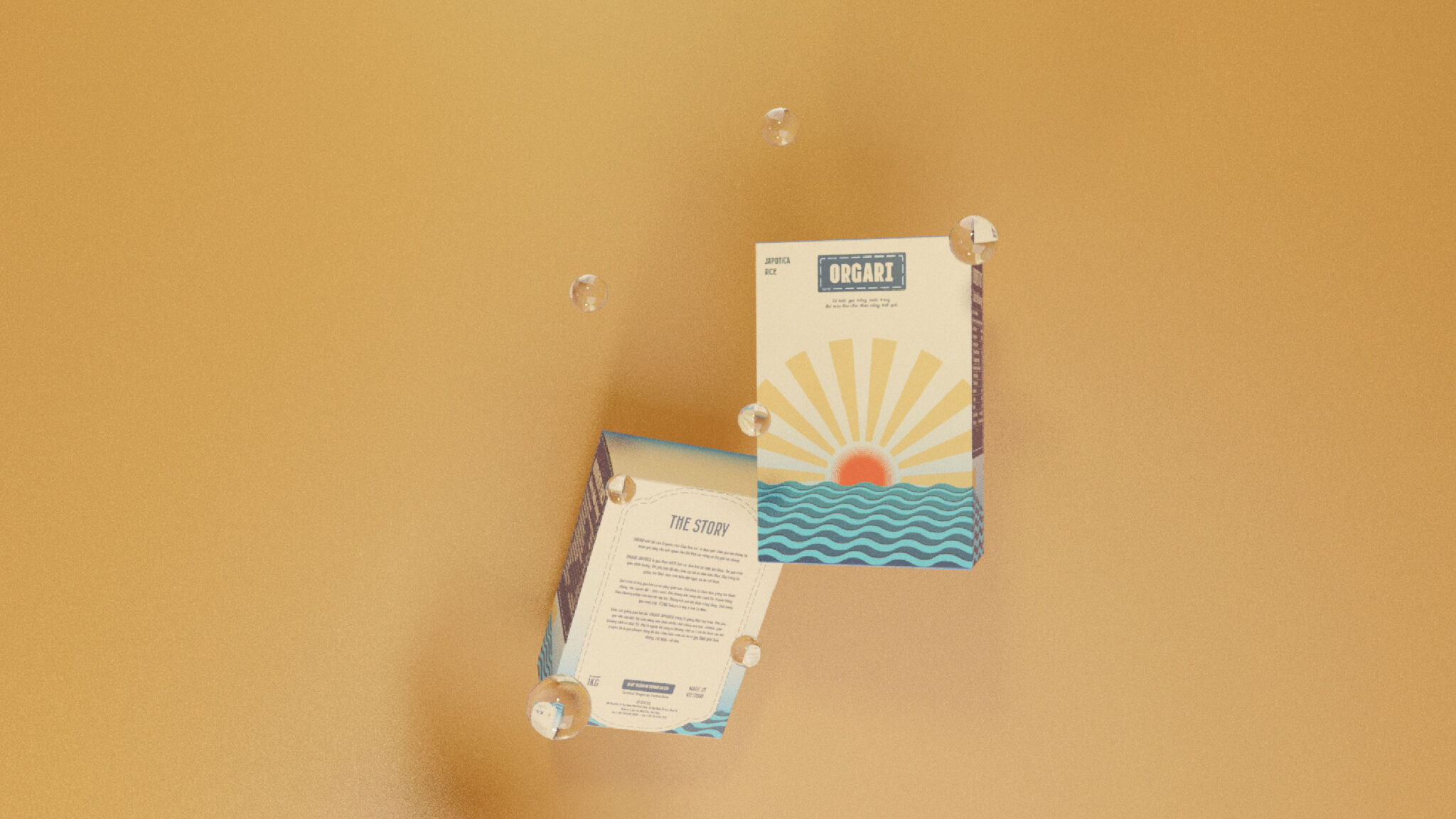
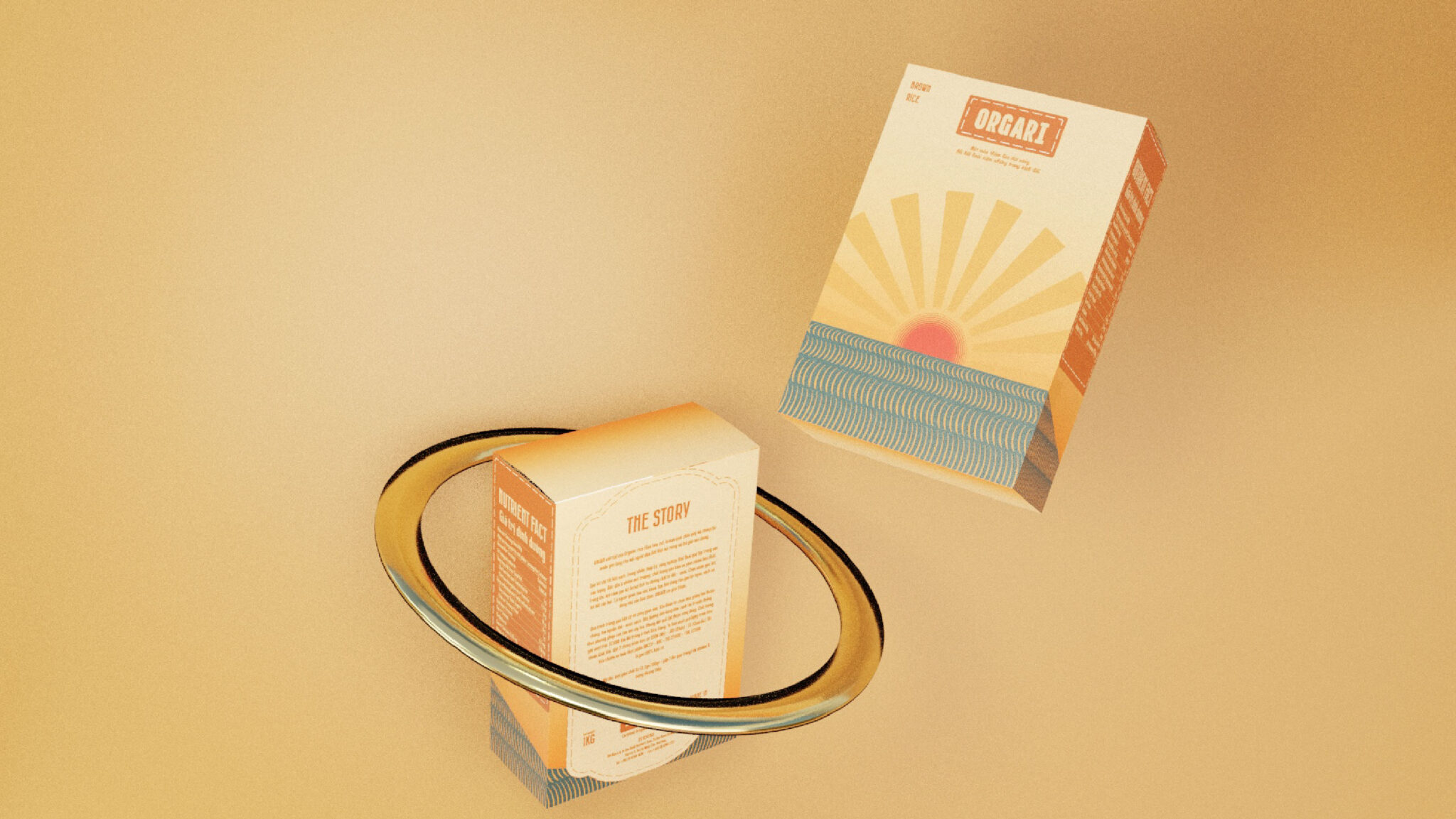
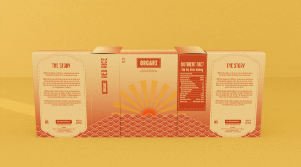
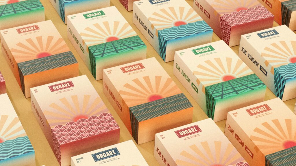
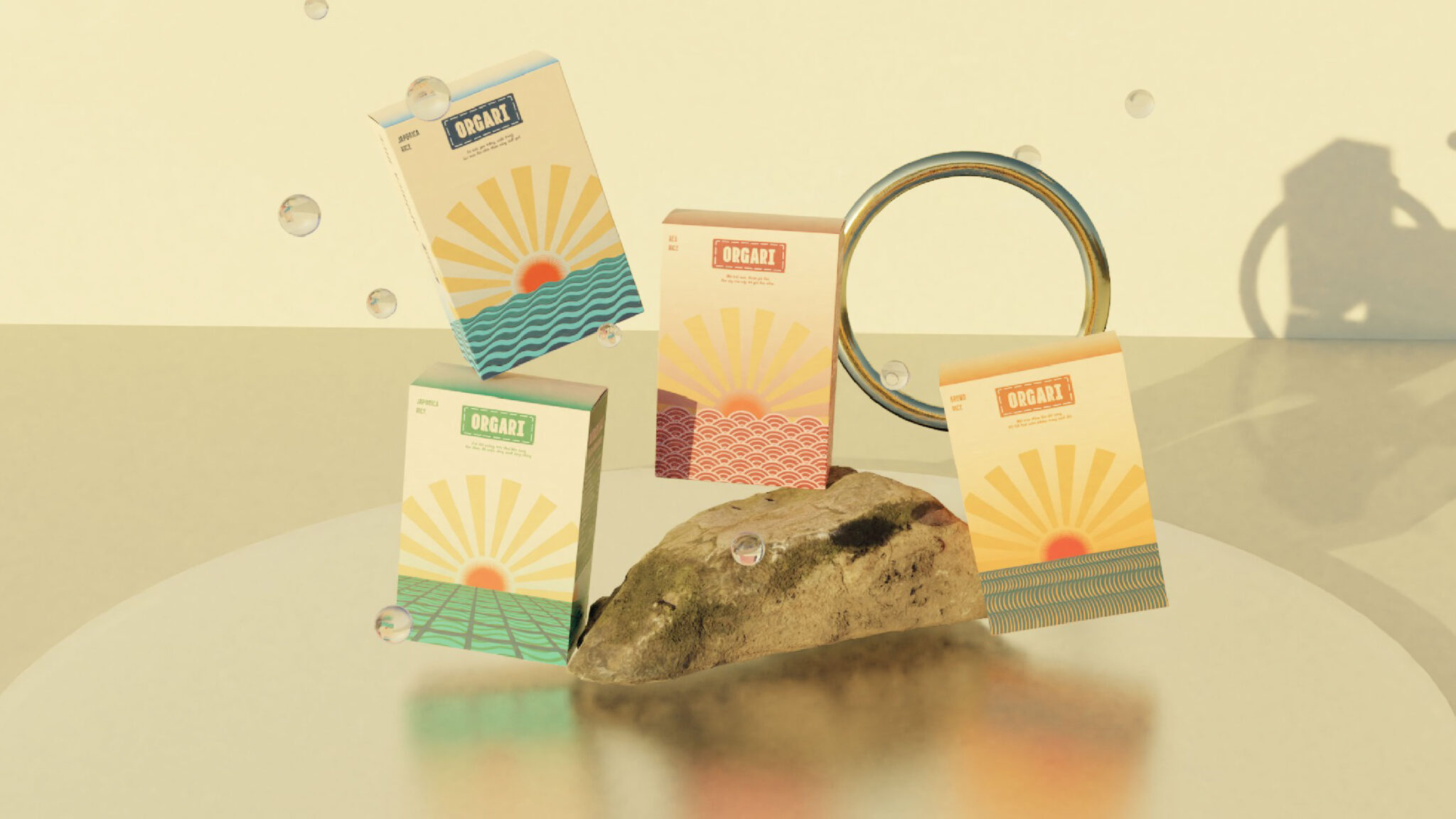
The logo of Orgari is greatly inspired by the sun, one of the most popular symbols in the culture of rice-farming societies. Besides, the logotype has a sense of thickness to illustrate the abundance and prosperity of the rice culture.
The colors are inspired by 4 main factors in rice production, namely soil, water, rice, and clouds (as weather). The colors bring a sense of affluence and optimism to customers.
Inspired by The Four Seasons, a famous set of paintings in Vietnam’s culture, I created 4 packagings presenting 4 main factors in rice production (soil, water, rice, and clouds), which are associated with 4 kinds of Orgari rice products, including Jasmine Rice, Japonica Rice, Red Rice, and Brown Rice.