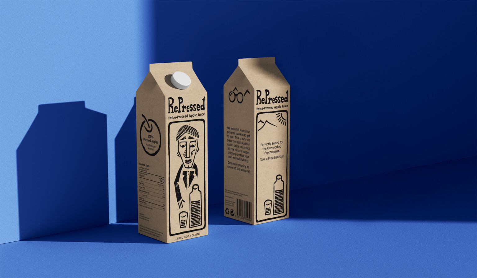
This Shillington brief was concise and unusual: I had to design the identity and packaging for a type of juice targeted specifically at psychologists.
I chose to play with the stereotypical figure of a sophisticated and cynical psychologist that is a bit too affected by their patients’ neuroses. Juice could help them feel better! I looked for inspiration in the era of the beginnings of psychoanalysis in Europe in the 1920’s. I came up with a story about Freud discovering the protective powers of apple juice, and about the company discovering recently that pressing the apples twice makes the treatment all the more efficient. Hence the name, RePressed, which refers to both the process and the feelings the juice protects you from. A few topical puns help convey this somewhat bittersweet tone of voice.
I used this opportunity to make bespoke linocut prints. Raw monochrome prints were the perfect fit for the atmosphere I was aiming for. The main print represents an old-fashioned psychologist reaching for juice. The brand name is an intentionally rough linocut of a serif typeface. The other linocuts are supporting graphic elements. The main features of this work being the illustrations and the tone of voice, the rest is toned down: ink on kraft paper for the colors and textures, and a humanist sans serif typeface, Parisine. The fruit crate and the two Instagram stories also showcase the brand identity.

