Which one do you like?
Honey is a competitive product, in terms of price and quality!
In designing this product, it was designed to be sold in the most economical way.
what does it mean?
That is, try to design at the lowest cost of packaging and printing, but at first glance it is clear that this product is honey.
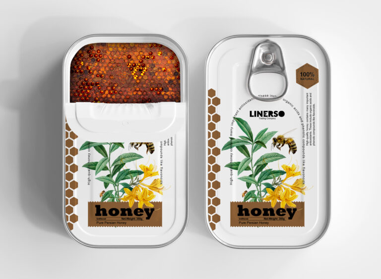
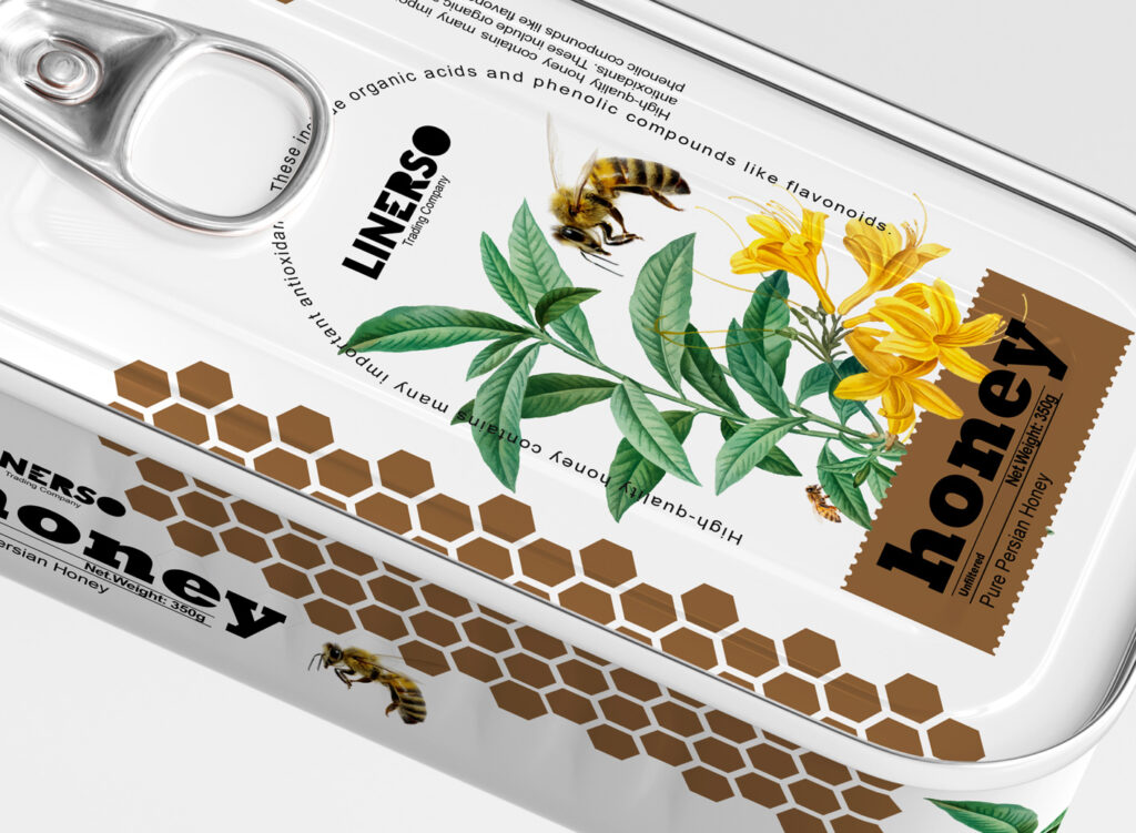
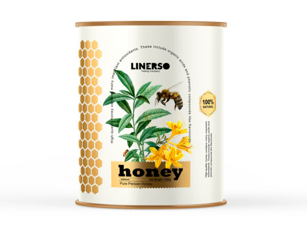
We considered the platform to reduce the cost of metal cans with easy-opening doors.
So it had to be designed based on this platform, and in the most economical way cost on the label, So in the first step, no print effects should be used and it should be completely flat and 2D.
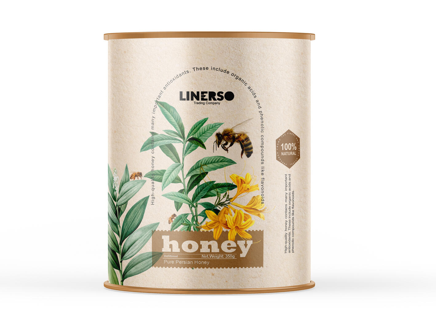
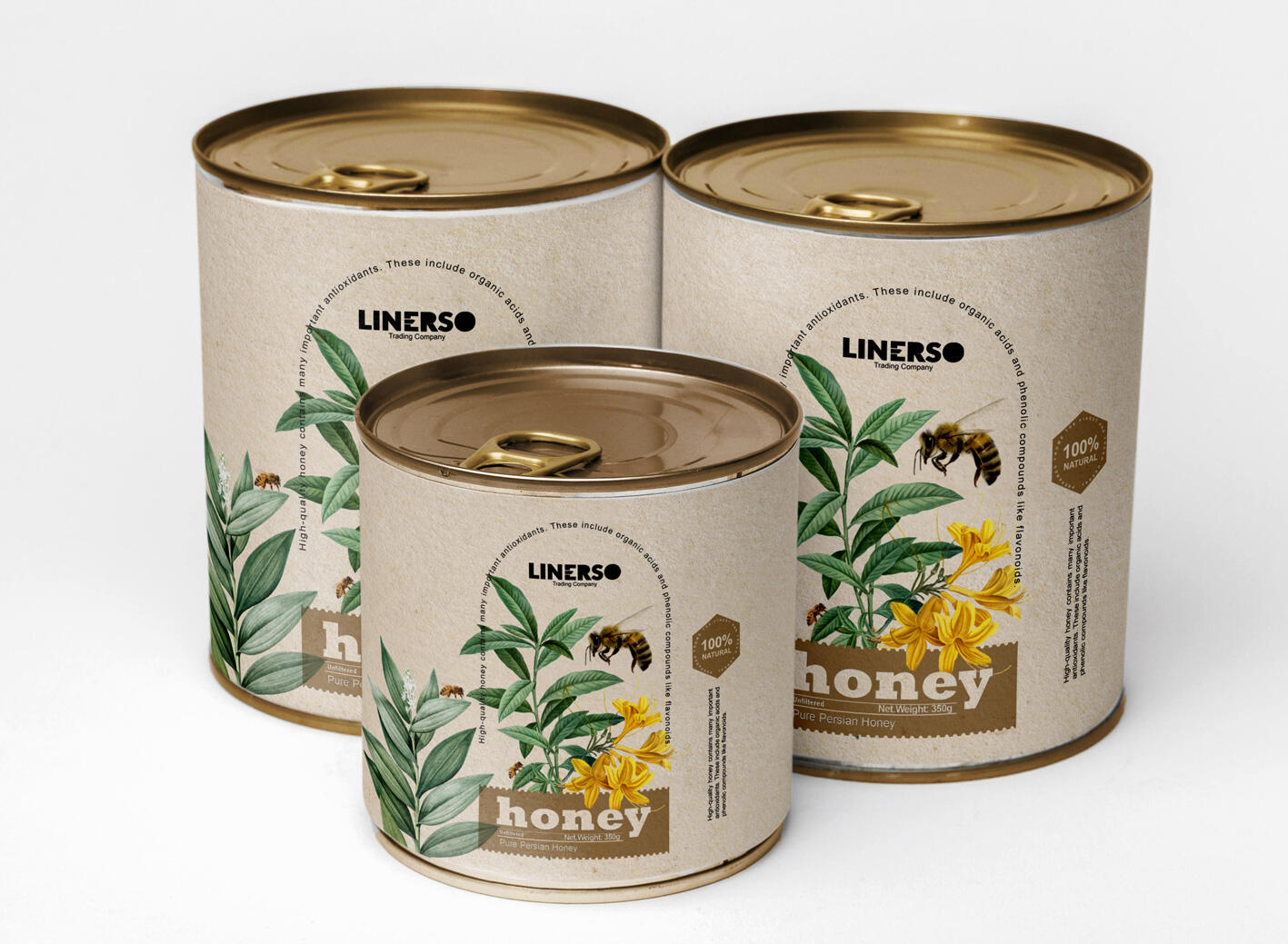
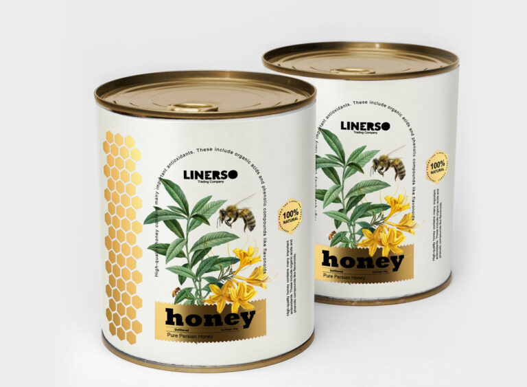
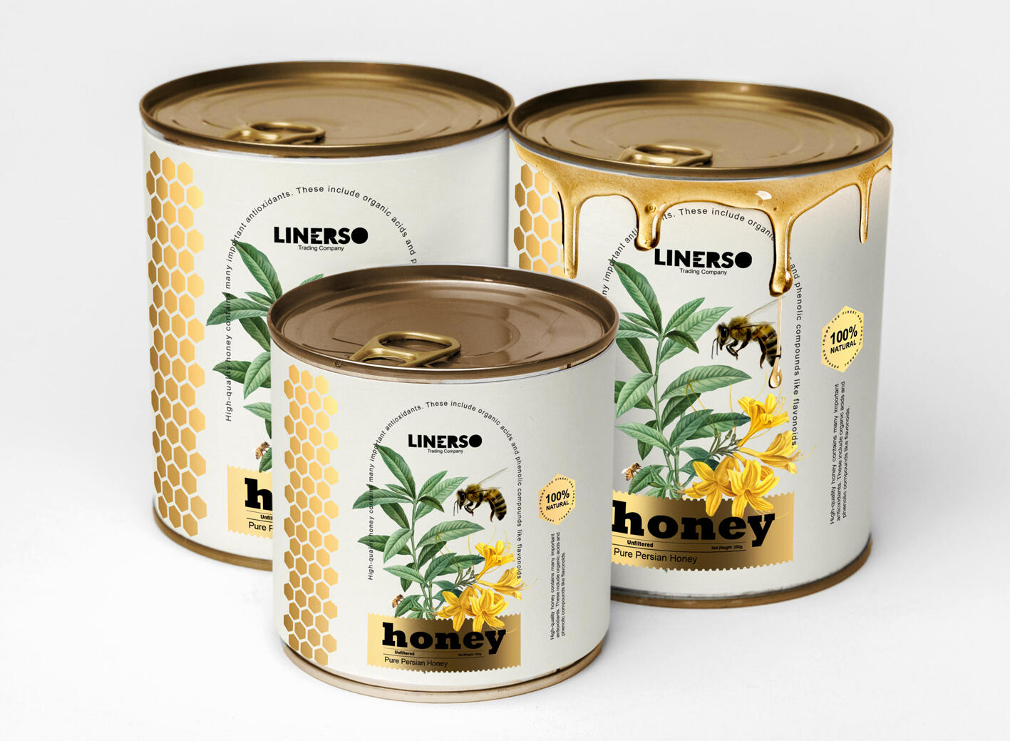
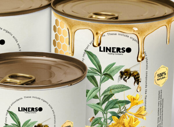
And most importantly, at first glance, not only should it be visually appealing, but it should be clear that this product is honey, the use of large bee elements, the use of hexagonal beehives next to the label, flowers for more communication. The customer is used with being organic and conveying a good feeling to the viewer.
Designed for more choice client in two types of paper labels and kraft for every type of customer taste!
Which one do you like?