Affinity, Europe’s third-largest pet food retail player, commissioned us to relaunch its super-premium brand: Ultima. Our challenge was to renew the brand image, improving its recognition and shoppability, through a better structure of the messages; and to improve Ultima’s branding, providing it with differentiation and uniqueness, taking into account that it often presented a brand identification problem (due to its common meaning in Spanish).
In this sense, we set different priorities to work on. On the one hand, the definition of a clear, more friendly and impactful branding for Ultima to be identified as a brand.
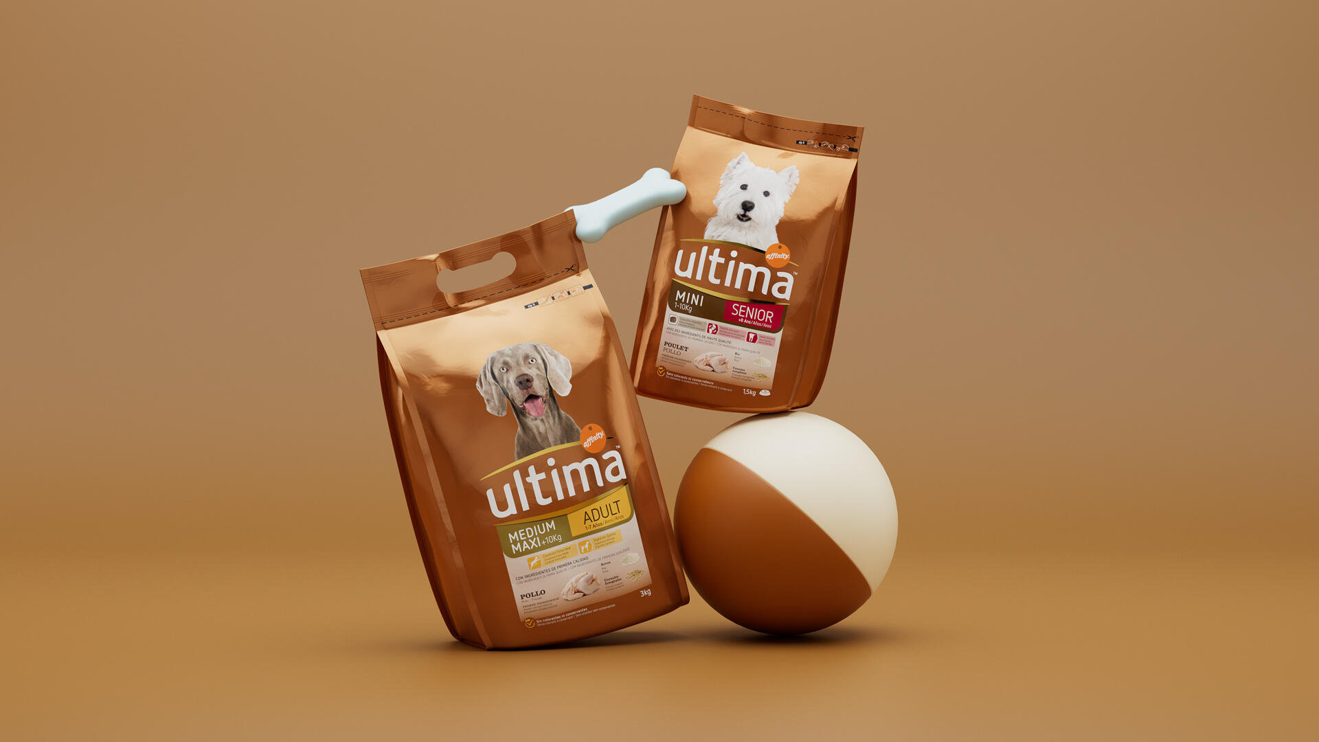
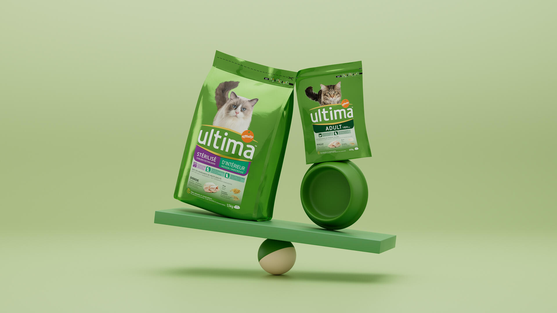
On the other hand, the redefinition of the presence of animals on the pack (the dog’s direct look and the cat’s accomplice body language) with the aim of improving the emotional bonding between the consumer and their pet. We focused on presenting the ingredients in the most honest, natural and appetising way possible, while maintaining a self-explanatory discourse for a premium retail pack.
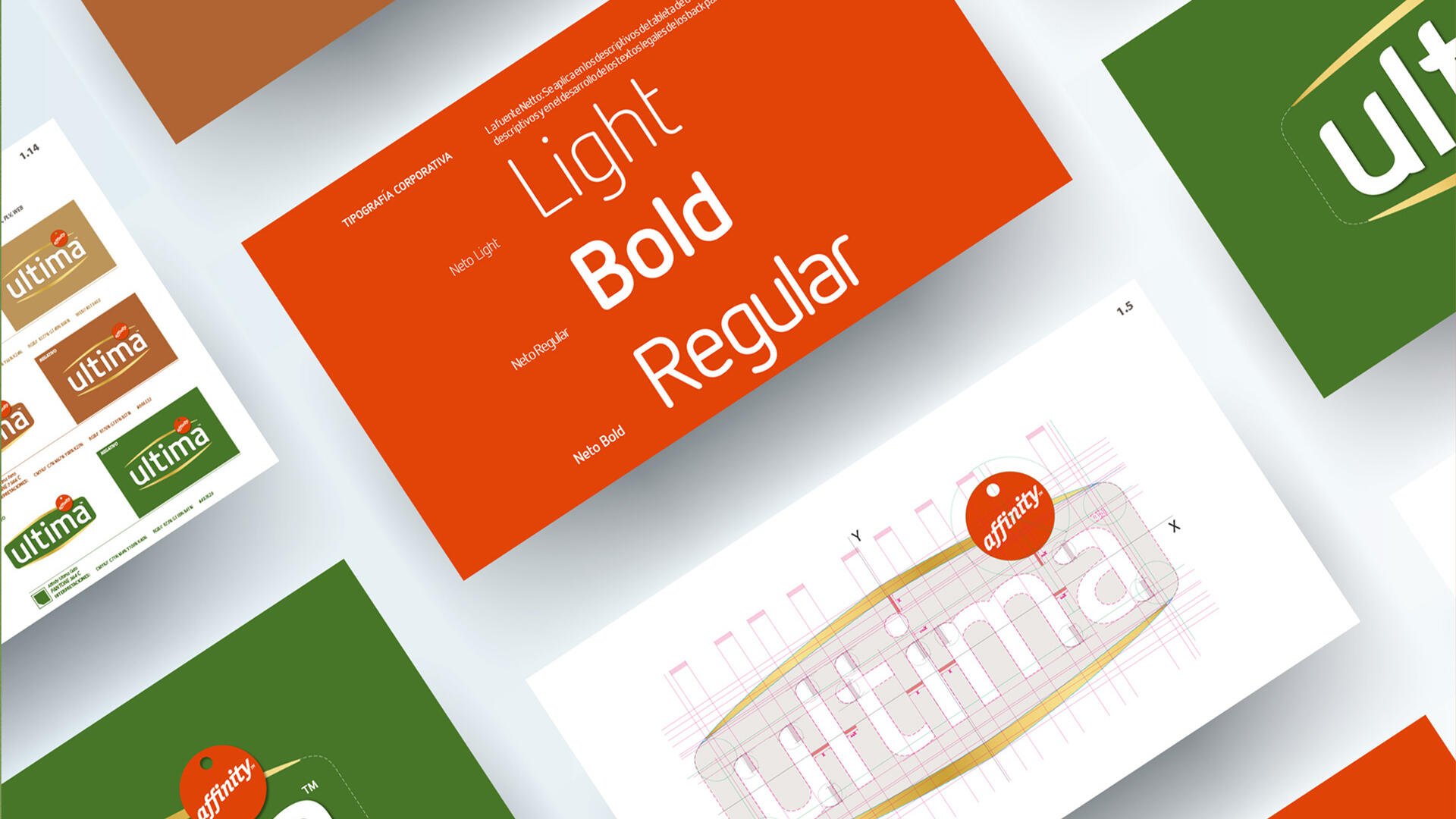
We created a new brand block that improved the brand’s stand-out factor by casing it in golden frames, with a softened, friendly and less scientific typography. We established a new strategic design grid that improved the hierarchy of messages, much more coherent with the purchase decision tree and the need state in this category. We managed to establish greater consistency across ranges and countries. We were able to convey greater closeness to pets through a new photographic shoot session took in London. As a result, we got an intuitive premium design for a complex shelf, that almost 10 years later is still valid.