GLOBAL KRYTEX UNIVERSE
Brand concept.The high-tech company Krytex asked for a new image for its brand. A bright but concise improvement was needed, keeping the overall brand concept, but adding something unique.
The task was to qualitatively change the logo, add dynamics to the identity. We needed a basic idea on which the image of the company would subsequently be based. An ambitious decision was made to turn to the space theme. Namely meteorites, research, modern technologies.
General image of the brand.
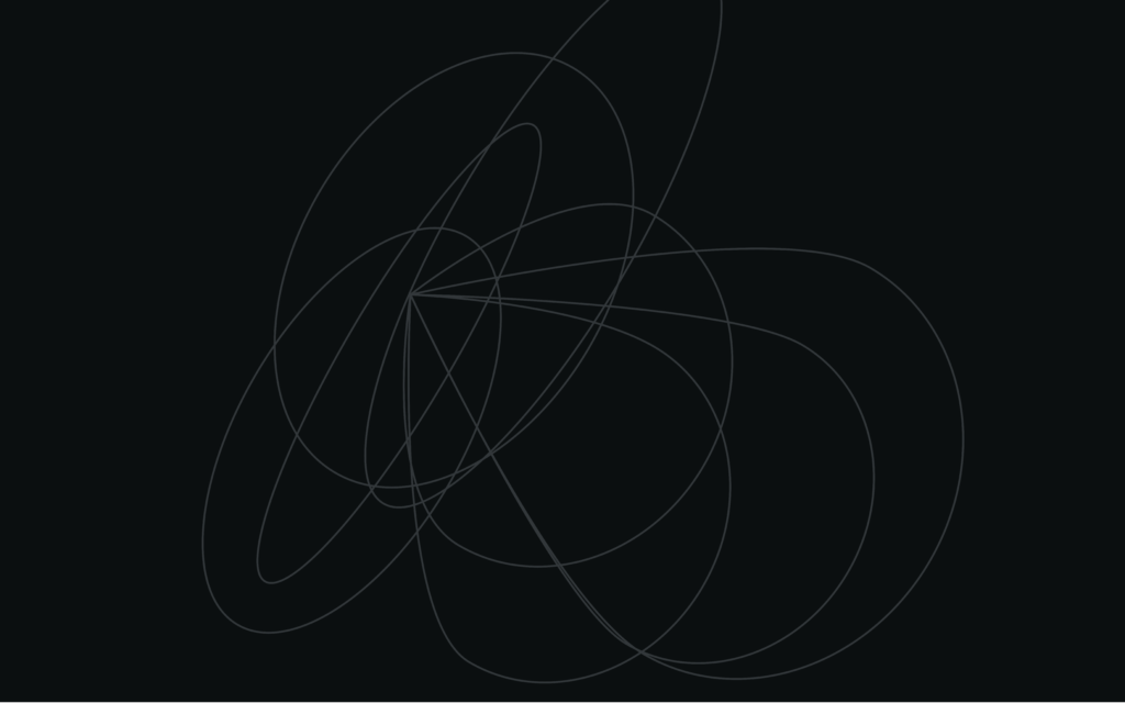
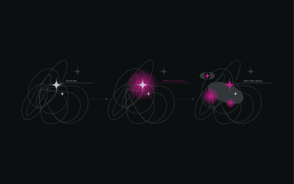
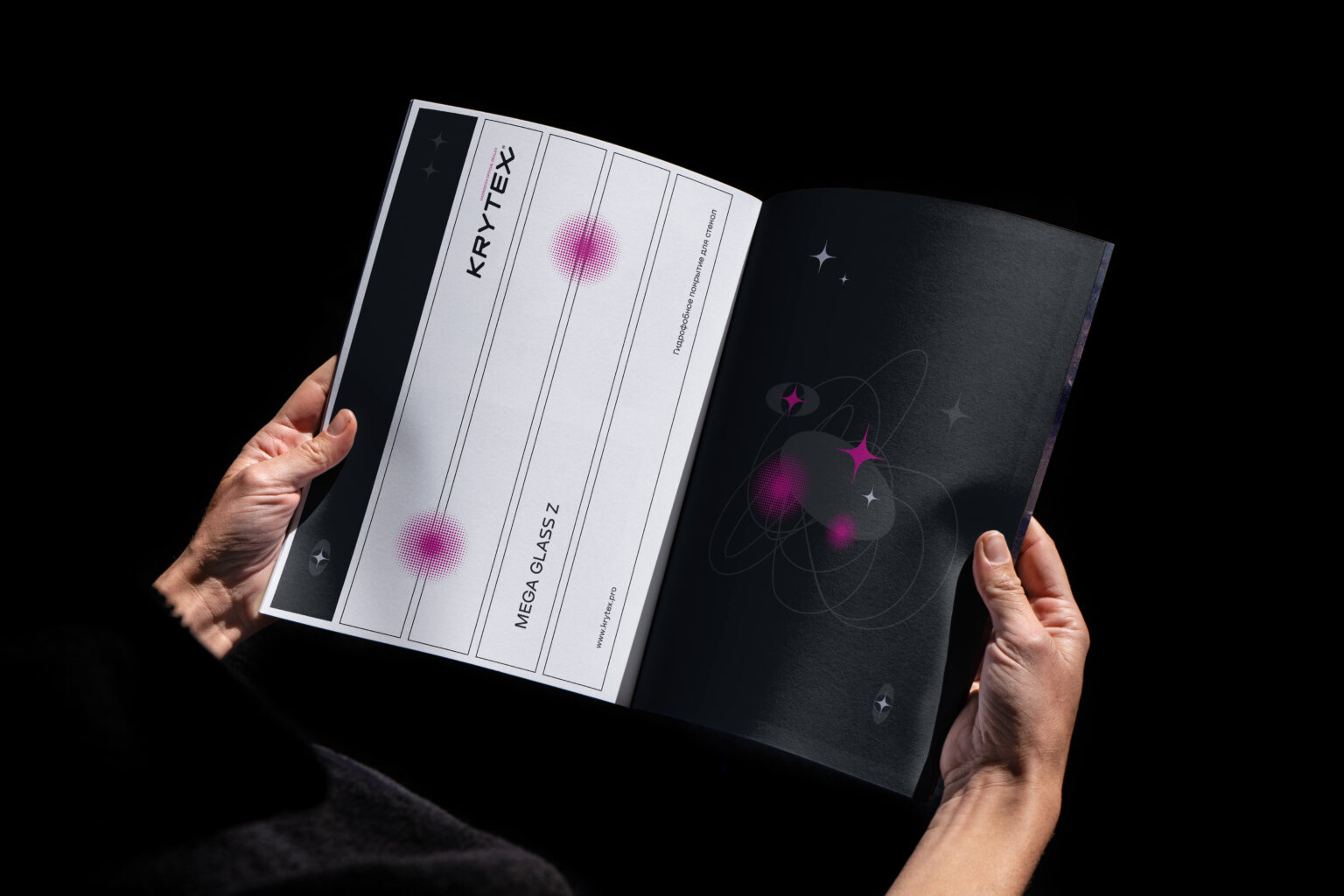
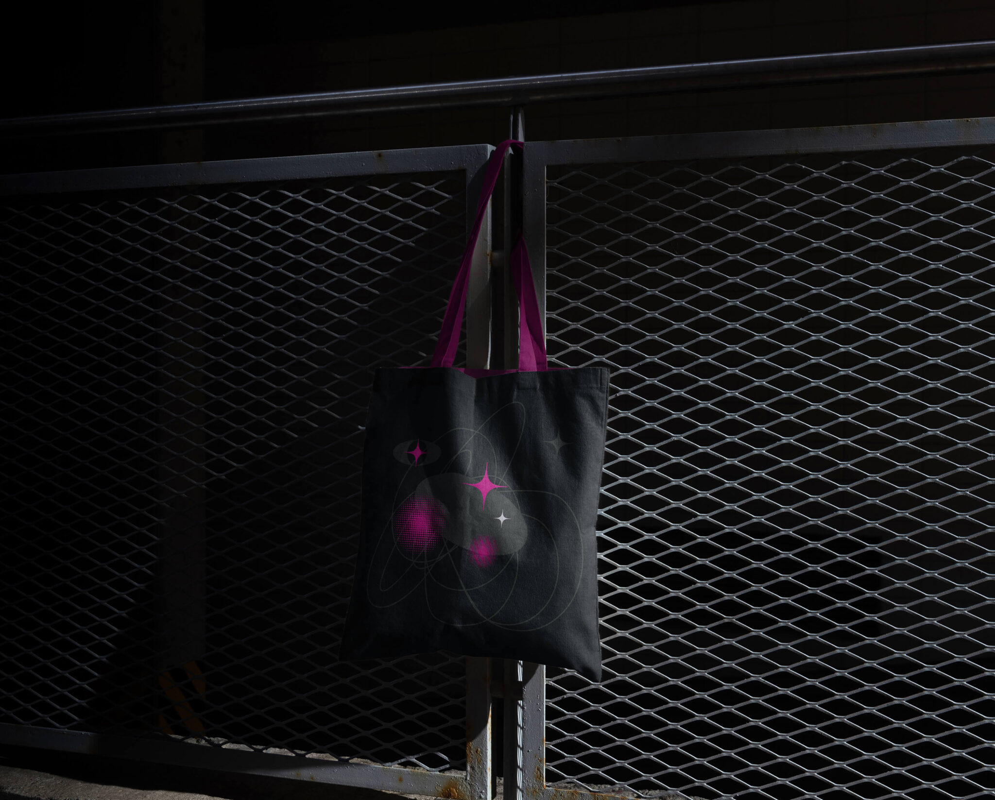
Inspired by space odyssey motifs and meteorite research, images were embodied in the rebranding of the Krytex logo. Through complex creative processes, several graphic elements of the identity were identified: Universe; stars; star; Milky Way; Earth; explosion; meteorite; comet; sun.
Combining them into a unique image, it was possible to create an innovative dynamic pattern for the new Krytex concept. It reflected the general idea – constant development, the desire to conquer the most incredible peaks and the introduction of cutting-edge technologies into the company’s activities. We have abandoned static, all elements of the identity seem to be in motion, changing along with the participants in the process.
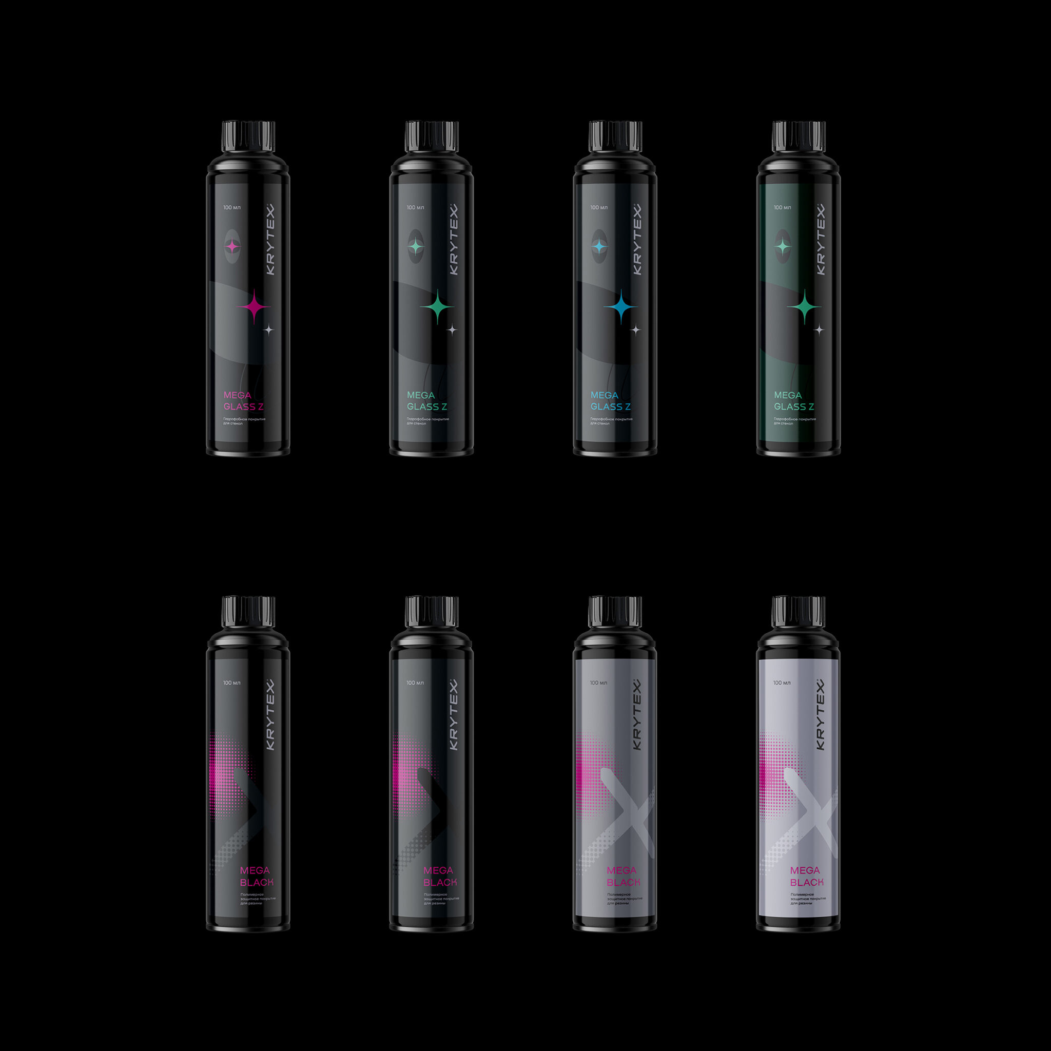
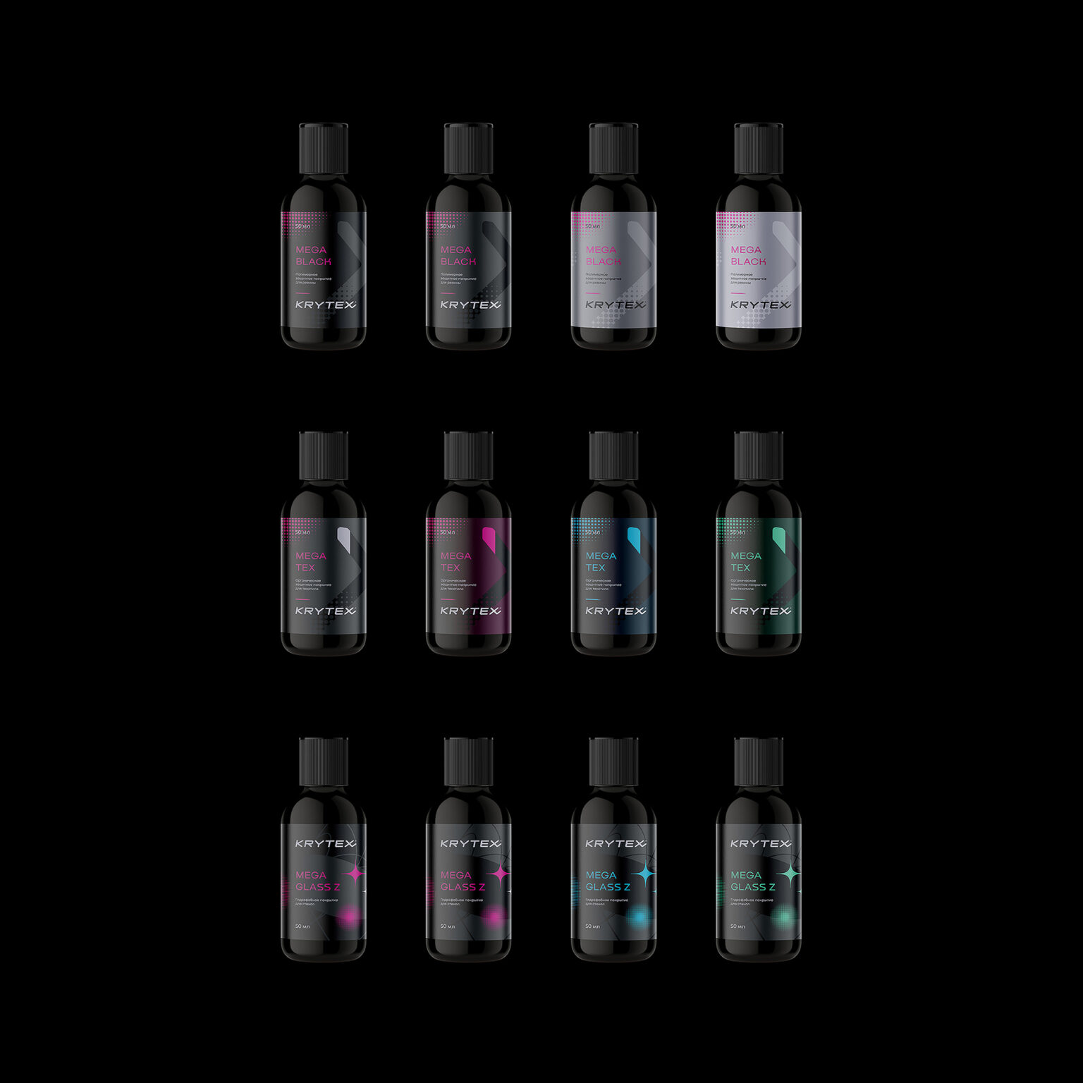
For different media, identity elements can be interpreted in different ways. They perfectly emphasize the overall style, give recognition. Several color solutions and scaling options have also been selected.
Logo as an extension of the brand.
The name of the brand – Krytex – was left as the main logo. But the visual image was seriously worked out. Thedus is used as the main font – powerful, bright, transmitting energy, made only in capital letters.
When rebranding the logo, the font was slightly changed in favor of clarity for the consumer and maintaining the dynamics of the overall image. Graphic images are rounded, the inscription has a slight slope. In the previous version of the logo, the letters were broken, “torn”. This has been changed, adding readability and understandability. The last letter “X” has a continuation in the form of a tick. In the new brand identity, this also means a comet and a meteorite. Thus, the logo gets a continuation. There is no end to development, no end to achievements!The result of cooperation.
Using experience in the art field, creative design, conceptual marketing, we managed to create a recognizable image of the company. The brand symbolizes stability (eternal space), relevance (Earth), dynamics of development (comets, meteors), striving for heights (stars). And all together this is the global universe of Krytex.