Banney is a brand concept created for Peanut Butter products. We conceptualized the Banney brand as a fun, modern and artisan brand.
The name Banney, designed by our Creative Director Eko Widarto, is short, memorable, funny, but easy to recognised. The name is taken from a play on the name Bunney.
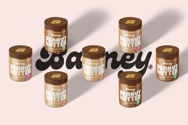
To represent the brand’s personality, Banney’s Wordmark created quirk, bold, and fun typography. With a capital letter “B” as a secondary wordmark for the use of logos on small media such as faticon, social media account profiles, etc.
For the brand colors, we use complementary purple colors, such as yellow, pink, etc. There are no boundaries to Banney’s creative communication. The use of this color will also be combined with photography to support the emotional impact through visuals.
For packaging, we use the type of glass jar with the print on glass or sticker method. With a typography-based label design, we chose a bold but fun typography to represent the “delicious” taste of peanut butter, simple but powerful. We reduced any visual elements that could blur the design’s emotional impact on the audiences. Simplify to Clarify.
Banney’s brand design concept is made to be accepted globally, without cultural restrictions in each country. This will make it easier for business owners to expand into any potential country in the future.
Overall, the goal of this strategy is how Banney’s packaging design is able to maximize the “Stopping Power” when potential customers pass through the shelves, where the survey results show consumers see the shelf in an average of only 4-7 seconds.


