Orbites “Chocolate Balls” is a delightful snack project aimed at providing a delicious and keto-friendly chocolate treat. The project encompasses various aspects of branding and packaging design to create a compelling identity for the product. Our services for the Orbites project include strategy (naming), identity creation, and packaging design. The overarching goal is to develop a brand that resonates with the target audience, particularly Gen Z and Millennials, by infusing a sense of fun, nostalgia, and vibrancy into the design elements.
NAMING
The first step in creating the Orbites brand is crafting a compelling and memorable name that reflects the essence of the product. Through extensive research and creative brainstorming, we aim to develop a name that captures the imagination of the target audience while conveying the indulgent nature of the chocolate balls. The chosen name will serve as the foundation upon which the entire brand identity is built, evoking feelings of excitement and anticipation associated with enjoying a delicious snack.
Drawing inspiration from the spherical shape of the chocolate balls and their delightful taste experience, we propose the name “Orbites.” The name combines the words “orb” and “bites,” suggesting a bite-sized spherical snack that offers a burst of flavor with every indulgent bite. It’s playful, memorable, and perfectly encapsulates the essence of the product.
IDENTITY
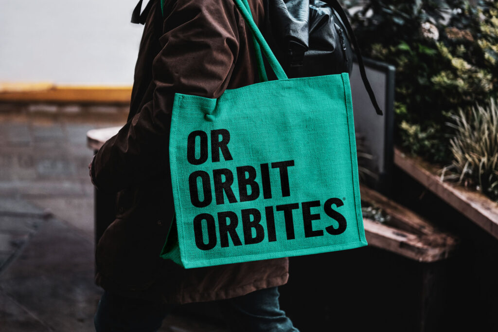
The identity of Orbites revolves around the concept of fun, nostalgia, and vibrancy, designed to appeal to the target demographic of Gen Z and Millennials. The visual elements and messaging are carefully curated to create a sense of excitement and anticipation, inviting consumers to experience the joy of indulging in a delicious and healthy chocolate treat.
VISUAL ELEMENTS
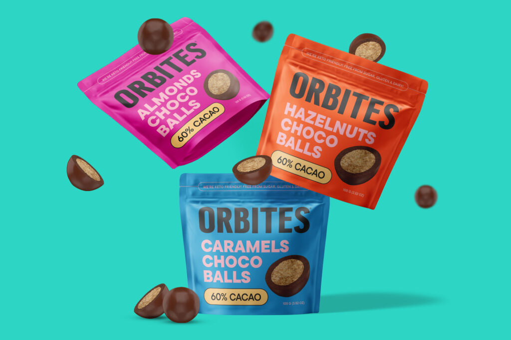
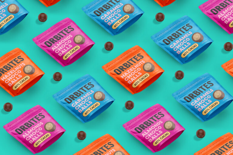
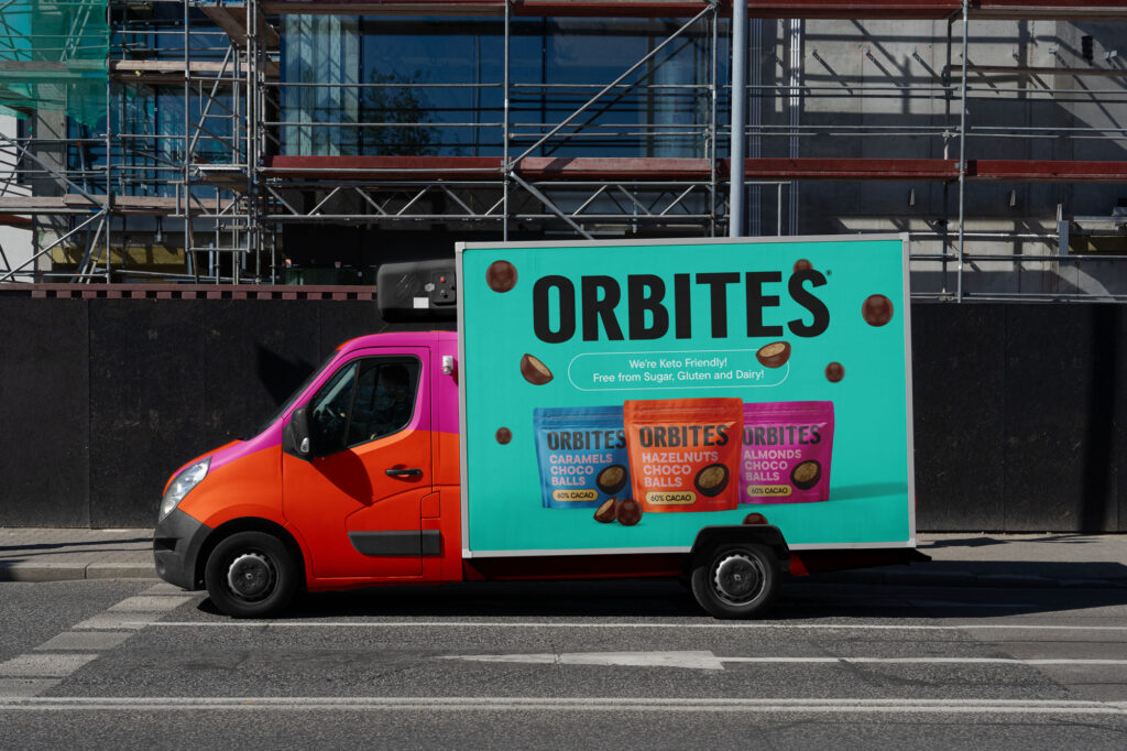
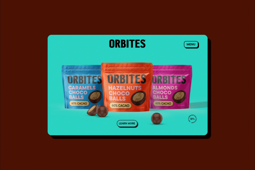
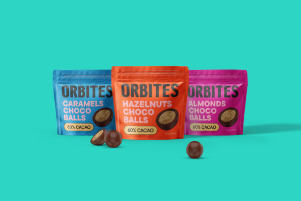
The visual identity of Orbites is characterized by vibrant colors, playful graphics, and nostalgic elements that evoke feelings of happiness and nostalgia. The color palette features bold and vibrant hues, including rich chocolate browns, vibrant oranges, and energetic pinks, reminiscent of the joyous moments associated with snacking.
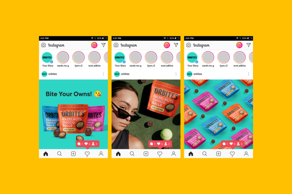
The graphic elements incorporate typography and real product image that add depth and dimension to the brand identity. These visual elements are designed to capture attention and create a sense of intrigue, inviting consumers to engage with the product on an emotional level.
The tone of voice is casual, relatable, and conversational, resonating with the target audience of Gen Z and Millennials. Whether through social media posts, packaging copy, or advertising campaigns, the messaging is designed to spark joy and excitement, inviting consumers to join the Orbites journey and indulge in a guilt-free snacking experience.
PACKAGING DESIGN
The packaging design for Orbites chocolate balls is a key component of the brand’s identity, serving as the primary point of interaction between the product and the consumer. Our approach to packaging design is centered around creating a visually captivating and memorable experience that reflects the brand’s values and personality.
DESIGN CONCEPT
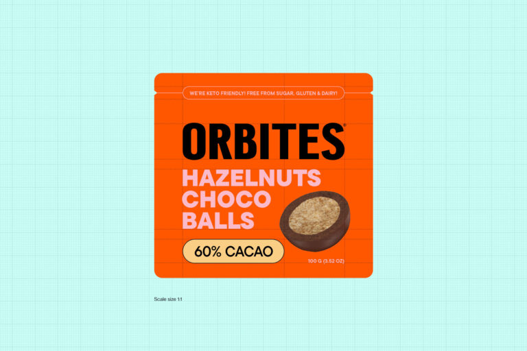
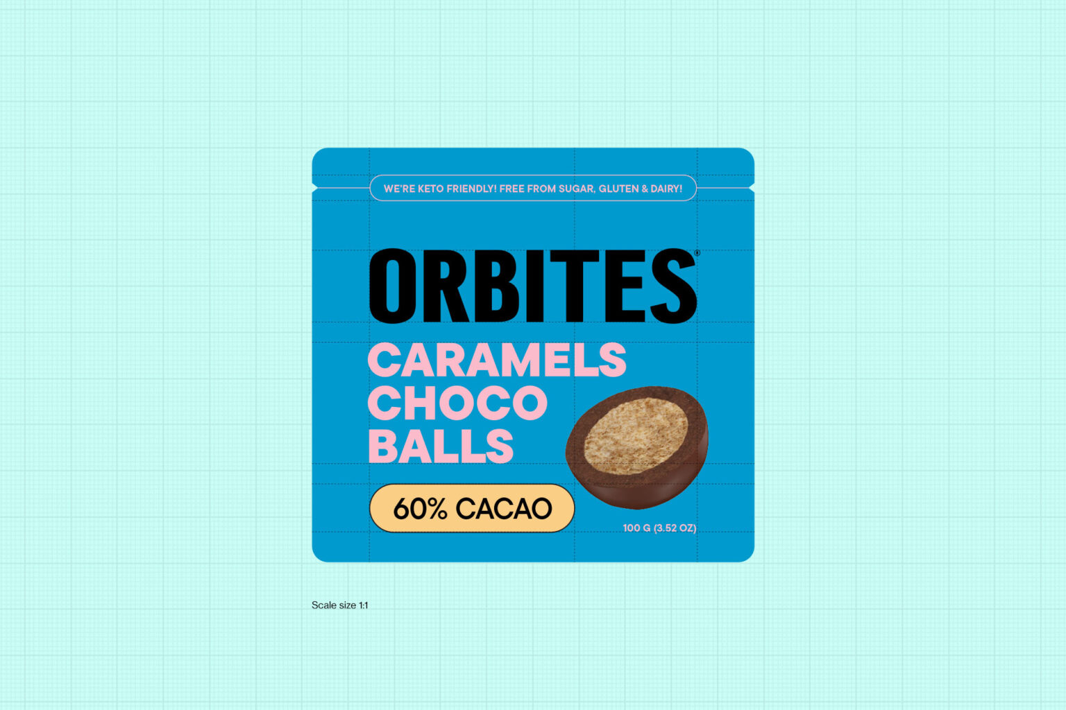
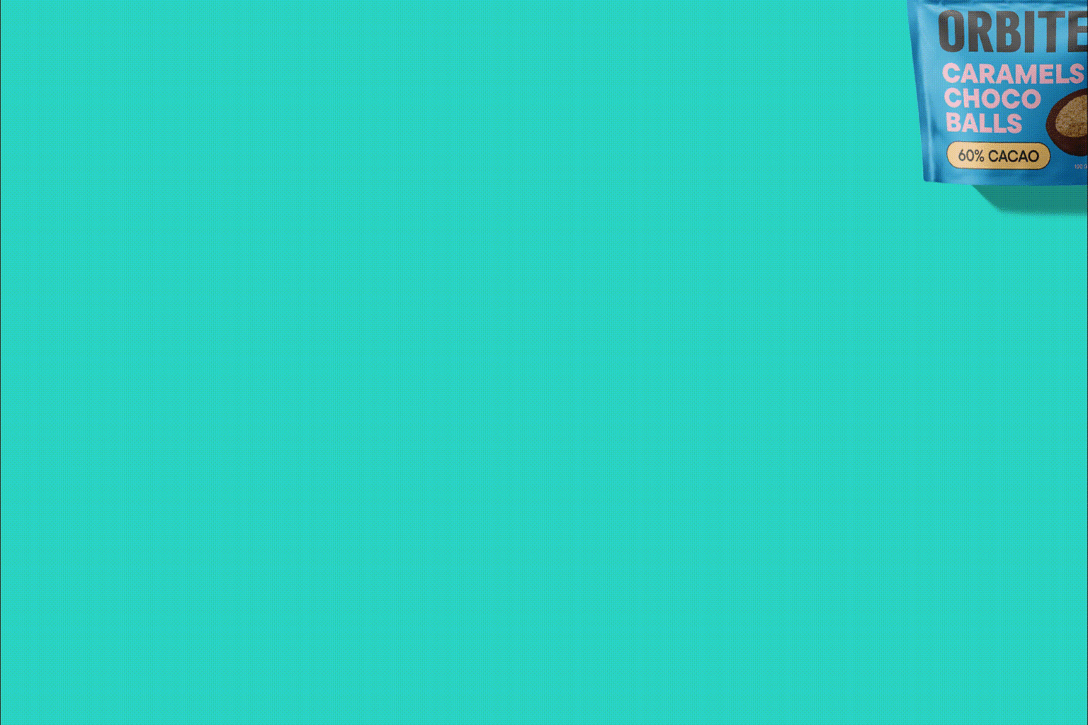
The design concept for Orbites packaging is inspired by nostalgia, fun, and vibrancy, with a modern twist that resonates with the target audience. The packaging features bold and eye-catching colors and dynamic typography that command attention and stand out on the shelf.
The color palette is dominated by energetic pinks, vibrant oranges, and fresh blues, creating a visually striking contrast that captures the essence of the product. The use of retro-inspired patterns and textures adds depth and dimension to the packaging, evoking feelings of nostalgia and excitement.
TYPOGRAPHY
The typography for Orbites packaging is predominantly sans serif, reflecting a casual and contemporary aesthetic that appeals to Gen Z and Millennials. The use of clean and modern typefaces ensures legibility and clarity, while also conveying a sense of playfulness and dynamism.
For the logotype, we selected a display-style font that is bold, distinctive, and easily recognizable. The logotype serves as the focal point of the packaging, reinforcing the Orbites brand identity and creating a strong visual presence that resonates with consumers.
Through careful attention to detail and thoughtful design choices, we aim to create packaging that not only protects and preserves the integrity of the product but also serves as a powerful vehicle for storytelling and brand expression.