ABOUT
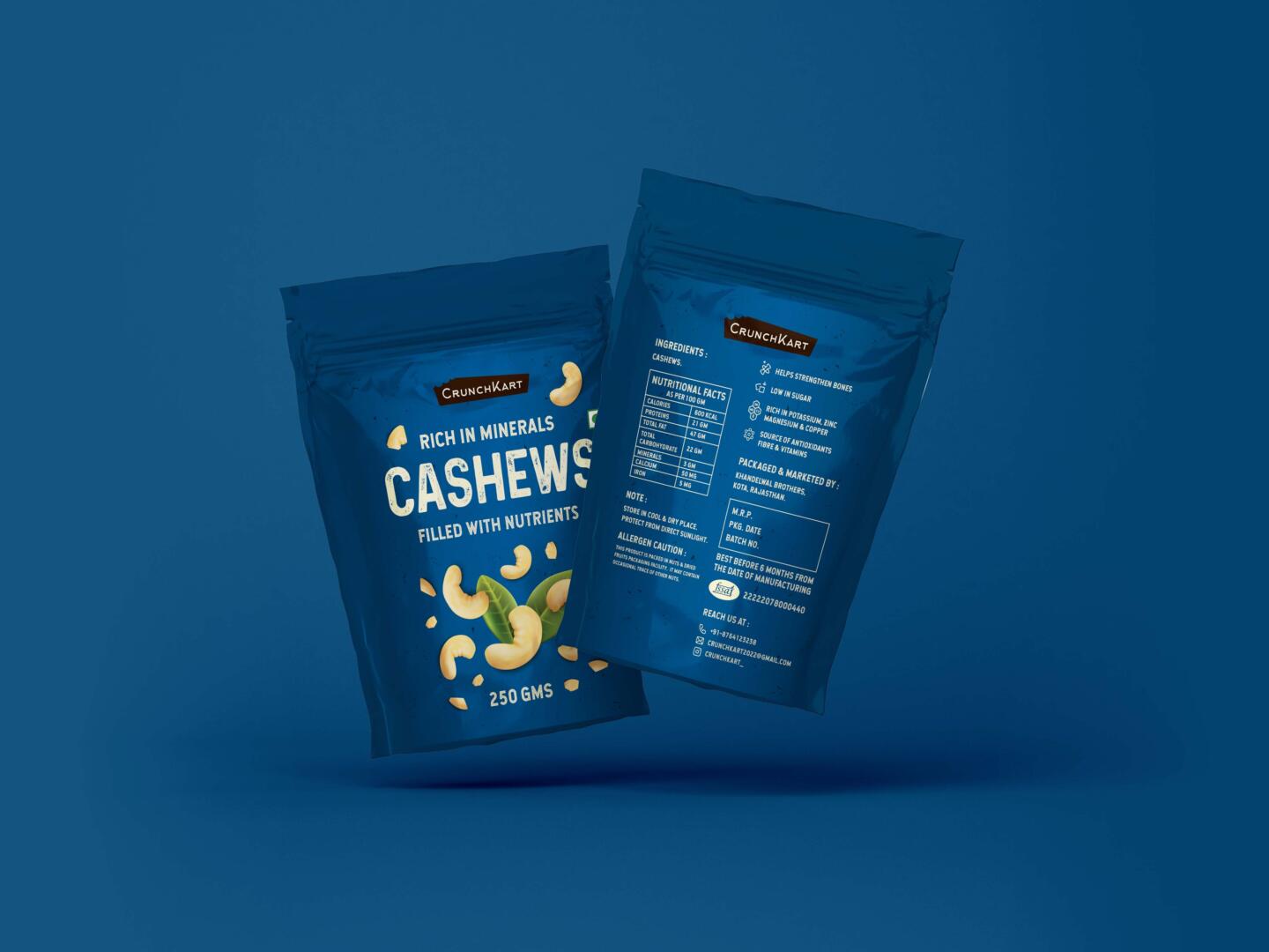
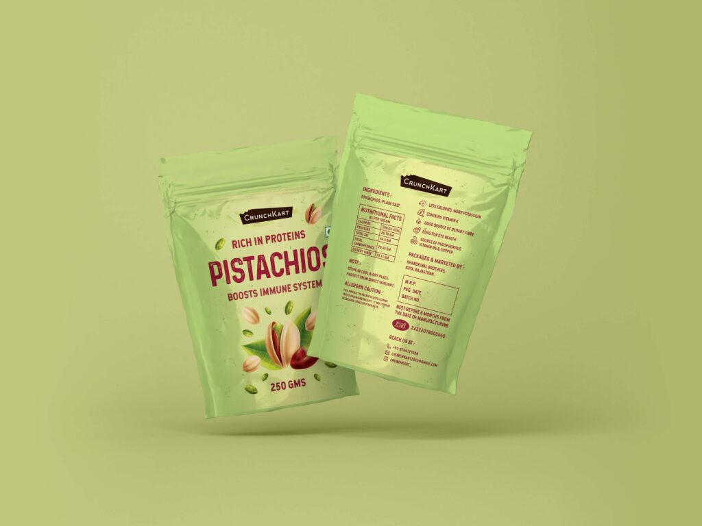
The following project was done for an upcoming FMCG brand called “Crunchkart”. The brand has introduced a new range of assorted dry fruits. I got the opportunity to work on the packaging design for this product line. The brief was to create a contemporary & distinctive design that is also suitable for festive gifting and gives the brand a trustworthy feel, as the initial plan was to sell the products through online marketplaces. I did a brief market research on the designs of a few leading and other competitive brands and observed that many competitors were using simple visuals and backgrounds, while few were using conceptual illustrations. The common focus was on pitching the health benefits of each product.
RESULT
Based on my findings, I concluded that using vibrant and rich colors would give CrunchKart a distinctive identity. Color used for each variation not only complements the overall design but also psychologically relates to the main attributes of each product. For example, Ruby Red (Almonds) is associates with brain power and energy, Blue (Cashews) with a stable nervous system, Pista Green (Pistachios) with the body’s natural healing, and Brown (Walnuts) with mental strength. Visuals have been used in a playful manner to give a hint of a boost in energy after consuming these dry nuts. Bold typography complements the overall mood of the design and helps in highlighting the health benefits effectively.