Ketri is a new Bulgarian wine brand with Thracian roots. In the language of the ancient Thracians, Ketri means 4. There are also four people behind this new venture – two sisters and their husbands. Lovers and professionals in wine, they decided to create their own selection of wines made in Bulgaria, as the ambition of the brand extends far beyond our native territory.
The design for these wines came out somehow very easily and naturally – with effort but without tension. Maybe because we had discussed in great detail many important issues about the project even before starting work, or maybe because the idea behind this wine brand had such an ancient Thracian origin which was a natural source of inspiration to me.
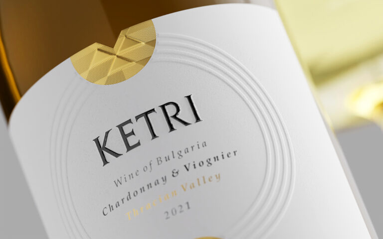
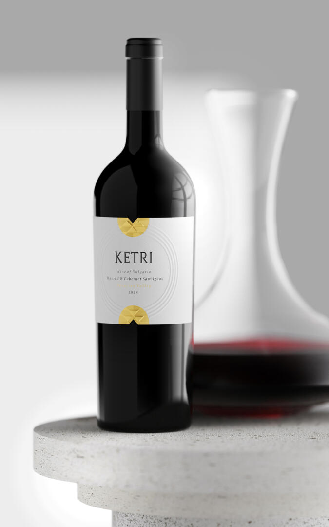
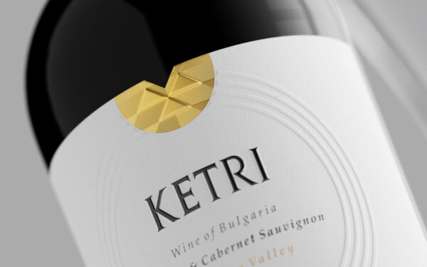
The main aesthetic motif in my work was the Ketri logo, which to a very large extent represents a traditional Bulgarian motif borrowed from needlework. Its magical geometry, which has lived through the centuries to the present day, helped me a lot to create the look and character of this new wine label design. I used the triangles and the empty space between them to achieve different reflections in the gold foil so as to achieve an original and attractive shiny image. The Ketri brand and information about the wine are located in the central part of the label. In order to unite all the themes in one – history, brand, wine, people – I decided to create 4 embossed circles that enclose the entire front of the label and shape the cosmos of Ketri.
The paper has a very flat fine texture so that it allows me to show all the reliefs and embossed shapes in the best possible way. The print was made by Dagaprint.com, who once again showed how important the printing itself and the choice of technology are for every wine label design.