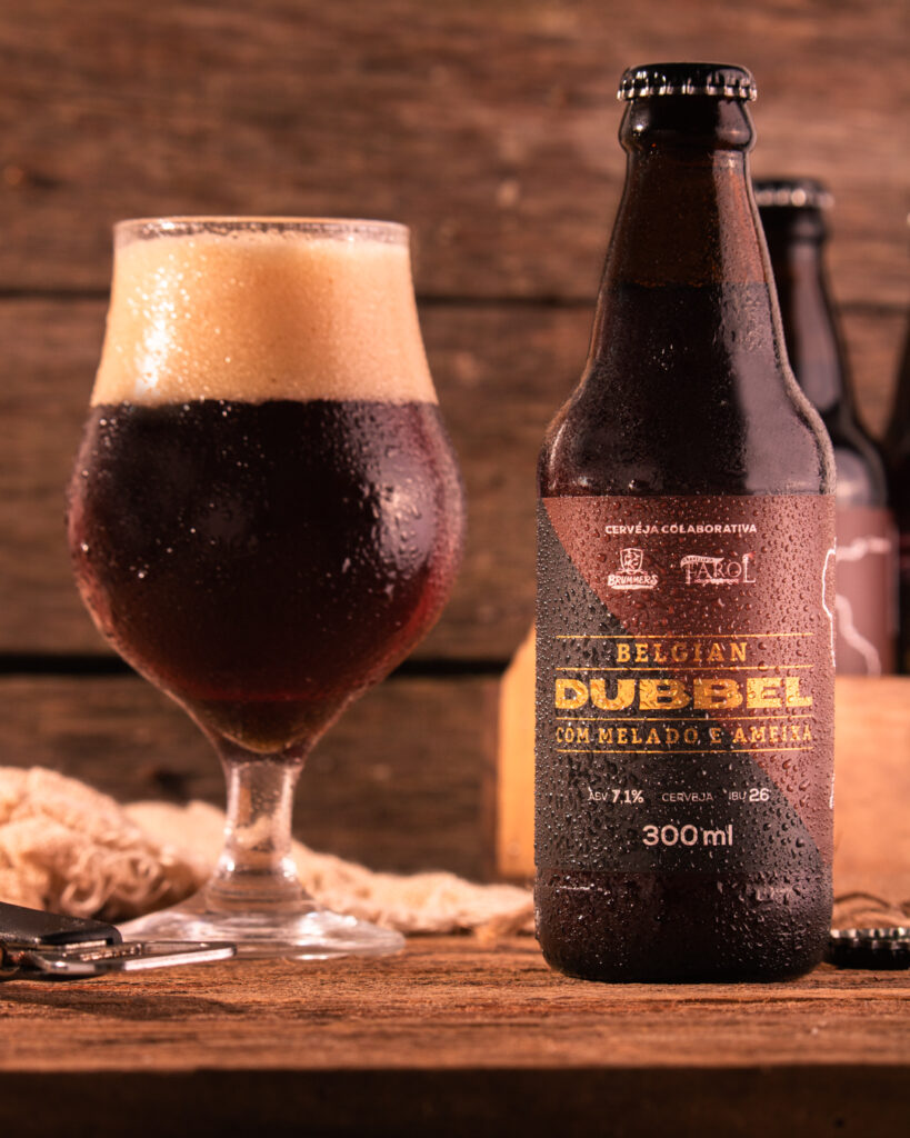
The Brazilian breweries, Farol (located in Canela, Rio Grande do Sul) and Brummers (located in Parobé, Rio Grande do Sul) have teamed up to innovate a traditional Belgian style. By adding molasses and prune to the recipe, the production of the special edition of the Belgian Dubbel has a slightly sweet touch, highlighting some already distinctive notes of the drink.
Belgian Dubbel is a style that originally appeared in the monasteries of Belgium in the Middle Age. From its first appearance until this day, the most famous brands in the world producing this style of beer still are the Belgian Trappist monasteries.
The challenge: to find the perfect composition to translate on the label the recipe flavors, the tradition of this drink style, and the passion shared by the two breweries.
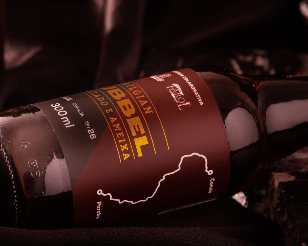
The designer Laudir Jaeger has built a clean and sophisticated visual. The minimalist layout is emphasized by the lettering in gold, doing justice to the exclusivity of the drink. After all, only a single batch of this special edition was produced.
Another detail that draws attention, shows the wealth of information, and honors both the trajectory and the partnership between Farol and Brummers is the illustration of a road connecting these two breweries on the side of the label.
The choice of these predominant colors, inspired by the Belgian flag, enhances the dark amber and coppery color of the drink. The reddish depth of the label catches the eye, symbolizing the perfect intensity between aroma, flavor, and appearance.
It is impossible to admire this packaging without feeling the urge to taste the complexity of this Belgian Dubbel.


