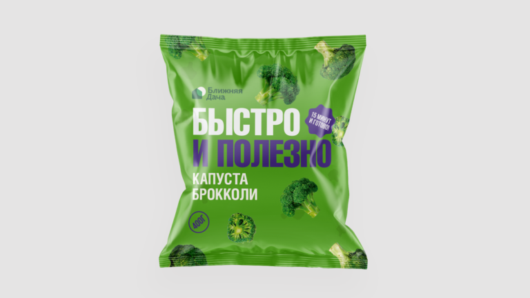
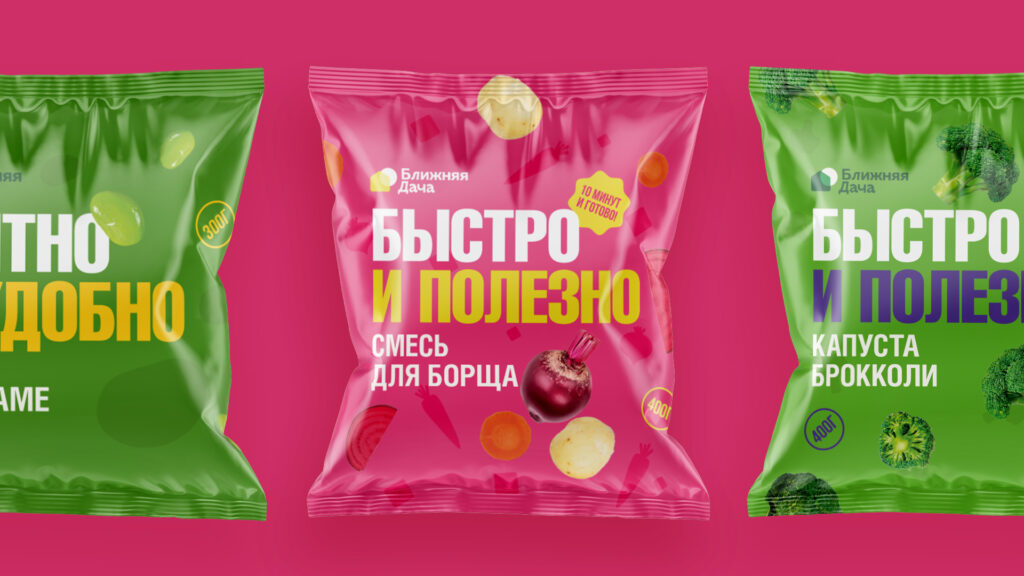
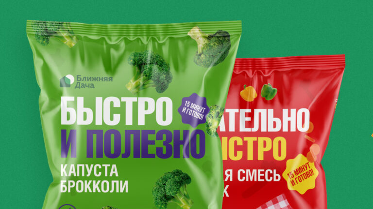
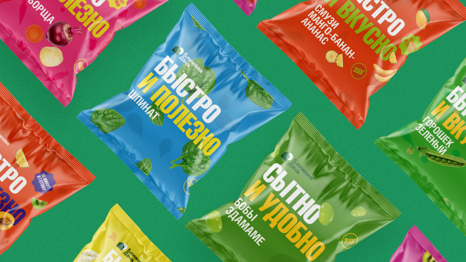
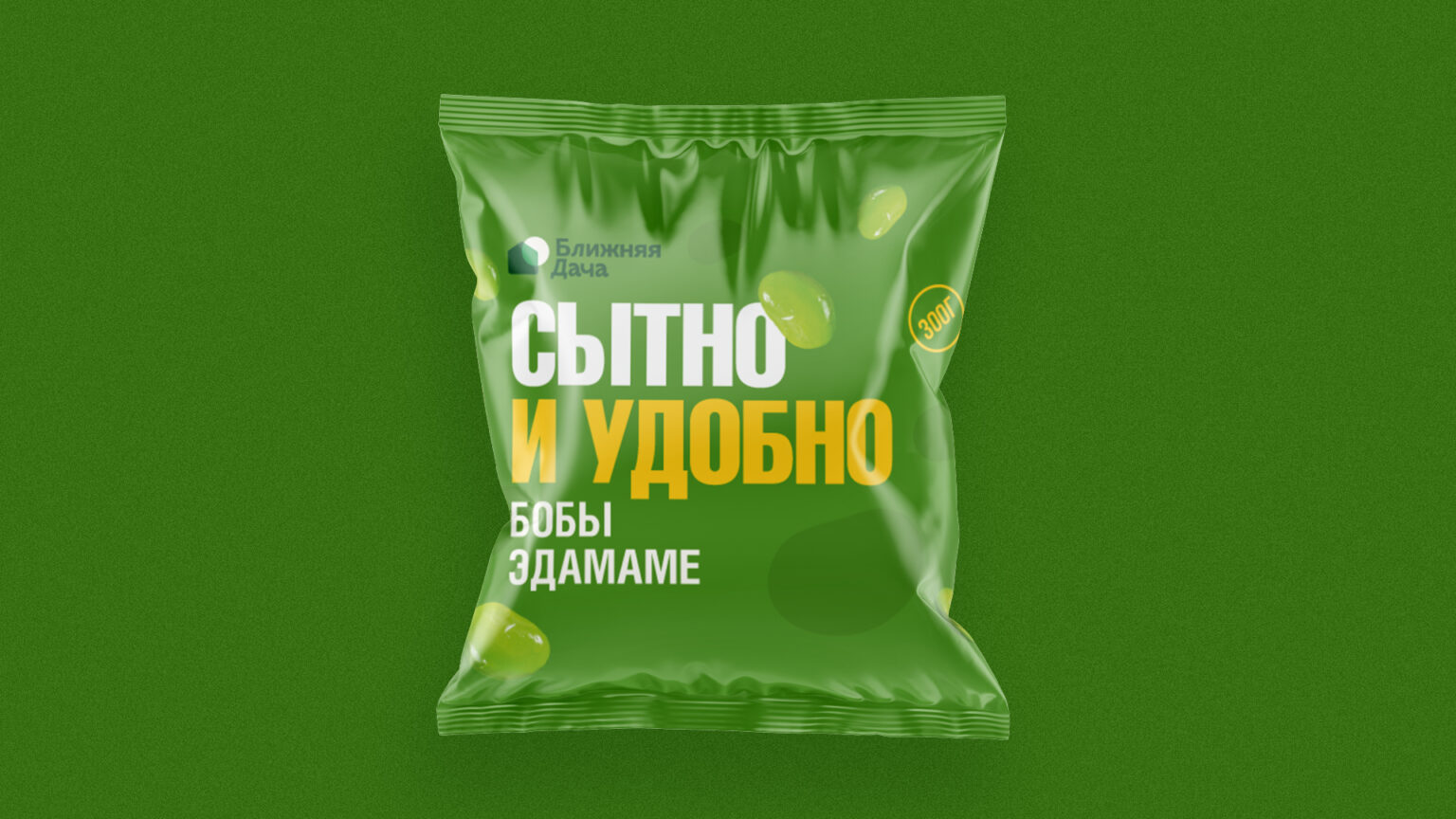
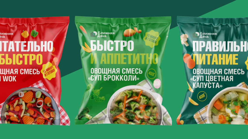
Blizhnaya Dacha brand is a new brand on the frozen food market. The assortment includes more than 15 diverse SKUs and is designed for the medium+ segment of the target audience.
We had the task to take a new look at the frozen food market – to make it interesting and attractive for people who like to eat quickly and deliciously. It was important for the packaging to say: we are also fresh and healthy food and our significant advantage is the speed of cooking – since most of the brand’s range is already ready-made meals for every day: borscht mix or even smoothies.
The graphic idea of the mess on the kitchen table during cooking was chosen as the visual metaphor for the whole style of packaging. When a person really likes to eat delicious food, he is fascinated by the process and forgets about the routine like tidying up. We wanted the packaging to become a creative unit of the process and evoke an irresistible feeling of creating and creating delicious dishes. Complementing this idea, which we reflected in the ingredients flying around the packaging, was large condensed typography communicating that our food is FAST AND Yummy, or FAST AND GOOD.
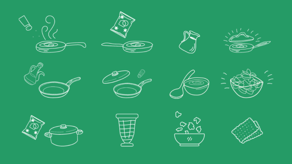
Recipes and hand graphics: A characteristic feature of the package turnover are recipes that make cooking even easier, for which we have developed a series of hand illustrations to help you understand in more detail and faster how to cook something. The hand-drawn graphics complemented the strict face typography of the packaging and helped us tell the customer even more clearly: it’s easy to cook!