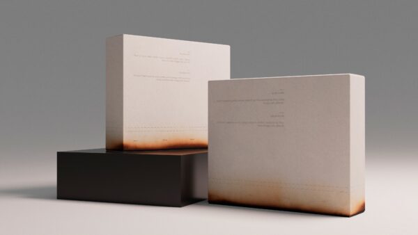
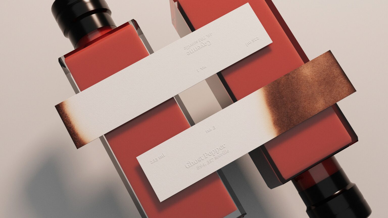
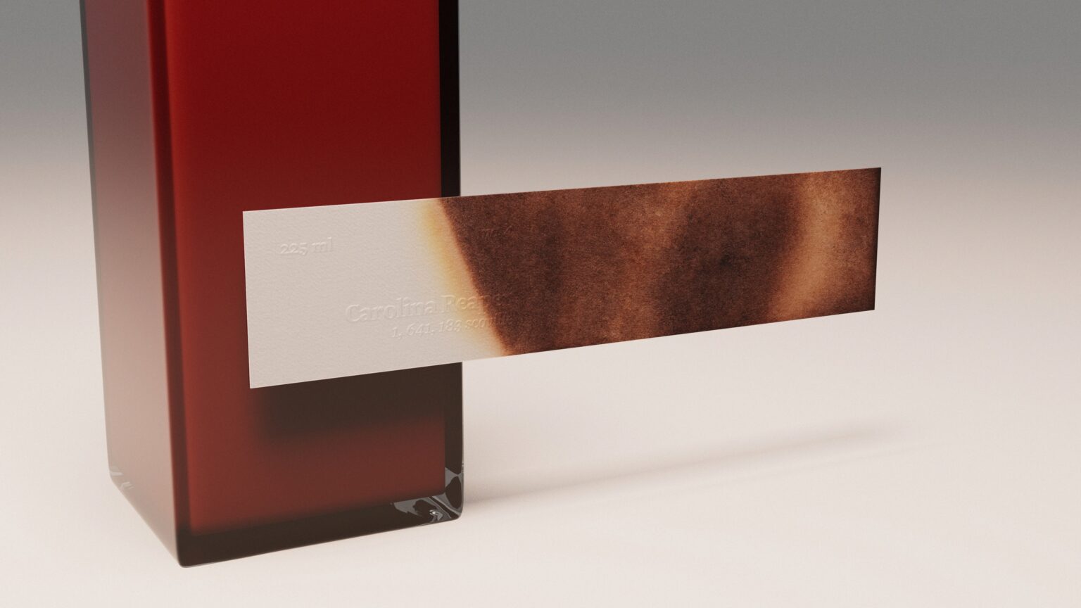
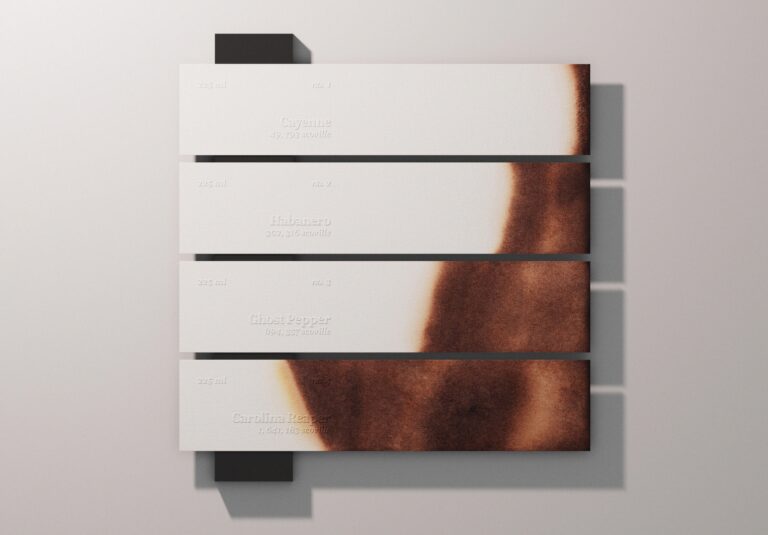
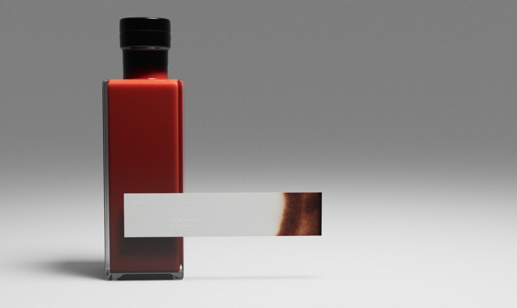
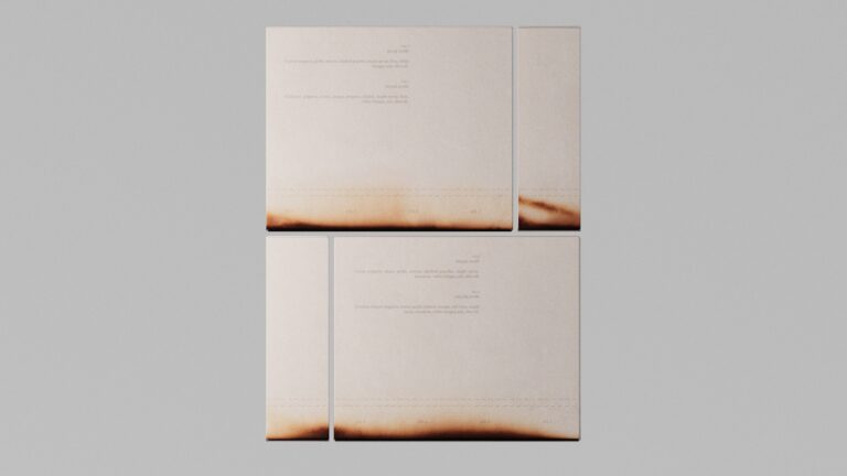
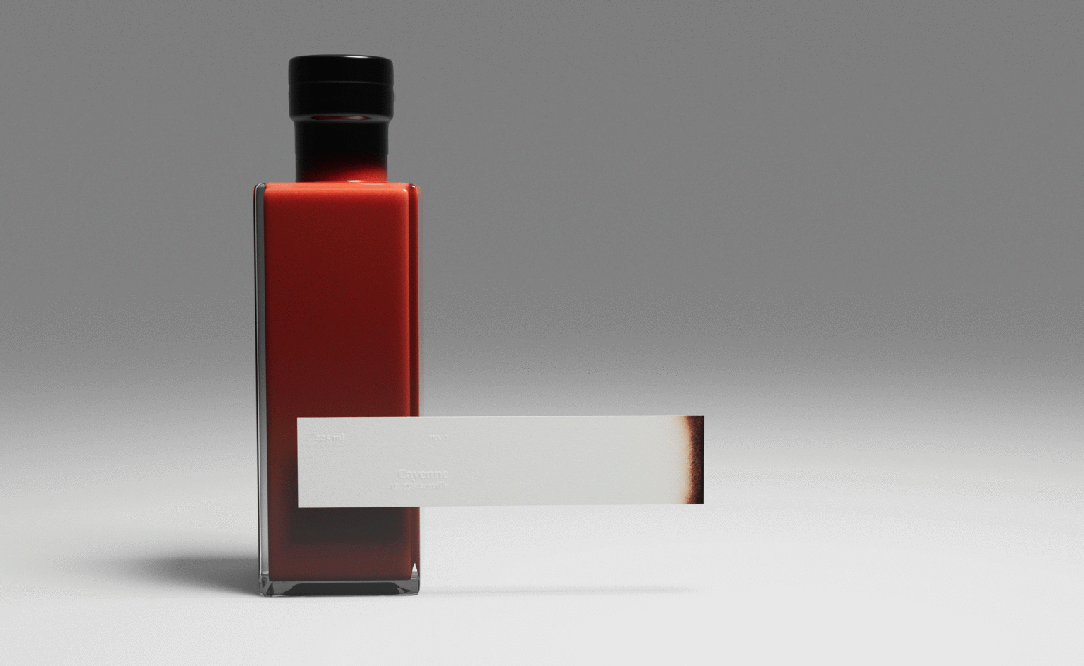
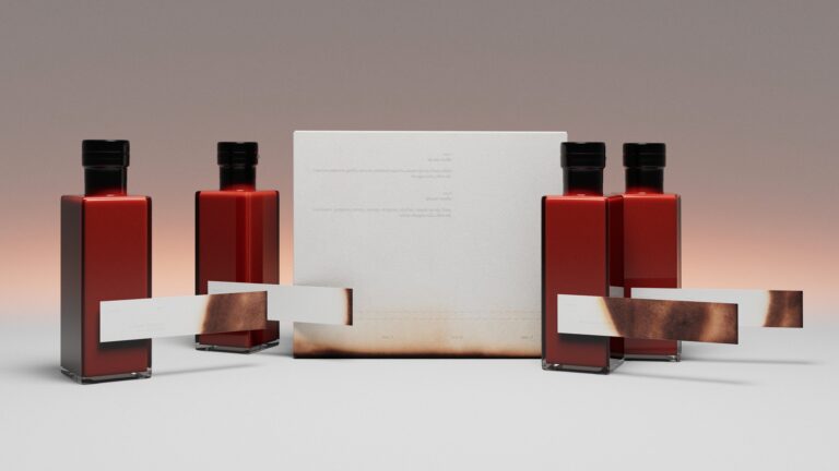
Packaging and label design for hot sauce set. My main goal while creating this design was to steer away from the usual “burning skull with a sombrero shooting flaming peppers at scorpions” look (don’t get me wrong, not taking yourself seriously is a big part of a fun hot sauce experience). I wanted to create a simple visual expression that provides the necessary information while not overburdening the design. The idea came from a litmus paper which you would normally dip in a liquid to see it’s acidity. In this case, it shows how hot the sauce is visually in the way that is easily understandable.
This very limited edition packaging set was used as a gift by the local hot sauce makers/enthusiasts for their potential clients.

