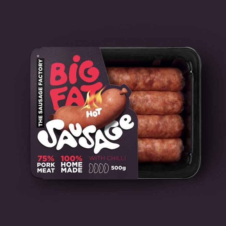
Controversial advertising done in a smart way is always a good idea for your brand. While some may not like it, the thing is your product will stick out and make people notice it. And what’s the most important thing for a new brand is to be noticed. Afterwards comes the quality of the product which is essential for your business to grow and make people want to buy it again and again…
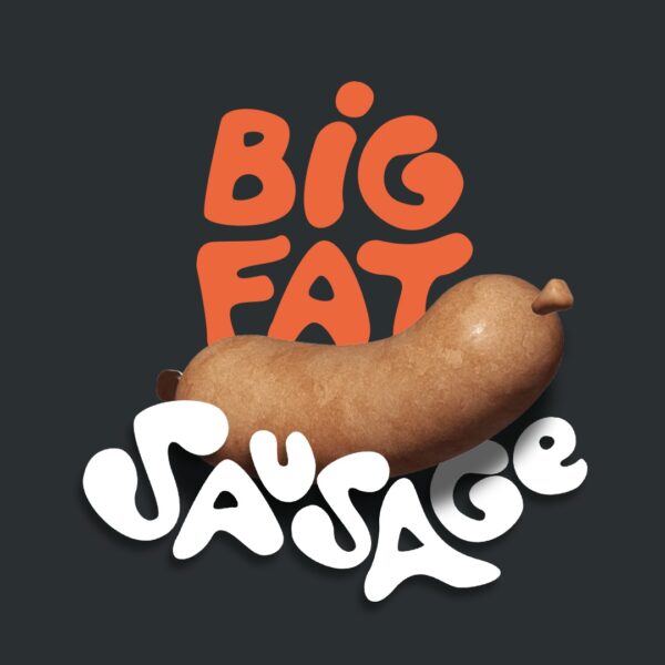
Having this in mind the name BIG FAT SAUSAGE is used for the brand name. The typography is hand drawn in graffiti style. The 3D illustration of the sausage used in the logo is designed and placed in a way to “wake your dirty thoughts”.
The differentiation of the 3 products is made by using different color palette for each product and also the 3D illustration of the sausage is redesigned to fit the actual product
Curator’s Insight
That name – BIG FAT SAUSAGE. It’s bold, it’s memorable, and it’s bound to make you do a double-take. But that’s the whole point – it grabs your attention. In the world of packaging design, standing out is half the battle, and this brand does it with its name. It’s a reminder to us that sometimes a little out of the norm can go a long way in making your brand stand out.