PASTA MAKER — pasta created for those who want not just to cook, but also to get an experience.
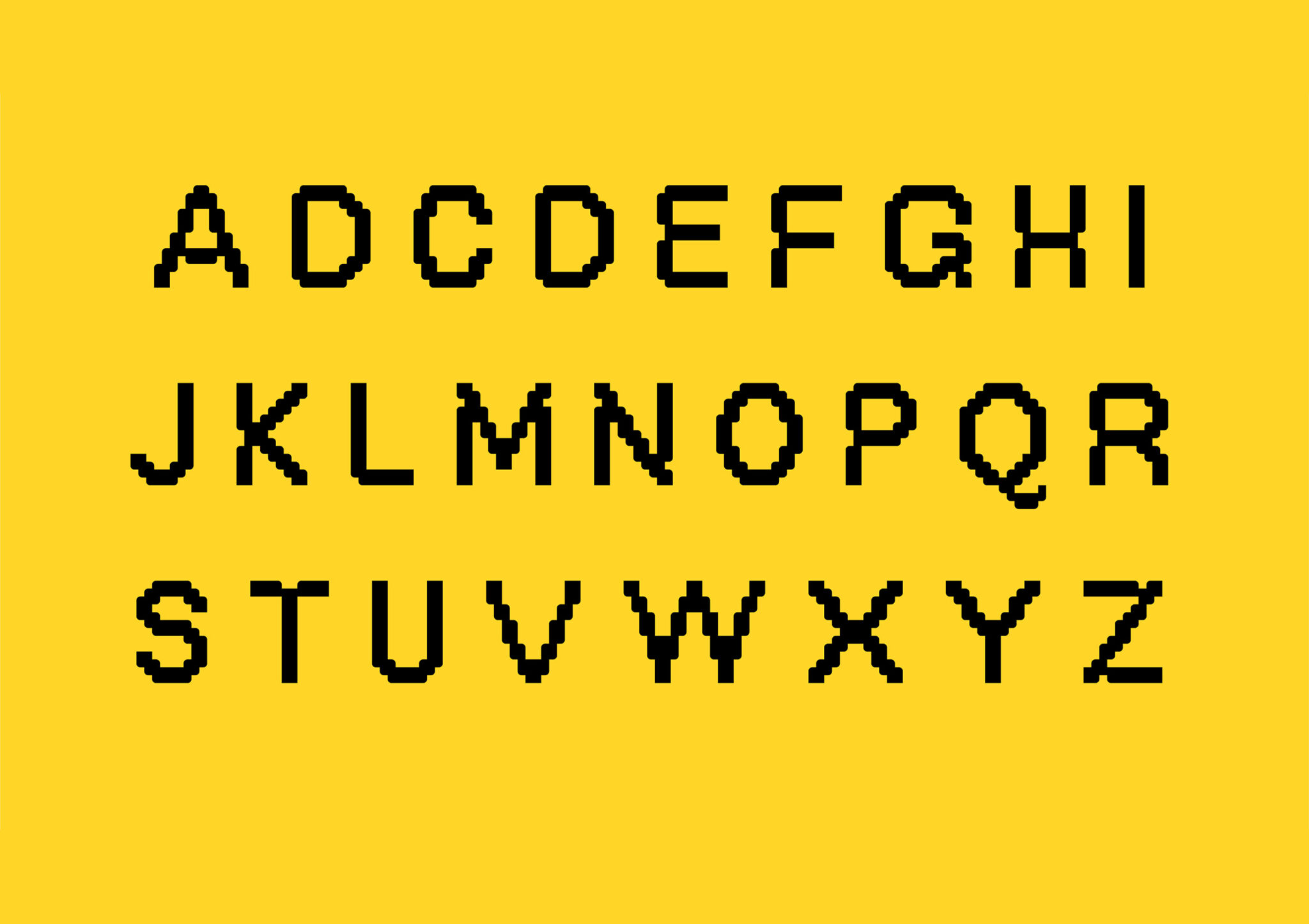
I developed the name, logo custom typeface and brand identity. When creating the brand identity, I tried to make it expressive and modern, so that it would be different and highlight its advantages.
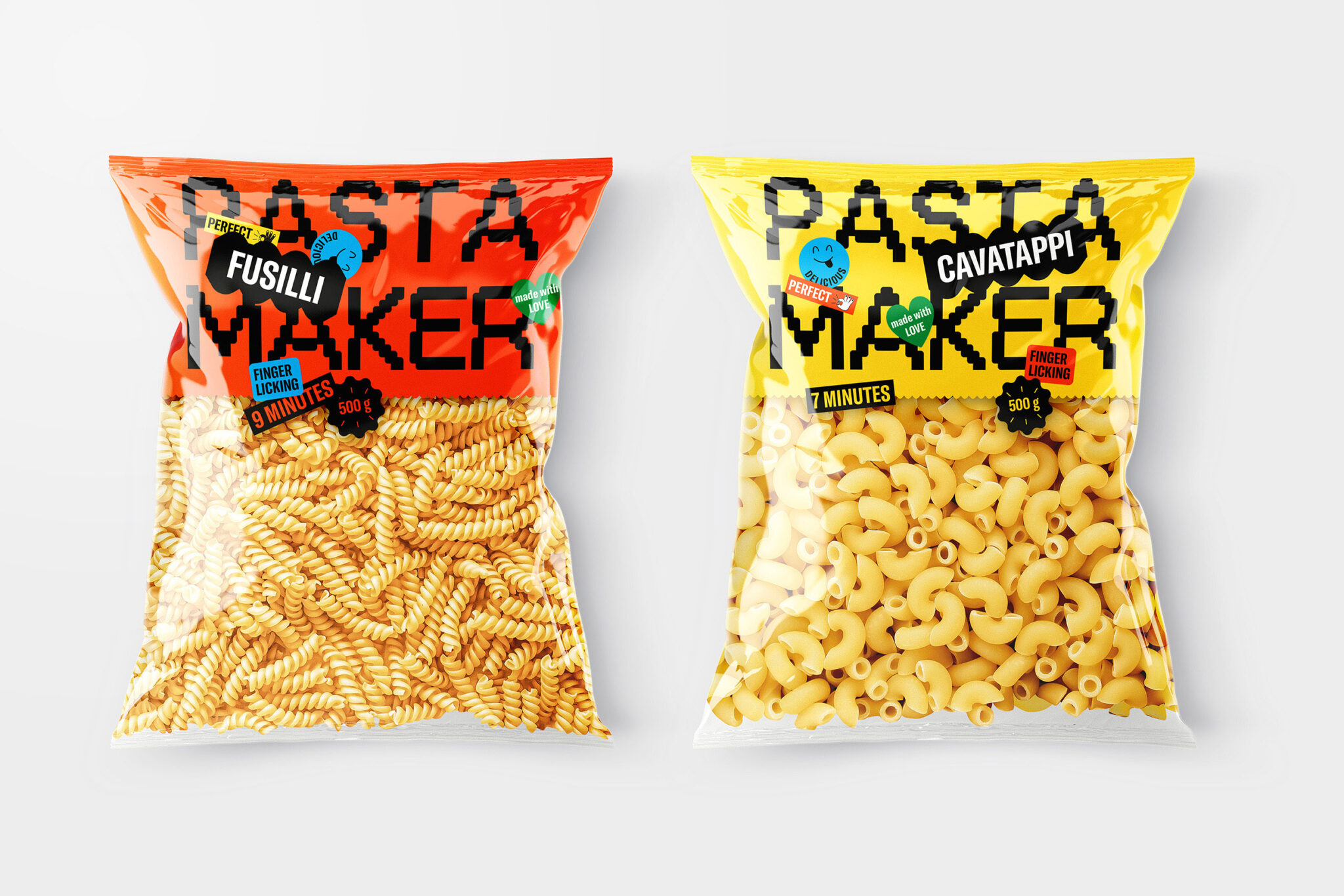
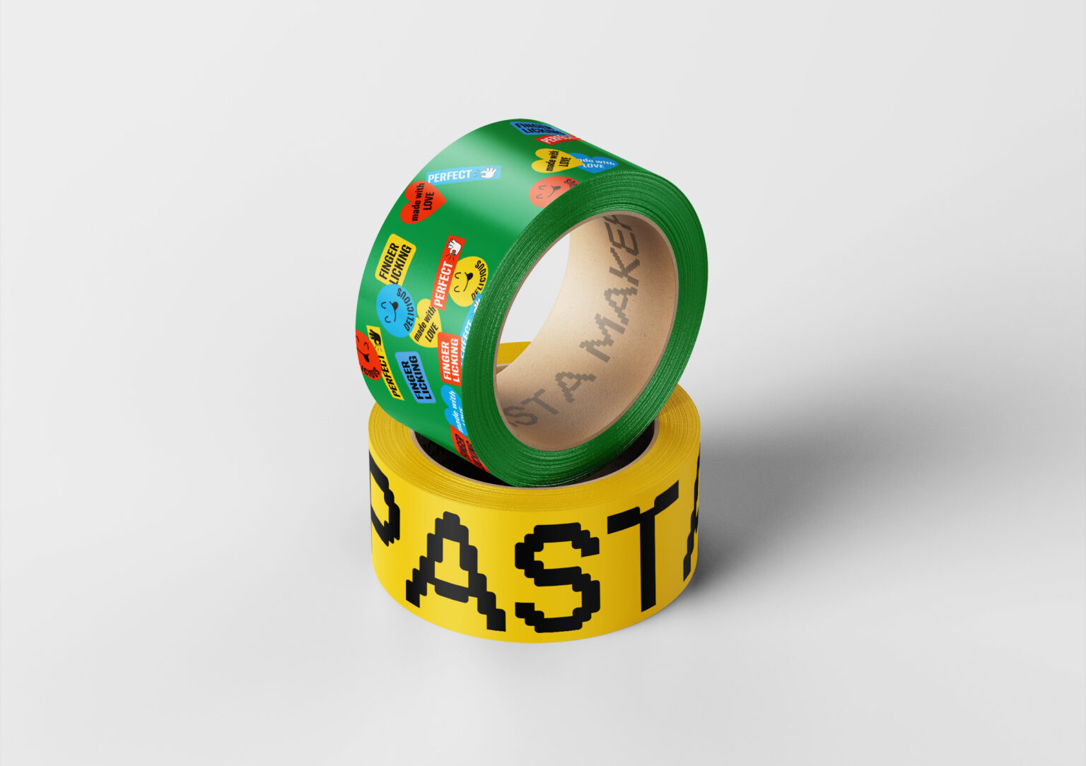
Starting with the name, PASTA MAKER instantly conveys the essence of the brand and the target audience. The custom font created for the logo gives it personality with pasta-like details, making it distinctive and instantly recognizable. Stickers add dynamics and brand recognition, reflecting the client’s individuality and excellent taste.
To make it easier for consumers to identify different types of pasta on the shelf, I chose a different color for each product. The top of the packaging is colored to match the SKU, while the bottom remains transparent, allowing customers to see the product inside. Thoughtful packaging design not only adds visual appeal, but also makes it easier for consumers to find the right pasta option.
Thanks to the use of these elements, the brand is presented in a bright and memorable style, which will help attract the attention of potential clients and stand out among competitors. This cohesive and modern visual identity provides a unified aesthetic experience, which is essential for establishing a strong brand presence in the market.
Make pasta, make love!
Curator’s Insight
The pasta-like details in the letters add a playful touch while making the brand instantly recognizable.


