Sensus is a new, Korean-born brand for Europe. Committed to challenging preconceived ideas and distorted perceptions, with a roadmap of product launches through multiple industries worldwide.
Their first product, sensus Skincare, offers a clean, plant-powered, pre-ageing skin care routine that reduces waste, removes toxic stereotypes, and promotes self-care for a healthier outlook on life.
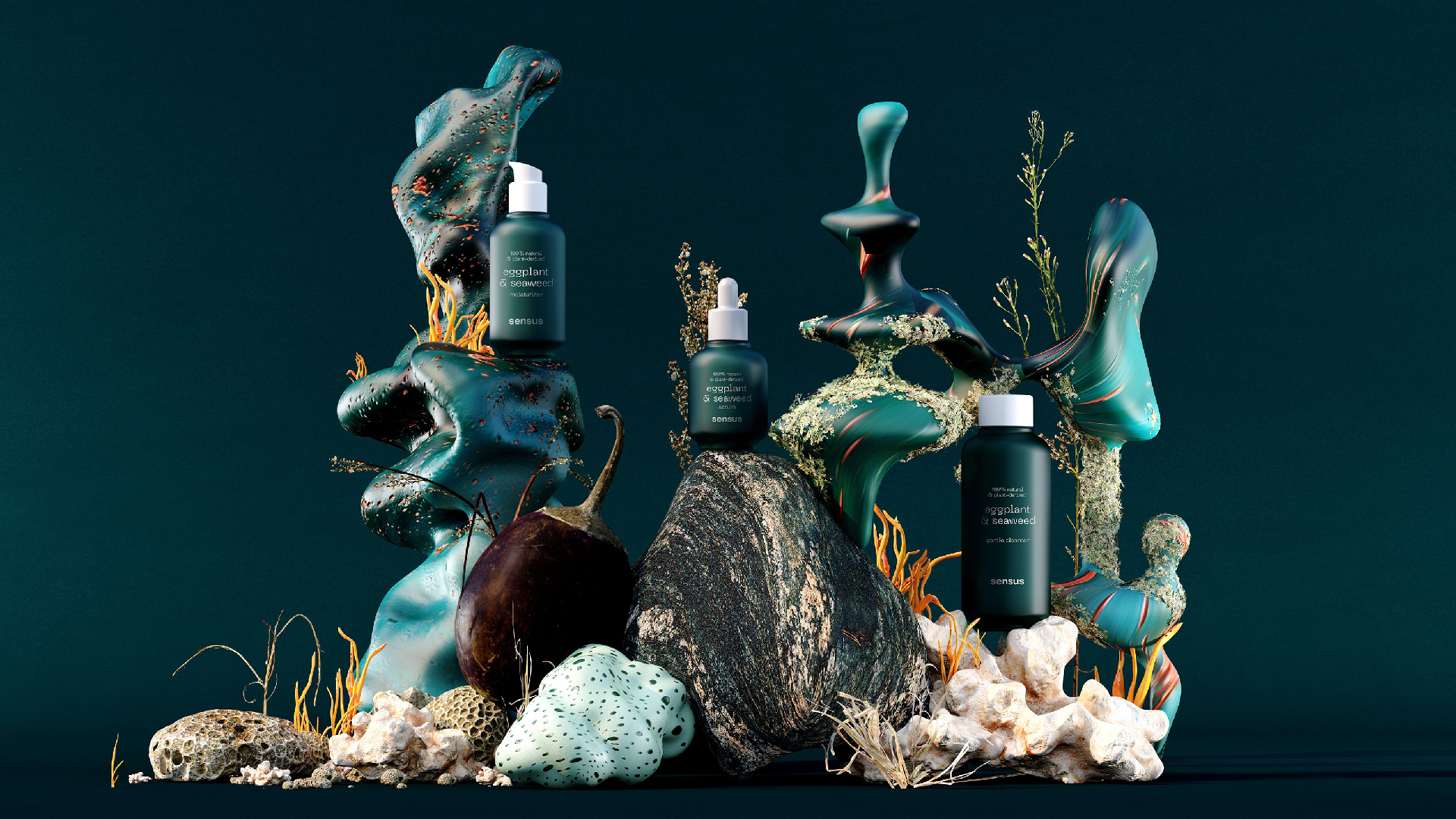
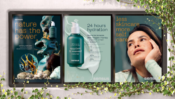
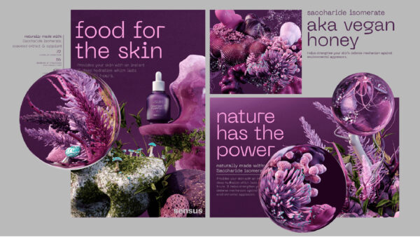
It was important to amplify the sensus vision into a sensory overload of content. Helping them land the most crucial and important aspects of the job. Unlocking impossible ideas and bringing them to life, helping them communicate complex ideas in an elegant and easily digestible way. Creating worlds that go beyond a single image, can be very cost and time- effective in the long run. Free from the principles of photography, we can bend and even break the rules in the content we create.
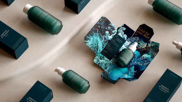
Whilst the rest of our world is hyper-engaging and emotionally intense, the packaging design needed to serve a different purpose: a more functional one. Education.
We needed to teach a simplified Korean skincare regime to people who might not realise how to use the products. The pack design needed to reflect this.
A discovery element was added to the inside of the pack to highlight the potency of the natural ingredients and add that social media ‘shareable’ moment during the product reviews on YouTube and TikTok.


