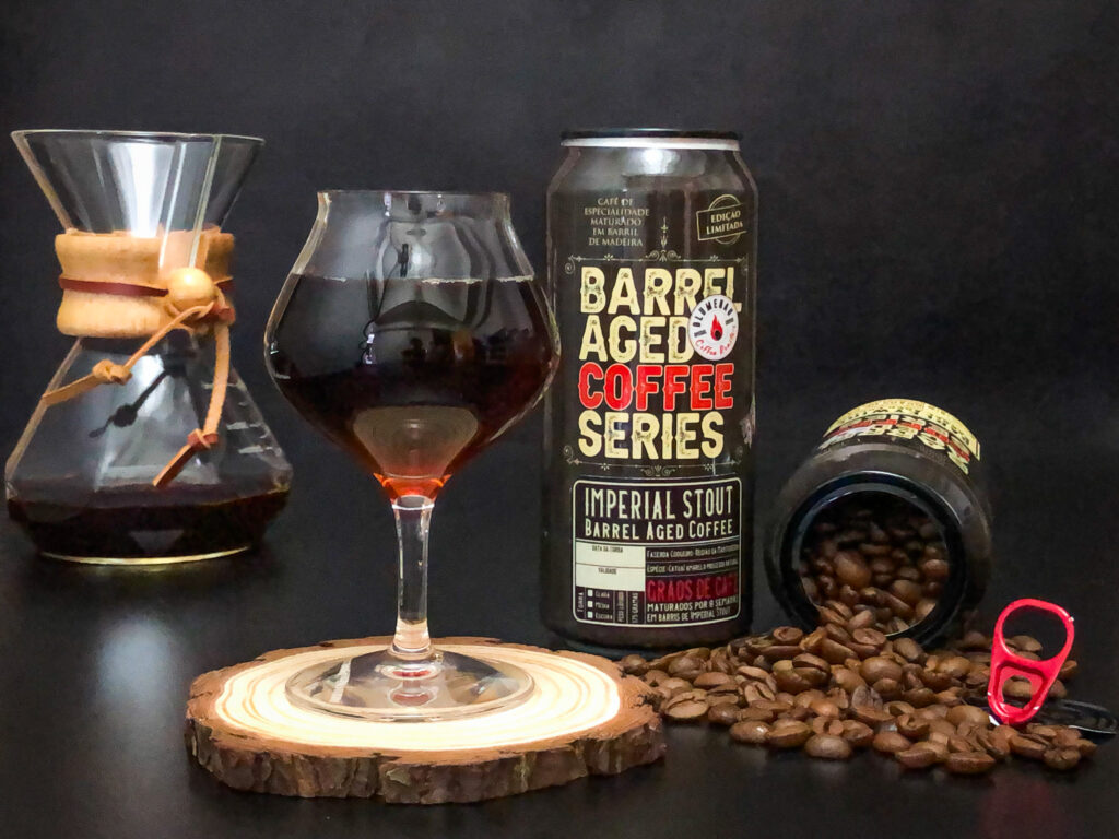
How to present a special series of coffees aged in wooden barrels previously used for maturing beverages?
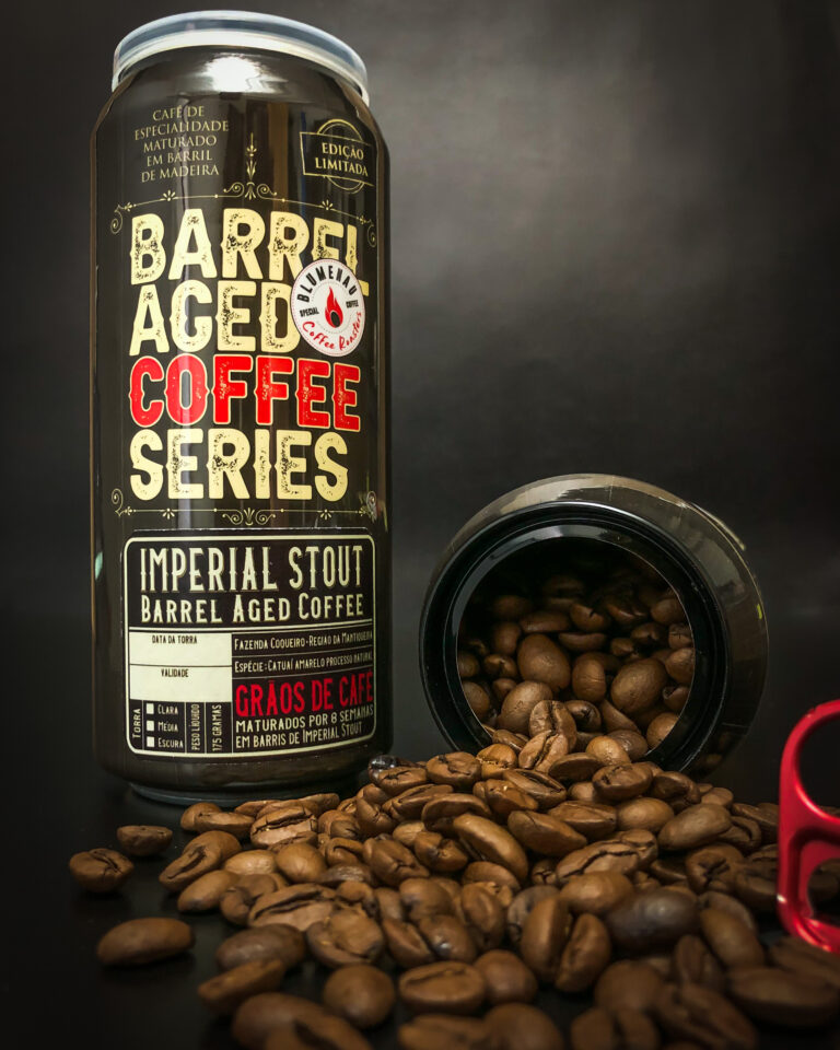
The answer to this question came in the form of a 473ml beer can, taking advantage of its cylindrical shape and its connection to the beverage that once occupied the barrels.
The overall label concept is an AllType design based on the old packaging of beverages, primarily distilled spirits, such as the famous American bourbons of the 19th century.
References to that era are evident not only in the chosen fonts but also in the arabesque patterns and lines that frame each part of the label.
References to beverage barrels are also visible through the vertical wood grain lines and textures that form the dark base of the label.
The fonts used similarly harken back to saloon times but with a weathered touch, reminiscent of the screen printing process used in posters of the era (this weathering can also be seen in the stamps that provide important information like “LIMITED EDITION”).
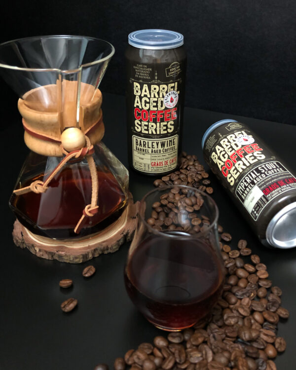
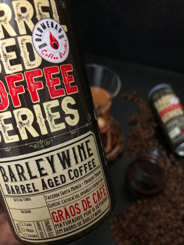
As a highlight on the front, we have the name of the special series, “Barrel Aged Coffee Series,” with “Coffee” highlighted in red for better product category visibility at the point of sale. In a second glance, just below the first, there is a label where variable information is placed according to the type of coffee in the can (IMPERIAL STOUT or BARLEY WINE), following font standards.
Despite containing a lot of information, this layout is designed to draw attention and stand out from other product offerings on the shelf, encouraging customers to pick up the package to read the details, thereby activating another sense (touch) to enhance the brand’s emotional impact.