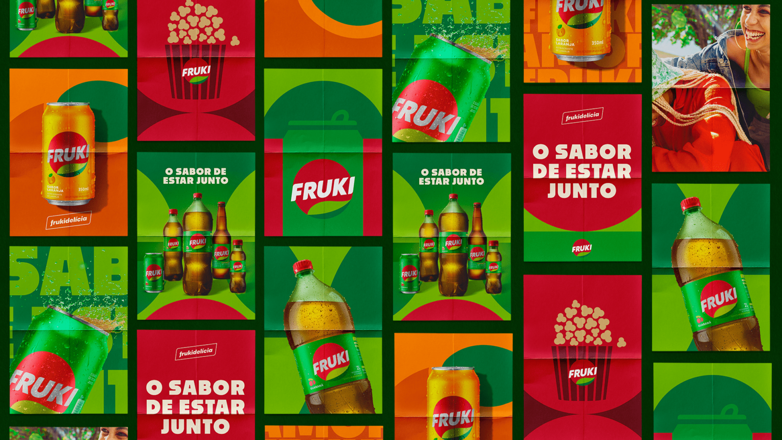
Fruki is a soft drink with a “fraternization” flavor, which occupies that special space on the table and in the hearts of the people of Rio Grande do Sul. It took a lot of subtlety and respect for its history to reformulate this brand that has such an emotional bond with its audience.
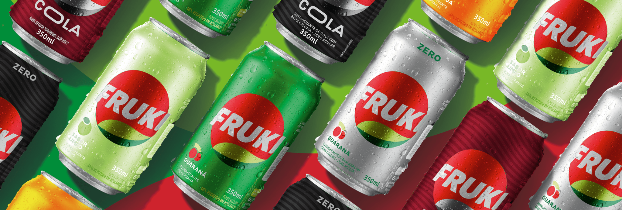
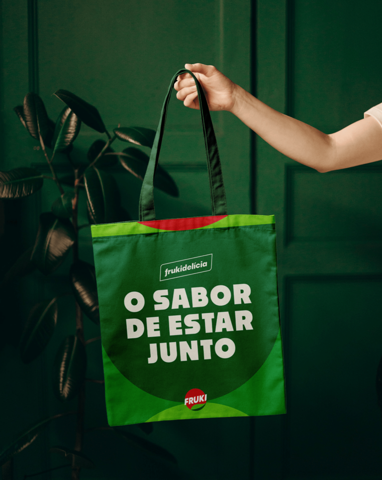
We studied the movements of the category, and competitors and created possible ways to update Fruki’s visual identity. We were responsible for redesigning the packaging and logo, developing the brand architecture, and creating the entire visual spirit of the brand. We tried to maintain Fruki’s original gestalt but with a more contemporary touch. The look was smoother, with less interference in the scenery. The illustrations became more iconographic, following a bold minimalist style, bringing clarity and distinction of flavor to the entire line.
The brand architecture was revised, assuming a master brand identity, uniting the different flavors under the same visual concept.


