It’s nori time: Ohmybrand redesigned the Naitori chips packaging
About the project
Earlier this year Salina Trade, long-term customers, addressed Ohmybrand agency. Some time ago Ohmybrand designed new packaging for Atlantica salt and even won an international award for it from The World Brand Design Society.
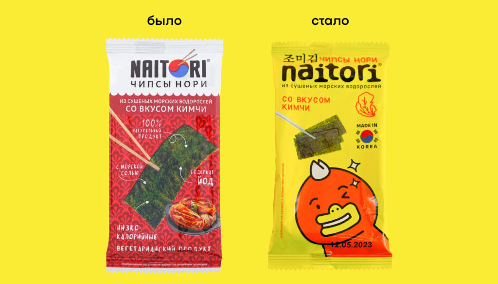
This time the agency was tasked with redesigning packaging for 100% natural nori chips Naitori, which for the past years have been sold in the specialized shops of Asian food and corresponding sections of regular supermarkets.
Tasks
We were supposed to develop the concept of the packaging redesign using the example of 4 SKU. Salina trade marketers had several specific requests for the upcoming design:
- It must demonstrate the authenticity of South Asian brand,
- It must reflect the naturalness and purity of the product
- And be targeted at younger audiences.
Brand’s character
Ohmybrand came up with the brand’s character before starting to work on the packaging design. It was clear from the get go that the whole visual aesthetic of the packaging will depend on the way customers view the brand as a whole.
Firstly, we came up with epithets characterising the brand.
Naitori is agile, confident, multifaceted, approachable and conveys feelings of happiness, trust, new experiences and introduction to Asian culture.
After that we studied profile of the customers. The main target audience is young men and women aged 15-22 years, interested in the bright Korean subculture – k-pop groups like BTS and BlackPink, manhwas and many more.
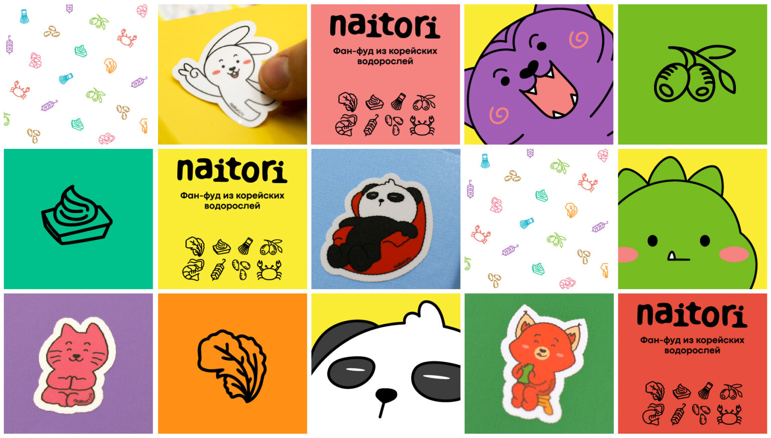
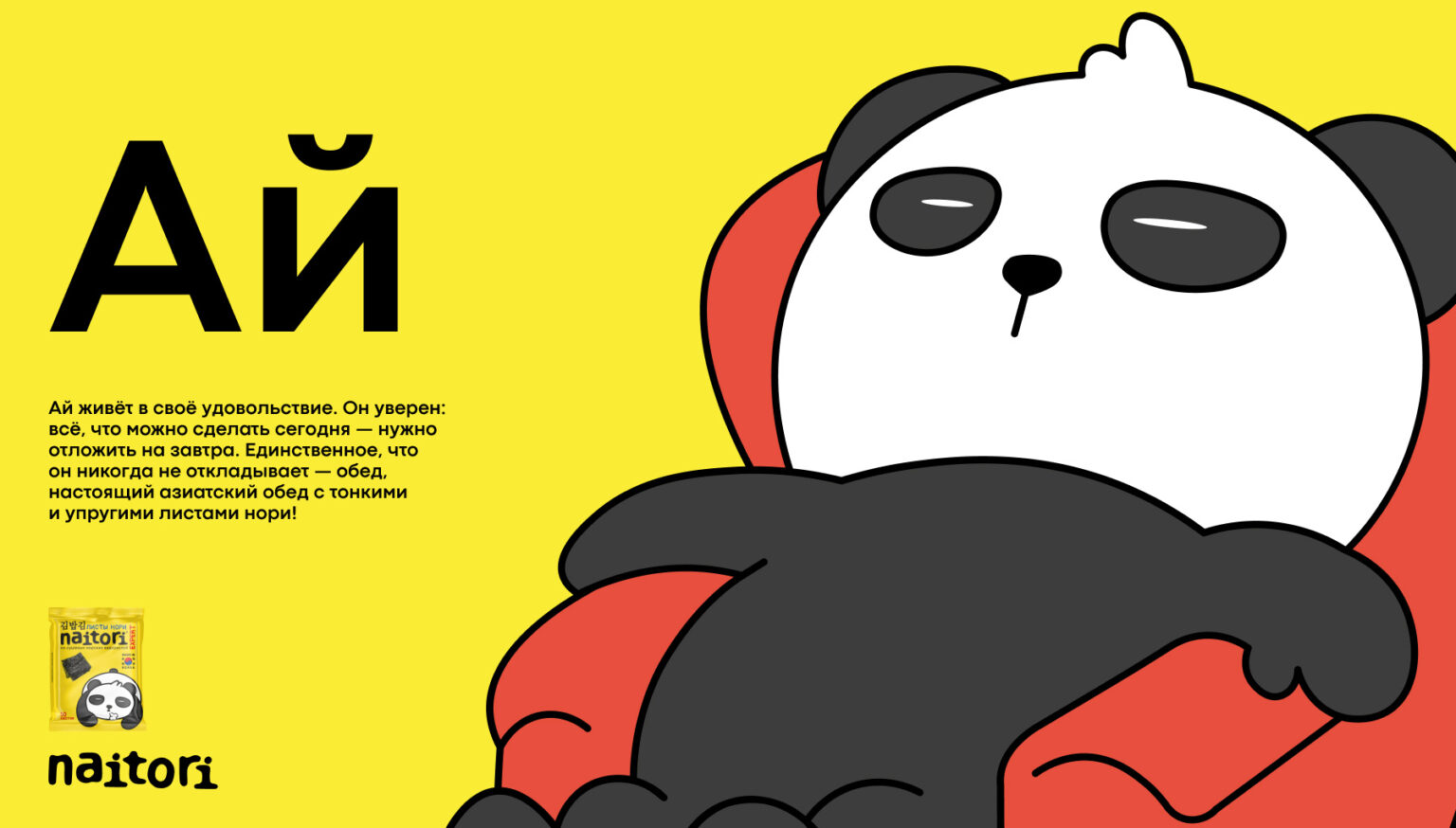
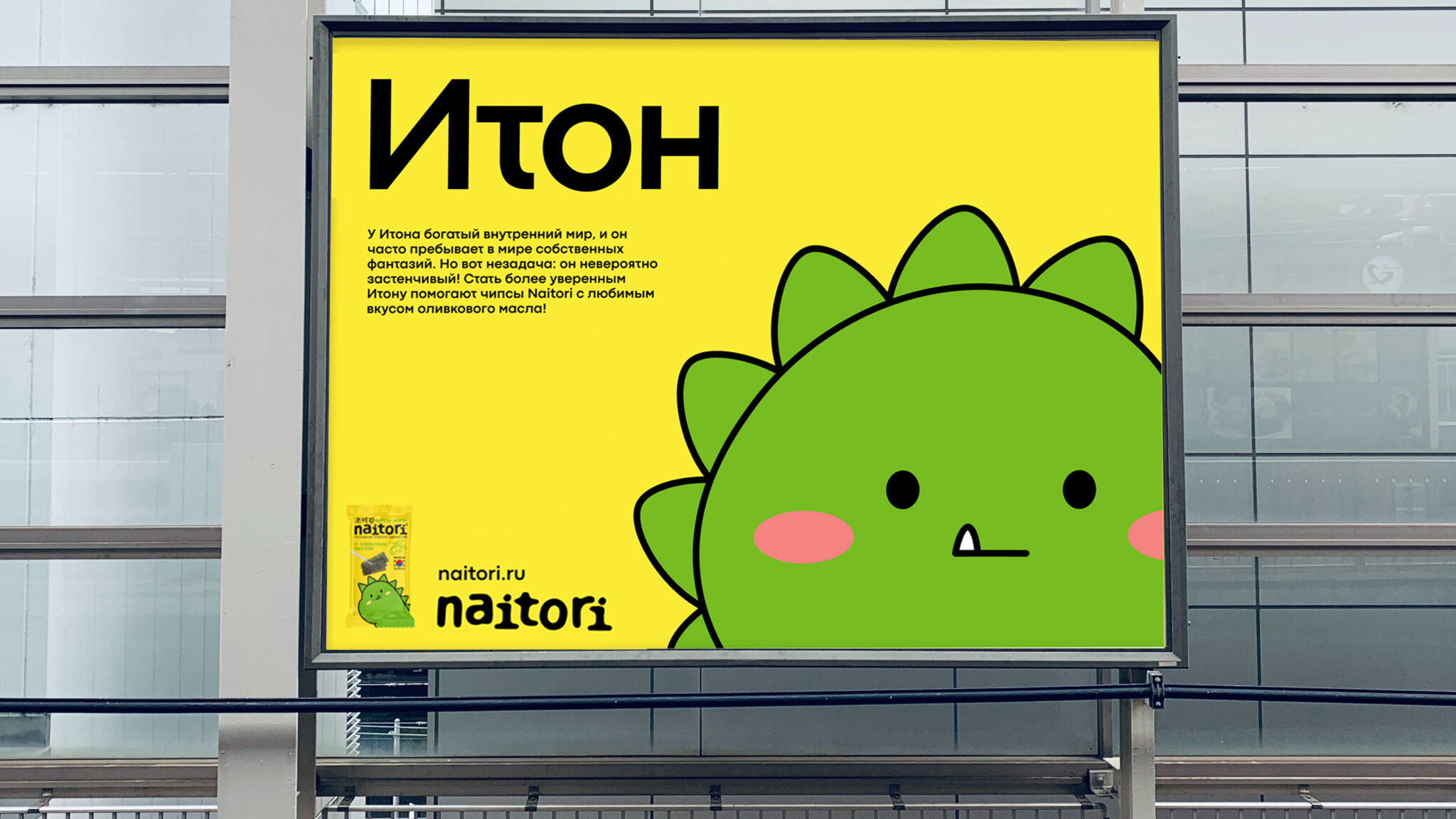
Korean culture is characterized by usage of mascots – cute characters with individual traits. Ohmybrand decided to create such characters for Naitori to further empathise Asian character of the brand.
“Better to be weird than boring!” – this motto was put at the core of the brand’s legend alongside the image of a friend group. Each one of them has their own character and emotions and together they are Natori-friends, with whom you will never get bored.
What did Ohmybrand agency do:
- We drew a character for each taste. Moreover, one character retains its taste in different lines for easier orientation, but changes poses and expressions.
- We thoroughly studied all possible competitors and chose gold as the primary brand color as the rarest color in this niche and the most noticeable on the shelf.
- We made the trademark more “Asian”, close to Korean letters, while retaining its readability even from a distanceWe came up with clear pictographs for tastes.
- We decided on differentiation between lines of products, in particular we specified the difference between nori chips and rice snacks with nori.
Result
Naitori Chips went on sale in spring 2023. And have already received Honorable Mention from the Jury of The World Brand Design Society.
Customer review:
“As we can see from active development of the brand, this design works wonders. This brand is relevant to the target audience and is in demand, its authenticity and positioning are expressed through design. Characters are easily identifiable by the customers as part of the Asian visual identity, and the quality of the product itself correlates with the high level of design and production of the package. Attention of the core audience is fully captured, at the same time, because of this design the brand is not only popular among children and teens, but also among older audiences”.


