ABOUT
Reign celebrates the timeless wisdom of Ayurveda, merging ancient traditions with modern skincare science to offer a holistic approach to radiant skin. The brand’s commitment to purity, authenticity, and efficacy sets them apart, as we not only enhance external beauty but also nurture well-being from within. Reign is your trusted ally on the journey to naturally healthy and glowing skin.
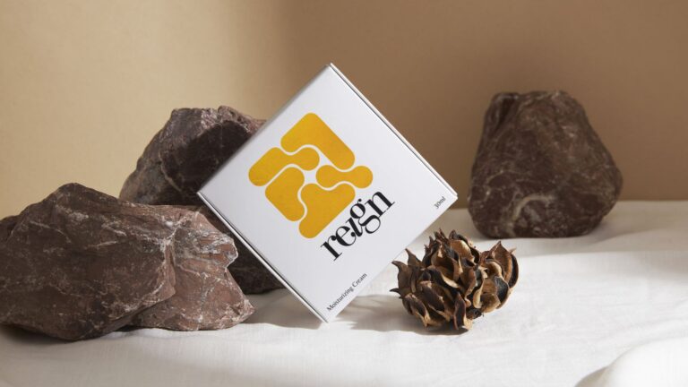
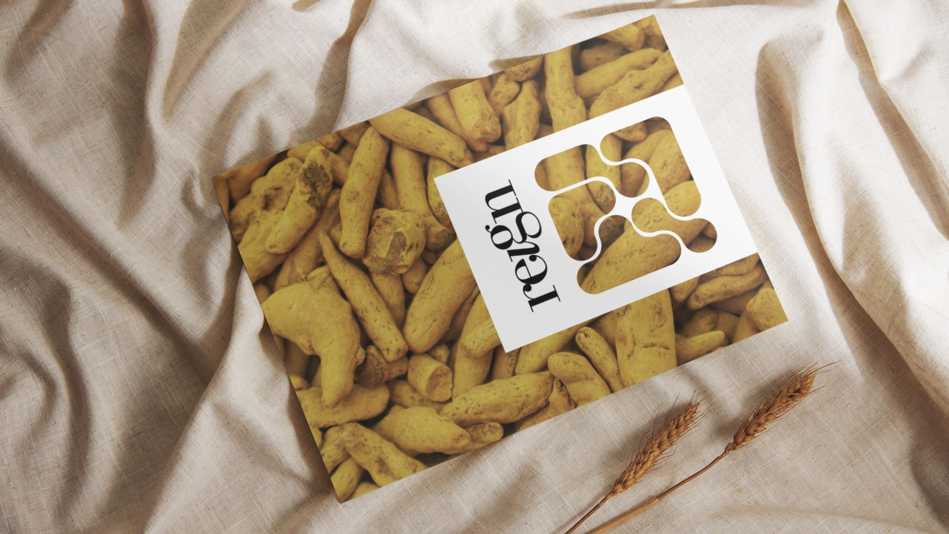
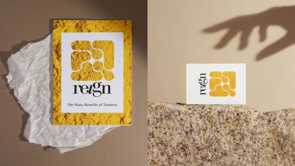
PACKAGING CONCEPT
The central theme revolves around the interconnected bulbous structures, resembling a network of energy and vitality. This motif is intricately woven into the packaging design, forming an elegant and cohesive visual language. The yellow hue, drawn from the logo, symbolizes the potency of turmeric, a key ingredient in our skincare line.
PACKAGING SOLUTION
Reign’s packaging solution embodies the brand’s ethos with a seamless blend of tradition and modernity. The abstract, linked bulbous structures take center stage, creating an intricate pattern that flows across each package. The square format adds a touch of geometric elegance, symbolizing balance and harmony. The minimalist labeling hierarchy enhances clarity and purity, ensuring that the focus remains on the fusion of Ayurvedic wisdom and modern science. As a metaphor for the holistic approach to skincare, the packaging reflects the interconnected journey to naturally healthy and glowing skin.