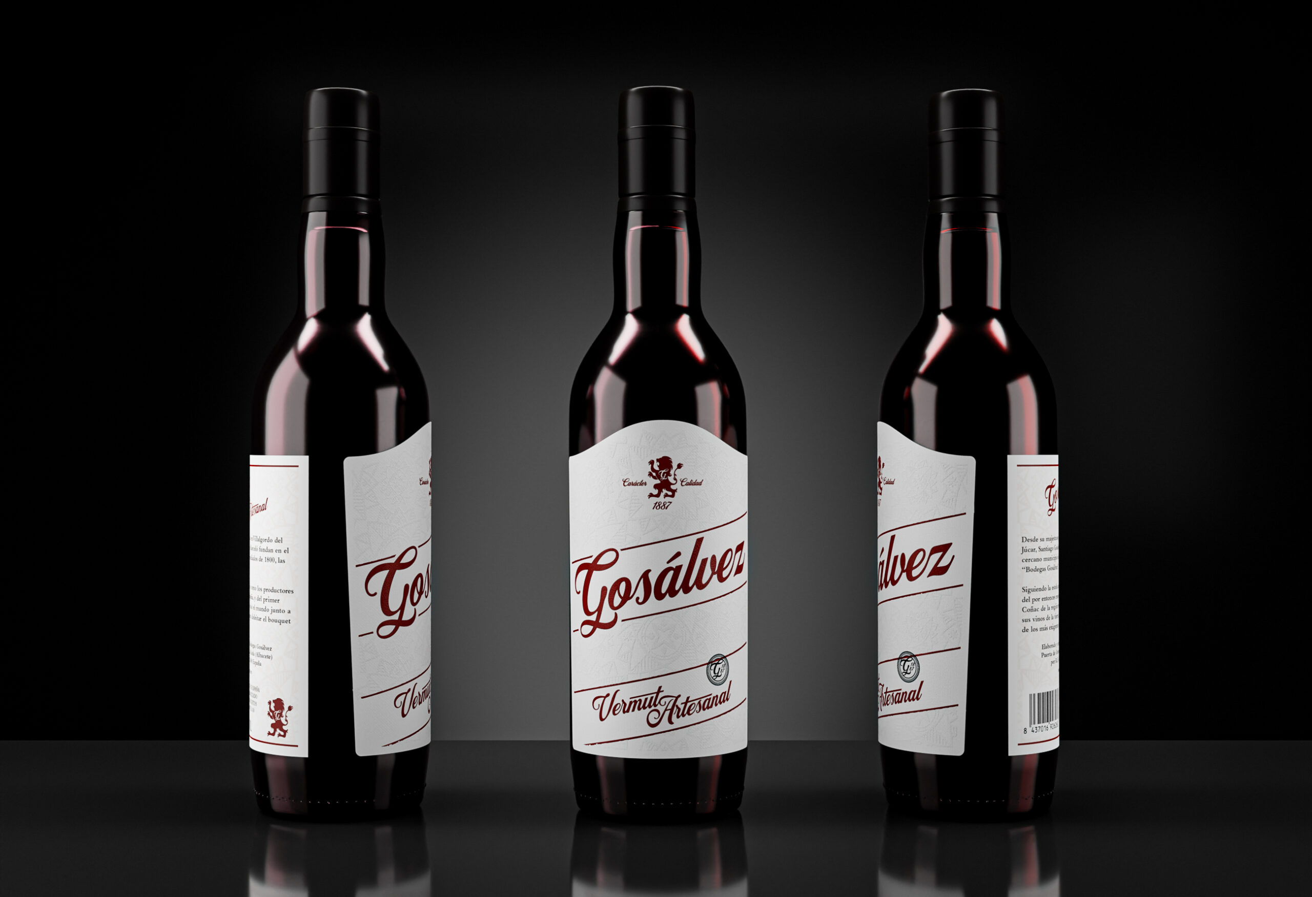
Label design for Vermut Gosálvez, a vermouth highly appreciated in Spain and Europe.
To appreciate the quality of the vermouth with all the senses, I designed a classic style label, rooted in the origin of the producing family, with more than a hundred years of experience, but with the idea in mind that it be a minimalist label, simple but attractive.
To appreciate the quality of the vermouth with all the senses, I designed a classic style label, rooted in the origin of the producing family, with more than a hundred years of experience, but with the idea in mind that it be a minimalist label, simple but attractive.
To achieve this sought-after classic style, and emphasize its artisanal production, both the logo, the upper seal with the lion (the family coat of arms), and the lower text, I drew them by hand, that is, I made a custom lettering for each element.
The idea was to unite on the same label the tradition, and the heritage of vermouth production and add geometric elements on the label, very subtle but that, thanks to the printing, are noticeable when we touch the label.
The geometric pattern on the label is inspired by the coats of arms present in the town where the vermouth factory comes from, La Roda (Albacete).