About
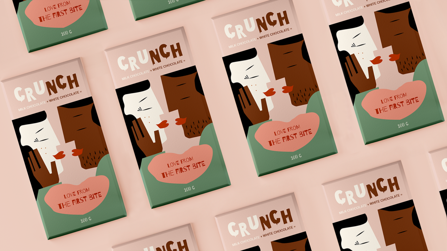
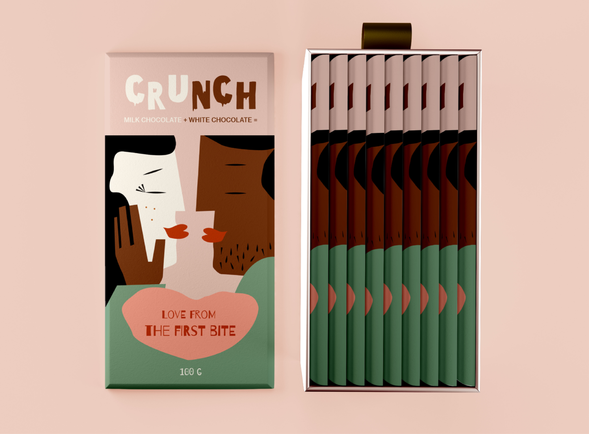
This is a love story but from the first bite. Crunch is a chocolate brand with half milk chocolate and the other half white chocolate, created for young couples. The branding needed to convey romance and tenderness in order to attract the target audience.
Solution
The melting logo represents the idea of the two halves and gives the feeling of delicious chocolate that melts in the mouth. The illustrated package reflects the youthful tone and adds character and individuality to the brand. As a result, the target customers feel closer to Crunch as they can associate themselves with the characters. To align with the brand positioning, pastel colors and a heart shape with the slogan were chosen to emphasize tenderness and romance.


