Almost Dead™ Packaging: Crafting a Visual Adventure
Introduction: Welcome to the exhilarating world of Almost Dead™, a vibrant and audacious beer brand that thrives on pushing boundaries and igniting the spirit of exploration. Crafting the visual identity for Almost Dead™ through its packaging design was a thrilling challenge, brimming with opportunities to capture the brand’s essence and allure consumers on a sensory journey. Join us as we delve into the creative process and strategic considerations that shaped the packaging design for Almost Dead™, offering insights and solutions to inspire fellow designers and enthusiasts in the packaging community.
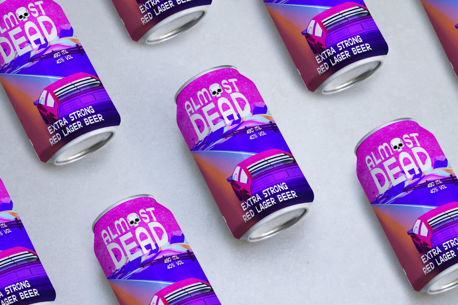
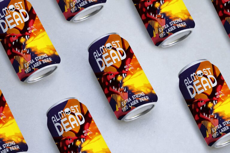
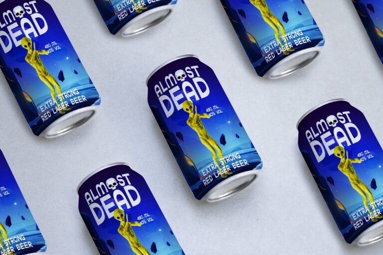
Description: Almost Dead™ packaging is more than just a vessel for beer; it’s an invitation to embark on an adventure of taste, discovery, and exhilaration. Drawing inspiration from the brand’s adventurous spirit, the packaging design embodies boldness and dynamism, capturing the essence of exploration and unpredictability. From the striking logo to the intricate details, every element of the packaging is meticulously crafted to evoke curiosity and intrigue.
The color palette, dominated by vibrant hues and bold contrasts, immediately grabs attention and sets the stage for the sensory experience that awaits within. Celestial motifs, reminiscent of starlit skies and cosmic wonders, adorn the packaging, echoing the brand’s ethos of curiosity and discovery. Each detail, from the typography to the imagery, contributes to the cohesive narrative of Almost Dead™, inviting consumers to immerse themselves in the brand’s world.