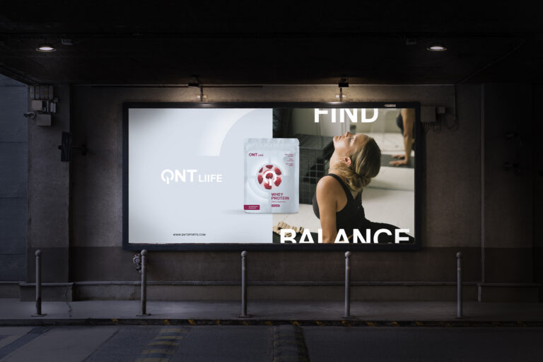
QNT is an international player in nutrition supplements active in over 55 markets and market leader in Belgium.
The challenge:
Being founded by a European champion in bodybuilding, the brand boasted a macho identity which didn’t align with a global health and wellbeing trend.
As a sales focussed organization, there was a constant strive for innovation, resulting in a cluttered portfolio of over 300 references across powders, bars and drinks.
The new icon and wordmark are based on the universal ‘on’ symbol, symbolizing the activating nature of the brand that is also expressed through the new tagline “It’s On”.
To bring a consistent and recognizable brand image across the entire range, we created an overarching design system based on the concept of the ‘radiant’ representing the 3 macronutrients (Carbohydrates, fat and protein), with the QNT supplements filling in the missing element.
The new brand identity was designed to create a more inclusive framework that did away with the blatant machismo associated with the category, while still being true to its own heritage. We reduced the portfolio of 20 brands to a clear brand architecture of 3 distinct sub-brands: Metapure, Move and Liife.


